For three generations, working Americans have thought that Social Security would allow them to retire at age 65 and enjoy the good life. That dream is now a fantasy. If you want to retire with financial security, you’d better start saving and investing heavily—now. Because although our current Social Security system has done a great job reducing elderly poverty and is currently running a $53-billion surplus, it faces a long-term funding shortfall of trillions of dollars. Unless the system is overhauled, closing that gap means pushing the 12.4 percent payroll tax way up to 20 percent or more. Or cutting benefits by 30 percent. So while you’re upping your savings, remember to exercise more and eat right; you may need to work longer than you’ve planned.
The antioxidant diet

Your best bet for fending off cellular damage from free radicals, scientists say, is to maintain a healthy supply of antioxidant compounds by eating fruits and vegetables—not by taking a pill.
Here are some foods rich in antioxidants.
Fruits: blueberries, cherries, kiwis, pink grapefruit, oranges, plums, prunes, raisins, raspberries, red grapes, strawberries Vegetables: alfalfa sprouts, beets, broccoli flowers, Brussels sprouts, corn, eggplant, kale, onions, red bell peppers, spinach
Here are some foods rich in antioxidants.
Fruits: blueberries, cherries, kiwis, pink grapefruit, oranges, plums, prunes, raisins, raspberries, red grapes, strawberries Vegetables: alfalfa sprouts, beets, broccoli flowers, Brussels sprouts, corn, eggplant, kale, onions, red bell peppers, spinach
A Radical Proposal
You can drop cigarettes. Avoid alcohol. But there’s one toxin you just can’t dodge: oxygen. With every gulp of air, oxygen gives you life. Some of it, however, gets converted inside your cells into a radical molecule that can wreak havoc, degrading those same cells and others. A growing number of scientists say this damage is what causes aging. They also think they may one day be able to fend off oxygen’s ill effects and help us live a lot longer. Scientists have long known that oxygen is capricious. As molecules go, it gets around, reacting with all kinds of things. Mostly, that’s good. Oxygen combines with fats and carbohydrates, in a part of cells known as the mitochondrion, to churn out the energy that gets you through the day.
But the conversion isn’t perfect. A small amount of oxygen is regenerated in a nasty form called a free radical, or oxidant—the very critter that causes metal to rust. The oxidants careen about, binding to and disrupting the membranes, proteins, DNA and other cell structures that make your body work. Over time, this damage adds up, and the result just might be an older, frailer you. According to one estimate, oxidants bombard the DNA inside every one of our cells roughly 10,000 times a day. Thankfully, most of the assailants are intercepted by a small army of antioxidant chemicals. Proteins also patch up the damage caused by the radicals that do get through. “The house is always getting dirty, and we’re always trying to clean it up,” remarks John Carney, chief technical officer at Centaur Pharmaceuticals in Sunnyvale, Calif., which is developing drugs to fight various diseases of aging. But eventually, the theory goes, our tired cells get less efficient at repelling free radicals and mopping up oxidative messes, and the damage accumulates.
We begin to rust from the inside out. If oxidants do send us crumbling into old age, then ramping up our biochemical defenses should extend life. That’s what scientists are finding, at least in the flies, rats, worms and other animals they have under scrutiny in the laboratory. Whether the techniques they are pursuing will ever lengthen life in humans remains an open question. But some researchers think they’re getting close to an answer. “The key is to really understand how oxidative damage works, and we’re learning that,” says biochemist Bruce N. Ames of the University of California at Berkeley. “I’m convinced life expectancy will get longer a lot faster than anybody thinks.”
Our Bionic Future
TELEVISION AND SLOT MACHINES notwithstanding, the point of technology is to extend what we can do with our bodies, our senses and, most of all, our minds. In the century now closing, we have gone from gaping at electric light bulbs and telephones to channel-surfing past images of a sunrise on Mars, to outbursts of pique if our e-mail takes more than a few minutes to get to the other side of the world. And in the next decade or two, the revolution is finally going to get really interesting. Several of the most important but disparate scientific and engineering achievements of the 20th century— the blossoming of electronics, the discovery of DNA and the elucidation of human genetics—will be the basis for leaps in technology that will extend, enhance or augment human capabilities far more directly, personally and powerfully than ever before. The heady assortment of biotechnologies, implants, wearables, artificial environments, synthetic sensations, and even demographic and societal shifts defies any attempt at concise categorization. But as our title boldly proclaims, we couldn’t resist resurrecting the word “bionics,” lately in a state of anachronistic limbo alongside the 1970s television adventures that made it a household word. Bionics often refers to the replacement of living parts with cybernetic ones, but more broadly it also means engineering better artificial systems through biological principles. That merger of the biological with the microelectronic is at the heart of most of the coming advances. As scientists and engineers unleash fully the power of the gene and of the electron, they will transform bits and pieces of the most fundamental facets of our lives, including eating and reproducing, staying healthy, being entertained and recovering from serious illness. Big changes could even be in store for what we wear, how we attract mates and how we stave off the debilitating effects of getting older.
Within a decade, we will see:
Within a decade, we will see:
•A cloned human being. It is possible, in fact, that experiments are already under way in secret.
•An artificial womb for women who can’t become—or don’t want to be—pregnant.
•Replacement hearts and livers, custom-grown from the recipient’s own versatile stem cells.
•Virtual reality that becomes far more vivid and compelling by adding the senses of smell and touch to those of sight and sound.
•Custom clothing, assembled automatically from highly detailed scans of the purchaser’s body and sold at a cost not much higher than off-the-rack.
•Foods that counteract various ailments, such as noninsulin- dependent diabetes, cholera, high cholesterol or hepatitis B.
•A genetic vaccine that endows the user with bigger, harder muscles, without any need to break a sweat at the gym.
World’s Oldest Creatures
Hiding inside rocky crevices 1,800 feet below the Pacific Ocean, rockfish stubbornly persist well past  100 years, far surpassing their peers. Giant 10-foot-long tube worms sway in the dark depths of the Gulf of Mexico for up to 250 years. Blanding’s turtles can slosh through Midwestern U.S. wetlands for at least 70 years, and certain giant tortoises push 300. Defying even greater odds, some bristlecone pines high in the California and Nevada mountains have lived almost 5,000 years! How do these remarkable creatures do it? Scientists are trying to find out, hoping to learn more about how nature’s organisms age and thus how we might lengthen human life. “The natural world offers hundreds of lessons in longevity,” says University of Southern California gerontologist Caleb E. Finch.
One lesson: find an environment free of predators. Researchers have identified yelloweye and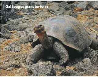 rougheye rockfish as old as 118 and 149 years, respectively, at great ocean depths. They endure partly because many of their predators prefer shallower waters, says Allen H. Andrews, a research associate at California State University. Blanding’s turtles may outlive soft-shelled varieties because their rough, hard exterior deflects the bite of hungry critters, explains ecologist Justin D. Congdon of the Savannah River Ecology Laboratory in Aiken, S.C.
The record-breaking bristlecone pines have also found a safe haven; they prevail at around 11,500 feet above sea level, too high for the comfort of many insects or competing trees. One pine at Nevada’s Wheeler Peak was estimated to be 4,900 years old, based on its annual growth rings, before it was cut down in 1964. Amazingly, Finch says, the trees seem to reproduce just as well in their 4,000th year as in earlier days.
For a long time, scientists didn’t bother to study the longevity of animals and plants. They assumed that most creatures would die before their time because of predators, competition, natural disasters, insects or disease. But that idea is changing. To measure more precisely the effect of environment on aging and longevity, University of Idaho biologist Steven N. Austad turned to an animal that normally lives fast, breeds madly and dies young: the opossum. Austad reasoned that opossums living without the evolutionary pressure of many predators—such as owls, coyotes and wolves—would age and breed more slowly, ultimately living longer. About a decade ago he found that very situation on Sapelo Island, a scrap of land off the Georgia coast. There opossums live up to 50 percent longer than on the mainland—and actually age more slowly along the way, according to Austad’s measurements of their tissues over time. Austad is now looking for similar longevity in island mice, considerably easier creatures to study in the lab.
 100 years, far surpassing their peers. Giant 10-foot-long tube worms sway in the dark depths of the Gulf of Mexico for up to 250 years. Blanding’s turtles can slosh through Midwestern U.S. wetlands for at least 70 years, and certain giant tortoises push 300. Defying even greater odds, some bristlecone pines high in the California and Nevada mountains have lived almost 5,000 years! How do these remarkable creatures do it? Scientists are trying to find out, hoping to learn more about how nature’s organisms age and thus how we might lengthen human life. “The natural world offers hundreds of lessons in longevity,” says University of Southern California gerontologist Caleb E. Finch.
One lesson: find an environment free of predators. Researchers have identified yelloweye and
 rougheye rockfish as old as 118 and 149 years, respectively, at great ocean depths. They endure partly because many of their predators prefer shallower waters, says Allen H. Andrews, a research associate at California State University. Blanding’s turtles may outlive soft-shelled varieties because their rough, hard exterior deflects the bite of hungry critters, explains ecologist Justin D. Congdon of the Savannah River Ecology Laboratory in Aiken, S.C.
The record-breaking bristlecone pines have also found a safe haven; they prevail at around 11,500 feet above sea level, too high for the comfort of many insects or competing trees. One pine at Nevada’s Wheeler Peak was estimated to be 4,900 years old, based on its annual growth rings, before it was cut down in 1964. Amazingly, Finch says, the trees seem to reproduce just as well in their 4,000th year as in earlier days.
For a long time, scientists didn’t bother to study the longevity of animals and plants. They assumed
 that most creatures would die before their time because of predators, competition, natural disasters, insects or disease. But that idea is changing. To measure more precisely the effect of environment on aging and longevity, University of Idaho biologist Steven N. Austad turned to an animal that normally lives fast, breeds madly and dies young: the opossum. Austad reasoned that opossums living without the evolutionary pressure of many predators—such as owls, coyotes and wolves—would age and breed more slowly, ultimately living longer. About a decade ago he found that very situation on Sapelo Island, a scrap of land off the Georgia coast. There opossums live up to 50 percent longer than on the mainland—and actually age more slowly along the way, according to Austad’s measurements of their tissues over time. Austad is now looking for similar longevity in island mice, considerably easier creatures to study in the lab.
THE PHYSICAL OF THE FUTURE
“I SEE THIS is your first visit,” says the doctor, looking up from her notes. “What seems to be the problem?” With a shuddering sigh, you describe your lack of energy, inability to sleep, disinterest in activities you once found pleasurable, and the crying—every day you cry. “Have you ever been treated for depression?” she asks, reaching for what looks like a small plastic tongue depressor. “Uh-uh,” you gurgle, mouth agape, as the doctor scrapes a swath of cells from inside your cheek. “Then we’ll just do a quick ‘snip check,’ and you can pick up your prescription this afternoon,” she says, dropping the spatula into a vial and sending it off to the laboratory. There technicians will extract and analyze your DNA to determine which of the 837 antidepressants on the market will best chase away your blues.
Will pharmacogenomics usher in such an era of personalized medicine, in which our genetic fingerprints will determine the kind of medical treatment we receive? Will every trip to the clinic involve surrendering some DNA for sequencing? And once our DNA sequences can be easily accessed from a global database, will physicals be replaced by phone-ins?
Will pharmacogenomics usher in such an era of personalized medicine, in which our genetic fingerprints will determine the kind of medical treatment we receive? Will every trip to the clinic involve surrendering some DNA for sequencing? And once our DNA sequences can be easily accessed from a global database, will physicals be replaced by phone-ins?
Well, yes and no. First, it is important to keep in mind that genes aren’t everything. “Many factors determine drug response,” cautions William A. Haseltine of Human Genome Sciences. Genes are important, but so are the age, sex and general health of the patient, as well as the other drugs he or she might be taking. Still, scientists anticipate that genetic profiling may soon help doctors diagnose diseases and allow them to prescribe medications that will work best for an individual patient. “Most drugs only work on 30 or 40 percent of people,” says Daniel Cohen of Genset in Paris. “Only aspirin works on almost everyone.”
Genetic testing should help match the right drug at the right dose to the right patient without a lot of time-consuming trial and error. If you were clinically depressed, for example, a quick look at the results of a test called a P450 profile might indicate that you break down drugs so rapidly that you would probably clear certain antidepressants from your bloodstream before they could take effect. Or you might break them down so slowly that normal doses would make you antsy.
In addition to helping determine drug dosage and minimizing unwanted side effects, genetic screening may soon be used to predict a patient’s predispositions to disease. Perhaps when you’re 18 years old, you’ll automatically be screened for your susceptibility to heart disease, diabetes, Alzheimer’s disease, cancer and scores of other disorders. Armed with this knowledge, you might then be able to change the way you live or the foods you eat to boost the odds that you’ll stay healthy.
Will we all eventually carry plastic plates the size of credit cards that are digitally encoded with all the genetic secrets stored in our genomes? “No, they’ll probably be on chips implanted under our arms,” jokes John Tallman, Neurogen’s executive vice president. Although both options may someday be technologically possible, they will probably be a ways off. For one, investigators have yet to sequence one complete human genome. So rather than sequencing every one of the six billion nucleotide letters that make up your personal genetic code, for now pharmacogeneticists will very likely focus on the few hundred gene mutations, or SNPs, that have been shown to correlate with drug responsiveness or disease risk, says Francis S. Collins of the National Human Genome Research Institute. Ultimately, researchers hope such tests will cost a few dollars and yield results in an hour. Genetic testing, of course, raises privacy issues. Will your employer or insurer be able to access your genetic profile? What about telemarketers? With any luck, legislators will pass laws designed to protect your genetic privacy long before the technology makes this future possible. Still, imagine answering the phone during dinner to hear a chirpy electronic voice dispense unwanted medical advice: “Isn’t it time you started taking Progenitol?”
How to Create Pages in InDesign? Part IV
Continue from Part III
Reusable Document Setups
This section is about efficiency. As I’ve said before, if you’ll do something more than once, do it only once and automate it. InDesign has numerous automation-enabling facilities for many common tasks, including reusable page setups.
 Document Presets
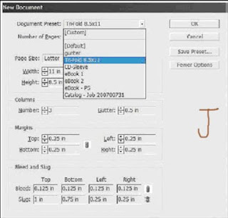
At the top of the New Document dialog (File >New >Document) is the Document Preset dropdown menu (see Figure J). By default, it contains only [Default] and [Custom]. The latter is intended just to be a visual cue for you the InDesign user. Change anything below and the preset becomes [Custom]; you do not need to preselect [Custom] in order to make any changes below it.
This section is about efficiency. As I’ve said before, if you’ll do something more than once, do it only once and automate it. InDesign has numerous automation-enabling facilities for many common tasks, including reusable page setups.
 Document Presets
At the top of the New Document dialog (File >New >Document) is the Document Preset dropdown menu (see Figure J). By default, it contains only [Default] and [Custom]. The latter is intended just to be a visual cue for you the InDesign user. Change anything below and the preset becomes [Custom]; you do not need to preselect [Custom] in order to make any changes below it.
If you more often than not have to change something from its default in the New Document dialog,—maybe your typical document is tabloid sized, includes a standard-sized bleed, has multiple columns, or needs something other than a half inch all around margin—set it up just once and build a preset. Every subsequent document you create will then not require all the manual settings; you’ll be able to select it from the Document Preset menu and have all your options applied. Just set the options once, click the Save Preset button, and give the preset a name in the Save Preset dialog that pops up. Upon clicking OK, you’ll find your customer preset below [Default] in the list, ready for two-click setup of your next document. Build presets for all the different types of documents you create at least once in a while.
Page Size Presets
Hey! Is there a way to customize the Paper Size menu? Another common question, and the answer is yes. The Page Size list contains the most common paper sizes customers told Adobe they use. If they aren’t inclusive of your most common page sizes, tell Adobe; maybe a future edition of InDesign will include your typical page sizes. Until then, you can manually override them by changing the width, height, and/or orientation below the drop-down menu, or you can add your own common sizes to the Page Sizes list. Here’s how:
1. Quit out of InDesign.
2. Open this file in your text editor:
Windows: Program Files\Adobe\Adobe InDesign CS3\Presets\New Doc Sizes.txt
Mac OS: Applications/Adobe InDesign CS3/Presets/New Doc Sizes.txt
3. At the bottom of the file, insert each of your desired page size presets in the following format:
Name[tab]Width[tab]Height. Here’s an example:
Business Card 3.5” 2”
4. Save and close New Doc Sizes.txt. When you open InDesign next, your new options will be in the Page Sizes list. There are other examples in the New Doc Sizes.txt file right above the copyright notice. Remove the semicolons and leading spaces to uncomment the examples and make them selectable page sizes for new documents. The rest of the file contains additional instructions and information you may find useful.
If your custom addition didn’t work, check that you inserted straight inch marks (") instead of curly quote marks (”). If you’re having trouble getting the inch marks (even some text editors do automatic correction now) use i or in in their stead.
Document Templates
Neither document presets nor page size presets can save your manually created live area guides, but a template can. In fact, a template can save everything to do with a particular document—paragraph, character, table, cell, and object styles as well as swatches, dictionary spelling and hyphenation exceptions, columns, and master pages, among other things. I always recommend templates for workflows that frequently employ the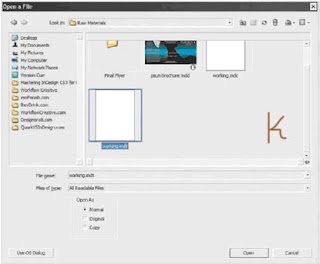 same or similar document layouts and styles. Cumulatively, templates can save a massive amount of time over setting up documents manually, and they can be passed around the office or posted on a shared server for simultaneous use by everyone. Templates, in fact, are the key to consistent style usage among workgroups (more on that in Chapter 11, “Efficiency”). If you’ve set up trim area guides or any other document feature likely to be reused on the same page size in the future, save it as a template. Just go to File >Save As, and change the Save As Type drop-down to InDesign CS3 Template. The resulting file will have an .indt extension instead of .indd and will have a slightly different icon. For all intents and purposes, it’s just a standard InDesign document with the sole exception that the .indt extension triggers a slightly different behavior when File >Open is used. Instead of opening the template itself, InDesign will create a new, untitled document based on that template—a duplicate—and will not open the template itself. In the new document you’ll have everything you had in the template—paragraph, character, table, cell, and object styles as well as swatches, dictionary spelling and hyphenation exceptions, columns, and master pages, among other things. The trick is in the way the Open dialog works. Note the three Open As options at the bottom (see Figure K). Original opens the original file, whether an InDesign document, template, or Interchange Format INX file. Copy generates on-the-fly an unsaved duplicate of the selected document; the original is left untouched, but InDesign creates a new document faithful to the original in every respect. Finally, Normal says to use whatever is default behavior for the specific document type—INDD and INX documents open originals, INDTs create copies. Normal is the default, which means that, when designers in your workgroup need to create new documents from your template, they won’t be editing the template itself. To do that, you must deliberately choose to open the original. Note that when you’re opening documents created in a previous version of InDesign or created in a compatible version of PageMaker (6.0–7.0) or QuarkXPress (3.3–4.1 and QuarkXPress Passport 4.1), a copy will be created regardless of the Open As choice. A template-based workflow is the ideal for any periodical and is usually more efficient and leads to fewer content-destroying mistakes than opening the previous issue’s files, resaving as the next issue’s files, and then replacing content. I’ve seen few other workflows wherein at least one document setup is reused that doesn’t also see a benefit from employing templates.
Document Templates
Neither document presets nor page size presets can save your manually created live area guides, but a template can. In fact, a template can save everything to do with a particular document—paragraph, character, table, cell, and object styles as well as swatches, dictionary spelling and hyphenation exceptions, columns, and master pages, among other things. I always recommend templates for workflows that frequently employ the
 same or similar document layouts and styles. Cumulatively, templates can save a massive amount of time over setting up documents manually, and they can be passed around the office or posted on a shared server for simultaneous use by everyone. Templates, in fact, are the key to consistent style usage among workgroups (more on that in Chapter 11, “Efficiency”). If you’ve set up trim area guides or any other document feature likely to be reused on the same page size in the future, save it as a template. Just go to File >Save As, and change the Save As Type drop-down to InDesign CS3 Template. The resulting file will have an .indt extension instead of .indd and will have a slightly different icon. For all intents and purposes, it’s just a standard InDesign document with the sole exception that the .indt extension triggers a slightly different behavior when File >Open is used. Instead of opening the template itself, InDesign will create a new, untitled document based on that template—a duplicate—and will not open the template itself. In the new document you’ll have everything you had in the template—paragraph, character, table, cell, and object styles as well as swatches, dictionary spelling and hyphenation exceptions, columns, and master pages, among other things. The trick is in the way the Open dialog works. Note the three Open As options at the bottom (see Figure K). Original opens the original file, whether an InDesign document, template, or Interchange Format INX file. Copy generates on-the-fly an unsaved duplicate of the selected document; the original is left untouched, but InDesign creates a new document faithful to the original in every respect. Finally, Normal says to use whatever is default behavior for the specific document type—INDD and INX documents open originals, INDTs create copies. Normal is the default, which means that, when designers in your workgroup need to create new documents from your template, they won’t be editing the template itself. To do that, you must deliberately choose to open the original. Note that when you’re opening documents created in a previous version of InDesign or created in a compatible version of PageMaker (6.0–7.0) or QuarkXPress (3.3–4.1 and QuarkXPress Passport 4.1), a copy will be created regardless of the Open As choice. A template-based workflow is the ideal for any periodical and is usually more efficient and leads to fewer content-destroying mistakes than opening the previous issue’s files, resaving as the next issue’s files, and then replacing content. I’ve seen few other workflows wherein at least one document setup is reused that doesn’t also see a benefit from employing templates.
If you choose the File >New >Document from Template command, it opens an Adobe Bridge window focused on the Templates\InDesign folder created during InDesign or Creative Suite install. Dozens of professionally designed, royalty-free templates are included with InDesign CS3, and you can use them as is or, better, as learning aids. They’re all InDesign template INDT files, so opening them by double-clicking in the Bridge view will have the same effect as opening a template you created using the default Normal option—a new, untitled document based on the template.
 Layout Adjustment
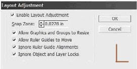
This isn’t strictly a master page thing, but layout adjustment is most often used in conjunction with master pages, so it makes the most sense to bring it up here.After initially creating the document, you can change its type—facing or nonfacing—as well as the paper size and orientation with File >Document Setup. Using Layout >Margins and Columns, you can also alter the margins, number of columns, and column gutter width. Finally, on master pages, margin guides can be manually dragged to new positions (if unlocked). None of these changes will adapt your page objects to the new conditions by default. If you want your text frames to expand or contract to fit new margins, to automatically reduce or increase the number of columns they contain according to changes you’ve made in Margins and Columns, or if you want other objects to adjust to the new document layout without you having to do it all by hand, turn to Layout Adjustment on the Layout menu (see Figure L).
 Layout Adjustment
This isn’t strictly a master page thing, but layout adjustment is most often used in conjunction with master pages, so it makes the most sense to bring it up here.After initially creating the document, you can change its type—facing or nonfacing—as well as the paper size and orientation with File >Document Setup. Using Layout >Margins and Columns, you can also alter the margins, number of columns, and column gutter width. Finally, on master pages, margin guides can be manually dragged to new positions (if unlocked). None of these changes will adapt your page objects to the new conditions by default. If you want your text frames to expand or contract to fit new margins, to automatically reduce or increase the number of columns they contain according to changes you’ve made in Margins and Columns, or if you want other objects to adjust to the new document layout without you having to do it all by hand, turn to Layout Adjustment on the Layout menu (see Figure L).
Layout Adjustment does a decent job of reformatting page (and master page) objects to conform to new document conditions such as new page sizes and orientations and margin and column guide relocation. Frames will be moved and resized as needed to adapt to the new layout if Enable Layout Adjustment is activated prior to making the layout change. Here is what the options mean:
Snap Zone The maximum distance an object must be from one or more margin or column guides or the page edge to be a candidate for repositioning or resizing with Layout Adjustment. For instance, with a value of 0.25 inches, a master text frame directly on four margins will be adjusted but a graphic frame 0.5 inches from the nearest guide will not be adjusted.
Allow Graphics and Groups to Resize Vector objects, frames, and groups of objects will be repositioned by Layout Adjustment regardless of whether they fall within the snap zone. This option determines whether they may also be scaled to better fit. For instance, if converting an 8.5x11-inch document from portrait to landscape, should a full-page background graphic frame follow suit to become 11x8.5 inches with its content scaled accordingly?
Allow Ruler Guides to Move Manually created ruler guides—column center points, for example—can be moved to maintain their relative position to margin and column guides with this option checked.
Ignore Ruler Guide Alignments Throughout working on a document, we often create numerous ruler guides that are not significantly related to the layout. Because layout adjustment considers all guides in its calculations, these nonessential guides can cause it confusion, leading to improperly adjusted layouts. Checking this option tells InDesign to ignore them, factoring in only page edges and column and margin guides when repositioning and scaling objects.
Ignore Object and Layer Locks This option is an easier alternative to unlocking locked layers and combing through a document looking for any objects whose positions have been selectively locked. Enabling this will reposition and/or scale objects regardless of their individual or layer lock statuses.
Multiple Page Sizes
Since long before computers, there has always been a need to create documents that include multiple page sizes or orientations. With the rise of VDP and digital-to-press output making high-quality, one-off productions an affordable option, multiple page sizes and orientations in documents have become more common and more desirable. But the software has never caught up with the need— even in the cutting edge of page production, InDesign CS3. QuarkXPress, since version 6.0, has done multiple page sizes in one “project,” but it’s not truly the same thing. You see, QuarkXPress merely allows multiple, disconnected layouts to be saved in the same file—it’s an MDF, a multiple document format, similar to the way Excel allows multiple spreadsheets to be saved in a single Excel document. QuarkXPress, even in the latest version as of this writing, still won’t allow two or more differently sized pages in a single, continuous layout. In close to a hundred InDesign training, consulting, and speaking engagements, I’m hard-pressed to recall a single one in which I wasn’t asked if InDesign could do multiple page sizes in one document. There’s a lot of need for that feature in our field. Gatefold covers and ads in magazines are still produced separately from surrounding pages and then inserted at bindery time. Maps, charts, and spreadsheets in proposals and technical books are still separate InDesign documents. Landscape content in a portrait-orientation book still forces designers to work sideways, either trying to read at 90 degrees or rotating their work for every change or onscreen copy proof—and that often requires grouping and ungrouping for many edits just to retain object relational positions. Frankly, it’s ridiculous. That’s why I did something about it.
First, let’s look at the workaround we—design, prepress, press professionals—have come to accept as the “only” way of creating multiple page sizes or orientations in a single document.
Book Panel
InDesign only allows a single page orientation and size per document. If most of the document is to be 8.5x11 inches portrait (tall), then it’s all going to be 8.5x11 inches portrait. The workaround to this limitation has been “booking” multiple documents together to (somewhat) behave as one. This isn’t just InDesign, by the way. Print pros have been using this same workaround for two decades in QuarkXPress, PageMaker, and other layout applications. We’ll look at the functionality of InDesign Book documents and the Book panel in Chapter 9, “Documents,” but in essence, an InDesign Book document (INDB) is a paperclip that links multiple, otherwise completely self-contained InDesign documents together. Via the Book panel, page and section numbers, styles, indexes, and tables of contents can be synchronized among all the booked files. They can also be preflighted, packaged, exported to PDF, and printed simultaneously as if they were a single document. That is very cool and powerful, as are the synchronizing functions. The Book panel, though, was developed for the purpose of managing longer documents. It enables, for instance, this book to be written in chapters. As I’m writing this chapter, others are with my editors Sam and Karen, some are already with the compositor being poured into the layout template, and still other chapters are on their way back to me for final layout proof. When all the chapters are done, the fact that they’re booked will keep page numbers, the TOC, and the index correct, ensuring that Chapter 2 begins numbering where Chapter 1 leaves off and so on. Because the Book panel has all these features, it can be used to insert an oversized or rotated page into the middle of a long document. For instance, if page 26 is a fold-out tabloid diagram among 47 other 8.5x11-inch pages, the Book panel can insert the tabloid as page 26 and keep the rest of the page numbers in synch. The catch is that they must all be separate documents. Pages 1 through 25 must be one 8.5x11-inch InDesign document, page 26 a single 11x17-inch page document, and then pages 27 through 48 have to be a third document because they’re 8.5x11 inches. If editorial says the tabloid diagram belongs two pages previous, you’ll have to pull two pages out of the first document and insert them in the third to make it work. Of course, that’s only the simplest of scenarios. Many longer documents have several charts, diagrams, fold-outs, or other oversized pages. Everywhere that the page size differs requires a new InDesign document. Beginning to see how this can get ugly? Add in the fact that each of those documents has its own localized paragraph, character, object, table, and cell styles as well as hyphenation exceptions, swatches, ink settings, master pages, and a whole lot more and every document exponentially increases the risk of mistakes making it to press. All of these can be synchronized via the Book panel, but that must be done deliberately and correctly. Someone forgets or doesn’t synch correctly, and…. Well, I’m sure you can imagine—or maybe you don’t have to imagine. If you need to deal with two or three different booked documents as a result of page size or orientation differences only once in a while, use the Book panel method. If you need it more often, or just don’t want to add another layer of complication to your workflow, there’s another option.
Page Control Plug-InUntil November 2006, the Book panel option was the only workaround to managing multiple page sizes or orientations in a single document created in InDesign. Then DTP Tools and I released the Page Control plug-in, which works in InDesign CS, CS2, and CS3. With it, you can resize any or all pages—singly or in spreads—change from landscape to portrait, change the vertical alignment of pages within a spread, resize master pages, set document pages to automatically resize according to their assigned masters, and change the size of the pasteboard for more working room—and all of this in one, single InDesign document that can be packaged, printed, exported to PDF, and so on without risky or inconvenient workarounds (see Figure M). And, it prints. Prior to releasing Page Control, we held a public beta period in which we asked printers in the U.S., Australia, and Europe, among other places and groups of professionals, to test it out thoroughly. Whether printed natively from InDesign, printed from an InDesign-exported PDF, or printed first to PostScript, documents containing a full range of different page sizes sailed through RIPs without complaint. As of this writing, Page Control has been available and selling to design and prepress professionals all over the world for several months; I have yet to hear a complaint from anywhere within the for-print process.

We even created a free Page Control Reader plug-in that enables anyone without the full Page Control plug-in to view, edit, save, and output InDesign documents containing multiple page sizes. (Hint, hint, you service bureaus and printers.) If you create documents with different page sizes in a single document, or just want to enlarge your pasteboard, there’s a 14-day try-out version of Page Control included on this book’s download page in the Chapter 7 folder. The BIN file is for Mac installs and the MSI for Windows. Upon installation, the Page Control commands will appear on the Pages panel’s flyout menu. The same installers will also set up Page Control Reader.
to be continued in part V..........
InDesign in Your Pocket
Or, InDesign on a Stick—a USB stick/thumbnail drive/flash drive. Although you can fit InDesign and all its component plug-ins on most portable USB flash drives, it won’t run from there. (Well, I’m sure somebody could get it to run, but I think that would violate the EULA.) What I mean by the title is taking your InDesign in your pocket, your unique configuration and work habits, and sitting down at any workstation and, in 30 seconds or less, making any copy of InDesign CS3 work exactly like InDesign on your main computer—complete with panel arrangements, keyboard shortcuts, menus, and even your own autocorrect settings and Find/Change queries.
It’s exceedingly simple, really. First, make sure you’ve created a new keyboard shortcut set, a new set of menus, and a new workspace. Create and save them in their respective manners. Nothing here is permanent, so please don’t feel pressured to create the perfect workspace or customize everything right now. Just do something simple for each, save the set, and close InDesign. Now, open a Finder or Explorer window and navigate to the InDesign folder:
It’s exceedingly simple, really. First, make sure you’ve created a new keyboard shortcut set, a new set of menus, and a new workspace. Create and save them in their respective manners. Nothing here is permanent, so please don’t feel pressured to create the perfect workspace or customize everything right now. Just do something simple for each, save the set, and close InDesign. Now, open a Finder or Explorer window and navigate to the InDesign folder:
Mac: [your user name]/Library/Preferences/Adobe/InDesign/Version 5.0/
Windows: Documents and Settings\[your user name]\Application Data\Adobe\InDesign\ Version 5.0\
Within those folders, you should see a subfolder for Workspaces. Open that, and you’ll find an XML file of the workspace you just created. Go back up to the Menu Sets folder to find your recently created menu set. At the same level as both of those folders, you’ll find others, called InDesign Shortcut Sets, Autocorrect, Find-Change Queries, and Glyph Sets. All of these folders store personal, per-user settings that are machine and even platform independent. You can pick up these files by copying the entire Version 5.0 folder, carry them to any other installation of InDesign CS3 on the same platform (Windows or Mac), copy them to the same locations on the new machine, and have access to them at that workstation just as you would your own. When you launch InDesign, your copied workspace will be on the Window>Workspaces menu, your keyboard and menu sets in the Keyboard Shortcuts and Customize Menu dialogs’ Sets dropdowns, and your Autocorrect, Find/Change, and Glyphs sets where they belong (I cover each later in this book). In fact, if you’re handy with scripting, you could probably write an Apple- Script or VBScript or BAT file that, upon execution on a target workstation, copies the Version 5.0 folder from the USB drive to the hard drive.
Photoshop: Understanding Photoshop CS3 Extended

For years, Adobe has heard the pleas of researchers, scientists, and other highly specialized users of Photoshop to include features that fulfill their needs. Finally, Adobe has been able to provide the tools these specialists need. But rather than just adding them into Photoshop CS3 and making everyone pay the costs for developing these features that few will use, Adobe packaged them as a separate, higher-priced version of the software. “Let those who need the new features subsidize their costs!” was the decision. And, in my opinion, it was a fine decision. As I explain, these extended features don’t really have a place in the workflow of most Photoshop users. That doesn’t mean that if you do have Photoshop CS3 Extended that you’ll never use any of these features! (“How do I know which version I have?” Watch as Photoshop starts to see which splash screen appears. Take a look at the difference in Figure.) Even if you didn’t specifically purchase the Extended version (it might have been part of a package deal), you might someday decide to work with 32-bit, high dynamic range images. Or you might find a need to calculate a height or a distance using the measuring tools in Vanishing Point. But unless you actually work directly in one of the target fields for the features of Photoshop CS3 Extended, you’re not likely to miss the additional capabilities at all. Another clue that you’re working in Photoshop CS3 Extended is that you can see the Analysis menu, which holds commands related to working with the new measuring capabilities
Photoshop: Working with 3D Artwork

Photoshop CS3 Extended can retain the three-dimensional characteristics of 3D objects (in the file formats U3D, 3DS, and OBJ) through the use of 3D Layers. Much like Smart Objects, 3D Layers can be manipulated in a variety of ways without continually resampling and degrading the image quality.
Add a 3D object to your artwork by choosing Layer>3D Layers>New Layer from 3D File or open a 3D file as a 3D layer by choosing File>Open. With a 3D object selected in the Layers palette, choose Layer>3D Layers>Transform 3D Model (shown in Figure A) to access the 3D-related features in Photoshop CS3 Extended. You can, among other things, reposition and rotate the 3D object as if working in a 3D program. The Options bar changes to provide access to the 3D features.  At the left end, you determine whether you want to modify the object or the “camera” that is showing the current view.
 At the left end, you determine whether you want to modify the object or the “camera” that is showing the current view.
 The six view buttons and the View menu provide you with a variety of familiar (familiar if you work with 3D programs) tools to reposition the object or camera. You can also save specific views and delete saved views. Next in the Options bar is a button that enables you to adjust lighting and rendering options (see Figure B).
You can also view cross sections in Photoshop by using the next button in the Options bar. You can specify which axis and adjust the position and angle of the “slice” with Offset and Tilt sliders (see Figure C).
You can also view cross sections in Photoshop by using the next button in the Options bar. You can specify which axis and adjust the position and angle of the “slice” with Offset and Tilt sliders (see Figure C).
After you make changes to the 3D content, you’re asked to confirm the new appearance. After you have approved the new look, you can continue editing your artwork normally. When you print the file, the current appearance of the 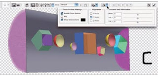 3D content is used for output. If your 3D object has textures attached, you can edit those textures by double-clicking the texture in the Layers palette. The texture opens as a new image window, you make your changes, and you save. The 3D object is automatically updated. (The process is comparable to updating a Smart Object.) If the 3D content includes animation, you can use the four buttons to the right in the Options bar (refer to Figure B) to play and to select an individual frame of the animation to display.
 3D content is used for output. If your 3D object has textures attached, you can edit those textures by double-clicking the texture in the Layers palette. The texture opens as a new image window, you make your changes, and you save. The 3D object is automatically updated. (The process is comparable to updating a Smart Object.) If the 3D content includes animation, you can use the four buttons to the right in the Options bar (refer to Figure B) to play and to select an individual frame of the animation to display.
Photoshop: Creating a sketch from a photo.
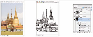
Simulating a painting in Photoshop is great, but sometimes you might need line art or a sketch. Photoshop has a couple of filters that do a nice job of creating pencil sketches, but none of them really do a great job with outlines. Here’s an easy way to create line art from a photo (see Figure A).
1. Open a copy of your image and create a Smart Object. Again, pen your image as a Smart Object or convert with the command Layer>Smart Objects>Convert to Smart Object before. When working with Smart Filters, you can later — if necessary — reopen the filter and change the settings
2. Apply the Smart Blur filter.
Set the filter to Quality: High and Mode: Normal. Use settings that remove all the tiny detail in your image (such as pores and individual hairs or blades of grass) but maintain edges and major detail (such as eyes, noses, golf balls, and trees).
3. Define edges with Smart Blur.
Reopen the Smart Blur dialog box and set the Mode pop-up menu to Edge Only. Adjust the sliders until the white-on-black preview shows approximately the amount of detail you want in the final image; then click OK.
4. Invert the colors.
Using the button at the bottom of the Layers palette or the Layer>New Adjustment Layer menu, add an Invert adjustment layer. (Not only is it a good idea to use adjustment layers rather than adjustment commands, but you’ll find that you can’t use most adjustment commands with Smart Objects.)
5. Blur the lines.
Click the Smart Object layer again in the Layers palette to make it active and apply a 1- or 2-pixel Gaussian Blur to soften the edges of the lines. 6. Adjust the thickness of the lines with a Levels adjustment layer. In the Levels dialog box, drag the middle slider control left and right until you’re satisfied with the image’s appearance. If desired, you can further refine the sketch with the Sharpen>Unsharp Mask filter.
Questions to Ask (CANCER)
4 years back, me and my friend decieded to go ThaiLand, for a business trip. We went to Islamabad-Pakistan, Embassy of ThaiLand and got visas. After two days we come back to out hometown Lahore-Pakistan. My friend Ameen Gujjar said that he had to manage his shop (hand over to a reliable person, so that his running expense for house keep on going in his absence.) He was running a business of CDs. I said ok, and decided that we will go ThaiLand after 20 days. I had been waiting and waiting but those 20 days never ened. niether the day of journey come. I went to my friend's home and found that he is dead, Shocked..............
I came to know that he was suffering from CANCER and never diganozed ever by any doctor... unfortunate,......He faced death within 15 days.
May Allah keep his soul in peace................ (Aameen)
I went to one of my friends who was doctor. I told him all scenario and asked him how it can be possible of that kind of sudden death in Cancer.
He axplained me so much.
I am extracting the conversation, as one should (patient) ask doctor to explain anything and everything you don’t understand. Prepare questions in advance of appointments (to reduce stress and the odds of forgetting any)—and bring a notebook to jot down answers and other important info.
Below are some questions you should ask:
q What causes this type of cancer?
q What are the risk factors? If it’s genetic, are other family members at risk?
q What lifestyle changes (diet, exercise, rest) do you recommend?
q What are my treatment options?
q Are there activities that should be avoided because they might trigger or exacerbate symptoms?
q What happens if new symptoms crop up or existing ones worsen?
q What medical tests or procedures are necessary? How often?
q What stage is my cancer? What does that mean?
q What is my overall prognosis or chance of recovery?
q What are the average survival and cure rates?
q Could my disease go into remission?
q What is the recommended treatment?
q H ow often will I have to undergo treatment—and for how long?
q What are the potential side effects?
q What are the benefits versus the risks of each treatment option?
q Are there alternative therapies? What are they?
q What are the expected results of treatment?
q Is the treatment painful? If so, is there a way to make it more bearable?
q How long is the recovery? Will it require a hospital stay?
q When can I resume my normal activity (if it’s been curtailed)?
q Has my cancer spread? If so, how does this change treatment decisions?
q Am I eligible for any clinical trials?
q What happens if my disease progresses while I’m in a clinical trial?
q Who foots the bills if I participate in a clinical trial?
q Where can I find emotional, psychological and spiritual support?
q Whom should I call with questions or concerns after office hours?
q May I contact you or a nurse if I have questions or more symptoms?
(If the answer is “no,” find another doctor.)
PhotoShop: Creating snow or rain
 Creating snow or rain
Here’s a multiuse technique that you can use to create falling snow or rain (as shown in Figure):
1. Add a new layer to your image by clicking the New Layer button in the Layers palette.
2. Still in the Layers palette, change the layer’s blending mode from Normal to Screen. Because this technique uses a separate layer, you can consider it to be nondestructive (you can always delete the layer later), so you don’t have to work on a copy of your image. But it’s always a good idea to work on a copy, just in case.
3. Choose Edit>Fill to fill the layer with black. Because the layer’s blending mode is Screen, you won’t see the black fill.
4. Add Noise to the layer. Use the Noise>Add Noise filter to add some variation to the layer. Use
Amount: 20%, Distribution: Gaussian, and mark the Monochromatic check box.
Amount: 20%, Distribution: Gaussian, and mark the Monochromatic check box.
5. Enlarge the noise with the Crystallize filter. Use the Pixelate>Crystallize filter to turn the little noise into larger chunks. Use Cell Size: 3 for small snow or rain; try 7 or 10 for larger
flakes. You can also apply a slight Gaussian Blur to increase the size.
flakes. You can also apply a slight Gaussian Blur to increase the size.
6. Sharpen the edges. Using the Unsharp Mask filter, sharpen until the snowflakes have distinct
edges. Use Amount: 100%, Radius: 2, Threshold: 0. When you create rain, use Amount: 40%.
edges. Use Amount: 100%, Radius: 2, Threshold: 0. When you create rain, use Amount: 40%.
7. Apply a Levels adjustment. In the Levels dialog box, drag the middle slider about halfway to the left; then drag the left slider slowly to the right until you see the amount of snow or rain that you want. Afterward, if desired, you can apply the Motion Blur filter to the falling snow/rain. And, of course, you can add a layer mask to control visibility.
How to Create Pages in InDesign? Part III
continued from part II.....
When exporting a PDF for press, you’ll want to ensure that the PDF includes the slug area. As you can see in Figure F, the Marks and Bleeds pane of the Export Adobe PDF dialog has a check box at the bottom to Include Slug Area. Check that for press output, but uncheck it when publishing a PDF to your website or intranet for digital distribution.
 The Print dialog’s Marks and Bleed pane has the same box (see Figure G) if you’re outputting straight from InDesign or printing to PostScript. When printing to a desktop printer, you typically only want to print the trim size, so uncheck it. However, if you’d like to scale the entire design to include the slug, bleed, and any marks, check the appropriate options, and then, on the Setup pane, activate the Scale to Fit option. Note that the entire output will shrink down to fit within the chosen paper size (and respect any rebates), including the slug and so forth. In both locations you can also add needed marks and symbols via the Printer’s Marks check boxes as well as control type, weight, and offset (distance from artwork) of the crop, bleed, and registration marks.
Bleed: Bleeding designs are run on sheets larger than the intended deliverable page size and then trimmed in very large stacks on a guillotine or other type of cutter. Cutter operators are punctilious (they have to be; they have 10 fingers relying on their attention to detail). Still, they’re human (as evidenced by the number of cutter operators at annual conventions answering to the nickname of “Lefty”). Moreover, sheets of paper have a tendency to shift ever so slightly as a blade is rammed down through a stack. Even a one one-thousandth of an inch shift can leave an ugly white strip down one or more sides of an edge-to-edge print piece that didn’t account for such possibilities. That would ruin an otherwise beautiful design. Hedge against this common problem by drawing beyond the trim. Don’t stop image frames or filled objects at the page edge; keep them going out 1⁄8 inch. Look at Figure G1, the same document with and without bleeds. See the difference? The one that extends the art to fill the bleed area can’t be marred by paper slivers; if the cutter is off enough to cause slivers with an 1⁄8-inch bleed, the operator will send the job for a print rerun anyway.

Create a bleed guide around any side that will run ink up to the trim edge—it’s usually easier to just set up a four-sided bleed guide even if fewer edges will bleed. When sending a bleeding document to press, always bleed the artwork. Get the desired bleed area size from your print service provider; when in doubt, use the industry standard 1⁄8 inch or 0.125 inch. Then, as you design, account for the bleed area by extending objects and colors out to the red bleed guide. If you use a background image, crop it at the bleed guide, not at the trim. Depending on the image, that may require you to enlarge it in InDesign or even go back to Photoshop or Illustrator and add more space around the focal point of the picture. As you get in the habit of using bleeds and bleed guides in InDesign, you’ll learn to plan for the bleed when prepping artwork. As you noticed in the preceding text, adding, resizing, and outputting bleed to print or PDF is controlled in the same place as whether to include the slug area. You’ve got additional control over bleed, however (see Figure H). You can use the document bleed settings as defined in New Document or Document Properties, or you can override them (or correct for their absence) by specifying new bleed values in the Bleed and Slug section of the Print or Export to PDF Marks and Bleed panes.

Live Area
Similar to bleed, live area compensates for paper shifts on a cutter, but on the inside of the trim. If pages or the blade slip during a cut and a bleeding print shows paper along one edge, it therefore follows that the opposite edge of the page will lose some of its artwork. It’s even more important that the design elements critical to communicating the message of a design be inset from the trim edges than it is that background colors extend out beyond. You don’t, for instance, want the last digit of an ad’s sales phone number chopped off. (I’ve seen that exact thing, actually, within an ad in a major, one million plus circulation magazine; the client showed it to me when my agency was hired to take over from the firm that had created and placed that ad.) The buffer space of the live area is, like the bleed buffer, typically 1⁄8 inch or 0.125 inches. It can vary, though. Product packaging labels and low linescreen boxes, for example, often need 0.25 or even more distance between trim and live area (and trim and bleed). Consult your print service provider.
Similar to bleed, live area compensates for paper shifts on a cutter, but on the inside of the trim. If pages or the blade slip during a cut and a bleeding print shows paper along one edge, it therefore follows that the opposite edge of the page will lose some of its artwork. It’s even more important that the design elements critical to communicating the message of a design be inset from the trim edges than it is that background colors extend out beyond. You don’t, for instance, want the last digit of an ad’s sales phone number chopped off. (I’ve seen that exact thing, actually, within an ad in a major, one million plus circulation magazine; the client showed it to me when my agency was hired to take over from the firm that had created and placed that ad.) The buffer space of the live area is, like the bleed buffer, typically 1⁄8 inch or 0.125 inches. It can vary, though. Product packaging labels and low linescreen boxes, for example, often need 0.25 or even more distance between trim and live area (and trim and bleed). Consult your print service provider.
I wish I could show you a dialog where you can create a live area guide (orange would be a nice choice in guides), but I can’t. InDesign doesn’t have such a feature, although I keep lobbying for one. Instead, Adobe considers the margin guides to define the live area despite the fact that they default to half an inch around all four sides instead of an eighth of an inch. Margins can be used to represent the live area—it makes sense in some respects given the way Adobe built InDesign’s margins feature—but there are some drawbacks to it as well. InDesign allows you to put anything you want within, outside, or crossing the margins—so does every other professional layout application and most consumer-grade layout tools as well. Margin guides, in fact, matter very little in InDesign. The only place they really have an effect is in automated text frame creation. When you check the Master Text Frame option while creating a new document, the resulting master page text frame will be sized and placed according to the margin guides. When you’re autoflowing multipage placed text, new text frames will also be generated according to the area defined by the margins. Other than that, their function is primarily as a visual guide to you. It’s the automatic text frame sizing that also foils their use as live area guides. Alive area should be, under most conditions, 0.125 inches in from the trim edges all around. If you use automatic text frames, though, that puts text flush with the live area guides. That’s not so much a problem for printing— the live area guides define the minimum area that you can be sure will print and cut intact—but more of a design issue. Copy running flush or too close to the edge looks bad. Readers need white space along the edges of paper to grip the page or book as well as to give their eyes a place to rest. So, what’s the verdict? Margins as live area guides or not? If every page will be manually created with individually placed frames, then you should be good to go using margin guides as live area guides. If you’re using any kind of automatic text frame creation (master text frame, autoflowing text), then don’t use margins as live area guides.
Instead, do this:
1. Select Ruler Guides from the Layout menu and change the color to something other than the defaults: Cyan (guide color), Magenta (margin guides), Violet (column guides), Fiesta (bleed guides), Grid Blue (slug guides), White, Light Gray, and Black (see Figure I). Personally, I like green for my live area guides because it stands out against most colors without being too similar to other types of guides.
 2. Go to the document master page(s) for the document and drag horizontal and vertical guides from the rulers for each edge (four for nonfacing documents, eight guides for both pages in the spread of a facing-pages document). Notice how they’re now green.
3. Unlock guides by unchecking the View >Grids & Guides >Lock Guides toggle command.
4. Using the Control or Transform panel, position unlocked guides 0.125 inches in from the page edges on all outside edges; with bound documents, you’ll probably want more space on the bind edges. Those guides will define your live area.
5. Deselect all guides with Cmd+Shift+A/Ctrl+Shift+A and return new guides to their default color (Cyan) with Layout >Ruler Guides again. With separate live area guides, you can now use the margin guides for their intended purpose— limiting content and enabling white space. As you design, keep all important elements inside the green guides, extend all bleeding objects out to the bleed guide, and you’ll be safe from misaligned cuts. Still, it seems like a lot of work to set up bleed, slug, and especially live area guides for every new document, doesn’t it? Wouldn’t it be cool if there were an easier way? There is.
to be continued ......... in part IV
corel painter: What is TV cut-off and safe titling?
Ans.  Understanding bitmaps
Everything in graphics output eventually becomes a bitmap. Bitmap files are large! They have to be—the computer must keep track of the color values of every pixel that makes up the image, not just vectors and attributes. Bitmaps are also resolution-dependent. If you blow up pixels, they just look more obvious. To make a bitmapped image large and smooth, you have to have a finer grid of pixels defining the image. For best results, you must create your image at the correct resolution, or higher. A bitmap is a rectangular grid of dots used to describe an image. It has four basic characteristics:

 Dimensions or spatial resolution
Bitmaps have two dimensions. They are grids containing picture elements (pixels). The dimensions of a bitmap are described by the number of pixels the bitmap is high and the number of pixels the bitmap is wide.
Color resolution
A bit (binary digit) can describe two states: on and off, black and white, 0 and 1, etc. If 1 bit = 2 colors, 2 bits give you 4 colors, and 8 bits give you 256 colors. That’s 2x2x2x2x2x2x2x2 = 256, or 2 to the power of 8 (28). At 24 bits of information, you have over 16.7 million colors to work with. Each pixel is made of three components: Red, Green and Blue, or RGB for short. We have 8 bits of color for each component, or 256 levels of Red, 256 levels of Green and 256 levels of Blue. Multiply 256 x 256 x 256, and you get 16,777,216 colors. You now know why Corel Painter and other software programs display RGB in values of 0 to 255. If each of the three RGB colors has 8 bits, the image needs 24 bits for all the colors. But what does it mean when you are working with a 32-bit image? What are those other 8 bits for, if they’re not needed to display the RGB colors? They are used for transparency. Certain file formats support “alpha channels.” Having an 8-bit alpha channel means that you can have 256 levels of transparency in your image. Color resolution, or bit depth, affects not only the file size (fewer colors means fewer bits), but also the smoothness of the color gradations in an image.
Compare output colors
Let’s look at an image at different bit depths in Corel Painter using the GIF file format.
1 - In Corel Painter, open a new file, 100 x 100 pixels at a resolution of 72 ppi.
2 - Set the paper color to pure red in the RGB values by setting the red to 255 and the green and blue to 0.
3 - Go to Effects > Tonal Control > Video Legal Colors. Choose NTSC. Notice how different the red looks in NTSC. (see fig. G)
 Visually reduce the number of colors in an image
1- Choose File > Save As and name your image file. Choose the GIF file format, and click Save. Click OK to dismiss the layer warning, if displayed.
2- In the Save As GIF Options dialog box, in the Number of Colors area, choose 256 colors. In the preview window, the image appears in 256 colors.
3- Change the number of colors to 128. In the preview window, the image appears in 128 colors. Continue reducing the number of colors in the graphic until you find the minimum number of colors necessary for adequate display of your image on a Web page.
4- Choose an Imaging Method. Choose Quantize To Nearest Color if you want Corel Painter to look at each pixel for which it doesn’t have the exact color and pick the nearest color for it from the available colors. Choose Dither Colors if you want Corel Painter to apply a pattern to the colors chosen to generate a more accurate, less banded result. In this case, Corel Painter will approximate the color of a larger area of the image, rather than individual pixel colors.
5- You can now either save the graphic to use it on a Web page, or return to Corel Painter to continue working on the image.
The Technical Terms Every Animator Needs to Know
Before beginning an animation project, you must consider the final format your work will be displayed in. Are you working for film, video, or the Web? Will any of the animation frames ever need to be resized for print? Setting the correct size, shape, and resolution for your project from the start is critical to its success. (see fig. A)
 TV cut-off and safe titling
If you are creating animation for television or film, you must make sure that your type is not cropped by the shape of the screen, and that nothing vital in your image is lost. The rule of thumb for layout purposes is to crop a 12-field layout, 1.5 inches all around for TV cutoff, and 2 inches around for title safe. (see fig. B)
Scanning for animation
If you draw your animation by hand, you will have to scan it into Corel Painter. Your drawing should be created at the correct dimensions (width to height) for your animation. Ten seconds of animation at 30 frames per second can translate into 300 drawings if you create one drawing for every frame of video. It is critical to scan efficiently to handle that volume of artwork. If you are scanning in art to use as final renderings in your animation, you will scan at 72 dpi in RGB at 720 x 486 for NTSC video. However, if you are scanning in to trace, reference, or make a rough pencil test of your motion, get into the habit of scanning at 72 dpi in grayscale, so that your files are small and scan quickly. Depending on your drawings, you may even scan them in as black-and-white line art; the drawings will look jaggy, but if you are only using them as reference to trace from in Corel Painter, that is all you need. This will give you files that take up the least amount of storage space on your computer. (see fig. C)
“Paint” = Bitmaps, “Draw” = Vectors
Computers handle images in two ways: as bitmaps, or as vector images (also known as object-oriented graphics). When working with objects and vectors, the computer keeps a “display list” that describes a series of points in space and their attributes.
Understanding vectors
A vector is a mathematical description of a location in space; as such, it has no actual size. Images described by vectors are resolution independent. They can be rendered at any size and maintain their image quality. The image file only contains a list of vectors and display properties, making vector-based (object-oriented) files very small compared to bitmaps. Eventually, the file has to be converted to a bitmap output. When it is sent to a printer, the raster image processor (RIP) usually handles that task. The display adapter in your computer interprets the image as a bitmap of pixels on your monitor. Some “Paint” programs like Corel Painter and Adobe® Photoshop® let you import vector graphics and turn them into bitmaps (“rasterize” them) so they can be embellished with paint effects. Corel Painter combines the best of both worlds by letting the artist work with both bitmaps and vector based objects.
Before beginning an animation project, you must consider the final format your work will be displayed in. Are you working for film, video, or the Web? Will any of the animation frames ever need to be resized for print? Setting the correct size, shape, and resolution for your project from the start is critical to its success. (see fig. A)
 TV cut-off and safe titling
If you are creating animation for television or film, you must make sure that your type is not cropped by the shape of the screen, and that nothing vital in your image is lost. The rule of thumb for layout purposes is to crop a 12-field layout, 1.5 inches all around for TV cutoff, and 2 inches around for title safe. (see fig. B)
Scanning for animation
If you draw your animation by hand, you will have to scan it into Corel Painter. Your drawing should be created at the correct dimensions (width to height) for your
 animation. Ten seconds of animation at 30 frames per second can translate into 300 drawings if you create one drawing for every frame of video. It is critical to scan efficiently to handle that volume of artwork. If you are scanning in art to use as final renderings in your animation, you will scan at 72 dpi in RGB at 720 x 486 for NTSC video. However, if you are scanning in to trace, reference, or make a rough pencil test of your motion, get into the habit of scanning at 72 dpi in grayscale, so that your files are small and scan quickly. Depending on your drawings, you may even scan them in as black-and-white line art; the drawings will look jaggy, but if you are only using them as reference to trace from in Corel Painter, that is all you need. This will give you files that take up the least amount of storage space on your computer. (see fig. C)
“Paint” = Bitmaps, “Draw” = Vectors
Computers handle images in two ways: as bitmaps, or as vector images (also known as object-oriented graphics). When working with objects and vectors, the computer keeps a “display list” that describes a series of points in space and their attributes.
Understanding vectors
A vector is a mathematical description of a location in space; as such, it has no actual size. Images described by vectors are resolution independent. They can be rendered at any size and maintain their image quality. The image file only contains a list of vectors and display properties, making vector-based (object-oriented) files very small compared to bitmaps. Eventually, the file has to be converted to a bitmap output. When it is sent to a printer, the raster image processor (RIP) usually handles that task. The display adapter in your computer interprets the image as a bitmap of pixels on your monitor. Some “Paint” programs like Corel Painter and Adobe® Photoshop® let you import vector graphics and turn them into bitmaps (“rasterize” them) so they can be embellished with paint effects. Corel Painter combines the best of both worlds by letting the artist work with both bitmaps and vector based objects.
 Understanding bitmaps
Everything in graphics output eventually becomes a bitmap. Bitmap files are large! They have to be—the computer must keep track of the color values of every pixel that makes up the image, not just vectors and attributes. Bitmaps are also resolution-dependent. If you blow up pixels, they just look more obvious. To make a bitmapped image large and smooth, you have to have a finer grid of pixels defining the image. For best results, you must create your image at the correct resolution, or higher. A bitmap is a rectangular grid of dots used to describe an image. It has four basic characteristics:

• Dimension
• Resolution
• Bit depth
• Color model
Resolution
The word “resolution” can be used to describe different things.
Spatial resolution — describes the dimensions of an image in width and height.
Color resolution — often referred to as “color depth” or “bit depth”; refers to how many colors are available to define the image.
Scanner resolution — refers to the number of dots per inch (DPI). If you have to enlarge an image, it should be done on the scanner and not in Corel Painter. DPI is also used for the resolution of printers, describing how many dots per inch the printer can apply to the paper.
Screen resolution — refers to the number of pixels per inch (PPI). Computer monitors can be set for different screen resolutions. The setting determines how many pixels the monitor can display. A large monitor can accommodate a high setting. A small monitor may be easier to see at a lower setting.
Line frequency — also known as “screen frequency”; refers to the number of lines per inch (LPI) that a halftone screen uses to break down a continuous tone image into printable dots for reproduction on a printing press. Low line frequency (large dots) is used for porous papers like newsprint. Coated stock can hold more detail and can take a higher line frequency. Always ask your service bureau what LPI you should be working at.
When you are creating an animation with Corel Painter, consider • the type of animation you are producing, • the requirements of any systems that will process the animation when you are finished with it in Corel Painter, • the final delivery medium of the animation (video, film, Web, CD, QuickTime, AVI, etc.).
 Dimensions or spatial resolution
Bitmaps have two dimensions. They are grids containing picture elements (pixels). The dimensions of a bitmap are described by the number of pixels the bitmap is high and the number of pixels the bitmap is wide.
spatial resolution = width x height
The spatial resolution of a bitmapped image is based on how many pixels in the grid make up each unit of measurement. In Corel Painter, you are working in pixels per inch (PPI). In other words, if you have a one-inch grid, how many pixels is this grid broken up into: 72, 96, or maybe 300? Which would look sharper and have more detail, the 1” grid described by 76 pixels or the 1” grid described by 300 pixels?
The spatial resolution of a bitmapped image is based on how many pixels in the grid make up each unit of measurement. In Corel Painter, you are working in pixels per inch (PPI). In other words, if you have a one-inch grid, how many pixels is this grid broken up into: 72, 96, or maybe 300? Which would look sharper and have more detail, the 1” grid described by 76 pixels or the 1” grid described by 300 pixels?
Color resolution
A bit (binary digit) can describe two states: on and off, black and white, 0 and 1, etc. If 1 bit = 2 colors, 2 bits give you 4 colors, and 8 bits give you 256 colors. That’s 2x2x2x2x2x2x2x2 = 256, or 2 to the power of 8 (28). At 24 bits of information, you have over 16.7 million colors to work with. Each pixel is made of three components: Red, Green and Blue, or RGB for short. We have 8 bits of color for each component, or 256 levels of Red, 256 levels of Green and 256 levels of Blue. Multiply 256 x 256 x 256, and you get 16,777,216 colors. You now know why Corel Painter and other software programs display RGB in values of 0 to 255. If each of the three RGB colors has 8 bits, the image needs 24 bits for all the colors. But what does it mean when you are working with a 32-bit image? What are those other 8 bits for, if they’re not needed to display the RGB colors? They are used for transparency. Certain file formats support “alpha channels.” Having an 8-bit alpha channel means that you can have 256 levels of transparency in your image. Color resolution, or bit depth, affects not only the file size (fewer colors means fewer bits), but also the smoothness of the color gradations in an image.
Compare output colors
Let’s look at an image at different bit depths in Corel Painter using the GIF file format.
1 - In Corel Painter, open a new file, 100 x 100 pixels at a resolution of 72 ppi.
2 - Set the paper color to pure red in the RGB values by setting the red to 255 and the green and blue to 0.
3 - Go to Effects > Tonal Control > Video Legal Colors. Choose NTSC. Notice how different the red looks in NTSC. (see fig. G)
 Visually reduce the number of colors in an image
1- Choose File > Save As and name your image file. Choose the GIF file format, and click Save. Click OK to dismiss the layer warning, if displayed.
2- In the Save As GIF Options dialog box, in the Number of Colors area, choose 256 colors. In the preview window, the image appears in 256 colors.
3- Change the number of colors to 128. In the preview window, the image appears in 128 colors. Continue reducing the number of colors in the graphic until you find the minimum number of colors necessary for adequate display of your image on a Web page.
4- Choose an Imaging Method. Choose Quantize To Nearest Color if you want Corel Painter to look at each pixel for which it doesn’t have the exact color and pick the nearest color for it from the available colors. Choose Dither Colors if you want Corel Painter to apply a pattern to the colors chosen to generate a more accurate, less banded result. In this case, Corel Painter will approximate the color of a larger area of the image, rather than individual pixel colors.
5- You can now either save the graphic to use it on a Web page, or return to Corel Painter to continue working on the image.
Resolution for video
In Corel Painter, when we start a new file, we see a dialog box that requires us to enter a resolution in pixels per inch (PPI), or pixels per centimeter. These pixels represent the number of blocks per inch making up the grid of the bitmap. In video, the default screen resolution is 72 ppi. In addition, it is critical to know the width and height, or spatial resolution necessary for the format you are working in. (see fig. H)
 Resolution for print
The RGB model can describe 256 levels of gray. Remember those gray scales you did? How hard it was to create a gray scale with ten steps, with twenty? Look at this grayscale strip—it is made of 256 levels of gray. Can you tell the difference between all 256 shades of gray?
Most job printing presses can’t reproduce much more than 100 levels of gray. Fine printers can do better if they use top quality materials and papers, and highly controlled press conditions.
Create a grayscale gradient
In Corel Painter, open a new file, 640 x 100 pixels at a resolution of 72 ppi. Fill it with a grayscale gradation from white to black. How many shades of gray can you see? Zoom in on the gradient and examine it closely.
In Corel Painter, open a new file, 640 x 100 pixels at a resolution of 72 ppi. Fill it with a grayscale gradation from white to black. How many shades of gray can you see? Zoom in on the gradient and examine it closely.

How to Create Pages in InDesign? Part II
continue from part I ...............
 Ruler Origin
Ruler orientation is also affected by choice of facing or nonfacing pages. Although you can override this in Edit >Preferences >Units & Increments, by default InDesign orients the horizontal ruler’s zero-point to the top-left corner of the spread. Thus, in an 8.5 x 11-inch document of nonfacing pages, the right edge of every page is at 8.5 inches. With facing pages, though, only even pages and page one end at 8.5 inches. Page three and all odd pages (except page one) begin at 8.5 inches (the spine) and end at 17. Positioning an object onto the right page of a spread using the Control or Transform panels, for instance, requires X positions greater than 8.5 inches. The Origin field in the Units & Increments preferences can change the horizontal ruler behavior (see Figure D). Spread is the default and works as described previously, beginning at the top left of the left page and growing across the entire spread. Page restarts the numbering for each page— at the spine, the right-read page starts over again at 0 inches. Finally, setting the Ruler Units Origin to Spine orients the ruler zero-point on the spine itself; pages to the right of the spine get positive measurements while pages to the left of the spine have negative measurements emanating from the spine.
Page Layout
If you graphic designer readers are considering skipping this section because you believe bleeds and slugs are in your print service providers’ sphere of concern rather than yours, don’t. Failure to create proper bleeds is among the most common reasons designers’ printed output is flawed and service providers charge for cleanup time and simply kick the job back as unacceptable. You print providers shouldn’t skip this section either. While I doubt I’ll teach you anything you don’t already know about bleed, live area, and slugs and why they’re important, you might learn a different way to explain these concepts to designers so they get it. Bleed is when artwork or text runs to the page trim edge. The cover of this book is a good example. Notice how the ink bleeds off all four edges of the cover leaf. The bleed area is how far beyond the page ink must extend in order to safely ensure against slivers of paper appearing in the finished piece should pages misalign on the cutter.

Let’s define the terms we’re talking about visually. In (Figure D1) you can see a trifold brochure.The blue guide box is the slug area. Inside that, with the artwork running right up to them, are the red bleed area guides. Next, the paper edges—turned green in the figure for easy identification—are the trim, the expected final paper size post-print, post-trim, post-finishing. Finally, within the page are the magenta margin guides that form the document live area (sort of). The white area beyond is, of course, the pasteboard.
Slug
Slug is a nebulous term that can be applied to a lot of different things. In my travels and two decades in the business I’ve noted its usage change regionally and by specialization within each of the print, prepress, and design industries. Quite a few people use the term slug to reference headers and footers or parts of them, like the page number. (The page number is properly called a folio, not to be confused with folio referencing a folded sheet of paper comprising two leafs or spreads.)
In this context, slug refers to any information that must accompany a design through prepress and print but that will be trimmed off during finishing. What should you put in the slug area? Whatever the designer or print service provider may need. Job name, job number, document title, InDesign filename, client name and contact info, date, designer’s name and contact info, color bars, short knock-knock jokes for your service provider’s amusement—anything can go in there. What should go in there is whatever is needed by the designer, the prepress bureau, the printer, the finishing and bindery service, and whoever will retain the film or plates generated from the artwork (if there are film or plates). It’s a great place to put special instructions to providers down the line, too. For instance, if your job contains a spot color intended to be a varnish, in addition to setting up the ink properly in Ink Manager, note in both the job ticket and the slug area which ink is the varnish. Even if the prepress and press operators miss the note on the job ticket, they’ll see it in the slug because the slug will output to every piece of film and every printed page. If you’re running film for the job, include enough information that, a year or five down the road, you’ll be able to immediately identify the job, client, designer, and corresponding digital document. Many a wasted hour has been spent at swapping sheets of film on a light table trying to figure out which page 14 cyan plate goes with which yellow, magenta, and black plates. Before sending a job to press, I typically add one small table into the slug area above the page and another table below. In the top, I include the job name as given to my print and finishing providers, the page number, the date, my account number(s) at the service provider (for proper billing and tracking), my name and contact information (so I can be called or emailed about something without a trip to the customer database), and any special instructions echoed from the job ticket. Within the lower table is information for my reference, including internal job name and number, client name, digital document title and filename, and authoring application and version. I often send PDFs to press, so I want to know on the film if I should be searching archive DVD-ROMs for an InDesign, QuarkXPress, Illustrator, or some other type of document and what version of that software I used in case whatever version I’m currently using has trouble translating from older ones (InDesign had that problem with version 1.0 and 1.5 documents). Knowing the authoring application and version can also help my prepress provider understand the document and any unique RIP considerations (once in a while it’s a factor, even with properly made PDFs). Of course, I put all this information on the master page rather than doing it manually page by page. Marks and symbols like crop marks, bleed marks, and registration marks vital to the proper output of your job will, by definition, wind up in the slug area. Setting up a slug area is simple. When you’re creating a new document (or later in Document Setup), clicking the More Options button reveals the Bleed and Slug area (see Figure E). The chain link button on the right will mirror all four sides’ measurements, which is usually not necessary. In most cases, you want to put all your slug information on one or, at most, two sides of the output. Your service providers will often add additional marks and symbols or their own tracking information, and you want to leave them space in which to do so. Additionally, because the slug will print on film and paper, too generous a slug area can unnecessarily enlarge the required substrates, potentially increasing the cost of the job. Slug areas should only be large enough to hold the required information comfortably.
Slug
Slug is a nebulous term that can be applied to a lot of different things. In my travels and two decades in the business I’ve noted its usage change regionally and by specialization within each of the print, prepress, and design industries. Quite a few people use the term slug to reference headers and footers or parts of them, like the page number. (The page number is properly called a folio, not to be confused with folio referencing a folded sheet of paper comprising two leafs or spreads.)
In this context, slug refers to any information that must accompany a design through prepress and print but that will be trimmed off during finishing. What should you put in the slug area? Whatever the designer or print service provider may need. Job name, job number, document title, InDesign filename, client name and contact info, date, designer’s name and contact info, color bars, short knock-knock jokes for your service provider’s amusement—anything can go in there. What should go in there is whatever is needed by the designer, the prepress bureau, the printer, the finishing and bindery service, and whoever will retain the film or plates generated from the artwork (if there are film or plates). It’s a great place to put special instructions to providers down the line, too. For instance, if your job contains a spot color intended to be a varnish, in addition to setting up the ink properly in Ink Manager, note in both the job ticket and the slug area which ink is the varnish. Even if the prepress and press operators miss the note on the job ticket, they’ll see it in the slug because the slug will output to every piece of film and every printed page. If you’re running film for the job, include enough information that, a year or five down the road, you’ll be able to immediately identify the job, client, designer, and corresponding digital document. Many a wasted hour has been spent at swapping sheets of film on a light table trying to figure out which page 14 cyan plate goes with which yellow, magenta, and black plates. Before sending a job to press, I typically add one small table into the slug area above the page and another table below. In the top, I include the job name as given to my print and finishing providers, the page number, the date, my account number(s) at the service provider (for proper billing and tracking), my name and contact information (so I can be called or emailed about something without a trip to the customer database), and any special instructions echoed from the job ticket. Within the lower table is information for my reference, including internal job name and number, client name, digital document title and filename, and authoring application and version. I often send PDFs to press, so I want to know on the film if I should be searching archive DVD-ROMs for an InDesign, QuarkXPress, Illustrator, or some other type of document and what version of that software I used in case whatever version I’m currently using has trouble translating from older ones (InDesign had that problem with version 1.0 and 1.5 documents). Knowing the authoring application and version can also help my prepress provider understand the document and any unique RIP considerations (once in a while it’s a factor, even with properly made PDFs). Of course, I put all this information on the master page rather than doing it manually page by page. Marks and symbols like crop marks, bleed marks, and
 registration marks vital to the proper output of your job will, by definition, wind up in the slug area. Setting up a slug area is simple. When you’re creating a new document (or later in Document Setup), clicking the More Options button reveals the Bleed and Slug area (see Figure E). The chain link button on the right will mirror all four sides’ measurements, which is usually not necessary. In most cases, you want to put all your slug information on one or, at most, two sides of the output. Your service providers will often add additional marks and symbols or their own tracking information, and you want to leave them space in which to do so. Additionally, because the slug will print on film and paper, too generous a slug area can unnecessarily enlarge the required substrates, potentially increasing the cost of the job. Slug areas should only be large enough to hold the required information comfortably.
to be continued............. in part III
InDesign: How to Use Print Dialog?
Ans. Print Dialog
We’ve talked about most of the Print dialog already, in context. Let’s quickly run through what we haven’t already covered.
General
In addition to printing all pages and sequential selections from the current document, InDesign allows printing of non-sequential pages. In the Range box (see Figure A),
In addition to printing all pages and sequential selections from the current document, InDesign allows printing of non-sequential pages. In the Range box (see Figure A),
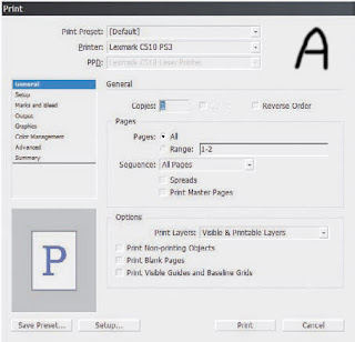 enter a sequential range as X-Y. If you want to print non-sequentially, use commas, like this: 2, 4, 6, 8, 10. Maybe, with a multiple-template magazine, for instance, you want to print about 10 pages, but they’re spread out in 2- and 3-page chunks across the document’s 36 pages. Simple: Combine range and non-sequential like so: 2-3,8-10,20-22. If all you need is even or odd pages, for instance when doing manual duplexing, select the appropriate option from the Sequence drop-down.
Printing master pages is useful for quite a few things, particularly when proofing or redesigning templates. Under options, you can choose to print layers that are visible (on) and not tagged as non-printing, but you can also override layer visibility and non-printing status. I like this feature for variations and particularly document review markups. I can feel free to mark up a document with change notes right in InDesign as long as my collaborators or I do it on a layer set to non-printing. When I want to print those markups or other non-printing data, the Print Layers drop-down lets me print them. Thus, through deliberate action I can get a hardcopy of my document and markups, comments, and other non-printing data, but I don’t have to worry that comments like "Were you high when you wrote this!?" will unintentionally go to press.
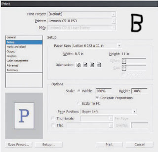 Setup If you need to scale pages to fit in a smaller space, make thumbnails, or tile large pages to span multiple sheets of smaller paper, do it here instead of in your printer’s setup dialog (Setup button on the bottom left). Why? Because InDesign will scale or divide the pre-processed data; leaving it to your printer scales the post-RIP imagery. You’ll get better quality letting InDesign take care of it. (See Figure C) The preview on the left will update with any changes here (or elsewhere in the Print dialog), which makes it easy to adjust thumbnails, scaling, page position, and tile overlap.
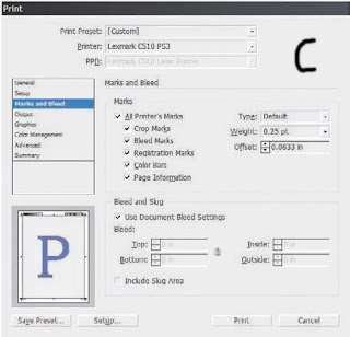 Marks and Bleed
 This is cool (see Figure D). Want color bars? You got ’em. Want crop marks with a custom offset? There they are. Need to print a proof with custom bleed widths without messing up the document? Well then, just uncheck Use Document Bleed Settings and set the new widths. You can even print information in the document slug area.
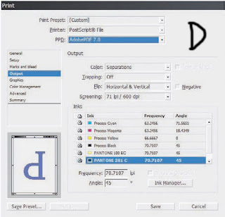 Output
We’ve already covered most of this pane (see Figure E). The rest is as follows:
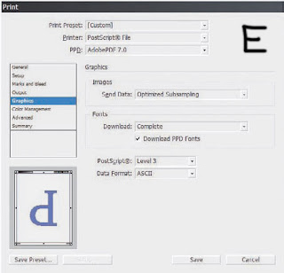 Text as Black Prints all text in black ink.
Flip This one tends to get some people who are used to other layout applications. Flip is how you set emulsion up or down (Flip Horizontal), but it also lets you rotate the image simultaneously.
Screening. All the screen frequencies (in lines per inch and gots per inch) available for the selected PPD. Inks Notice the little printer icon next to each ink? If you’d like to selectively print or omit from printing any inks, just click those icons just as you’d hide layers by clicking the eyeball. InDesign makes it really easy to create your own custom comps or seps or to print without including the colors taking the place of varnishes or dies.
Graphics
(See Figure F). This should be called something else since there’s really only one option for images, but…
 Send Data If high-quality images aren’t important to a particular proof, you can speed printing by sending sub-sampled, low-resolution proxy, or no images at all to the printer.
Fonts Should an entire font be sent to the printer, a subset comprising only the glyphs used in the document, or no fonts at all? The last option includes only a reference to the font in the PostScript file and is useful only when the printer has the needed fonts onboard. When you’ve used TrueType fonts or TrueType-flavored OpenTypes, it’s generally best to download them.
Download PPD Fonts Even if the fonts in use are printer resident, InDesign will download the fonts anyway. Typically, you want this on to guard against disparate versions of fonts causing glyph substitution or text reflows.
PostScript The version of PostScript encoding for the printed data. This option automatically sets itself according to the highest supported level of PostScript in the output device as reported by the PPD. Some desktop printers support emulated PostScript (a PS interpreter from someone other than Adobe), which often doesn’t support the full set of features for a particular PostScript level. If you experience problems printing at PostScript 3 with a device that should support it, try changing PostScript to Level 2. Similarly, when printing to a Post- Script file with a generic PPD, you may need to knock the level down to PostScript Level 2 for compatibility.
Data Format Binary has better compression and is a little faster, but it can cause problems with EPS and DCS files and may not be compatible with many output devices. I’ve used Binary a couple of times, but only on direct request from a service provider. I’ve never had trouble sending ASCII-encoded PostScript code to a wide variety of devices.
Color Management
At the top (see Figure G), choose whether to print using the document working space profile or the proof profile defined in the Customize Proof Conditions dialog. Next, depending on the printer, PPD, and output options selected, Color Handling will offer options to let InDesign handle color management or to handle it in-RIP. Choose the latter only if you have a PostScript 3—compatible RIP with onboard color management. Finally, choose the output device’s specific ICC profile. The rest of the options you already know.  Advanced
(See Figure H). In the OPI section, you can omit different types of proxy images from the print stream to leave just the OPI link comments in the PostScript code. Use this when OPI image insertion is to be handled further downstream.
Above the omit options, OPI Image Replacement tells InDesign to handle OPI image replacement in the print stream. Leave it unchecked for an OPI server to do the replacement. In order for InDesign to take care of image replacement, the following conditions must be met:
- EPS images in the document must have OPI comments linking to high-resolution versions.
- When the EPS proxies were imported, the Read Embedded OPI Image Links check box must have been checked in Import Options.
- InDesign must be able to access the high-resolution images. If conditions one and two are met but not three, InDesign will leave in place OPI comment links for images it can’t access.
Last is Transparency Flattener presets and the ability to ignore or override spread overrides.  Print Presets
Once you’ve configured all your print settings the way you need them, do yourself a favor and save a preset with the button at the bottom. Next time you need the same configuration, you’ll find all your arduously configured settings only two clicks away on the Presets menu. Even better, from File -Print Presets
-Define (see Figure I), you can manage all your presets and even save them to external, shareable PRST files. Clicking New or Edit opens the Print dialog to create or modify a complete set of printing options in the familiar interface.
I frequently recommend to my print and pre-press shop clients that they generate PRST files for their common devices and workflows and then distribute those files to their customers as part of job preparation instructions. Save yourself—and your designer customers—some agony and delays. Just make sure to also include the appropriate PPD and ICC files.
Subscribe to:
Posts (Atom)