here are some more
use the third brush option for photoshop


Asif Zamir (Profesor AZii)


InDesign is ideally suited to working with longer documents, but longer documents are not ide ally worked upon as a single document. Rather, they are easier, faster, and more securely worked on by one or multiple compositors or designers as a series of documents connected via an InDesign Book file. A Book file, in InDesign parlance, is a connection between otherwise separate InDesign documents. That connection allows the multiple documents to be treated and managed as a single, cohesive document—a book—including page numbers that run sequentially from one to the next and the ability to preflight, print, and export to PDF all documents joined by the Book file as a single unit.
Begin a Book File
Create a new Book file by choosing File > New > Book. When prompted, specify the location and name of the INDB Book file. Typically, the Book file should be named after the project title, and saved in the same location as the documents that are or will be components of the project. When you click Save, the Book panel will appear (see Figure A).
As with the Layers panel, the major area of a Book panel is a list, in this case a list of documents. Add documents to the book by clicking the Add Documents plus button at the bottom, which will generate an Open-style Add Documents dialog. In Add Documents, browse to the InDesign documents you want to add to the book. Multiple documents may be added concurren tly using standard multiple selection modifier keys such as Cmd/Ctrl to select non-sequen tial files and Shift for sequential selections. Click Open and the selected document(s) will be added to the Book panel . Additional documents, including those in other folders or on other disks, can be added to the book the same way. The Book file, not their respective locations on disk, ties them together.
Although a Book file can only manage a single book, any given document may belong to any number of Book files. If any documents were created by earlier versions of InDesign, or are InDesign Interchange Format INX files, checking Automatic Document Conversion on the panel flyout menu will convert documents to CS3 format while adding them to the Book file. Remove documents from the book by highlighting them and clicking the Remove Document minus sign button. Save changes to the Book file by clicking the disklike icon at the bottom or choose Save Book or Save Book As from the Book panel flyout menu. To open a document that is part of a book, double-click the document in the list.
Page, Chapter, and Section Numbering
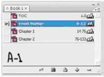
Upon adding documents to a book, the first thing you should notice is the document page numbers, which, unless you’ve specifically changed the section and nu mbering options in the individual documents, will be sequential—the numbers on the right in Figure 9.19. Each InDesign document, unless changed in the document’s Numbering & Sections Options, always begins numbering at page 1. Once booked, however, only the document first in the list begins with page number
1. Each successive document then begins numbering its pages where the previous left off. (Fig A-1)
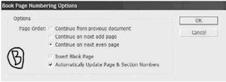
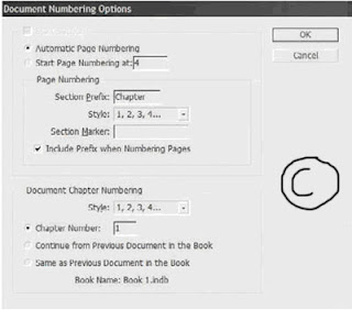
Automatic Page Numbering Continues numbering from the previous document in the book. If the selected document is the first, it will begin numbering from page 1, subject to the other options below.
Start Page Numbering At Choose this option and enter a number in the field to the right to begin numbering pages in the document at a certain point.
Section Prefix The Section Prefix field enables you to propend up to eight characters—letters and/or numbers—to section numbers. For instance, enter Part- here to create page numbering and TOC entries such as Part-X Page Y.
Style Choose the style for section numbers, either Arabic or upper- or lowercase Roman or alphabetic.
Section Marker Documents may be divided into multiple sections—for instance, in this book, there are sections for front matter pages, the TOC, the chapters, the glossary, and the index. Each section of a publication may be numbered or formatted differently, and the page number may also be prefixed with a section-specific bit of information like Section 1: Page 19. To insert a section marker in a text frame—say, in the folio beside the page number—place the Type tool cursor in the appropriate place in the text frame and choose Type > Insert Special Character > Markers > Section Marker. The section marker that appears will be specific to that section. What you enter in the Section Marker field is what appears as the section marker inserted into a text frame. For instance, to identify the glossary of a book, you may enter Glossary. When the section marker appears on the page, it will then display as Glossary in the folio, header, or wherever you’ve placed the marker. If the Include Prefix when Numbering Pages box is checked, it will also insert the section marker as part of automatic page numbers created using Type > Insert Special Character > Markers > Current Page Number.
Document Chapter Numbering Although a single document may contain several sections, it may only contain, or be, a single chapter. In this section, choose the format of chapter numbering, the chapter number for the current document, and whether to continue growing from, or mirror, the chapter number of the previous document in the book. The latter option is used to define two or more documents at being part of the same chapter. Chapter numbers are made visible on the page by inserting the Chapter Number text variable ( some other time I
Tables of Contents
Creating a table of contents for the document (or book) is far less involved than creating an index, as long as you practiced efficient composition by assigning paragraph styles to the elements that should be listed within the TOC. The basis for TOC generation is paragraph styles—in other words, any text assigned to this style or that style will be included or excluded based solely on its paragraph style. InDesign supports an unlimited number of
tables of contents. Thus, you can create the standard document TOC like the one at the front of this book, but you can also create per-chapter tables of contents, lists of figures or tables, alphabetized lists of topics, and just about anything else you can imagine (and manage with paragraph styles). Begin creating the table of contents by choosing Layout > Table of Contents, which opens the Table of Contents dialog (see Figure D). Click the More Options button to reveal the full depth of the dialog.
Title When the TOC is generated and placed, it will have a title as the first line of the story. By default, the title will be Contents, but it can be anything you like. Leaving the Title field blank removes the title from the generated TOC entirely, without leaving a blank carriage return where it would have been.
Style The paragraph style for formatting the TOC title.

Styles in Table of Contents This is the crux of creating a TOC. On the right, in the Other Styles list, are all the paragraph styles defined in the document. Click a style on the right to highlight it, then use the Add button to move it to the left, the Include Paragraph Styles list. You can also double-click an entry in either column to move it to the other. Each style included on the left will cause all text assigned to that style to be listed in the resulting TOC; styles not in the list will not have their dependent text referenced by the TOC. The order of styles in the Include list establishes the TOC hierarchy. In other words, the first listed style is the most important, highest level of the generated TOC, with the next appearing below it, the next below that, and so on. If you insert styles in the wrong order, drag them up or down in the list just as you reorder styles in the Paragraph or Character styles panels. But you must also change their Level value in the Style section below.(Figure E) shows an example of the Include Paragraph Styles list and the TOC it would generate.
Click to highlight a style in the Include Paragraph Styles to set its options below in the Style section. Each included style may have its own entry style, page number options, and so on.
Entry Style When the TOC is generated, the text for each entry level can have its own paragraph style. Unlike index styles, InDesign will not automatically created level-based paragraph styles. You’ll need to pre-create your TOC styles and then select them from the list for each Include Paragraph Style option. Alternatively, leave the default of [Same Style] to include the same style in the TOC as on the document pages.
Page Number Choose whether to place the page number before or after the entry text or to omit the page number entirely. With the Style field to the right, the page number can be given its own character style for customized formatting.
Between Entry and Number The separator character or characters to appear between the entry text and its number (or number and text, if the page number is placed before the text). The pop-up menu to the right offers many symbols, markers, and special characters. To create a leader dot separator, specify a tab (^t) in the field and then modify the paragraph style (outside of the Table of Contents dialog) to include a leader dot separator at that tab stop. The dropdown menu at the right allows assigning a character style to the separator itself, enabling any unique styling to be applied to just the separator.
Sort Entries in Alphabetical Order By default, and in most cases, TOC entries are sorted in order of appearance in the document. However, especially when creating documents for electronic distribution as PDFs, this option opens numerous other possible uses for the Table of Contents feature beyond creating a standard TOC. When InDesign generates a TOC, it creates hyperlinks connecting the TOC entries to the text they reference. Exporting to PDF preserves these hyperlinks, enabling a reader of such a PDF to click on the TOC entry and jump to the content. Thus, the option to sort entries alphabetically rather than logically opens the possibilities of creating vastly different lists such as lists of product names, personnel referenced in the document, or even a replacement for a standard index—without having to manually create index entries. The only significant limitation to using the Table of Contents functions in place of index and other features is that InDesign’s Table of Contents is dependent upon paragraph styles; it cannot create an entry from a character style or a specific word in the middle of a paragraph.
Level In a hierarchal TOC such as the one at the front of this book, entries from each successive style are considered inferior to their predecessors—Heading 1, for instance is superior to Heading 2, which is superior to Heading 3. The Level field defines that hierarchy. As each style is moved from the Other Styles list to the Include Paragraph Styles list, InDesign automatically assigns a successive level. If you have reordered the include list by dragging and dropping, you will also need to change the level for each affected style. Often successive TOC entries are indented as visual cues to the hierarchy. The Include list mimics the hierarchy by indenting styles in the list, giving you a visual representation of how the generated TOC may look. The Level field is nonexclusive, meaning that you are not required to have only a single level 1 or level 2 entry. If you have two or more equally important styles, they can all be set to the same level.
Create PDF Bookmarks Similar to the way each entry on the page itself will be hyperlinked to its content, InDesign can automatically generate PDF bookmarks, which are hidden until PDF export time. Adding these, and choosing to include bookmarks when exporting to PDF, creates something akin to Figure 9.38—a Bookmarks panel sidebar TOC-style list of topics that, when clicked in Acrobat or Adobe Reader, become hot links and jump the reader to the referenced content.
Replace Existing Table of Contents If you have previously generated and placed a TOC, this option will replace (not update) it. When using the Table of Contents to build separate styles of tables, you want this option unchecked.
Include Book Documents When generating a TOC for documents managed through an InDesign Book file, check this option to generate a single TOC that points to all instances of the included paragraph styles in all documents within the book.
Run-In By default, all TOC entries are given their own line, with a carriage return at the end. An alternate style is to use the run-in method that, like the same option within an index, only separated by top-level styles. All entries lower in the hierarchy than the top will be placed together in a paragraph (see Figure F).
Numbered Paragraphs New to CS3, this option tells InDesign how to handle paragraphs that have been numbered through the List and Numbering functions. Note that InDesign does not recognize numbers that have been converted to standard text and will include them in the TOC regardless of this setting. The options are as follows:
Include Full Paragraph lists the text in the TOC exactly as it appears on the page, with all text automatic numbering intact. For example, the ninth table in a chapter whose number is defined within the paragraph Numbering options to include the prefix Table 9 and whose table caption is KDY Capital-Class Products will list in both the main story and the TOC as Table 9.9 KDY Capital-Class Products.
Include Numbers Only ignores the text in the paragraph and includes only the automatic number and any prefixes. For example, to include a TOC entry for Table 9.9 without the table’s caption, choose Include Numbers Only.
Exclude Numbers includes in the TOC the text of the paragraph but not the automatic number. The TOC output using the above example would therefore be simply KDY Capital- Class Products. Click OK to return to the document with a loaded cursor ready to place the TOC story, which may be placed and flowed like any story. If any stories in the document contain overset text assigned to the included styles, you will be prompted after clicking OK whether to include those instances in the TOC. Unlike an index, tables of contents don’t have their own panel. Also unlike an index, you needn’t go through the entire generate process to update a TOC. Instead, select a text frame holding the TOC style, and choose Layout ➢Update Table of Contents. Shortly, an alert dialog will inform you that the table of contents has been updated successfully. When creating a comprehensive TOC for book documents, it’s often better to place the TOC into its own self-contained document and to add that document to the Book panel.
Interact with Documents Visually, Change Zoom Level, View Modes, and Display Performance
InDesign provides numerous means of changing the way you interact with documents, how fast they move, how you see them, and what you see.
Master It Open any InDesign document containing text and images on the same page. Open three different views of the same document, arranged simultaneously onscreen, zooming all to fit the page within the document window, and compare the views according to the following options:
View 1: Preview mode with High-Quality Display display performance.
View 2: Layout mode with Fast Display display performance.
View 3: Bleed mode with Typical Display display performance.
Build and Manage Grids and Guides The foundation of any well-laid-out document is a well thought- out grid.
Master It Create a new document and build a grid on the master page consisting of six equal columns and three equal rows within the page margins. Once that’s done, apportion the top row into three equal sections.
Create and Manage Book Files Often one person finds it easier to work on longer documents by breaking them up into chapters or sections and connecting them via a Book file. For workgroups wherein different people are responsible for different sections of the document, a Book file is essential to productivity.
Master It Working alone or in a group, create at least three InDesign documents of several pages of text each. Save each document, and then create a Book file to connect the documents. Finally, create a single PDF from the entire book.
Index Terms and Create an Index An index helps readers find content. From simple keyword lists to complex, multilevel, topic-driven indices, InDesign handles them all, marrying index entries to referenced text through index markers.
Master It Open or create an InDesign document containing a story of at least three pages in length. Working through the document, create index entries and cross-references for at least 10 words, one of which should be a word that repeats numerous times throughout the story (use a common word such as the if needed). Once the terms are indexed, generate and place the index story on a new page.
Create Tables of Contents Tables of contents direct readers in logical or virtually any order to content, and InDesign’s TOC options are varied and powerful for myriad uses.
Master It Open or quickly create a rudimentary book-style document containing body text and several heading paragraphs utilizing at least two levels of headings. Create and assign paragraph styles for the body text and headings. Using what you’ve learned in this chapter, generate and place a hierarchal TOC.
See the detailed info about Airbrushes (How they behave)
The Continuous Stroke Airbrush Dab
The airbrush, as it appears in many digital applications, is a simplified cousin of its traditional counterpart. The digital airbrush stroke is made by closely spacing a round soft-edged dab of concentrically graduated density. This brush is highly useful for many subtle density-building tasks like photographic dodging and burning (shadow and highlight addition). However, it lacks the graphic grittiness found in the traditional airbrush. The Continuous Stroke Airbrush dab encompasses many attributes associated with the traditional compressed air-driven airbrush. This dab, like the other dabs in the Continuous Stroke suite, is tilt and bearing sensitive.
When set to Continuous deposition, the airbrush sprays as long as it is triggered (usually by pressure). These physical modeling attributes combine to provide a very realistic simulation. A good representative variant illustrating the characteristics of the Airbrush dab is the Fine Spray (Brush Selector Bar: Airbrushes).
The density distribution of the Airbrush Dab is controlled by the top six profiles in the Size palette (Brush Controls). These profiles are representations that graph the amount of density across the width of the dab. Each profile weights the density distribution differently, resulting in a unique visual character.
Spread and Flow
The Airbrush palette provides additional control over the distribution of individual droplets: Spread and Flow. These controls mimic similar adjustments that can be made on a traditional airbrush and are found in the Airbrush palette (Brush Controls) as well as on the Brush Property Bar. The Spread slider controls the maximum angle of dispersion of the airbrush spray. Conversely, the Min Spread slider limits the minimum allowed dispersion. The Flow slider controls the rate at which droplets are emitted from the Airbrush. As flow is increased, droplets are deposited more quickly. Conversely, the Min Flow slider limits the minimum allowed flow.
Continuous Stroke brushes that render lines use Feature Size (Brush Controls: Size) to adjust the hair density of a dab. Because the Airbrush dab is applying individual droplets, this control is used to control the size of the droplets. For variety, the Random option of the Expression pop-up can be used to
randomize the droplet size.
The Wacom Airbrush Stylus
For enhanced airbrush simulation, the Wacom Airbrush Stylus is an option. This stylus replicates the shape and wheel control with respect to many traditional airbrush designs. Painter recognizes the wheel control when an airbrush stylus is present. The airbrush palette’s Expression Pop-up includes the Wheel option. Used in conjunction with the Wacom airbrush stylus, this option is used to control flow rate with an ergonomically correct interface.
Besides the sub-pixel droplet enabled Airbrush Dab, there are three additional dabs that enable a wide variety of expression
The Pixel Airbrush operates the same in all respects to the above-described Airbrush, with the exception of the droplet output. Droplets from the Pixel Airbrush are not sub-pixel accurate. Rather, all droplets are represented by a single pixel. This method requires less processor bandwidth and is particularly useful on slower machines. However, the quality of output is not as high as the Airbrush dab.
The Line Airbrush operates the same in all respects to the above-described Airbrush, with a major exception being that the actual droplet paths are rendered instead of the droplet’s final landing spot. The result is a novel mark-making tool that approximates natural growth phenomena like hair and grass, as well as energetic dispersions like sparks. The Furry Brush (Brush Selector Bar: FX) uses this dab with the addition of Color Variability to differentiate the individual lines. The Hair Spray (Brush Selector Bar: FX) doesn’t apply color; it moves existing color on the canvas or layer in an energetic fashion. For Line Airbrush dabs, the Random slider can be used to adjust the character of the emanating lines.
The Projected Dab Type operates the same in all respects to the above-described Airbrush, with the exception that a filled the conical area of the dab with the current color. This largely approximates Painter’s earlier dab-based airbrush with the addition of Tilt and Bearing control over the eccentricity of the circular shape.
waiting for your comments..........
your friend
Profesor AZii
A. There are few steps to follow........
They are as under..............
STEP 1: PLAN THE SHOT
Begin by communicating with your subject. Learn exactly what is expected from the portrait session, and how the pictures you shoot will be used. Next, find out about the setting that you will be shooting in ahead of time. This will guide you in your choice of lights and background materials. Arrange ahead of time the kind of clothing the subject will wear. It is best if they avoid pure white or black; very light or dark clothing can make lighting much more difficult.
STEP 2: SET UP THE LIGHTS AND BACKGROUND
In addition to your camera, you will need some lighting equipment. This can be as simple as a couple of off-camera flash units with umbrellas, or a couple of tungsten lights. In addition to the lights, you will also need a tripod and a background cloth. If you are shooting a busy executive, you may want to have someone else stand in while you adjust your lights and test your initial exposures. Set your main light at a 45-degree angle, and bounce it into a white umbrella. Set a second light up behind and to one side of your subject. This light will give your subject some definition against a dark background. Use a fill card on the opposite side of the main light to balance the light on the subjects face but keep the ratio of light between the main source and the fill uneven for a more interesting portrait. If the background is distracting, hang a black cloth several feet behind where the subject will sit. Test your exposures, adjust the power output of your strobes, and shoot a few frames.
STEP 3: ADJUST YOUR CAMERA
If you are using flash units, you will need to set up your camera to synchronize with them. We decided to work with both the flash and camera on manual, letting the photographer make all the exposure decisions. Switch your flash units to manual mode and turn off your internal flash. Choose a fast shutter speed to minimize any effect of ambient (room) light, and adjust your aperture to give a good exposure. This will be a function of the amount of light your flash units put out; reviewing a few test shots should show you the correct exposure. Be sure to set your color balance to match the electronic flash. If you are using incandescent (hot) lights, adjust your colour balance to match those lights. Set your camera to aperture priority mode, and choose a starting f-stop one stop down from wide open. If your camera has a portrait mode, you should experiment with that too. If your camera allows you to alter the degree of sharpening, use the normal or soft mode.
STEP 4: POSE THE SUBJECT
Engage your subject in a conversation as you work. Evaluate the person’s look, and compensate with your lights and the camera angle you choose. For example, if a person has a very thin face, have them look straight into the camera, while if they have a round face, try a 3/4 pose, and lift your camera angle a bit. If they have a lot of wrinkles, use softer wrapping light by bringing your umbrella closer. A large nose can be minimized by having it face directly into the camera with the chin raised slightly. A small nose can be given more emphasis with a side view. Watch out for reflections on eyeglasses, have them turned away from the lights, or raise your lights until the reflection goes away.
STEP 5: TAKE THE PHOTOGRAPH
Be sure the focus is sharpest on the eyes. That’s the first place people look when examining a portrait. If your camera lets you zoom in when you are in review or play back mode, you can use that feature to check for sharp catch lights in the eyes. Catch lights are reflections of the light source that give life to the person’s eyes and make the portrait look natural. If you can think of any humorous stories, share them as a natural smile can add warmth to a formal portrait. Review your images as you work, and make sure you have good expressions as well as good exposures before you end the session.
Profesor AZii................
waiting for your comments....
A. there are few steps any photographer can take to do the task...
here they are........................
STEP 1: CREATE A BASIC SHOOTING SET
Begin by creating a set on which to photograph your still life. Move a table next to a wall. Lay a piece of white mat board or foam board on the top of the table. This board will become your shooting platform. Place an additional board up against the wall. Now position the camera and adjust the zoom lens so the viewfinder just covers all the white area. If you plan to shoot objects that are tall, consider constructing your set on the floor instead of a table. This height allows you to work at a more comfortable and better shooting angle than if you had to extend your tripod and maybe even stand on a chair to see the LCD monitor.
■ Now you can get creative. Place the objects on the set, taking into account the way the shadows will fall and the relationship of objects to each other. Refer to Technique 7 to review some basic composition tips.
STEP 3: SET UP A LIGHT
For this side light technique you will work with only a single light source.
■ Begin by mounting the flash on a light stand and set it to the side of your table. You can use an adaptor like the Bogen Swivel Umbrella Adapter
■ Next, connect your flash unit to your digital camera. Some manufacturers, like Nikon, make proprietary connectors that require special adapters or flash cords. For example, Nikon’s cords are the SC-17, SC-18, and SC-19, and the shoe adapter is the AS-10. Check your user manual, or the Web site of the company that made your camera, to see which cords and adapters are needed for the particular model of camera you own.
STEP 4: POSITION THE CAMERA AND SELECT CAMERA SETTINGS
■ Attach your camera to your tripod. Adjust the height and angle to eliminate any background and keep the composition simple. If the camera has an LCD monitor that folds out, adjust it so you can clearly see the composition as you move your camera. If the LCD monitor does not move independently of the camera body, you may have to stand on a stool or chair to get a good look at it as you work to create a balanced composition.
■ Adjust the camera’s exposure mode, choosing manual exposure. This exposure allows you to modify the exposure to match the light being produced by the flash unit. Select a high shutter speed setting, like 1/1000 of a second. This setting reduces the effect of any ambient light in the room. Next, adjust the aperture setting to a middle f-stop, such as f/5.6.You will be opening up or closing down the aperture depending on the results of the first few test shots. If you are shooting very small items, or need to get in close for good composition, you may want to shoot in macro mode. If your flash has adjustable output settings, you will have much more control over the depth-of-field (the area that will be in sharp focus) in your picture. Reducing the light output allows you to use a wider aperture (smaller numbered f-stop), letting you selectively focus on a specific part of your subject and allowing other parts to be softly out of focus. Increasing the amount of light from your flash unit allows the aperture to be closed down (larger numbered f-stop), which increases the depth-of-field.
STEP 5: SHOOT AND REVIEW
■ Now shoot a few test photos. Because you are shooting in manual exposure mode, bracket the exposures by adjusting the f-stop or flash output power level, using flash exposure compensation. To get the best review of your photos, download the image files to a computer and check the composition, focus, and exposure.
The Technical Terms Every Animator Needs to Know
Before beginning an animation project, you must consider the final format your work will be displayed in. Are you working for film, video, or the Web? Will any of the animation frames ever need to be resized for print? Setting the correct size, shape, and resolution for your project from the start is critical to its success.
TV cut-off and safe titling
If you are creating animation for television or film, you must make sure that your type is not cropped by the shape of the screen, and that nothing vital in your image is lost. The rule of thumb for layout purposes is to crop a 12-field layout, 1.5 inches all around for TV cutoff, and 2 inches around for title safe.
Scanning for animation
If you draw your animation by hand, you will have to scan it into Corel Painter. Your drawing should be created at the correct dimensions (width to height) for your animation. Ten seconds of animation at 30 frames per second can translate into 300 drawings if you create one drawing for every frame of video. It is critical to scan efficiently to handle that volume of artwork. If you are scanning in art to use as final renderings in your animation, you will scan at 72 dpi in RGB at 720 x 486 for NTSC video. However, if you are scanning in to trace, reference, or make a rough pencil test of your motion, get into the habit of scanning at 72 dpi in grayscale, so that your files are small and scan quickly. Depending on your drawings, you may even scan them in as black-and-white line art; the drawings will look jaggy, but if you are only using them as reference to trace from in Corel Painter, that is all you need. This will give you files that take up the least amount of storage space on your computer.
“Paint” = Bitmaps, “Draw” = Vectors
Computers handle images in two ways: as bitmaps, or as vector images (also known as object-oriented graphics). When working with objects and vectors, the computer keeps a “display list” that describes a series of points in space and their attributes.
Understanding vectors
A vector is a mathematical description of a location in space; as such, it has no actual size. Images described by vectors are resolution independent. They can be rendered at any size and maintain their image quality. The image file only contains a list of vectors and display properties, making vector-based (object-oriented) files very small compared to bitmaps. Eventually, the file has to be converted to a bitmap output. When it is sent to a printer, the raster image processor (RIP) usually handles that task. The display adapter in your computer interprets the image as a bitmap of pixels on your monitor. Some “Paint” programs like Corel Painter and Adobe® Photoshop® let you import vector graphics and turn them into bitmaps (“rasterize” them) so they can be embellished with paint effects. Corel Painter combines the best of both worlds by letting the artist work with both bitmaps and vector based objects.
Understanding bitmaps
Everything in graphics output eventually becomes a bitmap. Bitmap files are large! They have to be—the computer must keep track of the color values of every pixel that makes up the image, not just vectors and attributes. Bitmaps are also resolution-dependent. If you blow up pixels, they just look more obvious. To make a bitmapped image large and smooth, you have to have a finer grid of pixels defining the image. For best results, you must create your image at the correct resolution, or higher. A bitmap is a rectangular grid of dots used to describe an image. It has four basic characteristics:
• Dimension
• Resolution
• Bit depth
• Color model
Resolution
The word “resolution” can be used to describe different things.
Spatial resolution — describes the dimensions of an image in width and height.
Color resolution — often referred to as “color depth” or “bit depth”; refers to how many colors are available to define the image.
Scanner resolution — refers to the number of dots per inch (DPI). If you have to enlarge an image, it should be done on the scanner and not in Corel Painter. DPI is also used for the resolution of printers, describing how many dots per inch the printer can apply to the paper.
Screen resolution — refers to the number of pixels per inch (PPI). Computer monitors can be set for different screen resolutions. The setting determines how many pixels the monitor can display. A large monitor can accommodate a high setting. A small monitor may be easier to see at a lower setting.
Line frequency — also known as “screen frequency”; refers to the number of lines per inch (LPI) that a halftone screen uses to break down a continuous tone image into printable dots for reproduction on a printing press. Low line frequency (large dots) is used for porous papers like newsprint. Coated stock can hold more detail and can take a higher line frequency. Always ask your service bureau what LPI you should be working at.
When you are creating an animation with Corel Painter, consider • the type of animation you are producing, • the requirements of any systems that will process the animation when you are finished with it in Corel Painter, • the final delivery medium of the animation (video, film, Web, CD, QuickTime, AVI, etc.).
Dimensions or spatial resolution
Bitmaps have two dimensions. They are grids containing picture elements (pixels). The dimensions of a bitmap are described by the number of pixels the bitmap is high and the number of pixels the bitmap is wide.
Spatial resolution = width x height
The spatial resolution of a bitmapped image is based on how many pixels in the grid make up each unit of measurement. In Corel Painter, you are working in pixels per inch (PPI). In other words, if you have a one-inch grid, how many pixels is this grid broken up into: 72, 96, or maybe 300? Which would look sharper and have more detail, the 1” grid described by 76 pixels or the 1” grid described by 300 pixels?
Color resolution
A bit (binary digit) can describe two states: on and off, black and white, 0 and 1, etc. If 1 bit = 2 colors, 2 bits give you 4 colors, and 8 bits give you 256 colors. That’s 2x2x2x2x2x2x2x2 = 256, or 2 to the power of 8 (28). At 24 bits of information, you have over 16.7 million colors to work with. Each pixel is made of three components: Red, Green and Blue, or RGB for short. We have 8 bits of color for each component, or 256 levels of Red, 256 levels of Green and 256 levels of Blue. Multiply 256 x 256 x 256, and you get 16,777,216 colors. You now know why Corel Painter and other software programs display RGB in values of 0 to 255. If each of the three RGB colors has 8 bits, the image needs 24 bits for all the colors. But what does it mean when you are working with a 32-bit image? What are those other 8 bits for, if they’re not needed to display the RGB colors? They are used for transparency. Certain file formats support “alpha channels.” Having an 8-bit alpha channel means that you can have 256 levels of transparency in your image. Color resolution, or bit depth, affects not only the file size (fewer colors means fewer bits), but also the smoothness of the color gradations in an image.
Let’s look at an image at different bit depths in Corel Painter using the GIF file format.
1. In Corel Painter, open a new file, 100 x 100 pixels at a resolution of 72 ppi.
2. Set the paper color to pure red in the RGB values by setting the red to 255 and the green and blue to 0.
3. Go to Effects > Tonal Control > Video Legal Colors. Choose NTSC. Notice how different the red looks in NTSC.
Visually reduce the number of colors in an image
1. Choose File > Save As and name your image file. Choose the GIF file format, and click Save. Click OK to dismiss the layer warning, if displayed.
2. In the Save As GIF Options dialog box, in the Number of Colors area, choose 256 colors. In the preview window, the image appears in 256 colors.
3. Change the number of colors to 128. In the preview window, the image appears in 128 colors. Continue reducing the number of colors in the graphic until you find the minimum number of colors necessary for adequate display of your image on a Web page.
4. Choose an Imaging Method. Choose Quantize To Nearest Color if you want Corel Painter to look at each pixel for which it doesn’t have the exact color and pick the nearest color for it from the available colors. Choose Dither Colors if you want Corel Painter to apply a pattern to the colors chosen to generate a more accurate, less banded result. In this case, Corel Painter will approximate the color of a larger area of the image, rather than individual pixel colors.
5. You can now either save the graphic to use it on a Web page, or return to Corel Painter to continue working on the image.
Resolution for video
In Corel Painter, when we start a new file, we see a dialog box that requires us to enter a resolution in pixels per inch (PPI), or pixels per centimeter. These pixels represent the number of blocks per inch making up the grid of the bitmap. In video, the default screen resolution is 72 ppi. In addition, it is critical to know the width and height, or spatial resolution necessary for the format you are working in.
Resolution for print
The RGB model can describe 256 levels of gray. Remember those gray scales you did? How hard it was to create a gray scale with ten steps, with twenty? Look at this grayscale strip—it is made of 256 levels of gray. Can you tell the difference between all 256 shades of gray?
Most job printing presses can’t reproduce much more than 100 levels of gray. Fine printers can do better if they use top quality materials and papers, and highly controlled press conditions.
Create a grayscale gradient
In Corel Painter, open a new file, 640 x 100 pixels at a resolution of 72 ppi. Fill it with a grayscale gradation from white to black. How many shades of gray can you see? Zoom in on the gradient and examine it closely.