Search This Blog

Book File Portfolio Eases Proposal and Bid Generation and Provides a Competitive Edge

Book files are useful for many things. For example, a designer (me) who values economy of motion might connect a dozen separate portfolio pieces together via a Book file. The portfolio documents wouldn’t be sequentially numbered and certainly wouldn’t want style synchronization. However, instead of opening and printing each of the 12 documents individually, documents that are most likely spread throughout numerous folders on the designer’s computer, you can print the entire portfolio, exported to PDF, or packaged with a single command—possibly without opening even one of the documents.

I do this very thing, as a matter of fact. Often, as part of a project bid, I’ll be asked to send samples of my previous work. Like most of you reading this, my body of work is broad and varied, but a client or prospective client only needs to see what is relevant to the project at hand. You wouldn’t, for instance, send photos of product packages you’ve designed to accompany a proposal to design a travel agency’s intranet website. Each set of work samples should usually be a subset of your entire portfolio, with pieces chosen specifically to convey to the client, I know how to do the job you want done. See? I’ve done similar work before to the benefit of other clients.

Some of my previous work is in native InDesign documents, some in QuarkXPress documents, some in Illustrator, PDF, websites, scans, image files, and so on. I include all of them in an InDesign Book file. QuarkXPress documents I convert to InDesign just for the portfolio, for websites I take screen shots, and for all other assets, I simply place them into their own InDesign documents. All of these purpose-built INDD documents reside in a single folder with the INDB Book file, but the pieces that are natively InDesign, as well as the placed assets, remain wherever they happen to live on my hard drives—client folders, other project folders, and so on; the Book file will happily manage them from multiple locations.

All the pieces I might want to send along with any proposal or request for samples are added to, and managed through, a single Book file. When I need to print or create a PDF to accompany a proposal, I choose the relevant pieces, select them individually in my portfolio’s Book panel, and then choose Print Selected Documents or Export Selected Documents to PDF from the panel’s flyout menu.

For instance, if I’m proposing a magazine template design, I include only my previous magazine work; if I’m bidding on an advertising job, I include primarily ad-centric prior work; and so on. I selectively choose which pieces to include from the Book panel that includes all of my portfolio pieces. When I output, the result is a single print job or PDF, displaying only what I want included and nothing I don’t, without the hassle of hunting down and printing each piece individually or converting each to a PDF and then combining PDFs. Naturally, in addition to being less work, it’s faster to open a single file—the INDB—select a few entries, and then choose one menu command—than to deal with the documents individually. Thus I can nearly always get a PDF of selected pieces in front of a prospective client’s eyes while we’re still on the initial phone call. And that gives me an edge over any competitors the client called before me, competitors who promised to get some samples together and off to the client the next day or even later in the same day.

Using the Ink Manager to Correct Photoshop Channel Disasters

Every few months I see in person or read about in online forums someone who, through some weird accident, wound up creating a two- or three-color image in Photoshop using a dozen or more channels. In the document’s Channels panel, he has multiple channels (plates) for each of the two or three spot colors. Why is this a disaster? Because each of those channels will be treated as a separate plate, turning a 2- or 3-color job into a 10- or 12-color job; the price of printing goes through the roof, as does the poor pressman who has to run the thing. The worst I ever saw personally was a two-color PSD with 14 channels for a single spot and 11 more for the second color. As near as I could figure, the designer, whom we’ll call Jane, had mistakenly used channels like layers, creating a new channel for every new object or section of color while she painted.

When these types of Photoshop images pop up, there isn’t a great deal that can be done to fix them within Photoshop. Sometimes cutting all image data off the extraneous channels one at a time and pasting onto a single target channel works, sometimes it doesn’t. Splitting the image into two, one to hold each color, merging the channels down into a single channel each, and then reconsolidating the images also works once in a while. Converting the image to grayscale and then back to duotone in Photoshop consolidates the channels easily but destroys the original color separations and usually requires copious recoloring work.

InDesign’s Ink Manager has provided the solution to Jane’s problem via ink aliases. If you find yourself dealing with such a Photoshop document, place it into InDesign and output from there.

Select one instance of each doppelganger ink as the primary, and, using the Ink Manager, alias all the others to their primary. Upon output, you’ll have just one plate for each color. Often images such as those previously described are set in multichannel color mode, and InDesign does not support placing PSD images in multichannel. InDesign only handles images in the CMYK, RGB, and Lab color spaces.

To get around the limitation:

1. Re-open the image in Photoshop.

2. On the Channels panel, create four empty new channels, and drag them to the top of the channels list.

3. Convert the document color mode to CMYK via Image >Mode >CMYK Color. The conversion will automatically turn the four empty channels into empty Cyan, Magenta, Yellow, and Black channels. Spot channels—the ones containing all the image data in this case—will be preserved, and upon save from Photoshop, InDesign will now be able to import the image.

Note: If the image will be the only content of the InDesign document, you’ll wind up outputting blank

C, M, Y, and K plates. When it’s time to output, disable printing of the cyan, magenta, yellow, and black inks in the Print dialog Output pane.

Often when channel disaster images are made, they contain several identically named channels (e.g., PANTONE 462 C). Photoshop doesn’t care that these are the names of spot colors, only that they’re the name of channels, which is what leads to this problem in the first place. InDesign, however, does care about taking in two or more spots with the same name, and it will complain, preventing you from importing the image. If you get this, just go back to Photoshop’s Channels panel and rename the duplicate channels to something like PANTONE 462 C copy 1, PANTONE 462 C copy 2, and so on. This will also make it easier to identify the target and aliased colors in InDesign.

Once correctly aliased, the extra inks will disappear off the Separations Preview panel, leaving only one of each ink.

The Importance of Google


Why a special guide just on Google? Aren’t there hundreds, if not thousands, of search engines


out there that need to be worried about? There are many other search engines and search directories that exist, but Google is the most prominent, most used, and most important of them all. At the very least, it is the search engine you should focus your website promotion efforts on first. So let’s discuss why this is so…

Without a doubt, Google is the largest and most used search engine in the world today. Google currently indexes over 3.3 billion Web pages (as well as PDF, Word, Excel and other files), over 425 million images, over 800 million Usenet (newsgroup) messages, and performs more than 200 million searches per day (as of September 2003).

Google also currently provides search results to other search engines and directories, notably Yahoo!, AOL, Netscape, Lycos, CompuServe, Earthlink, and AT&T Worldnet. This means a # 1 ranking on Google also mostly likely will land you a # 1 position on these partner sites as well! I say “likely” because the partner sites

tend to blend their results a little bit so the rankings across the partners may not be exact. To repeat:

a #1 ranking on Google also generally means a #1 ranking on:

Yahoo!

AOL

Netscape

Earthlink

CompuServe

Lycos (Sympatico)

iWon.com

GO.com

AT&T Worldnet

With its partners included, Google is now responsible for powering over 76% of all search engine traffic to websites.

In addition, the chart illustrates that more people are spending time on Google searching for what they need than on any other search firm. If you also include Google’s two major search partners AOL and Yahoo!, this is a lot of time web surfers spend in just a few places.

Clearly then, Google is where you need to focus your website promotion efforts. After you have applied the techniques, have monitored your results, and then refined your efforts over several months time, you should start seeing dramatic results. As an aside, the other major search engines are starting to look for the same elements as Google. So if you get it right for Google, you have also gotten it right in general for all the other search engines!

Thread and Unthread Text Frames

Thread and Unthread Text Frames and Flow Text Threaded text frames are the foundation of multipage documents, and, whether manual, auto, or semi-auto, flowing text is the way to pour that foundation.
Master It Create a new document with a two-column master page text frame and employ the skills learned in this chapter to lay out a multipage Word or other text document. There should be no overset text when you’ve finished.
Solution Learners will create a new document with two columns and the Master Text Frame option checked in the New Document dialog. They must then override the master text frame on the first page of the document, and pursue the technique described in “Autoflow in Master Page Frames” to lay out a multipage textual document in threaded frames.
Create Bulleted and Numbered Lists. InDesign CS3 offers more creative and structural control in updated bullets and numbering features and the new Lists property.
Master It In a new document, use Lists and Bullets and Numbering to re-create the headings from this chapter’s section “Threading and Unthreading Text Frames” as a hierarchical list.
Solution Learners should create three levels of lists in the Lists dialog, and then in Bullets and Numbering, set options to create the following hierarchical list, although the numbering systems may vary.
1. Threading and Unthreading Text Frames
A. QuarkXPress vs. InDesign
B. Threading Frames
i. Threading Pre-Created Frames
ii. Threading without Pre-Created Frames
iii. Threading Upon Import
iv. Threading without Text
C. Threading Tips
D. Viewing Threads
E. Managing Threads
i. Unthread Text Frames
ii. Removing Frames from a Thread
iii. Adding Frames into a Thread
iv. Duplicating Frames in a Thread
F. Autoflowing Text
G. Autoflow in Master Page Frames
i. Autoflowing Immediately
ii. Use the Master Text Frame
H. Jumplines
Write and Word Process in InDesign The world is changing, and writing and editing in the layout application is no longer such a crazy idea.
Master It In Story Editor, write a paragraph or two discussing how something you’ve learned in this chapter will benefit your work. Include at least one footnote, and set its options for a pleasing appearance on the page.
Solution After creating a new text frame, learners should open Story Editor with the menu command or keyboard shortcut and write the essay. They should also insert and, through
the Type > Document Footnote Options, style the footnote.
Fixing, Finding, and Changing Text and More. In addition to beefing up its already solid text support systems of spell checking, hyphenation, and Autocorrect, InDesign CS3 completely revamps Find/Change with incredible new capabilities.
Master It Using the two-column, multipage document created just a few moments ago, use the new Find/Change features to convert the text frame to three-columns with a 0.25-inch column gutter. At the same time, give the text frames a semitransparent background color (while keeping the text fully opaque) and a frame inset.
Solution Learners should use the Object tab in Find/Change, searching for all text frames, and setting the described graphical attributes in the Change Object Format Options dialog.

Interact with Documents

Interact with Documents Visually, Change Zoom Level, View Modes, and Display Performance
InDesign provides numerous means of changing the way you interact with documents, how fast they move, how you see them, and what you see.
Master It Open any InDesign document containing text and images on the same page. Open three different views of the same document, arranged simultaneously onscreen, zooming all to fit the page within the document window, and compare the views according to the following options:
· View 1: Preview mode with High-Quality Display display performance.
· View 2: Layout mode with Fast Display display performance.
· View 3: Bleed mode with Typical Display display performance.
Solution Learners should open a document and then, using the Window >Arrange >New Window command, create two other views on the same document. They should then manually arrange the trio comfortably onscreen, and by changing the View >Display Performance setting and the different modes at the bottom of the Tools panel, establish the comparison described above.
Build and Manage Grids and Guides The foundation of any well-laid-out document is a well-thought-out grid.
Master It Create a new document and build a grid on the master page consisting of six equal columns and three equal rows within the page margins. Once that’s done, apportion the top row into three equal sections.
Solution Learners should use the Layout >Create Guides utility to create the initial grid with six and three, no gutters, and Fit Guides to Margins. Next, to divide the top row, they will have to manually drag down two horizontal ruler guides. After unlocking guides, they will precisely position the new manually created guides with the Transform or Control panel’s Y field.
Create and Manage Book Files Often one person finds it easier to work on longer documents by breaking them up into chapters or sections and connecting them via a Book file. For workgroups wherein different people are responsible for different sections of the document, a Book file is essential to productivity.
Master It Working alone or in a group, create at least three InDesign documents of several pages of text each. Save each document, and then create a Book file to connect the documents. Finally, create a single PDF from the entire book.
Solution Learners should preferably team up to create InDesign documents and then designate one individual to create the Book file. Once the book is set, the Export Book to PDF command should be chosen from the Book panel flyout menu.
Index Terms and Create an Index An index helps readers find content. From simple keyword lists to complex, multilevel, topic-driven indices, InDesign handles them all, marrying index entries to referenced text through index markers.
Master It Open or create an InDesign document containing a story of at least three pages in length. Working through the document, create index entries and cross-references for at least 10 words, one of which should be a word that repeats numerous times throughout the story (use a common word such as the if needed). Once the terms are indexed, generate and place the index story on a new page.
Solution Learners may take several routes to accomplishing the indexing depending on the story and words chosen, although their methods should conform to those described in the sections “Creating Index Entries,” “Cross-References,” and “Power Indexing” under “Indexing” in this chapter. With all the options available to them in the Generate Index dialog, the final output will likely vary as well from learner to learner.
Create Tables of Contents Tables of contents direct readers in logical or virtually any order to content, and InDesign’s TOC options are varied and powerful for myriad uses.
Master It Open or quickly create a rudimentary book-style document containing body text and several heading paragraphs utilizing at least two levels of headings. Create and assign paragraph styles for the body text and headings. Using what you’ve learned in this chapter, generate and place a hierarchal TOC.
Solution Before beginning with the Layout >Table of Contents command and the corresponding dialog, learners should create a document that has text and styles in the format of Heading 1, Heading 2, and Body Text, with several paragraphs of each style. Then, in the Table of Contents dialog, the Heading 1 and Heading 2 styles should be moved into the Include Paragraph Styles list, assigned Levels 1 and 2 respectively, and then the TOC placed into the document. The other options available for formatting the TOC will vary by learner.

Efficiency with InDesign

Work Efficiently with Text Text comprises the most space in the average InDesign document. Unfortunately, editing and restyling text occupies the majority of a creative’s time in the document. Used wisely, paragraph and character styles, nested styles, text variables, and data merge eliminate repetitive actions and hours of work.
Master It Use Excel, a database, or Notepad/TextEdit to create a new flat-file database of information. The data may be anything you like—a mailing list, product listings for a catalog, directory listings, etc.—but should include at least three fields and three rows. Save the file as either comma or tab delimited; this will be your data source file. Beginning with a blank InDesign document, build a variable data target document to hold the records from the data source file. Include static information as well as field placeholders. Format all text—static and placeholders—and create paragraph and character styles to make the initial and follow-up formatting easier. If you have appropriate places to employ nested styling, do so. When the target document is ready, effect a data merge to generate a press-ready variable data project.
Solution Owing to the multiple steps and complexity of this exercise, a great deal of variance in learners’ results is to be expected. Upon completion, the learner should have a merge document with all data correctly imported. Additionally, all text in the document should be assigned to paragraph and/or character styles.
Work Efficiently with Tables Barring additional investments in third-party plug-ins, each table created in prior versions of InDesign had to be individually and manually formatted. The more creative the formatting, the more arduous the task of styling multiple subsequent tables to match. New table and cell styles make it a one-click operation to format tabular data and to instantly update all tables to match future formatting changes.
Master It Begin with a table of data. If you have tables in preexisting InDesign documents, use those (save the document under a different name, just in case). If you don’t have such documents already, create a new layout and add at least two tables; the sports or financial sections of today’s newspaper are excellent places to find tabular data you can use for FPO. Style one table with alternating fills, custom strokes of your choosing, and with appropriate text formatting using paragraph styles. When the first table is styled to your liking, build table and cell styles, and then use them to format the second table.
Solution Results will vary, but learners should end up with two (or more) identically formatted tables. Additionally, all text within the tables should be assigned to paragraph styles and cell styles.
Work Efficiently with Objects Working efficiently doesn’t end with text and tables. Graphics, paths, and containers are part of any InDesign document, and creating and editing them productively is also important to the efficient InDesign-based workflow.
Master It Using either your own or a client’s various media logos (RGB, CMYK, grayscale; with and without taglines; iconic and full logos; and so on), build a shareable, reusable logo library. Now create a second library of text frames and other objects you use at least occasionally. Make sure to give each an object style before adding them to the library so that other objects can quickly be styled to match and so that formatting changes don’t take too much time. Don’t forget to label objects in both libraries for rapid identification and filtering by you or your coworkers.
Solution When finished, learners should have two INDL libraries. Every object in each library should be labeled. The majority of objects in the second library should have object styles assigned to them.

Collaboration in InDesign

Collaborate with Other Designers Teamwork and workgroup-based creativity is common among larger publications. Collaborating efficiently is crucial but rare—until now.
Master It Working alone or together with colleagues, create or convert a pre-existing, multi-page document into a candidate for the Placed Page Collaboration Workflow. Assign content to coworkers, and have them design or alter the existing design of their portions of the publication and deliver their respective INDD documents back to you so that you may update and finalize the overall publication.
Solution Learners should apportion a multi-page document such that one or more separate pages are assigned to each member of the learner’s workgroup. Content on those pages should be removed to separate InDesign documents and then placed back into the original locations as placed and linked INDD documents. The other members of the workgroup should edit their assignments and return the art to the team leader working with the core document. The leader will then update linked assets to bring the document current. Watch out for pages with duplicated content, which indicates that the learner forgot to delete the original objects from the core document subsequent to generating the assigned component documents.
Collaborate with Writers and Editors It’s a control thing, man. Laying out the page is the domain of the designer; editing the copy is the realm ruled by editors. Neither group wants governorship of either material forced upon (or even really given to) the other group. Thankfully, with InCopy, Adobe’s best-kept secret, there’s no longer a need for either editorial or design to give up its control, freedom, or field of view.
Master It Open or create a layout containing at least two separate stories. Create assignments for two collaborators, assigning at least one story to each, and then generate and email an InCopy package for each assignment to its assignee. If your collaborators have InCopy CS3 on hand, have them edit the stories and return them to you as InDesign packages. Finally, update the content in the layout from those packages.
Solution If learners do not have access to InCopy or coworkers with InCopy, forgo the second part of the exercise. In the first part, the result should be an Assignments panel that lists two assignments with at least one content item each. Both assignments should display the purple gift box icon denoting that they’ve successfully been packaged. Also check File>User to ensure that the learner correctly identified himself to InDesign, per the instructions in this chapter.
Share Reusable Settings They say the definition of the word insane is doing something over and over while expecting different results. I agree with that definition, but I would like to propose my own addendum: doing the same thing over and over when there’s no reason to do it more than once is also insane. In this thing we do, there is more than enough insanity thrust upon us by deadlines, clients, limited budgets, malfunctioning software, temperamental RIPs, and so many other sources; we must do what we can to salvage our own peace of mind and maintain productivity. Save a brain cell; share a setting.
Master It Examine your work, the typical documents you create and contribute to, the styles, swatches, and other reusable settings you use at least once a month. Save them all. Put them on a USB flash memory stick or email them home to yourself. Then, send them to your coworkers or lab partners, and ask for their reusable settings in return. Each of you should then load pieces you’ve exchanged into your respective versions of InDesign. It’s time to collaborate efficiently. Solution Given that each learner will likely opt to save and share different types of reusable settings, there is no check against their progress other than that something was transferred between the InDesign users and successfully loaded into their copies of InDesign.

use of plugin shag hair part 2

Due to some bussiness I couldn't upload the part 2, please accept my apology.
here starts the "use of plugin shag hair"......
In the following tutorial, you will take the file from the previous tutorial and create both dark brown hair using sub-material ID’s, then create a clown-like hair style by applying a material directly to the ShagView object.
First up, let’s use a SubMaterial ID. To begin, we need a new material for the head, so open up the Material Editor.
1. There, you will find a beige skin colored material. Select that material preview window if it isn’t already selected.
2. Click on the Material Type button. This launches the Material/Map browser.
3. Select a Multi/Sub-object material and choose to keep the material as a sub-material. Then click OK.
4. This places the beige material in the Material ID slot #1. Copy that material to slot #2 as well. When you do, if you have a shaded camera view, you will see the area where the hair is emitting has turned gray.
5. Click on the Material located in slot #4. This takes you to the Standard Material rollout for that sub-material.
6. Click on the blank button next to diffuse to apply a map. This launches the Material/Map browser. Select Bitmap and choose OK.
7. When the Bitmap rollout appears, click on the blank button. This launches a file selection dialog box. Select the file Dryleave.JPG from your MAPS/Ground folder.
8. Once you have selected the Map, turn on Show Map in Viewport.
9. Choose Go to Parent twice, and then assign the material to the Head object. Now, the map doesn’t appear yet because we need to have mapping coordinates.
10.Select the head and go to the Modify command panel. Apply a UVW Mapping modifier. Set the mapping type to Box with a size of 70 in the X,Y, and Z directions. You should now see the map on the head.
11.Now, let’s setup the hair. Go to the Environment dialog box. You should see the Shag:Hair and Shag:Render entries from the last exercise. Click on Shag:Hair.
12.Scroll down to the Shading, Geometry, Quality rollout. For the Tip color, enable the Sub-Mat ID spinner and set the spinner to 4. Repeat for the Base color as well.
13.Close the Environment dialog box and render the scene. At this point, the Shag: Hair strands will take their coloration from the underlying material on the scalp of the head. This is great when working with animals such as zebras or leopards, where you want a specific pattern applied to the strands.

Another method for applying materials is to simply select the ShagView object and add a material directly to it.
14.Now, let’s create a clown hairstyle this way. Open the Material Editor and select an empty material slot.
15.In the Diffuse Map slot add a Gradient Ramp material. The default colors of Red, Green and Blue work fine here. Under the Coordinates rollout, change the W Angle value from 0 to 90. This will rotate the map 90 degrees so that the gradient will run along the length of the individual strands, and will start out blue, and change through green to red.
16.In the scene, select the ShagView object. Assign the material you just created to this object.
17.Re-render the scene.

v2 versus v1?

A number of broad ICC profiles ship with Creative Suite and its constituent applications. Many of these, for instance U.S. Web Coated (SWOP), carry the v2 version number suffix. If you’ve continuously upgraded from earlier Adobe applications, you may also have v1 profiles hanging around. Use the v2. The v1 ones were created with older software (Color Savvy for Adobe PressReady), whereas the v2 profiles were built using a special version of Photoshop and perform better in multistaged color conversions wherein an image is converted from one profile to another and then either back to the first or into a third profile.
A Color Management Off set is also there, but it’s a misnomer—there is no off switch to color management in Creative Suite. Instead, this set will define defaults just like the rest, which, come press time and depending on your work, can cause either barely noticeable color shifts or disastrously wide spectral swings. It assumes that all your RGB images were created directly on your monitor, in its color space, and that everything will be printed in the U.S. Web Coated (SWOP) v2 CMYK space.
Here is what Color Management Off really gives you:
RGB Working Space (Your monitor’s ICC/ICM profile)
CMYK Working Space U.S. Web Coated (SWOP) v2
RGB Policy Off (Leave it as is, without considering the source profile and without converting it to the current working space, and upon print, just convert the RGB numeric values to CMYK numeric values.)
CMYK Policy Off (Print it as is, without considering the source or output profile and without converting it to the current working space.)
Profile Mismatches Ask When Opening
Missing Profiles N/A
Rendering Intent Relative Colorimetric
Black Point Compensation Yes
I vigorously advise against using Color Management Off if color matters in the least to your work. Even one of the out-of-the-box presets would be a (marginally) better option.

Find/Change Styles to the Rescue

Mr. X worked as the final stop in a publication workflow that involved nine layout artists, each working on different portions of a 320-page quarterly. His job was to collect and proof everyone’s work, stitch it all together into a single publication managed by an InDesign book, and fix any mistakes before imposing the issue and sending it to press. Ofcourse, the publication had a style guide, templates, and preconfigured paragraph and character styles; invariably, however, the articles and sections Mr. X received from the other creatives contained numerous style overrides in the form of local formatting—all of which Mr. X had to fix before the publication went to press. Making matters worse, the publication also ran per issue anywhere between 1 and 10 articles and pieces of articles from outside agencies and filler libraries. The outside contributions were formatted in ways that rarely bore any resemblance to Mr. X’s templates.
Wrangling these wild styles should have been as easy as selecting paragraphs and applying or reapplying paragraph styles. Unfortunately, doing so cleared out desired overrides, most notably italic. Consequently, Mr. X found himself spending days staring at side-by-side comparisons of original pages and pages with correct paragraph styles, locating italicized words in the former, and manually italicizing the same words in the latter. The process took so long that Mr. X had to push up the issue closing date—which, of course, some members of the team understood to mean more time between submission and press for making last-minute rewrites, leading to more formatting cleanup and often on the same story more than once.
The real solution to Mr. X’s problem lay with stricter enforcement of the publication’s style guide, which was in the offing but still left Mr. X with a lot of extra work in the interim. Although style enforcement might improve the consistency of work from Mr. X’s coworkers, policy changes for content from external agencies wasn’t likely to improve as quickly as internal policy changes. By way of retaining Mr. X’s direct control over fixing the publication, there is a two-step solution.
First, Mr. X should identify all the formatting options that fell under the heading of “desired override”— in other words, any appropriately used character-level formatting such as italic, a couple of different underline and coloring styles used for assorted kinds of URLs listed in stories, and small caps for acronyms and occasional other uses. Mr. X should create character styles to hold each of the settings—one for small caps, one each for the types of URLs, one each for italic, bold-italic. Mr. X also should create a Regular character style that specifically disallowed all the formatting options of all the other character styles; using the Regular style would instantly strip off the effects of, say, the bold-italic style, reverting the selected text to non-bold, non-italic. Mr. X should add these styles to the main template.
Step two is building and enacting a procedure to replace wanted style overrides with character styles and then remove all unwanted overrides. No sweat. Using Find/Change (Edit > Find/Change), Mr. X should search for any italic glyph and assigned it to the Italic character style. You see those settings in the screenshot of the Find/Change dialog. Similar searches were run for each of the other format overrides that had matching character styles. Each replacement criteria set was saved as a reusable query.

To revert undesirable overrides back to their correct paragraph styles, additional searches were performed, one for each paragraph style. In that case, it was even simpler: both Find Format and Change Format were set to the same paragraph style and no other options.

When InDesign performs a Find/Change with such criteria, it automatically strips off any overrides—but not those properly assigned to character styles. So, to remove any unwanted overrides on the Body Copy style, Mr. X set the Find Format to search for Paragraph Style: Body Copy; the Change Format was also set to only Paragraph Style:
Body Copy. InDesign rolled through all the stories in the document, finding every instance of text in the Body Copy style, and force reapplying the paragraph style. Mr. X’s problem was solved.

To make things even faster, and with the help of a JavaScript programmer in Mr. X’s IT department, even all the Find/Change queries were automated. Now Mr. X just executes the Style Cleanup script from the Scripts panel. Formatting cleanup that used to take his days is finished within a couple of minutes.

Difference between InDesign and InCopy

InCopy is Adobe’s best kept secret, the least marketed of all of Adobe’s products, and a tool whose success is due almost entirely to the passionate handful of InCopy experts running around praising it to anyone who will listen. The difference between Story Editor in InDesign and the entire InCopy application is like the difference between the farm teams and major league baseball— steroids…um, I mean, greater talent and vastly expanded training.
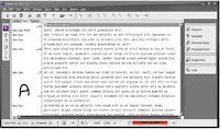
InDesign and InCopy share a code base, meaning that they are, for all intents and purposes, the same application at heart. Their differences are the result of different sets of plug-ins stacked atop that code base. Many features are identical. For example, InCopy has InDesign’s full text styling and formatting capabilities, including lists, bullets and numbering, and tables and even identical Character, Paragraph, Character Styles, Paragraph Styles, Tabs, Swatches, Table, Story, Glyphs, Links, and Layers panels. Anything you can do with text in InDesign you can do in InCopy, its editorial counterpart. It also introduces features far beyond InDesign’s, features like an advanced thesaurus (and accompanying panel); Word-esque change tracking; text macros; constantly updating line, word, and character counts; and the ability to edit one, some, or all stories and text frames in an InDesign document concurrently, in several windows or just one. Whereas InDesign has two editing modes, InCopy has three: Story, Layout, and Galley. Story view (see Figure A) is identical to InDesign’s Story Editor, a pure word processor without accurate line breaks or composition. It also has the same pros, cons, and customization options.
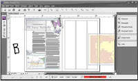
Of course, InCopy can open its own INCD and INCX file formats, as well as Microsoft Word DOC files, ASCII text, Rich Text format, and other common textual document formats, but it can also open InDesign documents. Lacking layout tools, frames cannot be moved or modified in InCopy, but their contents—text and imagery—can, which is what enables offloading editorial work from design and production to the editorial department. Editors who want to proof or even edit copy within the final layout can do so through InCopy’s layout view (see Figure B). The document in layout view is 100% accurately copy fit.
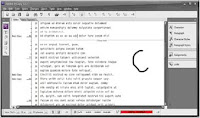
Finally, galley view is a combination of both (see Figure C). It’s a story editor but with accurate line breaks, hyphenation, composition, and copy-fitting. Working together, InDesign and InCopy fill both sides of the design-editorial dynamic, allowing one department to concentrate on its specialty and allowing the other group to do the same. Native editing of both applications’ files in the other, live copy and layout update links between them, and for more robust needs, the ability to assign frames, pages, and spreads to specific InCopy users are the reasons InCopy is rapidly supplanting Microsoft Word in collaborative publishing workflows. If you’re part of such a workflow, whether design and editorial are at the same or different sites, migrating writers, editors, and proof readers to InCopy could be the most valuable idea you gain from this book. I say that with all sincerity, and I have the experience migrating publishing clients to back up the claim.

Footnotes
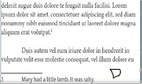
Footnotes are citations or resources placed at the end of a story and referenced from within the main text of the story. Figure D shows a typical footnote.
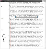
Inserting a footnote is easy. Position the cursor in the text immediately after the word or phrase to reference the footnote, and then select Type > Insert Footnote. Using the current footnote options, a new footnote reference will be added to the text at that point and the footnote itself at the bottom of the column; your cursor will stand ready to type the footnote. The easiest way to edit footnotes and their reference numbers is in Story Editor where they magically appear together. In Figure E, you can see both collapsed and expanded footnotes in their colored boxes. To collapse or expand, just double-click the colored box. To collapse or expand all footnotes at once, choose Collapse All Footnotes or Expand All Footnotes from the context sensitive menu or from the View > Story Editor menu.
Footnotes are anchored to their reference numbers. If text reflows, moving the reference to another column or page, the footnote follows to the bottom of that column or page. Similarly, pasting or dragging text containing a reference to a different place in the same document takes the footnote with it. The same occurs when pasting or dragging into a different document with the added benefit that both the reference and footnote itself will pick up the footnote formatting options in effect in the new document. Deleting a footnote is even easier than inserting it—delete just the reference number and the entire footnote goes along with it. You can delete the footnote number or other identifier at the beginning of the footnote itself, but you really shouldn’t—readers match the reference to the footnote by that mark. If you’ve deleted the number and want to reinsert it, choose Type > Insert Special Character > Markers > Footnote Number with the cursor ahead of the footnote.
Formatting Footnotes
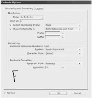
Extensive footnote formatting controls are available from Type > Document Footnote Options. The first tab of Footnote Options, Numbering and Formatting, is largely concerned with the appearance and sequence of footnotes (see Figure F).

What does it all mean?

Style Footnotes may take on numerous styles, including the most common Arabic numerals; the second most common, a system of symbols including the dagger (†), double-dagger (‡), and so on; incrementing asterisks; Roman numerals in both cases; and alphabetic enumerators in both lower- and uppercase.
Start At. InDesign automatically increments footnote numbers in the same story, and renumbers them to reflect additions, deletions, and rearrangement of footnote references. By default, each first footnote in the story will begin with 1 and ascend from there. In cases where a single chapter or document comprises more than a single story, you’ll want to either manually choose the starting number in the Start At field, or set an appropriate Restart Numbering Every option.
Depending on the type of document being written or laid out, you may want footnotes to continuously increment throughout the whole document or just per-section, spread, or page. For the former, leave Restart Numbering Every unchecked. However, to start the footnote reference numbering over at the Start At value for every section, spread, or page, check this box and choose the appropriate divider in the drop-down menu to the right.
Show Prefix/Suffix Between the check box, drop-down list, and specific Prefix and Suffix fields, you can add brackets [],parentheses (), hair spaces, thin spaces, or custom glyphs to either or both the footnote reference number and footnote text. The spaces in particular are handy when footnote references are rendered in a typeface too close to preceding or succeeding glyphs.
Footnote Reference Number in Text In the Position drop-down, determine if you’d like to format footnote reference numbers in the usual fashion of superscripted numbers or if you’d like them subscripted or even rendered as normal position, full-size numbers. By creating beforehand and assigning here a character style, every aspect of reference numbers’ appearance is open to customization distinct from surrounding copy.
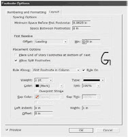
Footnote Formatting Footnotes themselves are paragraphs and can be styled while editing. Here, though, you have the ability to specify a particular paragraph style to set the majority of global appearance options. In the Separator field, enter the glyph(s) or marks to divide the identifying reference number from the footnote text it keys. The default, ^t, is code for a tab. On the Layout tab, more advanced formatting as well as footnote placement is stipulated (see Figure G).
Spacing Options. Enter in these fields the amount of vertical spacing between the end of the story column and the first footnote as well as the amount of vertical paragraph space separating multiple footnotes from each other. The latter option has no effect with single footnotes.
First Baseline. Baseline offset sets the vertical distance between the baseline of the first line of footnote text and the (by default ruled) top of the text frame holding footnotes. Control text baseline offset using the same options as in normal text frames—by ascent, cap height, leading value, x-height, or a fixed amount. The Min field refines Baseline Offset values of Leading or Fixed by specifying the minimum amount of space between the top of the line and the baseline of its text.
Place End of Story Footnotes at Bottom of Text. This option specifies where footnotes appearing in the last frame of a threaded story appear. In all other frames but the last, footnotes are placed at the bottom of the column in which their reference numbers appear. In some publications and according to some style guides, however, it’s preferable to place all footnotes from the last frame of a story not at the bottom of each column but beneath the last column. Checking this option sets the latter condition.
Allow Split Footnotes. When footnote text outgrows the amount of space allotted to hold footnotes, how should it be handled? Checking this option splits long footnotes across columns (and perhaps even pages), creating effectively threaded footnote frames at the bottoms of successive columns. Unchecking Allow Split Footnotes can force InDesign to move the body copy line of text containing the footnote reference number to its next column, which could result in large, multiline gaps at the bottom of main story columns. If the resulting gap is too large, InDesign will instead overset the footnote text. One way to help control footnote cohesion is to ensure that you’ve assigned to it a paragraph style with appropriate keeps options defined (e.g., keep X number of lines together or keep all lines together).
Rules. Mirroring the options of a paragraph rule above the paragraph, this section lets you create visually interesting separators above the first footnote section and/or above all footnote sections (for split footnotes). To disable the rule entirely, uncheck the Rule On box. In addition to all the formatting options in Footnote Options, you can still manually and individually style footnotes. For instance, you could select the footnote text (press Cmd+A/Ctrl+A with the cursor inside a footnote to select the entire text of just that footnote) and apply character styles, font or color changes, or anything else you can normally do with text. You can also manually style the footnote reference numbers, but it’s a much better idea to do it in Footnote Options with character styles. Even doing it that way, though, styles will be lost if you clear overrides and character styles in the paragraph containing the footnote reference.
Endnotes
Endnotes are similar to footnotes except that, instead of appearing at the end of columns, endnotes appear at the end of the story. InDesign does not have any actual endnote creation features beyond pressing Cmd+Shift+End/Ctrl+Shift+End (the shortcut to go to the end of the story) and typing the endnote. Microsoft Word does have endnote features, which means you could potentially import Word documents including them. Checking Show Import Options in the Place dialog presents the option of whether to import endnotes in Word files. If they’re imported, InDesign will convert Word endnotes to normal,

Table Of Contents in InDesign

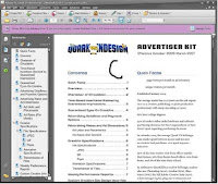
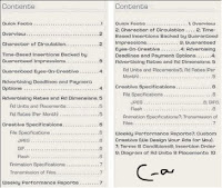
Creating a table of contents for the document (or book) is far less involved than creating an index, as long as you practiced efficient composition by assigning paragraph styles to the elements that should be listed within the TOC. The basis for TOC generation is paragraph styles—in other words, any text assigned to this style or that style will be included or excluded based solely on its paragraph style.
InDesign supports an unlimited number of tables of contents. Thus, you can create the standard document TOC like the one at the front of this book, but you can also create per-chapter tables of contents, lists of figures or tables, alphabetized lists of topics, and just about anything else you can imagine (and manage with paragraph styles).
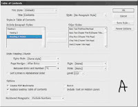
Begin creating the table of contents by choosing Layout > Table of Contents, which opens the Table of Contents dialog (see Figure A). Click the More Options button to reveal the full depth of the dialog.

TOC Style. All of the options incorporated into the Table of Contents dialog may be saved as a preset called a TOC style. After setting the options, click the Save Style button on the right and give the style a name. TOC styles can also be created and edited from Layout > Table of Contents Styles. If a style has been pre-created, it will appear in the TOC Style list; choose it, and all the below options will fill in with their style-defined values.
Title. When the TOC is generated and placed, it will have a title as the first line of the story. By default, the title will be Contents, but it can be anything you like. Leaving the Title field blank removes the title from the generated TOC entirely, without leaving a blank carriage return where it would have been.
Style. The paragraph style for formatting the TOC title.
Styles in Table of Contents. This is the root of creating a TOC. On the right, in the Other Styles list, are all the paragraph styles defined in the document. Click a style on the right to highlight it, and then use the Add button to move it to the left, the Include Paragraph Styles list. You can also double-click an entry in either column to move it to the other. Each style included on the left will cause all text assigned to that style to be listed in the resulting

TOC; styles not in the list will not have their dependent text referenced by the TOC. The order of styles in the Include list establishes the TOC hierarchy. In other words, the first listed style is the most important, highest level of the generated TOC, with the next appearing below it, the next below that, and so on. If you insert styles in the wrong order, drag them up or down in the list just as you reorder styles in the Paragraph or Character styles panels. But you must also change their Level value in the Style section below. Figure B shows an example of the Include Paragraph Styles list and the TOC it would generate.

Click to highlight a style in the Include Paragraph Styles to set its options below in the Style section. Each included style may have its own entry style, page number options, and so on.
Entry Style. When the TOC is generated, the text for each entry level can have its own paragraph style. Unlike index styles, InDesign will not automatically created level-based paragraph styles. You’ll need to pre-create your TOC styles and then select them from the list for each Include Paragraph Style option. Alternatively, leave the default of [Same Style] to include the same style in the TOC as on the document pages.
Page Number. Choose whether to place the page number before or after the entry text or to omit the page number entirely. With the Style field to the right, the page number can be given its own character style for customized formatting.
Between Entry and Number. The separator character or characters to appear between the entry text and its number (or number and text, if the page number is placed before the text). The pop-up menu to the right offers many symbols, markers, and special characters. To create a leader dot separator, specify a tab (^t) in the field and then modify the paragraph style (outside of the Table of Contents dialog) to include a leader dot separator at that tab stop. The dropdown menu at the right allows assigning a character style to the separator itself, enabling any unique styling to be applied to just the separator.
Sort Entries in Alphabetical Order. By default, and in most cases, TOC entries are sorted in order of appearance in the document. However, especially when creating documents for electronic distribution as PDFs, this option opens numerous other possible uses for the Table of Contents feature beyond creating a standard TOC. When InDesign generates a TOC, it creates hyperlinks connecting the TOC entries to the text they reference. Exporting to PDF preserves these hyperlinks, enabling a reader of such a PDF to click on the TOC entry and jump to the content. Thus, the option to sort entries alphabetically rather than logically opens the possibilities of creating vastly different lists such as lists of product names, personnel referenced in the document, or even a replacement for a standard index—without having to manually create index entries. The only significant limitation to using the Table of Contents functions in place of index and other features is that InDesign’s Table of Contents is dependent upon paragraph styles; it cannot create an entry from a character style or a specific word in the middle of a paragraph.
Level. In a hierarchal TOC such as the one at the front of this book, entries from each successive style are considered inferior to their predecessors—Heading
1, for instance is superior to Heading.
2, which is superior to Heading.
3. The Level field defines that hierarchy. As each style is moved from the Other Styles list to the Include Paragraph Styles list, InDesign automatically assigns a successive level. If you have reordered the include list by dragging and dropping, you will also need to change the level for each affected style.
Often successive TOC entries are indented as visual cues to the hierarchy. The Include list mimics the hierarchy by indenting styles in the list, giving you a visual representation of how the generated TOC may look. The Level field is nonexclusive, meaning that you are not required to have only a single level 1 or level 2 entry. If you have two or more equally important styles, they can all be set to the same level.
Create PDF Bookmarks. Similar to the way each entry on the page itself will be hyperlinked to its content, InDesign can automatically generate PDF bookmarks, which are hidden until PDF export time. Adding these, and choosing to include bookmarks when exporting to PDF, creates something —a Bookmarks panel sidebar TOC-style list of topics that, when clicked in Acrobat or Adobe Reader, become hot links and jump the reader to the referenced content.
Replace Existing Table of Contents. If you have previously generated and placed a TOC, this option will replace (not update) it. When using the Table of Contents to build separate styles of tables, you want this option unchecked.
Include Book Documents. When generating a TOC for documents managed through an InDesign Book file, check this option to generate a single TOC that points to all instances of the included paragraph styles in all documents within the book.
Run-In By default, all TOC entries are given their own line, with a carriage return at the end. An alternate style is to use the run-in method that, like the same option within an index, only separated by top-level styles. All entries lower in the hierarchy than the top will be placed together in a paragraph (see Figure C).

Include Text on Hidden Layers Choose whether to include in the TOC text on hidden layers.
Numbered Paragraphs New to CS3, this option tells InDesign how to handle paragraphs that have been numbered through the List and Numbering functions. Note that InDesign does not recognize numbers that have been converted to standard text and will include them in the TOC regardless of this setting. The options are as follows:
Include Full Paragraph lists the text in the TOC exactly as it appears on the page, with all text automatic numbering intact. For example, you choose table 9 (if you have in the document) in a chapter whose number is defined within the paragraph Numbering options to include the prefix Table 9 and whose table caption is XYZ or ABC Products will list in both the main story and the TOC as Table 9. XYZ or ABC Products.
Include Numbers Only. ignores the text in the paragraph and includes only the automatic number and any prefixes. For example, to include a TOC entry for Table 9.9 without the table’s caption, choose Include Numbers Only.
Exclude Numbers. includes in the TOC the text of the paragraph but not the automatic number. The TOC output using the above example would therefore be simply KDY Capital- Class Products.
Click OK to return to the document with a loaded cursor ready to place the TOC story, which may be placed and flowed like any story. If any stories in the document contain overset text assigned to the included styles, you will be prompted after clicking OK whether to include those instances in the TOC.
Unlike an index, tables of contents don’t have their own panel. Also unlike an index, you needn’t go through the entire generate process to update a TOC. Instead, select a text frame holding the TOC style, and choose Layout > Update Table of Contents. Shortly, an alert dialog will inform you that the table of contents has been updated successfully. When creating a comprehensive TOC for book documents, it’s often better to place the TOC into its own self-contained document and to add that document to the Book panel.

How to rotate text?

Ans. There are times when, for creative reasons, you’d like to rotate text without rotating the frame in which it resides. Maybe the frame is a bezier path, or maybe it’s just a rectangle. For whatever reason, however, rotating the frame and its content and then using the direct selection tool to manually restore the rotated frame to its original shape and location are too time- consuming. There is a way to accomplish this task quickly using InDesign’s Pathfinder feature.
Rotating text in frames
We start with our text un-rotated and in a bezier frame.Draw a new frame on top and completely within the bounding box of the text frame, as shown in the screenshot at right. It doesn’t matter how big this new frame is, as long as it fits completely inside the original text frame. Text frame that contains text you want to rotate.
The new frame that you draw on top of the first text frame.
Next, Cut the text from the text frame, and paste it into your new frame. Then rotate the new frame to your desired angle, and select both frames.
Rotating text in frames
Using the Pathfinder palette, click on the Add button to combine the two shapes. When the Pathfinder combines multiple shapes with Add function, the stroke, fill, content, angle of rotation and other properties for the resulting shape are taken from the topmost object.

blog adversiting store review

Computers. They pretty much dictate our daily lives by now. The plans of the store you bought it in were most likely drafted on one.
Reading this article through this blog/site means that you’re probably a computer junkie, and you’re looking for a way to make your next fix more interesting. While looking through this site, You feel the need to enhance your life on the Internet. You probably spend over half of your day online . . . and you love it.
has lot of information about what you try to see.

What I found on this
A Web site that provides updated headlines and news articles of all aspect of life and also enhance the living status of the user; Also may include journal entries, commentaries and recommendations compiled by the Who's (site owner).

For some people, it’s a release. They might keep a daily diary of how they’re coping with cancer, so they don’t have to constantly tell friends and family the same news over and over, but also so they can say the things that they find too hard to discuss face to face with people, simply, they have name of the site on their lips.

Anyone can find info about Others because they’re isolated from the world—whether physically or mentally. Maybe they live in the middle of war-torn Iraq, like Salam Pax, the “Baghdad Blogger”. Writing their thoughts as a web page helps these people feel like part of something and gives them hope. The has a big network.
blog advertising

There is also a choice of the advertiser that where he/she wants his/her product info should apear, I mean to say this store has several registered and well known blogs to its directory.

Finally I concluded that provides and financial enhancement for both parties (blogger and advertiser) and also provides the relavant information to the user.

blogadversitingstore review

Computers. They pretty much dictate our daily lives by now. The plans of the store
you bought it in were most likely drafted on one.Reading this article through this blog/site means that you’re probably a computer
junkie, and you’re looking for a way to make your next fix more interesting. While
looking through this site, You feel the need to enhance your life on the Internet. You
probably spend over half of your day online . . . and you love it. www.blogadvertisingstore.com/ has lot of information about what you try to see.
What I found on this http://www.blogadvertisingstore.com/....A Web site that provides updated headlines and news articles of all aspect of life and
also enhance the living status of the user; Also may include journal entries,
commentaries and recommendations compiled by the Who's (site owner).
For some people, it’s a release. They might keep a daily diary of how they’re coping
with cancer, so they don’t have to constantly tell friends and family the same news
over and over, but also so they can say the things that they find too hard to discuss
face to face with people, simply, they have name of the site on their lips.
Anyone can find info about Others because they’re isolated from the world—whether
physically or mentally. Maybe they live in the middle of war-torn Iraq, like Salam
Pax, the “Baghdad Blogger”. Writing their thoughts as a web page helps these people
feel like part of something and gives them hope. The
http://www.blogadvertisingstore.com/ has a big network.blog/'>http://www.blogadvertisingstore.com">blog advertising
There is also a choice of the advertiser that where he/she wants his/her product info
should apear, I mean to say this store has several registered and well known blogs to
its directory.
Finally I concluded that http://www.blogadvertisingstore.com/ provides and financial
enhancement for both parties (blogger and advertiser) and also provides the relavant
information to the user.

ATTRIB: Understand Your Computer

In Windows, files and folders have certain properties (called attributes) that can be configured. If you right-click on the file or folder's icon, you'll see some check boxes that allow you to change these attributes. The ATTRIB command allows you to do this when the Windows GUI is not available. The possible attributes, which vary based on Windows version and other factors, are as follows:
Read only: When set, this allows the file to be opened and viewed, but not changed or deleted.
Archive: This attribute affects whether the file will be backed up in certain backup schemes using a backup program, or whether running the XCOPY command will copy that particular file. For more information, see Windows Backup help files.

System: This indicates that the file is necessary for some Windows process.
Hidden: Windows hides certain files by default; however, any file can be hidden or displayed by changing this attribute. In 2000 and XP, when the user has enabled the showing of hidden files (in any Windows folder in Tools > Folder Options > View tab), icons for hidden folders and files appear translucent.

The most common repair use for the ATTRIB command is to replace corrupted registry files in 9x).
When run without switches, ATTRIB shows the attributes of each file in the current folder.
ATTRIB displays, sets, or removes the read-only, archive, system, and hidden attributes assigned to files or folders. Used without parameters, ATTRIB displays attributes of all files in the current folder.
Use
ATTRIB uses the plus sign (+) to turn on an attribute, and the minus sign (-) to turn off an attribute. To use ATTRIB, navigate to the folder where the desired file is located, and type the command followed by the filename (with or without wildcards) and the desired parameters and switches.
Parameters:
+r: Sets the read-only file attribute.
-r: Clears the read-only file attribute.
+a: Sets the archive file attribute.
-a: Clears the archive file attribute.
+s: Sets the system file attribute.
-s: Clears the system file attribute.
+h: Sets the hidden file attribute.
-h: Clears the hidden file attribute.
Switches:
/s: Applies the command to matching files in the current folder and all its subfolders.
/d: Applies the command to the entire folder.
Note:
To apply a change to a group of files using wildcard characters, files with their system and/or hidden attributes will not be affected unless you turn off the hidden and system attributes first.
Examples:
To display the attributes of a file named chapter07.doc, navigate to the folder and enter:
ATTRIB chapter07.doc
To assign the read-only attribute to the file, enter:
ATTRIB +r chapter07.doc
To remove the read-only, hidden, and system attributes from all .reg files on the C: drive, including in all subfolders, navigate to the C: drive and enter:
ATTRIB -r -h -s *.reg /s

CHKDSK: Understand Your Computer

CHKDSK (present in all versions, useful in 2000 and XP only)
CHKDSK is a program used for checking the status of magnetic drives/disks, fixing certain errors, and even recovering readable data from bad disk sectors. It isn't particularly useful in 9x, except for obtaining a report on files on the disk. To correct any disk errors on 9x, run ScanDisk. In 2000, and XP, CHKDSK replaces 9x's ScanDisk. In 2000 and XP, it is easier to run CHKDSK from Windows, so you might as well save the command-line version for when the computer is booted into Safe Mode, Command prompt only. When invoked with the /f and/or /r switches to run on a disk in use, CHKDSK will prompt you to run at the next boot.
Use
Type CHKDSK followed by the drive letter and colon (:), followed by any switches (each switch must be preceded by a space character).
Switches
/c: Use with NTFS-formatted drives only. Skips folder structure cycle checking, resulting in a faster completion.
/f: Fixes file system errors on the disk. If run on a disk currently in use, /f causes CHKDSK to be run on the next boot.
/i: Use with NTFS-formatted drives only. Performs a less exhaustive check of index entries, resulting in a faster completion.
/r: Recovers readable information from bad disk sectors. If run on a disk currently in use, /r causes CHKDSK to be run on the next boot. See the listing for the RECOVER command for another tool that can recover lost data.
/v: Displays the name of each file in every folder as the disk is checked.
/x: Use with NTFS-formatted drives only. Makes all necessary changes to any network-mapped drives in order for CHKDSK to work on them. /x also includes the functionality of the /r switch.
Notes
· Running CHKDSK without the /f, /r, and/or /x switches is usually pointless and might report false disk errors.

· If you are prompted to convert lost chains (unidentified file fragments) to files, do so by typing . You can then find the files in the root folder (C:\ in the C: drive). The files are named File****.chk (the asterisks stand for any character). If the files don't contain any data you need, you can delete them. If you type (answer no) to the prompt, the fragments will be deleted automatically.If you use the /f or /x switch on a very large disk such as 80GB, or one with huge numbers of files (e.g., millions of files), CHKDSK might take several days to complete. CHKDSK cannot be stopped while it is running, so the computer will not be available for this time.

understand what is web directory?

Before we start understand what is web directory, we should understand the driving traffic or get publicy from the web or web directory:

When driving traffic to the website offer it is very important to diversify the tools and tactics use to generate this traffic. A good traffic generation strategy should consist of things like article marketing, pay per click advertising, search engine optimization, joint ventures video marketing, forum marketing and list building for e-mail marketing.

Now try to understand what is web directory
A web directory is a directory on the World Wide Web. It specializes in linking to other web sites and categorizing those links.

A web directory is not a seach engine and does not display lists of web pages based on keywords; instead, it lists web sites by category and subcategory. The categorization is usually based on the whole web site rather than one page or a set of keywords, and sites are often limited to inclusion in only a few categories.

Web directories often allow site owners to directly submit their site for inclusion, and have editors review submissions for fitness.
See some web directories
http://www.dmoz.org , http://dir.yahoo.com , http://www.business.com , http://botw.org/

Here are some type of web directories exists.
Human-edited directories
A human-edited directory is created and maintained by editors who add links based on the policies particular to that directory.
Bid for Position directories
Bid for Position directories or also known as bidding web directories, are paid-for-inclusion web directories where the listings of websites in the directory are ordered according to their bid amount.
Automated submission web directories
Automated submission web directories human editing or moderation is replaced with the automated processing which requires special techniques for the website content categorization and filtering.
Article directories
Article directories are a form of Search Engine Optimization where companies and professional writers submit articles based on a specific niche.
Ezines
It is anothre name of Article directories and also named as Online Magazines for their depository methods hosting hundreds or thousands of content related to any subject.
RSS directories
These are similar to web directories, but contain collections of RSS feeds, instead of links to web sites.

Creating a Restore Point and Exporting Your Registry

Creating a system restore point and Exporting your Windows XP/Vista Registry
It is very important to remember to always export a copy of your Windows Registry and create a restore point before making any attempts to edit your Registry.
Step 1: Windows Vista Users- Creating a System Restore Point
Right Click on my computer and select Properties
Click on System Protection on the tasks menu
You should see a Window with your hard drive/s in it. Your C: should be already checked.
Click on the Create Button
Name your restore point appropriately by date
Now Click on the Create Button
A conformation screen should appear when your restore point is completed
Windows XP Users- Creating a System Restore Point
The best way is to find help and support in your start menu and type: system restore wizard
Find and run the system restore wizard under run tasks
From here it’s the same process as Vista
Step 2: Exporting your Windows Registry (all versions)
Follow these steps for every version of Windows
Click start then run (search in Vista)
Type in regedit
Now select file then export
Name your file appropriately and save
Now you have a system restore point as well as a copy of your registry.
If for some reason you delete or edit the wrong key you can simply repeat the exporting process
and or course select import. In case importing the registry file doesn’t work you can always revert
to the system restore point.
Blog Widget by LinkWithin