Search This Blog

General Info: What is GSM?

A:
GSM, Global System for Mobile communications. GSM is the European standard for mobile telephony and is currently implemented in over 80 countries from Albania to Zimbabwe, with a rapidly growing subscriber base - in fact current rates of growth mean that there is a new subscriber added every second!

GSM is a digital, circuit switched system developed for mobile telephony which has been in commercial operation since 1991. The channel access is TDMA with 8 time slots and the operating frequency is 900 MHz. The new DCS operates at 1800 MHz and PCS at 1900 MHz. Both DCS and PCS are extensions to the original GSM specification. The architecture shown here can be split into 2 main parts, the basestation system and the switching system. The Operation and Maintenance system isn't shown in this picture, as it's not relevant to this discussion. The Mobile Station is used by a mobile subscriber to communicate with the cellular system. The Base Transceiver Station handles the radio interface for a cell. Mobile Stations communicate with the BTS using a radio channel. The Base Station Controller establishes, supervises and releases channels for a BTS. It is also responsible for handovers between base transceiver stations. One BSC can be connected to several BTSs.

The Mobile Services Switching Center performs telephony switching within the network. It is responsible for call establishment and handovers between base station controllers. One MSC can be connected to several BSCs. Ericsson's MSCs are based on AXE technology. The Gateway Mobile Service Switching Center handles incoming calls from external networks. Any MSC can act as a GMSC.

The Home Location Register stores and manages all the subscription information for a single network. The information stored includes a subscribers supplementary services, location information and authentication parameters. The Visitor Location Register contains information about all the mobiles currently under a single MSC. The VLR can be seen as a distributed HLR. Ericsson's VLR is integrated into the MSC. The Equipment Identity Register contains details of MS hardware numbers and their status. This means that faulty or stolen mobiles can be barred from the network regardless of the subscription they are using. The Authentication Center is a database connected to the HLR. Its purpose is to provide authentication parameters and ciphering keys to the HLR to help protect network operators and subscribers from fraud. Another important concept in the GSM infrastructure is that of a Location Area. An LA is a collection of cells where an MS can move around without having to report its new position. An incoming call for an MS means that a paging message is broadcast in all the cells in the MS's Location Area.

A user in the fixed telephone network dials the number for a mobile subscriber. This is routed via the PSTN to the Gateway MSC. The GMSC queries the HLR for the mobile subscriber's serving MSC/VLR. The call is then routed to correct MSC/VLR. The MSC queries the VLR for the MS's current Location Area. A paging message is broadcast to the MS's Location Area, which the mobile receives and responds to. The MSC now knows the actual cell the mobile is located in and can route the call to the correct BSC. The BSC selects the traffic channel on the relevant BTS and orders the mobile to tune to the correct channel. The Mobile Station then generates a ring signal and when the subscriber answers the call is connected. What happens when a mobile subscriber makes a telephone call? First the subscriber dials the number which results in an access request message being sent to the serving MSC. The MSC queries the VLR to verify that the MS is allowed to perform this action. If the mobile is authorized then the MSC initiates a call set-up to the PSTN network. The MSC also asks the BSC to allocate a free traffic channel. The BTS is informed of the selected traffic channel and the MS is ordered to switch to that channel. The person receiving the call answers and the connection is established.

What happens when a mobile moves around the GSM network? The exact chain of events depends on the state of the mobile - firstly we’ll look at what happens when the mobile is in the idle mode - that is the mobile is turned on but there is no telephone call in progress. As we said earlier, an idle mobile is not particularly interested in the exact cell location. It is only tracked on the Location Area level. So, when the mobile moves from cell A to cell B, which are within the same Location Area, no update messages are required. If we imagine that cell B and cell C are in different Location Areas, when the mobile moves from B to C it notices that the Location Area has changed. So, the mobile transmits a Location Area update to inform the MSC and VLR that it has entered a new Location Area. The MSC performs some authentication procedures (for example, to check if the mobile is allowed to use the new Location Area) and then informs the mobile that the update request was successful. As the Location Area is under the same MSC the HLR does not need to be informed. The process is similar when the mobile roams to a new cell under a different MSC, for example moving from C to D. As the cell is under a different MSC it is also in a different Location Area. Again the mobile sends a Location Area update message to the new MSC which again performs some authentication procedures. Because the Location Area is under a new MSC the HLR is also informed of the new serving MSC. When this is done the mobile is informed that the Location Area update was successful. When a mobile is in the active state (that is, there is a circuit switched call ongoing) the process is slightly different. In this case the mobile is tracked on the cell level. So, when an active mobile moves from cell D to E (both under the same BSC), it is the BSC that decides a handover should take place. This decision is based on measurements supplied by the BTS and the mobile. The BSC sends a message to the new BTS to allocate a new radio channel for the mobile. It then sends a message to the mobile, using the old BTS, to inform the mobile of the channel to use in the new BTS cell. The mobile then tunes to the new channel and transmits a small message informing the BSC that the handover is complete. The BSC then instructs the old BTS to release the now unused radio channel. Note that no Location Area updates are issued while the mobile is active. If the two cells happen to be in different Location Areas, the mobile will send a Location Area update message when the call is completed. What happens when an active mobile moves from a cell which is under the control of a different BSC? This case can be seen when the mobile moves from cell E to cell F. The procedure is almost exactly the same as for handover between two cells under the same BSC, except that messages between the new and old BSCs must be sent via the MSC. Handovers between cells under different MSCs (for example, when the mobile moves from cell F to G) are a little more involved.

When the mobile realizes a handover is necessary it sends a handover request up to the BSC. The BSC realizes that the new cell is not in its jurisdiction and sends the request up to the MSC. Similarly the old MSC realizes that the new cell lies under another MSC. The handover request message is forwarded by the new MSC which forwards it to the correct BSC and the process is the same as for the handover between two BSC. However, when the mobile tunes to the new channel under the new BSC and sends the message informing the BSC that the mobile is now under its control, the call is routed from the old MSC to the new MSC, possibly via the PSTN. This means that for the duration of the call the circuit goes through the old MSC, the PSTN and the new MSC before reaching the BSC, BTS and ultimately the mobile.
next to come: What is GPRS?

Corel Painter X: Power of Scripting

There are two kinds of scripts in Corel Painter. One type you use with the Record feature. The other automatically records your work session. Should your computer crash, there is a good possibility you can retrieve your work session in Painter by playing back the script from the time of the crash. You can specify how many days Painter keeps the automatically recorded scripts by specifying the number of days in the Preferences > General dialog box. The default is one day.

The Power of Scripting
Every good computer graphics program offers the ability to write scripts in one form or another. Tapping into the power of scripting greatly increases your ability to make software work for you. No matter how comprehensive the tools in a piece of software might be, there is always something the programmers didn’t think of, or a feature that would have been too bulky or specialized to include, or a repetitive task you would like to automate, such as applying the same effect to each frame in a video clip. And that is where scripting comes in. You can literally write your own processes without having to learn programming. In Corel Painter, scripting offers you, for example, the power to have unlimited “undos.” If you record your work in a script, you can revert to any stage in the project by playing the script back and stopping it at the stage you want.

Play a script
1
Open the Scripts palette by going to Window > Show Scripts.
2 Play the Tim Warnock 1 script by clicking the Play button at the bottom of the palette.
3 Play the script again, this time using the Stop or Pause button to stop the playback.
4 From the Script Selector, choose another script and play it back.
5 Click the Single Step button to see the steps the script is following.
(see Fig. AB)

Record a script
1
Start recording by clicking the Record button on the Scripts palette.
2 Open a new file with a white background. Set it to 720 x 486 at 180 ppi (that is a good resolution for printing on a 1440 dpi inkjet printer).
3 Choose Select > All, or use Command+A (Mac OS) or Ctrl+A (Windows). Choose Select > Convert To Shape.
4 From the Shapes > Set Shapes Attributes dialog box, make sure Stroke is on and Fill is off. Select a color for your border and adjust the size of the stroke.
5 Choose the Shape Selection tool in the toolbox. In the property bar, click the Convert to Layer button, then drop the layer to the canvas.
6 Go to Canvas > Canvas Size, and add 200 pixels to the bottom of the canvas.
7 Click on the Text tool in the toolbox, and type in “Audio,” “Job” and “Scene #.”
8 Put a thin border around the entire image. Make sure everything is dropped to the canvas, and stop recording. Give your script a descriptive name like NTSC756X486.
9 Close your image file and play back your script. If you have done everything correctly, you should have an image similar to (fig. C)

Editing scripts
Scripts are flexible. For example, you can play a script one instruction at a time. You can also edit scripts by opening them in the Scripts palette. To open a script, click the palette menu arrow, and choose Open Script. In the dialog box, choose the script and click Open. You will see all the steps and information about the script listed. (fig. D)

You can edit a script to change the order of instructions, remove an instruction, or add a segment from a different script. You can select instructions by clicking them. To select multiple instructions, hold down Shift when clicking them. To cut, copy and paste parts of your script, select one or more instructions, then click the palette menu arrow and choose Cut or Copy. Select the instruction before which you want to paste. Click the palette menu arrow and choose Paste. Corel Painter stores copied instructions in the Clipboard, so you can close one script, open another, and paste the instructions there.

Recording a painting
Imagine recording a drawing, then playing the drawing back with a different drawing tool. This is an easy way to experiment with different looks, and an easy effect to create using scripting. The trick is to set up the script options correctly in Corel Painter. Replaying scripts with different tools is a wonderful way to experiment with a sketch. (see fig E)

Record a painting
1 Open a new file. Pick your color and your drawing tool.
2 On the Scripts palette, click the palette menu arrow, and choose Script Options. In the Script Options dialog box, disable the Record Initial State option. This will allow you to change art materials on playback.
3 Start recording.
4 Make your sketch, but be careful not to change colors or drawing tools.
5 End recording and name your script Sketch.
6 Choose Select > All, and hit the Delete or Backspace key to clear your canvas. Test your script by playing it.
7 Now play back the script with different tools and colors. Try combining several playbacks over the same file.

Scripting for animation
Scripts can also be created for the purpose of making movies. You can create a movie from a script by saving the script as frames during playback. Before you record the script, you need to enable the Record Initial State option. Once the script is recorded, you can play it back to test it before you save it as a movie. When you want to create a movie from the script, go to the Script Options dialog box and enable the Save Frames On Playback option (this is the option that directs Corel Painter to create a movie on playback). (fig F)
Choose how many tenths of a second you want between frames. Corel Painter defaults to ten 1/10ths of a second. The lower the number, the more frequently a frame is created and the smoother the animation will be. More frames, however, use more disk space. In this example, I played back my Sketch script. When Save Frames On Playback is turned on and you play a script, a dialog box will open asking you to save a frame stack. I named the file Sketch.frm. Corel Painter automatically broke the movie up into 72 frames. The length of the movie will depend on the 1/10ths of a second setting you choose and the length of your script.

Play the Sketch QuickTime movie.
Increasing resolution with scripts
One of the reasons artists like to work with vectors is that they are resolution-independent. They are easy to make larger with no loss of image quality. When you enlarge a bitmap, however, the image quality suffers. With scripts, there is a way around this limitation. You can use a script to record your painting while you work at a low resolution, then play the painting back at a higher resolution! This technique allows you to paint quickly and intuitively at a low resolution, while still having the advantage of being able to render your painting at a high resolution.

Replay a script at a higher resolution
1 In the Script Options dialog box, make sure the Record Initial State option is enabled and everything else is turned off.
2 Open a new file, 640 x 480 at 72 ppi.
3 Choose Select > All. (This action allows for a resolution-independent playback later. It creates a reference rectangle that is part of the recording. The rectangle must be recorded to play a session back into a higher resolution file later.)
4 Start recording your script.
5 Make your painting. When you are finished, stop recording and name your script Hi_rez.
6 Open a new document, two to four times the size of your original file (in this case, 1280 x 960 or 2560 x 1920 at 72 ppi). Make sure the new document has the same aspect ratio as the original, so your image won’t get distorted.
7 Choose Select > All again to select the entire canvas. The rectangle recorded at the outset of the original script is referenced to the selected rectangle in this document.
8 Now play back the Hi_rez script you created. Corel Painter will play back the script in the new document while automatically scaling the brushes to fit the higher resolution.

InDesign: Finding the Unfindable Swatch, Deleting the Undeletable Swatch

Finding the Unfindable Swatch, Deleting the Undeletable Swatch
Most often, a swatch that cannot be deleted in InDesign is actually contained within a placed EPS, PDF, AI, or other image asset. InDesign can place and modify such assets within the context of the instance on the page, but it cannot edit the asset itself, cannot change the EPS, PDF, AI or what have you. Therefore, InDesign can’t delete or alter swatches that may be in the asset. Worse, you often can’t even find where the color is used. Often this happens because the path carrying the offending color is hidden behind other paths and, even more common, there is no path, just a single anchor point. In vector drawing, a single anchor point is considered an object just as surely as a complex path. As an object, the anchor point may have a fill and/or stroke color assigned to it even though there isn’t a path to make either fill or stroke visible. One errant click of the mouse in Illustrator or another program can create an orphaned anchor point, and thus an orphaned color instance, resulting in an undeletable color swatch in InDesign. Because these orphaned anchor points are invisible, they’re also often impossible to find—unless you know to look for them and how to look.

Find the Image
First, in InDesign, identify the image that is the source of the undeletable color swatch.
1. Save a copy of the document—never perform troubleshooting on the original.
2. Remove all unused swatches from the Swatches panel to narrow the possibilities and make cleanup easier.
3. Go back to the first page of your document containing placed assets, and select and delete all placed assets. Select all unused swatches again with the appropriate Swatches panel command. Is the ostensibly undeletable swatch among those highlighted as unused? If not, move on to page 2, deleting all placed assets and then selecting all unused swatches. Keep repeating this seek-and destroy process until the swatch does get selected by the Select All Unused command.
4. When removing all objects and then selecting unused swatches causes the undeletable swatch to be flagged as not in use, you will have found the page containing the swatch. The next step is to narrow that down to the exact image. So, press Cmd+Z/Ctrl+Z to undo the deletion of all of the page’s objects, and then, one at a time, delete each placed asset object and choose Select All Unused from the Swatches panel flyout menu. Eventually, the undeletable swatch will be among the selected, identifying the exact image that contains it.
5. Press Cmd+Z/Ctrl+Z again to restore the image you just deleted, and keep it selected.
6. On the Links panel (Window >Links), the asset will also be highlighted. Click the Edit Original button at the bottom of the Links panel, the button that looks like a pencil, which will open the application registered on your system to edit such imagery—Illustrator for vector or Photoshop for raster, for example. Note: If the undeletable swatch is not contained within a linked asset, if it’s instead within objects or imagery that were pasted into InDesign, the Links panel will not help you. Instead, copy the asset and paste it back into the application that created it. Make the necessary changes and then copy and paste back into InDesign.

If the Edit Original Command Opens Photoshop…
1. Open the Channels panel in Photoshop (Window Channels). RGB, Lab, and process colors created in Photoshop do not generate swatches upon import of the image to InDesign. Only spot colors, created on separate channels, create InDesign swatches. Therefore, your undeletable swatch will be a separate channel beneath the Red, Green, and Blue channels or Cyan, Magenta, Yellow, and Black channels. That channel’s name will be the same as the title of the InDesign swatch.
2. Turn off all channels except the offending spot color channel by clicking the eyeball icon beside each of the other channels. When only the spot color channel is visible, its contents will render onscreen in black rather than in the actual color.
3. Examine the image data there. Do you need it? Should it remain a spot color, generating a new plate upon separation output from InDesign or the RIP? If your answer is yes, close everything and go back to your original InDesign document to keep working. If no, if you don’t want the spot color, decide whether you want that image data at all. To keep the image data but convert the spot color into the nearest equivalent mix of process inks (or RGB), highlight the spot channel and choose Merge Spot Channel from the Channels panel flyout menu. The image data on the spot channel will become part of the CMYK or RGB channels, approximating the original spot color as closely as those color models allow. Note that Merge Spot Channel is not available for images in Lab mode. If your image is in Lab mode, you’ll need to first convert it to RGB or CMYK with the appropriate command on the Image Image Mode menu. If you decide you don’t want the spot color or the image data on the channel, select the spot channel and drag and drop it atop the trashcan icon at the bottom of the Channels panel.
4. Save the document and close Photoshop. Because you used InDesign’s Edit Original command, InDesign will automatically update the placed asset without further action required. When you reopen your original document, of course, you’ll be prompted to update the image with a single button click. In both the original and temporary troubleshooting copy, the formerly undeletable swatch should now be delete-able.

If the Edit Original Command Opens Illustrator…
1. Illustrator is much more like InDesign than like Photoshop in terms of color handling and swatches. You won’t find a Channels panel, for instance. Instead, you’ll need to locate the path or anchor point containing the unwanted spot color swatch. On Illustrator’s Swatches panel you’ll find the offending swatch (hint: spot color swatches appear with a black dot inside a white triangle in their lower-right corners). With no objects selected, choose from the Swatches panel the spot color swatch of which you want to rid yourself.
2. Go to Select >Same >Fill Color. Illustrator will then select any and all paths (and orphaned anchor points) filled with that color. If nothing was selected, move on to step 3; otherwise, skip down to step 4.
3. If trying to select objects with the offending swatch as their fill produced no results, then it isn’t being used as a fill color. Try looking for it as a stroke color with Select >Same >Stroke Color.
4. Examine what was selected and decide whether to delete or recolor it. If you decide that you don’t need the selected items, press the Delete key on your keyboard. Poof! Problem solved. However, if you decide you do want the selected paths, you just don’t want them to use a spot color ink, convert the spot color to CMYK or RGB. Double-click the swatch in the Swatches panel and, in the Swatch Options dialog, change Color Mode to CMYK or RGB and then the Color Type field to Process Color. Note: Even if you did get hits on the fill color, it’s a good idea to go back and look for any paths with that stroke color as well.
5. Save the document and close Illustrator. Because you used InDesign’s Edit Original command, InDesign will automatically update the placed asset without further action required. When you reopen your original document, of course, you’ll be prompted to update the image with a single button click. In both the original and temporary troubleshooting copy, the formerly undeletable swatch should now be deletable.
Note: Illustrator artwork can contain both embedded and linked raster images and even other vector art files. It’s entirely possible to have a Russian doll of images—one image placed into another, which is placed into another, and another, and so on. If you determine that the unwanted swatch is within a linked asset rather than the Illustrator document itself, use the Edit Original command on Illustrator’s identical Links panel, and then follow the same procedures above for whichever application opens.

If the Edit Original Command Opens Another Application…
Most raster image editors will conform at least loosely to the Photoshop directions, and most vector drawing applications to the Illustrator. Use those as guides within the unique environments and user interfaces of whichever applications you employ to edit raster and vector artwork.

3D Studio Max, Use of Plugin, Shag Hair

This is Professor Azii (Asif Zamir) this tutorial is performed with a plugin; ‘shag hair’ you can download shag hair pugin through google search bar. I don’t have exact location. Sorry buddies ……… but how it works and how you can manipulate it in the 3D Studio Max? I am here to tell u……….
So read and lean…………….

Understanding Hair Concepts
Before getting into the tutorial, you need to understand some basic concepts about the Hair system along with some terminology.

The individual hairs in Shag: Hair system are called strands. There are two types of strands: Vertex Strands and Middle Strands. Vertex strands are the objects that appear in the view-port when you assigned an object as an emitter for the hair system.
The following figure shows you an example of these types of strands.

Vertex strands are the first level of hair and are generated every time the Shape of the hair changes. Vertex strands, as you might guess, are always placed on the vertices of the emitter object. These strands are used when you want to use model hair cutters, restricting cutters, and to give you visual feedback in the view-ports. Many of the commands in Shag: Hair and/or Shag: Fur operates only on vertex strands.

The next level of hair in the system is the middle strand. These are the strands that are actually rendered. They do not appear in the view-port and are not located on the vertices of the object. But, they are based on the nearest vertex strands. So, any changes to the vertex strands are immediately transmitted to the middle strands at render time. As with vertex strands, some of the hair and fur commands will only affect the middle strands.

When using Shag Hair, you must use a model hair as the shape for your hair. A model hair is simply defined as a spline or NURBS curve that has had the Model Hair modifier applied to it. Once the modifier is applied, it can be used as the hair instead of straight lines. This gives you a true sense of flexibility in how you can create your hair. The hair routines, as a matter of fact, require the use of at least one model hair before any hair will be rendered.

Since model hairs are based on splines, you are probably already familiar with terms like vertices and segments. Hair uses the term knot. A knot is similar to the vertex of a spline that is using a Bezier Spline corner type. The more knots you have in a model hair, the more accurate the motion of that hair will be, but also the longer it will take to calculate dynamics on the hair strands. Hair also uses the term bezier steps, which is simply the number of straight- line segments between knots. The more steps you have the smoother the hair will appear, but the longer it will take to render and calculate dynamics. Now that you have a grasp of some of the basic terminology associated with the Shag: Hair system, you are ready to dive into the tutorials.

Shag Hair Tutorial / Part 1 ( Simple Hair )

1. Load the file HAIRDEMO.MAX from your SCENES folder. This scene contains a simple cartoon style head that you will apply hair to. If you don’t have the scene then you can easily create it yourself.

First, let’s start by creating a light. Shag Hair uses special lights that are necessary to render the hair. Switch to a Top View and zoom out so you can see more of the scene.

2. In the Create Command panel, click on the lights button. Then choose Hair-Enabled Lights from the drop down list. Select an Omni light.

3. In the Top viewport, click down and to the right from the head to create the light, approximately where shown in the following figure.


4. Move the light approximately 120 units vertically in the Z-axis to position it above the head. Use the Transform Type in if that is easier for you.

5. Once the light is created, go to the Modify command panel and set the following:

Color 237,237,237
Cast Shadows On
Shadow Size 512 (this should be the default)

6. Now, it’s time to create the hair for use on the head. In the Create command panel, go to Shapes and select the Line command.

7. In the top viewport, create a line that is approximately 20 units long. Create the line with only two vertices, a start and an end one.

8. With the spline we’re going to use as a model hair still selected, go to the Modify command panel. Select the More&ldots; button, then click on the Model Hair modifier and choose OK. This assigns the Model Hair modifier to the spline.

9. From the new Model Hair modifier, expand the Coordinate Systems rollout. Enable the (Curve Base, Tangent) system. This places the Hair coordinate system at the base of the hair strand and will correctly orient the hair on the surface of the head.

NOTE: Normally, you will create many spline control strands that you will place along the scalp of your character to define how the hair will interpolate across the head. With many, you can create parts in the hair and other styling definitions. Once you’ve finished this tutorial, you are welcome to go back and create more strands for placement on the head.

Now, it’s time to setup the head for working with the hair strand. By default, if we applied Shag: Hair atmospheric now, it would cover the entire head model. However, the location of the hair strands can be controlled by changing the Material ID of the faces on the mesh, so we’re going to pick the faces where we want the hair to grow now.

10. Switch to the Right Viewport. Select the head and go to the Modify Command Panel. Enable Face Sub-Object mode.

11. Using a Window selection, select approximately the faces shown in the following figure. This selection will approximate the hairline for our model.

12. Scroll down in the Editable Mesh command panel to the Edit Surface rollout. Change the Material ID spinner to 4. Turn off Sub-Object mode.

Now, we are almost ready to add the hair to the head, but one more task remains.

13. Hair requires either a Camera view or a Perspective view to render correctly, so lets create a camera in the scene that produces a view similar to the following figure.

14. Now, let’s setup the actual hair system. From the main MAX pulldown menus, select Rendering / Environment. This launches the Environment dialog box.

15. Under the Atmospherics rollout, click on the Add&ldots; button. In the list that appears, select Shag: Hair and choose OK.

16. Repeat step 15, but this time add a Shag:Render entry. Both shaders must be present for Shag: Hair to render properly.


NOTE: You can have multiple Shag: Fur and Shag: Hair atmospheric
entries in the dialog, but you only need one Shag: Render entry for the system to work correctly.

17. Click on the Shag: Hair entry. You will immediately see the Hair rollout appear. In the Objects, Copy/Paste, Load/Save rollout, click on the

Pick button under Emitters. Then click on the head itself. You will see the name of the head (Sphere01) appear in the dropdown list.

18. Click on the Face Level button. This launches the Face Level Assignment dialog box where you can assign which faces the hair strands will emit from. In this dialog box, enable By Sub-Material and set the spinner to 4 to match the ID you assigned earlier. Choose OK to close the dialog box.

19. Under Model Hairs, choose the Pick button and select the Spline that you created earlier. After selecting the spline, you will immediately see the Shag View object appear in the viewport.

This shows you the Vertex strands of the hair and roughly how large it will be. The following figure shows you what you should see.


20. Now, let’s setup the parameters for the hair. In the parameters rollout, set the following settings:

Under Density Per Area 1.0 (Increases the number of Hairs)
Under Thickness Maximum 0.1 (Makes hair thinner)
Under Thickness Random Factor 0.52 (Randomizes the thickness)
Under Curliness Enabled On (Turns on curling of the hair)
Under Curliness Turns 4.0 (Number of turns in the curly hair)
Under Random Middle Strands 1.0 (Randomizes the middle strands)
Under Random Vertex Strands 1.0 (Randomizes the vertex strands)

21. Under the Shading, Geometry, Quality rollout, set the following:

Under Shading Shade Bezier Segments On
Under Shading Shade Middle Strands On

22. Scroll back up to the top of the Environment dialog box and select the

Shag:Render atmospheric entry.

23. Set the Quality and Memory spinner to 10.0. This is the highest quality setting.
24. Set the Render Stripe size to 480 and turn on the Render Progress

Bar checkbox. Now, you are ready to render the scene. 25. Close the Environment dialog box. Then, render the Camera view-port at 640 x 480

26. Finally, so that the woman’s hair is not a dull gray, go back to the Shag Hair atmospheric and scroll down to the Shading, Geometry, Quality rollout. Here you will find a pair of color swatches labeled Base and Tip. These control the color of the individual hair strands along their length. Change the Base to a dark brown (RGB: 70, 33,0), and change the Tip to a lighter golden brown (RGB: 207,149, 47).

27. Change the Random Factor setting to 0.1. This will give some subtle variations on the Base and Tip colorations throughout the hair and make it look less even. Then render the scene again

Next to come

Shag Hair Tutorial / Part 2
Exploring Materials in Hair

Q: When and How to Shoot Cityscape?

A:
Here are some steps to follow to shoot a good quality photograph of cityscape.

1: CHOOSE DAY AND TIME TO SHOOT
Depending on the city you choose to photograph, quite likely you can get successful photos no matter what time of day or night you shoot. Generally, you will find that mid-day sun offers the least attractive light. As with all subjects, you want to consider carefully when the sun will provide the best light from your chosen vantage point. Some of the best views of a city may be seen from one direction only. If the sun sets behind a city (from your chosen vantage point), you may find that the best time to shoot that city is during daylight in the morning when the sun will be shining on the city—not from behind it, which would cause the buildings to be covered in shadows. Because many cities are often covered in haze (a nice word for pollution) {not every city in South Asia}, you may get some excellent photos if you shoot right after a rain because rain clears the air and possibly provides a rich blue sky, too.

2: SET UP THE TRIPOD AND CAMERA
Choose a good place to set up your camera and tripod. When you’ve determined the city you want to shoot, decide what vantage point you want. Consider shooting from a balcony in a high-rise building, or from a bridge. A different vantage point from the more obvious vantage points will result in a more unusual photo.

3: CHOOSE CAMERA SETTINGS
Select the slowest ISO speed your camera offers (possibly ISO 80 or ISO 100). Choose aperture priority mode and set the aperture to its smallest setting (for example, f/8.0) to provide the greatest depth-of-field. Use automatic focus and try using a “matrix” or “evaluative” metering mode to meter the entire image.

4: CHOOSE FOCAL LENGTH
Generally, you want to use the widest-angle setting your camera offers when shooting cityscapes. However, you can take many successful cityscapes with a telephoto lens as well. If you are some distance back from the city you want to shoot, you can select one small portion of the city to shoot with a telephoto lens. Technique 48(as most camera men know about it) give you better results for your cityscapes shooting.

5: COMPOSE AND TAKE PHOTOS
A beautiful city, perfect light, and the right camera equipment can all result in a not so- good photo if your composition is not good.

6: EVALUATE RESULTS AND MAKE SETTING CHANGES
As you shoot with a digital camera, take advantage of your camera’s histogram (if your camera has one).Use the histogram in addition to the image on the LCD monitor to see whether your images are properly exposed. Varying the settings slightly, especially by bracketing exposure, is always a good idea to give you a choice between images when you later download the photos to your computer and view the images on a large computer monitor.

lot more from profesor azii on this topic (photography)

Practice: from profesorazii

Dear Art Lovers,
How are you all!
I hope by the Grace of God you all will be doing fine!
This is Asif Zamir you know me as profesor azii.
I am starting a new series of testing your skills about sketching and filling color to an object. Here I have uploaded for you 2 images in jpg format. You will have to redraw them and fill them with colors.


Please tell/show me your result at profesorazii@gmail.com


so lets start


here comes your sketchs.....................


best of luck

waiting for your results..................

Q: How to do Photography for Nature?

Here we can learn some steps to learn what is Nature photography and How to do it. here we go.............
A:
STEP 1: DECIDE WHERE TO SHOOT
-- The first step to getting a good pet portrait is deciding where to shoot. Sure, you can put the pet on a chair or table in front of a black drape and shoot the subject with strobes just as you would a people portrait. However, you can get much more interesting photos of pets if you shoot them in their natural surroundings doing things they enjoy doing. If your pet is a cat, try catching it napping in the sunlight in front of a favorite window. Or, you can shoot pets outdoors playing with a ball or chasing children. Once again, you should be aware of how important it is to have good light. An attempt at shooting a black Labrador in dark shade will be challenging. Likewise, when shooting a white poodle in bright sun, getting a well-exposed photo will also be hard. Yet, if you place the same white dog in an area of your yard where overhead trees soften the bright sun, you can easily shoot against a shady background to get a photo. The quality of light makes or breaks a photo—so choose a day, time, and place where you have good light. If you have a small pet like a bird, mouse, or snake, having someone hold the pet in his hands or on a comfortable perch held near a window can provide both a good source of light and a way of controlling the pet’s movement. Think about ways to involve your pet that will result in some good facial expressions. A “meow” sound made the poodle in turn his head and look curiously at the owner, who was standing directly behind the photographer. With a cat, a string or a bit of twine can work wonders. For a horse, it might be a carrot or a lump of sugar or maybe you can get a good photo just by shooting it in the stall. Next time your pet is fast asleep, with legs up in the air, and has a silly expression on its face, quietly grab your camera and take a few shots. Many of the best photographic opportunities just happen— they aren’t created.

STEP 2: CHOOSE FOCAL LENGTH
-- Depending on the length of the zoom lens on your camera, you may want to use a supplemental telephoto lens when taking a pet portrait. Longer lenses allow you to be farther away from your subject, which can be helpful if your pet is uncomfortable with too much attention. A little extra distance can also be helpful if your pet is a real attention hog, as you can reduce your pet’s activity by being a bit more distant and aloof.

STEP 3: CHOOSE CAMERA SETTINGS
-- If you are planning to shoot outdoors, select aperture priority mode and open your lens to its maximum f-stop. Depending on the amount of available light, the maximum f-stop setting will ensure that you are getting the fastest shutter speed you can, which helps stop any movement and helps keep your pet sharply focused. Try to use at least 1/250th of a second as the shutter speed if your pet is moving quickly. Next, enable fill, or forced flash. Outdoor fill flash allows you to capture detail in shadows, and is especially helpful if your pet has dark or black fur.

-- If you plan to shoot indoors, you have to evaluate the amount of available light to decide whether or not to use flash. If you have a cat that likes to sit on a window ledge, your primary concern will be getting a good exposure by metering for the cat, not the bright window. Use your camera’s exposure compensation feature, or spot metering with exposure lock to ensure that your subject is properly exposed. Shooting in a darker part of the room may work for sleeping pets (which can actually make some very good pictures), but if you have an active animal, you need to use supplemental lights.

STEP 4: GET YOUR PETS READY
-- Because shooting a pet can be more or less challenging depending on whose pet it is, what kind of pet it is, and how manageable it is, decide who ought to be working with the pet and who ought to be behind the camera taking photographs. Some of the most manageable pets, such as a well-trained dog can still be challenging unless you can get them to mind and to look like you want them to look.

-- Getting your pet’s attention, getting the right composition, and taking pictures all by yourself is sometimes tough, so, if possible, have an assistant who can either engage your pet or take pictures. If you plan to use an assistant, choose someone who has a good relationship with your pet and knows how to control it. A family member or a close friend who knows the pet would be a good choice.

-- In addition to your camera gear, make sure that you have a plentiful supply of the pet’s favorite treat. Food is a good motivator and reward, and it helps to get your pet to do what you want. Other useful tools for getting attention are noise makers, like squeakers and clickers. For animals that are fascinated by movement, like cats, a string or bit of yarn can be useful to attract their attention. If your pet has a favorite toy, use it to keep the pet posed for good photographs.

STEP 5: COMPOSE AND TAKE PHOTOS
-- Look critically at the light, and choose your angle based on its direction. While the obvious orientation is to have the sun shine toward the subject, you should also try some shots with the sun behind your subject, and fill the shaded face with light from your flash. If your camera has an automated fill flash mode, try it first. If not, you may need to move closer or farther away to achieve the correct balance between flash and existing light. You won’t be able to shoot from too far away, because built-in flash units are only effective at close range. Getting the exposure correct may take a few tries, but backlit and side-lit shots can do wonderful things with fur. Be sure to review your results on your LCD monitor as you shoot to ensure that you’re getting the right exposure, and that you are not picking up any red-eye from the flash. If your pet has dark fur, you may need to shoot with the sun behind you to get the detail you need.

-- When you are composing a picture of a pet, be sure to get the eyes in focus. If the eyes are in focus, your mind fills in the rest of the detail, and overall, it makes for a more pleasant portrait. The same technique applies for photographing people. A catch light (reflection of the light source) in the eyes gives your portrait more life — try to shoot to get one.

-- Also try shooting close to the ground so you’re shooting level to your pet, as that perspective is much better than one where you are looking down at it. To a small kitten, grass may be like a jungle, and you can shoot through the blades of grass to capture a unique perspective. Turn off your flash if it lights up too much of the foreground. Be aware of the background, and try to keep it simple. Indoors, choosing an angle that allows the background to go dark will be relatively easy; when you’re shooting outdoors, try to keep the background plain or out of focus.

STEP 6: EVALUATE SHOTS AND CHANGE
SETTINGS IF NEEDED
-- Once you’ve taken a few pictures, take time to carefully evaluate your results to see that they are well-composed, that they are in focus, and that they are properly exposed. Use your LCD monitor to look at the overall composition, and if your camera review has a zoom feature, use it to zoom in on the subject’s face to see if the eyes and face are in focus. Likewise, if your camera has a histogram, take a quick look to evaluate exposure.

-- Although obviously some differences exist between photographing different kinds of pets, great pictures of any kind of pet share a surprising number of similarities. First, the animal’s attention will be focused. When a horse’s attention is focused, its ears are pricked forward, both pointing in the same direction. With a snake, it could be indicated with a fixed stare of one eye, and a flick of the tongue. No matter what size your pet is, its eyes should be alive and bright, and your pet should be shown in a setting that is free of distracting elements.

Graphic Designing Solutions: InDesign: How to Type on a Path?

Graphic Designing Solutions: InDesign: How to Type on a Path?

InDesign: How to Type on a Path?

Q: How to Type on a Path?

A:
Not only can text be set in frames of any shape, it can also be set around frames of any shape, on any open or closed path. Figure below shows a few different examples of type on a path. The concept of Type on a Path isn’t new—illustration applications and many page layout programs have had the ability for decades now. InDesign does it as well as any other application, and it has a few features you might be surprised to see in a page layout application.

Setting Type on a Path
Let’s start with a little hands-on.
1. With the Pen tool, draw a meandering open path. I’m going to use a gentle S curve see Figure , but any shape will do.
2. On the Tools panel, click and hold on the Type tool to reveal the Type on a Path tool behind it. The Type on a Path tool looks rather like a T sliding down a log flume ride.
3. Position the Type on a Path tool cursor near the beginning of the path. When you’re close enough, a little plus sign will appear in the upper-right quadrant of the cursor. Click.
4. You should now see a flashing I-beam cursor on the path itself. Type something and watch as your type follows the flow of the path (see Figure).
One of the differences between the way InDesign and other applications do type on a path is the fact that InDesign does not automatically strip the fill or stroke colour from the path. Notice the line stroke is still visible. This can be a good thing or a bad thing. To hide the path stroke, just remove it on the Swatches panel.

Editing Type on a Path
The text in the type on a path object is just standard text. You can style it however you like, including applying paragraph and character styles. Spell check, Find/Change, Autocorrect, and all the other text features of InDesign work on, and apply equally to, text in type on a path objects as framed type. They can even contain (or be) anchored objects. If your typing went too far, placing more text than will fit on the path, the text will overset just like a text frame. You can see in Figure
the little red plus sign indicating overset text after I increased the size of the type but not the size of the path on which it rides. The overset indicator appears in the outport of the type on a path object. If you look toward the other end of the path, you’ll also see a matching inport. Yes, you can thread multiple type on a path objects together, running text from one to the other just like you can with text frames. You can change text alignment by using the alignment buttons on the Paragraph panel (left, right, center, justified, and so on). On the same panel, the left and right paragraph indentation fields are also available, enabling you to build some padding into the beginning or end of the path. Alignment occurs within the total length of the path less any indentations you’ve set. There’s another way to control the indentation of type on a path, which, conveniently, is similar to the way you alter the center point and flip type from the top to the bottom of the path and vice versa.

Type on a path objects have three special indicators
---the start point,
---the center point,
---the end point indicators.
With the black arrow Selection tool, select the type on a path object and position the cursor over any of the three indicators. When you’re close enough, the cursor will change to the one in Figure.
Once you see that, click and drag the indicator. Dragging the start or end point indicators inward will create padding on that end, enabling the path to continue but limiting the text to the position of the indicator. The center point indicator can go either way and will alter the horizontal center of the line of text. It can also flip text from one side of the path to the other—just drag the center point indicator across the path and the text will follow. Note that the text changes direction as well; if you just want to push the text below the path without changing direction, use the Align and To Path fields in Type on a Path Options. See Figure.
The path remains completely editable at all times, incidentally. Just grab the Direct Selection or any other path editing tool and change the path shape; the text will reflow to follow. If you’ve changed your mind and want to remove type from the path, that’s easy. To keep the type, select it with the Type or Type on a Path tool and cut; paste the text elsewhere. If you’d also (or instead) like to preserve the path without text, select the type on a path object and choose
Type >Type on a Path >Delete Type from Path.

InDesign: How can you do Drawing with Pencil Tool?

Q: How Can I do Drawing with the Pencil Tool?

A:

The Pencil tool has its uses, but its freehand drawing is not a substitute for the precision of the Pen tool. Rather, it’s a complement to it, another tool in your belt. If you need a path that feels more natural, more hand drawn or hand written, go for the Pencil tool—especially if you have an electronic tablet whose stylus lets you draw with an honest-to goodness writing utensil. Mousing or track balling with the Pencil tool is difficult and requires a very steady hand. Every little stutter or hitch creates new anchor points—several of them—that you’ll probably want to clean up.

There’s the chief minus to the Pencil tool’s pluses:
Remember when I said you want a path without extraneous anchor points? Swipe the Pencil tool across the page and just try to count all those anchor points. Man, if you need to reshape that path… Let’s try a tracing exercise with the Pencil tool. Grab the Pencil tool and, beginning with one path or one color area. Do your best to trace over it with the Pencil tool’s freehand path. Hold Cmd/Ctrl and click in an empty area of the page to deselect your path. Now, try drawing another path right up against to the first—start within a few pixels of the first, in fact, and let your second path overlap the first one as in Figure A. Whoa! Didn’t see that coming; did you?


Modifying Paths with the Pencil Tool
Another difference between the Pen and Pencil tools is in how each relates to pre-existing paths. The Pen will happily create independent path after independent path atop any previous paths without altering previous paths. Conversely, the Pencil tool will alter paths to which it draws near. Although jarring at first, this is actually a very cool feature because it allows you to modify paths drawn with the Pen, Pencil, shape, and frame tools as well as type converted to paths, all with the speed and handiness of the Pencil. (If you’d like to get your previous path back, undo the Pencil action with Cmd+Z/Ctrl+Z.) Let’s try some intentional modifications.

1. Clear any paths you’ve already created in the the document (indd file).

2. With the Pencil tool, trace the cartoon’s outer hair line as closely as possible, leaving the face area open but completely ignoring the spike of bangs in the front—just draw right past it as if it wasn’t there. Give the path a fill color. See Figure B.


3. Zoom in to where the bangs meet the main hair line, and with the white Direct Selection tool, select the path you just finished drawing.

4. Switch back to the Pencil tool and position its tip atop one of the anchor points in your path around the intersection of the bangs with the rest of the hair. The small X in the Pencil tool cursor will disappear when you’re in the right spot.

5. Click the anchor point, and draw the spike of bang, coming back up and terminating that path on a different anchor point in your first path (see Figure C).


The result will be that the bangs are added to the main hair path, with the two paths fully
merged. If you got differing results, undo and try again, ensuring that you both begin and end your drawing on anchor points already in the path. Again, it takes a very steady hand as well as good hand-eye coordination to work with the Pencil tool in this manner. You might find it helpful to zoom in on areas of the drawing as you work, but note that it’s still extremely fine work even zoomed far in. Let’s try modifying the path shape instead of just adding to it.

1. With the hair path still selected, find an anchor point around the length to which you’d like to cut the hair.
2. Once again, click the Pencil tool on the anchor point. This time, however, drag across the interior of the object to another anchor point on the other side instead of dragging outside the path. When you let go, one of two things will happen: Either you’ll have a haircut or you’ll have hair only on the shoulders. If it’s the latter case, undo, then repeat step 2 in the opposite direction. If you began with an anchor point on the left and dragged left to right, start this time with an anchor point on the right and drag back to the left. That should chop off your locks. The reason you might have gotten either result is because paths have a direction. Depending on whether you drew the original path clockwise or counterclockwise, the direction in which you take the Pencil tool will reshape or chop one side or the other. Thankfully, Undo backs you out if the result opposed what you expected.


Drawing from a path segment instead of from an anchor point will terminate the path at that point, allowing you to completely reshape a section. In such a case, the Pencil tool will create new anchor points at the inception and termination locations—and everywhere in between—as needed. Just in case it’s not obvious, the Pencil tool can modify not only paths drawn with the Pencil, but any unlocked, modifiable path, such as one you might create with the Pen or Rectangle tools. So, what are you to do if you just want to draw one path near another without adding to, subtracting from, or reshaping the first? Easy: Don’t start drawing directly on a pre-existing anchor point or path segment. Begin drawing outside (or inside) a path area and the Pencil tool ignores what’s underneath and creates a new, completely independent path. The distinction is in the proximity of existing paths to where you click to initiate drawing with the Pencil tool; begin within a few pixels of an existing path to modify it, further out to ignore it. If you’r new, independent pencil path must begin within the modification zone of an existing path, a useful trick is to begin the new path on a new layer, locking the layer or layers containing lower paths.

Cleaning Up Pencil Paths
Getting back to the Hera the Pencil tool, has two other aspects: Juno the Smooth tool and Frigga the Erase tool. As noted previously, Pencil tool drawing creates many, many anchor points; the slightest twitch in your wrist could create an unsightly bump or divot in an otherwise smooth path. If such is the case with your path, or you simply want to clean up some of those extraneous anchor points, reach for the Smooth tool, behind the face of the Pencil tool on the Tools panel. For little touch-ups here and there, you can also just hold the Option/Alt key with the Pencil tool selected. As you might guess, the Smooth tool irons wrinkles out of paths, eliminating anchor points that are too close together or have too little difference in their coordinates—both very common when drawing with the Pencil tool. Drag it along a section of Pencil-drawn path to watch unsightly bumps just melt away. Unlike most late-night infomercial weight-loss shams, the Smooth tool doesn’t dump the weight and leave the path a big sagging skin bag; as cottage cheese anchor points slough off, other anchor points reveal themselves to make a smoother, more attractive path that retains curves in all the right places.

Applications of the Smooth tool are cumulative—run it across a path to clean and smooth it, run it again to clean it up more and make even more gentle curves.


Finally, what’s a pencil without an eraser? Flip the Pencil tool upside down and gaze upon the goddess’s final face. Whereas the Delete Anchor Point tool (and corresponding mode of the Pen tool) removes anchor points without breaking the path, the Eraser tool does break the path. Drag the Eraser tool along a length of path to erase everything it touches—anchor points and path segments. Dragging the Eraser tool across a path segment will split the path, with new anchor points developing on either side of the split, but it leaves a gap. Smudge out an anchor point directly and the same occurs. To split a path without an unsightly gap, don’t use the Eraser tool. Read “Editing Paths and Shapes” later in this chapter for the correct tools. What might be a practical use of the Eraser tool? Opening up a closed path is a pretty common one. Maybe you have a closed path and a new, disconnected open path that you’d like to merge together. Erase a big enough opening in the former, and then connect them with the Pencil tool, which is a nice segue into…

enjoy!

Profesor AZii

InDesign: What is Compound Paths and How to handle them?

Q: What is Compound Paths and How to handle them?

A:
Compound Paths
Any time a Pathfinder command results in a shape that is more than a single, continuous path, you get what’s called a compound path. Although compound shape is merely a descriptive term for a shape that is more complex than a rectangle, ellipse, or polygon and, in the grand scheme of things, hasn’t much of a meaning, compound path is a more important term because it refers to a certain type of path. A compound path is a new, more complex type of path with different considerations than those for a simple, continuous path. It’s multiple separate paths behaving as one.

Here we start to learn

1. Draw a perfect circle (you know two ways to do that quickly), and fill it with a solid color but without a stroke.

2. Atop the circle, create a five-pointed star that is larger than the circle (see Figure A), and give it, too, a solid color fill and no stroke color.

3. Select both the star and circle and go to Object >Pathfinder >Exclude Overlap. Your result should be similar to mine (Figure B), with the overlapping area knocked out and the resulting shape acquiring the star’s fill and stroke attributes. Look closely at this new object. If you select it with the Direct Selection tool, you’ll notice all the anchor points throughout. There’s no way that object is a single continuous path. It can’t be—it has 10 different filled areas, 10 different closed paths. That, ladies, and gentlemen, is a compound path— multiple paths behaving as one.

Try changing the object’s fill color—all areas will change simultaneously. In many cases, you’ll find that’s the desired result. When it isn’t, when you want to separately color the shapes in this compound path, remember this crucial piece of information.

4. Although this will work however you’ve selected the compound path, let’s keep it selected with the Direct Selection tool so we can more closely observe the changes to the object as we…choose Object >Paths >Release Compound Path. Do you see the difference? It’s subtle. Undo the last command and look at your compound path star. Where’s the object center point? Right: In the center of the star. Now press Cmd+Shift+Z/Ctrl+Shift+Z to redo the release compound path command. Where is the center point now? Uh-huh. That’s right: There isn’t 1 but 10. All the shapes have been released to individual paths, with their own centers and their own independent paths. They can even be moved or edited independently if you wanted to do that (but not now).

5. Deselect all, then select one of the star points. Give it a fill color. Good. Now give the next star point a different color. Keep going until you’ve filled all five. (Figure C) shows how my star looks so far (it also shows the center points and paths, in case you need to see them).

6. For this particular project, we don’t want all the star points to be different colors, though. We want them the same color. In fact, we want the remaining circle sections to also match each other, but not with a solid color fill; we want them to have a radial gradient (see Figure D). See what you can do to match your circle sections to mine.

No luck on getting the circle parts to fill with a radial gradient like mine in (Figure D) Let me guess: You got a separate radial gradient in all five sections, didn’t you? That’s because we haven’t done step 7 yet.

7. Applying a gradient, object effects, and a few other things to multiple paths applies a new instance to each path. To get the desired effect for this project, we can’t have separate paths. We need a compound path—but only of the circle pieces, not the star points, too, or we’ll end up back at the same problem we faced in step 3. Select all five sections of the circle together and go to Object >Paths >Make Compound Path. Now we’ve turned these separate paths back into a compound path, which means they’ll once again behave as if they were one path. Try giving it a radial gradient fill now. Better results, right?

Go ahead and deselect the circle parts compound path and select the individual star point paths. Make a compound path of them as well, just for efficiency and expediency. Now assign their fill color; I went with a solid red, but you’re free to use any color or even another gradient if you like.

What else can you do with compound paths? You can use them as containers for placed images. Select your circle sections compound path, choose File >Place, and import a photo. It will place right into the compound path. Think about the possibilities that opens up for creative image frame shapes and vector elements. Compound paths can also hold text, although the shapes we have with this star would be better suited to containing decorative text rather than copy you expect to be read. Click in it with the Text tool and start typing to see what I mean. Of course, being a container, a compound path can hold other containers. Experiment and you’ll find some really interesting ideas!

Waiting for your feedback…..

Profesor AZii

InDesign: What is anchoring and How to Do it?

Q: What and How to Anchor you Object?

A:
Let’s go hands-on, anchoring an object to text together. If you’re already comfortable with threading text frames. Go ahead and set up your own facing pages document with three to five pages and a single story running between them in a series of two or three-column frames

1. With your text ready to go, find a place on the first page of the story about midway down the first column. Highlight two words, and give them an obvious and contrasting color like blue, green, red, or orange. The color isn’t necessary to create anchored objects, of course; we’re just doing it as part of this exercise solely so we can easily pick out the location of the object anchor we’ll insert momentarily.

2. Deselect the text and text frame, and place an image, any image, into the document. I’m going to use the infamous Photoshop sample file Ducky.tiff, found in the Samples folder under the installation folder of any recent version of Photoshop. If you chose a large image, scale it down to about the width of a single column of the text.

3. On the Text Wrap panel (Window >Text Wrap), choose Wrap Around Bounding Box to push text out of the way of the image. Again, although you may elect to use a text wrap on a real project, we’re doing it now just to simplify this exercise—it’s easier to watch the colored tracking text if it isn’t hidden behind the image.

4. With the image still selected, cut it with Cmd+X/Ctrl+X, and switch to the Type tool by pressing T.

5. Insert your cursor between the two words you re-colored and paste with Cmd+V/Ctrl+V. You should see something like what I have in Figure A. Wait, you might say. That’s just a simple inline graphic. Correct, we’ve just inserted an inline graphic, which is nothing revolutionary. What is different, however, is how InDesign has redefined the role of inline graphic.

6. After pasting, your image frame should still be selected. If it isn’t, grab it with the black arrow Selection tool, which will select the image and its frame (the Direct Selection tool will select just the image inside). The frame is the key part of this. Now, choose Object >Anchored Object >Options to open the initial, deceptively simple view of the Anchored Object Options dialog (see Figure B).

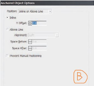
With Position set to its initial value of Inline or Above Line, examine the Anchored Object Options dialog for a moment and its functions should be easily gleaned. If not, don’t sweat it; after this initial exercise, we’ll go through what everything means.

7. For now, check the Preview box at the bottom, and arrange the dialog onscreen such that you can clearly see it and the image we’re working with. Now, set the Position field to its other option, Custom. Your image should jump similar to mine (see Figure C).


8. Check the Relative to Spine option at the top, but leave everything else at its defaults. Hit OK.

9. With the Type tool, return to the story a paragraph or so above the colored text. Begin typing. It can be anything you want, just as long as you add a few lines or a new paragraph. We don’t want so much new copy that the colored text goes into the next column, not yet. As you insert new text, as the colored tracking text is forced to move down the column, you should see the image move down to follow. Hurray!, you’ve just made your first anchored object, an image that will follow a specific place in the text without ever needing to be manually repositioned.

10. Zoom to the point where you can see the entire spread onscreen. Insert a lot more text, enough to push the colored tracking words to the next page across the spread (copying and pasting paragraphs will be much faster than typing).


Where did your image go? Right: it not only followed the text, it swapped sides of the page. That was the effect of the Relative to Spine option I had you check a moment ago. The anchored object alignment was relative to the spine—in this case, using defaults, it was positioned away from the spine. Thus, when the text jumped from a left-read to a right-read page, the anchored object swapped sides of the paper to stay in the outside margin away from the spine.


Now that you’ve got the basic how-to of anchored objects down, pick your jaw up off the floor, and let’s dive a little deeper into this tremendous time-saver.

Corel Painter: The Rule of sixteen

Q: What is "The rule of sixteen" use for

A:
Let’s say you want to print out your storyboard for a big client presentation. There will be several people in the room and you want it to look good from a distance and also upon close examination. A high quality look is important to impress the client. You created the storyboard at 72 PPI, and it looked fine on your monitor. When you printed it out, it looked awful! What happened? There weren’t enough pixels per printed dot to give you a good-looking print. You need higher resolution for print than you do for video. How do you find out how much higher?

You already know it is possible to display 256 levels of gray in RGB. Now you need to know the highest screen frequency (LPI) you should be working at, given the capabilities of your printer. To arrive at the LPI value, divide your printer DPI by 16 and multiply by 2. For example your ink-jet printer has a resolution of 1440 DPI. If you divide that by 16, 1440 ÷ 16 = 90. The rule of thumb is that you need 2 pixels per printed dot to get a nice-looking image from your printer. You will multiply 90 x 2, and set your resolution at 180 PPI. This should give you a full range of tones and a beautiful print on photo glossy paper from your ink-jet printer.

There is no LPI to worry about in video. Video defaults to 72 pixels per inch. The important thing to know is the spatial resolution—the size of the image as measured by its width and height. The screen resolution is going to default to 72 PPI for video and the Web, but you need to know the spatial resolution of your final output, in order to create your animation at the correct dimensions and aspect ratio (the ratio of width to height).


Vocab.
LPI = lines per inch
DPI = Dots per inch
PPI = Pixels per inch

RGB = Red Green Blue

Fabric Decoration, Marbling

Q: What is Marbling?

A:
The origins of marbling are not precisely known, although we have evidence that the Japanese were marbling paper some 700 years ago. According to Japanese legend, marbling was a divine gift, bestowed upon an individual to reward him for his devotion at the Katsuga Shrine.
However, other theories suggest that the origins of marbling were contained in a game, played in the Japanese royal court during the 12th century. The game entailed floating paper decorated with sumi-ink drawing (a freehand method of marbling) on water, the aim being to capture the inks on the paper.

Q: How to use marble?

A:
1. First, it is important that you wash your chosen fabric in hot, soapy water to remove any dressing or grease which may affect the material’s natural ability to accept thedyes. Next rinse the cloth in warm water, squeeze out excess moisture and leave to dry. Using a cool iron, press the fabric flat to remove creses.

2. In a measuring jug or plastic bucket, combine one heaped teaspoon of thickening powder with 1 litre (2pnts) cold water and leave to stand for one hour.
Pour the resulting mixture into the marbling bath, making sure that the depth of the gel measures at least 3cm-5cm (11/2in-2 in)

3. Using an eye-dropper or pipette, drop your chosen inks onto the gel. The different colours will float on the surface of the liquid and spread out form the middle of the bath to the edges. Do not drop too much ink as it will sink to the bottom.

4. When the dyebath is completely swamped with colour, create “veined” patterns on the surface of the gel by gently swirling or combing the coloured inks with the tip of a cocktail stick or paintbrush.

5. Once your are happy with your pattern, gently lay the fabric over the inked surface, taking care that the middle of the cloth is the first area to come into contact with the medium. Let the edges of the cloth fall into place. Wearing rubber gloves, gently touch the reverse of the cloth with the back of your hand to make sure that the fabric lies flat. Avoid moving the material once it is an position or you are liable to disturb the patter,. Since most fabrics are rendered translucent when they are wet, you should be able to see if any areas of cloth have not taken the pattern. If this is the case, smooth out those areas with the flat of your hand.
When the material has soaked up sufficient colour, carefully lift it off horizontally so as not to disturb the pattern. Next that the by all four corners and rinse under cool running water until the cloth loses its slippery feel. Hang the cloth over a clothes line and leave to dry. Finally, fix the paints according to the manufacturer’s instructions.

Equipment and materials

Fabric
Marbling bath
Marbling kit, consisting of
thickener and marbling inks
eye-dropper or pipette
cocktail stick or fine paintbrush
Iron
Rubber gloves
Measuring jug or plastic bucket

Fabric Decoration: Use of Metallic Paint

Q: What is HAND PAINTING?
A:
One of the most versatile methods of decorating cloth, hand painting is becoming increasingly easy to carry out as a wider range of fabric paints, dyes and pen become available to the public. Hand painting fabric has the advantage that you can combine a variety of different techniques and paint mediums on one piece of cloth with exciting results.

Q: How to use metallic paint
A:
1.
First draw your design on rough paper, using the actual colours that you intend to use for your final design. If you don’t have the exact colours, indicate where they should to using a lead pencil.
If you are unable to by silk in your preferred shade, dye a piece of white silk using hot or cold water dyes. Leave the cloth to dry and fix the colour by ironing the reverse of the cloth. When fixing dyes or paints, always use the hottest setting that the fabric can withstand without burning.

2. Cover a work surface with an old sheet to a piece of lining fabric to protect it, then place a backing cloth over the top and secure it with masking tape.
Following the manufacturer’s instructions for quantities, combine the binder with the catalyst. Once the catalyst is added, the mixture must be used within 24 hours. Next, combine the binder with the metallic past in a bowl.

3. Pin the dyed silk securely to the backing fabric and using a soft pencil or a piece of tailor’s chalk, draw your design on the silk to the exact dimensions.
Next, dip a fine paintbrush into the metallic paste mixture and carefully trace over the pencil guidelines. Vary the thickness of your paintbrush according to how heavy or fine a line you want to produce.

4. Once you are satisfied with your painted design, unpin the silk, carefully lift it off the work surface and hang it in a warm room to dry. It is important that you leave the metallic paste to dry for at least 48 hours before attempting to wash the cloth.

Equipment and materials

Scrap paper
Coloured pens
Soft pencil or tailor’s chalk
Old sheet
Backing cloth
Silk fabric
Dressmaker’s pins
Masking tape
Metallic paste
Binder
Catalyst
Bowl
Paintbrushes
Iron
Coldwater or Hot water
Dyes (optional)

Herbs and Spices, Garlic

Garlic

Family: Liliaceae
Annual height: 30cm (12in)
Soil: rich, well-manured, well-drained
Situation: sunny
Propagation: cloves
Main constituents: amino acids, fats, vitamins A, B and C, volatile oil

Cultivation

If you are an avid garlic user, allocate a special sunny plot in the garden that has been well dug and drains well. Add plenty of compost and / or manure, and unless your growing season is particularly short and the weather cold you should get a good harvest. Split the bulb into cloves and plant them (tapering side up) about 5 cm (2in) deep and 10-15cm (4-6in) apart in spring. Keep well weeded and the sun should do the rest. For a longer growing season, plant in autumn and cover with strawy compost. Harvest when leaves die off.

History

The Chinese have used it for centuries and records show that the Babylonians, too, used it around 3000bc. The folklore is endless: Hungarian jockeys used to carry garlic to prevent another horse getting in front; bullfighters wore it to prevent the bulls from charging. A In India it is still used to ward off evil spirits. Throughout its history garlic has had great health-giving properties attached to it. It warded off colds and flus and even the plague. Modern research is still going on, but it shows that garlic has anti bacterial prpperties, can reduce blood pressure, cholesterol, and blood clotting, an is effective against many other diseases.

Preserving and main uses

Store by hanging the bulbs in a cool, dry place, and use individual cloves. It can be used in most savoury dishes with meat, fish, poultry and vegetables, salads and sauces. It is also extensively used in curries and Eastern cousine.

Fabric Decoration: What is batik and how to make a batik?

Q: what is Batik?

A:
BATIK
The word BATIK originates from the Javanese verb AMBATIK, which derives from the word “tik” meaning to mark with dots.

BATICK is a resist method of patterning cloth. The principle of all resist techniques is that a “resist” substance, such as wax or starch paste, is applied to the surface of the cloth to prevent the dye from penetrating to those areas when the fabric is placed in the dyebath.

Some theories suggest that batik originated in China between 474BC and 221BC and that the art then spread eastward to Japan. Today, batik is practiced in many parts of the world including India, Africa, South-East Asia and Europe.

Q: How to make a batik?

A:
1.
Using a thick marker pen, draw your design to the exact proportions on rough paper, then secure your drawing to a flat surface or table with masking tape.
Next, wash out any finish from your chosen fabric, allow it to dry then iron it flat. Tape the fabric over your paper design and, using a charcoal pencil, carefully trace the design onto the cloth. Stretch the fabric over a batik frame and secure it with drawing pins or silk pins.

2. place the wax mixture in a double boiler and heat to a constant temperature of 800C (1700F) over an electric ring. Top up the lower pan with water at regular intervals.

3. Using a paintbrush, apply a generous coat of wax to the white back ground area of the design, making sure that you leave the chicken pattern and borders unwaxed. Hold a piece of tissue in your spare hand to catch any drips from the paintbrush. Leave the waxed fabric to cool.

4. Next, start making up the yellow dyebath. If you plan to use more than one colour, make sure that you start with the lightest colour and then progress to the darker colours. For example, go from yellow to red to green to indigo. Remove thefabric from the frame and wearing rubber gloves, immerse it in the dyebath for at least 30 minutes (refer to the manufacturer’s instructions).

5. Remove the cloth from the dyebath and leave to dry before re-stretching it over the frame. Next, using a fine-nibbed tjanting, apply wax over the areas that you to remain yellow, for example, the feet and the beaks. Leave the wax to dry, then immerse the cloth in the red dyebath. Continue waxing and dyeing in this manner until you reach the final dyeing stage. When you have given the fabric its last coat of wax, screw it into a tight ball in order to crackle the wax, then submerge it in the indigo dyebath.

6. Once you have achieved your desired effect, remove the wax by dipping the cloth in boiling water and ironing it between sheets of paper.


Epuipment and materials

Thick marker pen
Scrap paper
Masking tape
Cotton fabric
Batick stretcher
Three-pronged silk pins or
Drawing pins
Tjantings in various sizes
Paintbrush
Thermometer
Cold-water or reactive dyes
Batick wax
Charcoal pencil
Shallow dyebath
Rubber gloves
Tissues
Electric ring
Double boiler
Iron

What are the basic laws of persuasion?

Q: What are the basic Laws of Persuasion?
A:
Negotiation strategies using the Six Laws of Persuasion
Law of Reciprocity
Limited disclosure/confession of the real reason for a negotiation stance, such as “this is all the money we have,” can provoke a concession from the other party. (This is often seen in salary/promotion negotiations.) Concessions in general follow this “tit-for-tat” rule (the lower the “value” of the concession on your part, of course, the better). You can also use this law to appeal to fairness. For example, if the other party manipulates the physical environment by requiring that your team sits facing the sun, at the next meeting they should reciprocate.
Law of Commitment and Consistency
An example of this tactic would be using a series of questions to conduct the step-by-step close. Dale Carnegie, in How to Win Friends and Influence People, called this, “Get the other person saying ‘yes, yes’ immediately.” This occurs when one party asks the other side to make a number of “small” decisions that lead to only one obvious conclusion: to accept the general concession. You could employ this principle by asking a potential client if she values quality in your product or service. Of course the only answer would be “yes.” Then you could follow with a question that begs the obvious: “We’d love to provide you with this product/service, but if we don’t get the resources we need from you (i. e. sufficient money) and quality suffers as a result, would you still want it?” How can the prospect say “yes” to poor quality? This tactic makes it easier for you to ask for additional funds.You might also see an example of this ploy when lowballing (intentional last-minute additions to what was originally a low price) occurs. Unscrupulous vendors might attempt to make you psychologically “invest” in a product that you initially believe costs less.
Law of Liking
This law is often seen in the strategy of “good cop, bad cop,” where one person in the other negotiating party is clearly opposed to your objectives, but it appears that another of their team members is “on your side.” This causes you to identify with and trust the “good” team member, so you may find yourself agreeing to the other team’s concessions and goals instead of your own. You can see this in situations where a salesperson “battles” their supervisor to get you a “better” deal (of course this was the result they wanted in the first place). You might also apply this law to establish rapport up front when you are negotiating with your own superiors or teams.
Law of Scarcity
The more time you spend with a salesperson, the more commitment he/she has to make the deal. If you are under no time pressure and the other side is, you have the upper hand.
Law of Authority
Vendors often quote vague authorities to sell their wares, “Experts say our product is the best.“ But who are these experts? What are their qualifications to make these claims? Do they have a vested interest in selling the company’s products or services? In addition, use this Law to establish your own credentials/credibility early in the negotiation.
Law of Social Proof
This law works when you draw on testimonials from satisfied customers or clients (unscripted ones are best) to encourage new prospects to buy your services and products. The law also can be used to convince your supervisors or staff that their counterparts in other divisions or companies are following similar suggestions to yours. People want to feel like they are part of an established community that already knows where it is going.
Ethical Issues
Persuasion can be used for good or ill. In an environment that seeks to follow ethical rules, it should only be used to make lives better. Manipulation occurs when you exploit or deceive others solely for your own gain. This does not result in a win-win situation.
Blog Widget by LinkWithin