Search This Blog

Showing posts with label Adobe Indesign. Show all posts

TIP1: Frame Resizing On the Double Click

You've placed an image into a selected Frame and decide afterwards that you'd like the Frame to Fit the whole image. Is there a quick way to accomplish this without applying any menu commands or dragging of bounding box points? If you're using CS3 or later, you're in luck.
Instead of dragging bounding box points, simply double-click on any corner bounding box point. The Frame will instantly resize to the image it contains.
If you double-click on a side center Bounding Box Point, the Frame will resize to fit the Image's width leaving the height of the Frame untouched. If you double-click on a top or bottom center Bounding Box Point, the Frame will resize to fit the Image's height leaving the width of the Frame untouched.

TIP2: Make the Pasteboard Bigger
InDesign's Pasteboard to the left and right of a page are plenty big enough to store design elements, but the default Pasteboard size above and below a page is just 1" tall. To make the Pasteboard taller, go to the InDesign menu (PC: Edit) > Preferences > Guides & Pasteboard and increase the Minimum Vertical Offset in the Pasteboard Options section of the dialog window to any size up to 120". Then click OK to apply.

TIP3: Match Colors on Your Monitor and Your iPad

The iPad has a strange color gamut (range of colors). To get an approximate preview of iPad colors on your desktop, download Christian Albrecht's ICC color profile for the iPad from http://bit.ly/xEI6nH.

Install this profile on your computer and then do the following in InDesign:
1. Be sure that Edit > Transparency Blend Space is set to Document RGB.
2. Be sure that Edit > Color Settings is set to North America General Purpose 2.
3. Choose View > Proof Setup > Custom.
4. Select iPad.icc for the "Device to Simulate" and check the Preserve RGB Numbers option.
5. Choose View > Proof Colors.

The colors on your monitor should now more closely match the colors on your iPad.

Create a support structure for InDesign users

Before you start training QuarkXPress users how to use InDesign, you should develop a support structure for your InDesign users. A good first step is to put together a group of in-house InDesign experts. Make them the first group to receive training). After they’ve been trained, ask them to evangelize the benefits of switching to InDesign and the relative ease of learning the pro¬gram, as well as to provide on-demand training and support. Designate your top InDesign users as the resident experts and task them with collecting and distributing information about product and plug-in updates, common problems, tips and tricks, frequently asked questions, and so on.
In-house support can also include:
• A library of InDesign reference books. Several titles are available, including:
Adobe InDesign Classroom in a Book from Adobe Press (available for purchase at www.adobepress.com/bookstore.
Real World Adobe InDesign CS by Olav Martin Kvern and David Blatner (Peachpit Press).
InDesign CS for Macintosh and Windows: Visual QuickStart Guide by Sandee Cohen (Peachpit Press).
Moving to InDesign: Use What You Know About QuarkXPress and PageMaker to Get Up to Speed in InDesign Fast! by David Blatner, Christopher Smith, and Steve Werner (Peachpit Press).
InDesign for QuarkXPress Users by David Blatner (Peachpit Press).
Adobe InDesign CS One-on-One by Deke McLelland (Deke Press).
How to Do Everything with Adobe InDesign CS by David Bergsland (McGraw-Hill Osborne Media). Adobe InDesign for Dummies by Deke McLelland and Amy Thomas Buscaglia (Hungry Minds).
• Subscriptions to the InDesign Talk mailing list. This free e-mail discussion list, hosted by OmniPilot Software, Inc., lets you post and reply to messages about InDesign. If you have a question or encounter a problem, you can post a message to the list, and you can search the list archives to see if your question has already been discussed. To subscribe, unsubscribe, and search the list’s archives, go to the list’s home page at www.listsearch.com/indesigntalk.lasso?tab1=about&tab2=lists.

Other support resources
In addition to the in-house support resources you provide, you can also point InDesign users to support options available on the Adobe website:
• Adobe CustomerFirst Technical Support offers two pay-as-you-go support options: (1) Per minute. Pay $2/minute. The cost is charged to your phone bill. For the Windows version of InDesign, call 900-555-2200; for the Macintosh version of InDesign, call 900-555-3300. This option is available only in the U.S. (2) Flat fee. Pay $25 per incident. For the Windows and Macintosh versions of InDesign, call 206-675-6126. Adobe CustomerFirst Alliance support plans let you purchase one year of toll-free support. Several options are available. For informa¬tion, call 800-685-3652.
• The Adobe InDesign Support page on the Adobe website (www.adobe.com/support/products/indesign.html)
includes links to top support issues, tutorials, support-related announcements, and user forums. You can also subscribe to an InDesign RSS (Really Simple Syndication/Rich Site Summary) feed to receive current support information.
• The Adobe Support –User to User Forums home page at www.adobe.com/support/forums/main.html
includes links to user forums for all Adobe products. These forums let you share questions, suggestions, and information with other Adobe software users around the world.
• InDesign User Group chapters have formed in major cities throughout the United States. The InDesign User Group home page at www.indesignusergroup.com/
has links to each of the InDesign user group chapters, as well as a link for meeting topic archives. The archives include meeting notes, presentations, and documents. The home page also includes links to other InDesign-related resources, including news and events, tips and techniques, and services and support.
Leveraging your legacy documents
Although InDesign can open some QuarkXPress documents, the recommended best practice for ad agencies with legacy documents is to rebuild them using InDesign. Attempting to convert a potentially corrupted QuarkXPress document and then making it the foundation for years of future work can lead to unexpected results and other problems. After years of use, QuarkXPress documents can become bloated with unused and unnecessary fonts, colors, and style sheets, as well as other unneeded objects and information. Building new documents and templates with InDesign is a good way for new users to learn the program and ensures that you’re starting out with clean, correctly constructed files.
Opening a QuarkXPress document with InDesign isn’t the only way to move content between the two programs. Here are some other options:
• Save Page as EPS. If you need to use a single page of a QuarkXPress document in an InDesign document and you don’t need to modify any of the page’s content within InDesign, you can use the Save Page as EPS command (File menu) in QuarkXPress to save the page as an EPS file, and then use the Place command (File menu) to import the file into an InDesign document.
• Export Document as PDF. If you would rather work with PDF files than EPS files, you can use the PDF export feature in QuarkXPress to create a PDF file of the pages you want to place into an InDesign document.
• Copy and paste. If you need to move text from a QuarkXPress document into an InDesign document and you don’t need to retain the formatting, you can use the Copy and Paste com¬mands. You can also copy and paste pictures, but in most cases you shouldn’t use this method because the link to the original graphic file is not maintained. Use copy and paste only for pictures that have no disk file (for example, screen captures).
• XML. You can export XML from QuarkXPress and import the XML file into InDesign.
Converting versus recreating QuarkXPress documents
If you’re thinking about converting QuarkXPress documents into InDesign documents, you should begin by doing some experimenting. In general, the longer and more complicated a QuarkXPress document, the more likely you are to discover differences when you open the document in InDesign. If possible, it’s best to recreate your QuarkXPress documents using InDesign. In addition to being an effective way to learn to use InDesign, recreating documents eliminates the possibility of conversion-related problems.
If you choose the conversion option, keep in mind that the process of converting everything in a QuarkXPress document—text formatting, graphics, character and paragraph styles, master pages—is not an exact science. While the programs are similar in many ways, there are also many differences. At best, a QuarkXPress document that’s opened with InDesign is a starting point. You may discover that you need to modify the InDesign document to make it match the original QuarkXPress document. In some cases, you may find it easier to recreate a document than to find and change all of the differences.

Book File Portfolio Eases Proposal and Bid Generation and Provides a Competitive Edge

Book files are useful for many things. For example, a designer (me) who values economy of motion might connect a dozen separate portfolio pieces together via a Book file. The portfolio documents wouldn’t be sequentially numbered and certainly wouldn’t want style synchronization. However, instead of opening and printing each of the 12 documents individually, documents that are most likely spread throughout numerous folders on the designer’s computer, you can print the entire portfolio, exported to PDF, or packaged with a single command—possibly without opening even one of the documents.

I do this very thing, as a matter of fact. Often, as part of a project bid, I’ll be asked to send samples of my previous work. Like most of you reading this, my body of work is broad and varied, but a client or prospective client only needs to see what is relevant to the project at hand. You wouldn’t, for instance, send photos of product packages you’ve designed to accompany a proposal to design a travel agency’s intranet website. Each set of work samples should usually be a subset of your entire portfolio, with pieces chosen specifically to convey to the client, I know how to do the job you want done. See? I’ve done similar work before to the benefit of other clients.

Some of my previous work is in native InDesign documents, some in QuarkXPress documents, some in Illustrator, PDF, websites, scans, image files, and so on. I include all of them in an InDesign Book file. QuarkXPress documents I convert to InDesign just for the portfolio, for websites I take screen shots, and for all other assets, I simply place them into their own InDesign documents. All of these purpose-built INDD documents reside in a single folder with the INDB Book file, but the pieces that are natively InDesign, as well as the placed assets, remain wherever they happen to live on my hard drives—client folders, other project folders, and so on; the Book file will happily manage them from multiple locations.

All the pieces I might want to send along with any proposal or request for samples are added to, and managed through, a single Book file. When I need to print or create a PDF to accompany a proposal, I choose the relevant pieces, select them individually in my portfolio’s Book panel, and then choose Print Selected Documents or Export Selected Documents to PDF from the panel’s flyout menu.

For instance, if I’m proposing a magazine template design, I include only my previous magazine work; if I’m bidding on an advertising job, I include primarily ad-centric prior work; and so on. I selectively choose which pieces to include from the Book panel that includes all of my portfolio pieces. When I output, the result is a single print job or PDF, displaying only what I want included and nothing I don’t, without the hassle of hunting down and printing each piece individually or converting each to a PDF and then combining PDFs. Naturally, in addition to being less work, it’s faster to open a single file—the INDB—select a few entries, and then choose one menu command—than to deal with the documents individually. Thus I can nearly always get a PDF of selected pieces in front of a prospective client’s eyes while we’re still on the initial phone call. And that gives me an edge over any competitors the client called before me, competitors who promised to get some samples together and off to the client the next day or even later in the same day.

Using the Ink Manager to Correct Photoshop Channel Disasters

Every few months I see in person or read about in online forums someone who, through some weird accident, wound up creating a two- or three-color image in Photoshop using a dozen or more channels. In the document’s Channels panel, he has multiple channels (plates) for each of the two or three spot colors. Why is this a disaster? Because each of those channels will be treated as a separate plate, turning a 2- or 3-color job into a 10- or 12-color job; the price of printing goes through the roof, as does the poor pressman who has to run the thing. The worst I ever saw personally was a two-color PSD with 14 channels for a single spot and 11 more for the second color. As near as I could figure, the designer, whom we’ll call Jane, had mistakenly used channels like layers, creating a new channel for every new object or section of color while she painted.

When these types of Photoshop images pop up, there isn’t a great deal that can be done to fix them within Photoshop. Sometimes cutting all image data off the extraneous channels one at a time and pasting onto a single target channel works, sometimes it doesn’t. Splitting the image into two, one to hold each color, merging the channels down into a single channel each, and then reconsolidating the images also works once in a while. Converting the image to grayscale and then back to duotone in Photoshop consolidates the channels easily but destroys the original color separations and usually requires copious recoloring work.

InDesign’s Ink Manager has provided the solution to Jane’s problem via ink aliases. If you find yourself dealing with such a Photoshop document, place it into InDesign and output from there.

Select one instance of each doppelganger ink as the primary, and, using the Ink Manager, alias all the others to their primary. Upon output, you’ll have just one plate for each color. Often images such as those previously described are set in multichannel color mode, and InDesign does not support placing PSD images in multichannel. InDesign only handles images in the CMYK, RGB, and Lab color spaces.

To get around the limitation:

1. Re-open the image in Photoshop.

2. On the Channels panel, create four empty new channels, and drag them to the top of the channels list.

3. Convert the document color mode to CMYK via Image >Mode >CMYK Color. The conversion will automatically turn the four empty channels into empty Cyan, Magenta, Yellow, and Black channels. Spot channels—the ones containing all the image data in this case—will be preserved, and upon save from Photoshop, InDesign will now be able to import the image.

Note: If the image will be the only content of the InDesign document, you’ll wind up outputting blank

C, M, Y, and K plates. When it’s time to output, disable printing of the cyan, magenta, yellow, and black inks in the Print dialog Output pane.

Often when channel disaster images are made, they contain several identically named channels (e.g., PANTONE 462 C). Photoshop doesn’t care that these are the names of spot colors, only that they’re the name of channels, which is what leads to this problem in the first place. InDesign, however, does care about taking in two or more spots with the same name, and it will complain, preventing you from importing the image. If you get this, just go back to Photoshop’s Channels panel and rename the duplicate channels to something like PANTONE 462 C copy 1, PANTONE 462 C copy 2, and so on. This will also make it easier to identify the target and aliased colors in InDesign.

Once correctly aliased, the extra inks will disappear off the Separations Preview panel, leaving only one of each ink.

Interact with Documents

Interact with Documents Visually, Change Zoom Level, View Modes, and Display Performance
InDesign provides numerous means of changing the way you interact with documents, how fast they move, how you see them, and what you see.
Master It Open any InDesign document containing text and images on the same page. Open three different views of the same document, arranged simultaneously onscreen, zooming all to fit the page within the document window, and compare the views according to the following options:
· View 1: Preview mode with High-Quality Display display performance.
· View 2: Layout mode with Fast Display display performance.
· View 3: Bleed mode with Typical Display display performance.
Solution Learners should open a document and then, using the Window >Arrange >New Window command, create two other views on the same document. They should then manually arrange the trio comfortably onscreen, and by changing the View >Display Performance setting and the different modes at the bottom of the Tools panel, establish the comparison described above.
Build and Manage Grids and Guides The foundation of any well-laid-out document is a well-thought-out grid.
Master It Create a new document and build a grid on the master page consisting of six equal columns and three equal rows within the page margins. Once that’s done, apportion the top row into three equal sections.
Solution Learners should use the Layout >Create Guides utility to create the initial grid with six and three, no gutters, and Fit Guides to Margins. Next, to divide the top row, they will have to manually drag down two horizontal ruler guides. After unlocking guides, they will precisely position the new manually created guides with the Transform or Control panel’s Y field.
Create and Manage Book Files Often one person finds it easier to work on longer documents by breaking them up into chapters or sections and connecting them via a Book file. For workgroups wherein different people are responsible for different sections of the document, a Book file is essential to productivity.
Master It Working alone or in a group, create at least three InDesign documents of several pages of text each. Save each document, and then create a Book file to connect the documents. Finally, create a single PDF from the entire book.
Solution Learners should preferably team up to create InDesign documents and then designate one individual to create the Book file. Once the book is set, the Export Book to PDF command should be chosen from the Book panel flyout menu.
Index Terms and Create an Index An index helps readers find content. From simple keyword lists to complex, multilevel, topic-driven indices, InDesign handles them all, marrying index entries to referenced text through index markers.
Master It Open or create an InDesign document containing a story of at least three pages in length. Working through the document, create index entries and cross-references for at least 10 words, one of which should be a word that repeats numerous times throughout the story (use a common word such as the if needed). Once the terms are indexed, generate and place the index story on a new page.
Solution Learners may take several routes to accomplishing the indexing depending on the story and words chosen, although their methods should conform to those described in the sections “Creating Index Entries,” “Cross-References,” and “Power Indexing” under “Indexing” in this chapter. With all the options available to them in the Generate Index dialog, the final output will likely vary as well from learner to learner.
Create Tables of Contents Tables of contents direct readers in logical or virtually any order to content, and InDesign’s TOC options are varied and powerful for myriad uses.
Master It Open or quickly create a rudimentary book-style document containing body text and several heading paragraphs utilizing at least two levels of headings. Create and assign paragraph styles for the body text and headings. Using what you’ve learned in this chapter, generate and place a hierarchal TOC.
Solution Before beginning with the Layout >Table of Contents command and the corresponding dialog, learners should create a document that has text and styles in the format of Heading 1, Heading 2, and Body Text, with several paragraphs of each style. Then, in the Table of Contents dialog, the Heading 1 and Heading 2 styles should be moved into the Include Paragraph Styles list, assigned Levels 1 and 2 respectively, and then the TOC placed into the document. The other options available for formatting the TOC will vary by learner.

Efficiency with InDesign

Work Efficiently with Text Text comprises the most space in the average InDesign document. Unfortunately, editing and restyling text occupies the majority of a creative’s time in the document. Used wisely, paragraph and character styles, nested styles, text variables, and data merge eliminate repetitive actions and hours of work.
Master It Use Excel, a database, or Notepad/TextEdit to create a new flat-file database of information. The data may be anything you like—a mailing list, product listings for a catalog, directory listings, etc.—but should include at least three fields and three rows. Save the file as either comma or tab delimited; this will be your data source file. Beginning with a blank InDesign document, build a variable data target document to hold the records from the data source file. Include static information as well as field placeholders. Format all text—static and placeholders—and create paragraph and character styles to make the initial and follow-up formatting easier. If you have appropriate places to employ nested styling, do so. When the target document is ready, effect a data merge to generate a press-ready variable data project.
Solution Owing to the multiple steps and complexity of this exercise, a great deal of variance in learners’ results is to be expected. Upon completion, the learner should have a merge document with all data correctly imported. Additionally, all text in the document should be assigned to paragraph and/or character styles.
Work Efficiently with Tables Barring additional investments in third-party plug-ins, each table created in prior versions of InDesign had to be individually and manually formatted. The more creative the formatting, the more arduous the task of styling multiple subsequent tables to match. New table and cell styles make it a one-click operation to format tabular data and to instantly update all tables to match future formatting changes.
Master It Begin with a table of data. If you have tables in preexisting InDesign documents, use those (save the document under a different name, just in case). If you don’t have such documents already, create a new layout and add at least two tables; the sports or financial sections of today’s newspaper are excellent places to find tabular data you can use for FPO. Style one table with alternating fills, custom strokes of your choosing, and with appropriate text formatting using paragraph styles. When the first table is styled to your liking, build table and cell styles, and then use them to format the second table.
Solution Results will vary, but learners should end up with two (or more) identically formatted tables. Additionally, all text within the tables should be assigned to paragraph styles and cell styles.
Work Efficiently with Objects Working efficiently doesn’t end with text and tables. Graphics, paths, and containers are part of any InDesign document, and creating and editing them productively is also important to the efficient InDesign-based workflow.
Master It Using either your own or a client’s various media logos (RGB, CMYK, grayscale; with and without taglines; iconic and full logos; and so on), build a shareable, reusable logo library. Now create a second library of text frames and other objects you use at least occasionally. Make sure to give each an object style before adding them to the library so that other objects can quickly be styled to match and so that formatting changes don’t take too much time. Don’t forget to label objects in both libraries for rapid identification and filtering by you or your coworkers.
Solution When finished, learners should have two INDL libraries. Every object in each library should be labeled. The majority of objects in the second library should have object styles assigned to them.

What is Linking vs. Embedding in InDesign?

A. Linking vs. Embedding

When you embed assets in a layout, you put all your eggs in one basket.
If one file gets corrupted, all your work is gone.

Embedding assets is tempting, and I see many new creatives opting for it. They’re tempted by the fact that embedding means fewer—or no—external assets. They like the idea of having just one file to move around, never having to worry about network paths remapping or forgetting to copy PSD from this other folder onto their USB drives to work on the layout at home.

Sure, a layout with all or a significant portion of its imagery and copy embedded is easier to deal with, easier to manage, and easier to send to a thumb drive or DVD-ROM, but it’s not worth the risk. Eggs. Basket. Splat. Weeks of work oozing out all over the linoleum. I like being right as much as the next guy, but I hate being proven right on the linking versus embedding debate. It truly saddens me when somebody comes up to me long-faced at a conference and begs me to help him fix a corrupted document wherein he has embedded all his images.

Sure, I know a few tricks I can try (most are somewhere in this tome), but it’s a rare occasion when they work; if all the safeguards have failed, there just isn’t much to be done to resurrect a truly corrupt INDD. At that point, it’s a matter of re-creating the document. If all the assets are external, the work is lot less than if they were all embedded and must also be re-created from scratch.
If that doesn’t dissuade you from embedding assets, maybe this will: Remember the urn? If you embed, you potentially lose the ability to quickly and easily edit original artwork. Images placed as links and then embedded can often be extracted back to an editable state, but artwork brought in via paste or drag and drop from an application are instantly frozen into EPS or TIFF formats— good-bye live effects, good-bye layers, good-bye to a lot of stuff.
Opinions differ on the linking versus embedding debate. Some—including a few gurus whom I admire—say embedding is fine, that there are enough safeguards in place with InDesign’s Saved-Data and extremely stable file format. In my experience, having done page layout and compositing for all these years, having looked into the faces of misty-eyed owners of unopenable documents, and having researched enough technical support cases wherein months’ worth of work was lost due to a simple power surge or mistimed network backup, embedding anything that will take longer than 5 minutes to re-create—cumulatively—is, in my opinion, a bad idea.

How to Copy and Paste in InDesign?

A. Copy and Paste
Naturally, you can copy frames and their content, together or separately, from within InDesign and paste elsewhere within InDesign. You can copy type from the middle of a story and paste it, too. I won’t waste your time talking about something as academic as that. I would like to spend a few paragraphs discussing what can and can’t be copied into InDesign from other applications and some of the things to watch out for when doing that.

InDesign’s drawing tools are perfect for most common drawing tasks. When you need something a little more robust, however, haul out Illustrator. When you do that, you have a choice: Save the Illustrator file and place it into InDesign as an asset, or simply copy the artwork from Illustrator and paste into InDesign. Both methods works, and each has its pros and cons. InDesign understands vector paths and basic shapes about as well as Illustrator, and, more importantly, InDesign is wise enough to recognize when something—in this case, Illustrator—is more knowledgeable than itself. Take, for instance, live effect 3D objects created in Illustrator. InDesign is a page layout application; it has no concept of 3D space beyond x and y coordinates and basic stacking order.

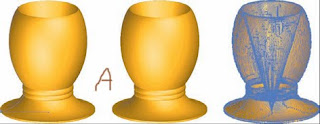
Draw a path in Illustrator, apply a 3D Revolve effect to spin the path into a vase or ashtray, and the path remains infinitely editable (because it’s a nondestructive effect in Illustrator). InDesign, however, doesn’t have a 3D Revolve effect, has no concept of lighting—three-dimensional or otherwise—and just doesn’t get it. Consequently, you might expect that copying the 3D object from Illustrator and pasting into InDesign would result in just the original path, sans 3D, in InDesign. Fortunately, if that’s what you expected, you’d be wrong.


In Figure A, you can see three versions of an urn. In Illustrator, I drew a relatively simple path (highlighted on the left) and revolved it into a 3D urn. This is a live effect—I can change the path at any time and the 3D Revolve effect will update the three-dimensional shape to match my changes. The center version is the same object copied from Illustrator and pasted into InDesign. Notice how it looks identical? What really happened is that the 3D effect was converted to flat paths, maintaining the object’s appearance by sacrificing the reality. If I ungrouped the paths in InDesign, I’d be left with hundreds of little slivers, which you can see as individual paths in the picture on the right. That one is the object copied in InDesign and pasted back into Illustrator. The ability to edit the 3D shape easily is gone; if I needed to change the shape or color of the urn, I’d have to spend hours doing it. In this case, I’d re-create the object from scratch, hoping I remembered or could re-create the exact 3D Revolve settings, light source positions, and so on. Odds are, it would take me less than five minutes to re-create the urn; with something complicated, though, I could be looking at hours or days worth of redrawing time just because I thought copy and paste would be faster initially.


There’s the pro and the con: You can copy native objects from Illustrator and have them become native objects in InDesign—no rasterization. Draw a couple of rectangles or stars in Illustrator, paste them into InDesign, and you can edit their paths further there. You can also change their colors and transparency, move around the constituent objects in a group pasted in, and so on. However, if you get something InDesign doesn’t understand—like the 3D urn— InDesign will make it understandable and could thereby reduce or eliminate your ability to later edit the object.

If it takes more than 1 minute to draw in Illustrator, I’ll save the AI file and place it rather than copy and paste to InDesign. I would much rather retain editability of a drawing than worry about managing one more external asset.
The same is true of Photoshop images. While you can copy and paste from Photoshop to InDesign, and it’s great for little bits here and there, you lose a lot. The first to go is transparency; pasted images are flattened onto a white background. Not even InDesign’s Object>Clipping Path>Option command will get rid of the white. The same is true if you drag one or more layers from Photoshop and drop them into InDesign. Other things to watch out for include transparency—Illustrator transparency flattens upon paste or drag into InDesign—and color. Both Illustrator and Photoshop support color models InDesign does not, like Web-Safe RGB, HSL, and Grayscale. The latter will become tints of process black (the K in CMYK), while the former two will convert to the RGB color space. Spot colors survive unless they’re from a library InDesign doesn’t have, such as Visibone2, in which case they’re-converted to the nearest match CMYK process values. Simple Illustrator gradients—linear, radial— will convert to InDesign gradients and may be edited after paste, but more complicated ones or gradient meshes become individual vector paths in InDesign (think of the urn). Illustrator patterns become embedded EPS images and are no longer editable.

Objects or elements coming into InDesign via paste or drag and drop will be permanently converted, whereas placed assets only appear within InDesign using that application’s supported color models; the actual colors and spaces will survive unchanged inside the external assets and thus through to output. This can also be a gotcha: An image saved in HSL (Hue, Saturation, Luminosity) will look RGB in the layout, enticing you to forget that the asset is not RGB, and may later cause problems with a RIP that doesn’t know how to convert from HSL. Preflight and Package for Print will pick up on the color space and alert you, though, so keep an eye on those.

Text from nearly any application—including Photoshop and Illustrator—can be pasted into (or from) InDesign, though, by default, text will lose its formatting upon paste. Back on the Clipboard Handling pane of InDesign’s Preferences, you can change that behavior by toggling the setting for When Pasting Text and Tables from Other Applications to All Information instead of the default Text Only.

Other Flavours of Paste
No, I don’t mean to discuss the chunky white bottled paste we found so delicious as pre-nap snack in kindergarten. I mean Paste without Formatting, Paste Into, and Paste in Place. They aren’t strictly for getting assets into InDesign, but at this point in the discussion, they are relevant. When the Clipboard Handling preference is changed to preserve formatting, swatches, styles, and so forth on pasted text, there is a way to override it and paste unformatted text per instance.
This same method is very helpful for copying and pasting from one place or document in InDesign to another.

On the Edit menu is the Paste without Formatting command. Instead of using Cmd+V/Ctrl+V to execute a normal paste, use Cmd+Shift+V/Ctrl+Shift+V to paste text without any formatting. Pasted text will then take on the attributes assigned to the frame or surrounding text, including style, formatting, color, and so on. Just below that command is Paste Into, which is a nifty command to know when you want to accomplish one of these tasks:

> Paste one container (with or without content) inside another container
> Move or copy an image (or text) from one frame to another without having to go through a fresh place routine
>Clip or mask a group of objects by pasting into a frame in the shape of the desired mask

Next is Paste in Place. Copy an object, then choose Paste in Place to put a duplicate directly above, and perfectly aligned with, the original (there is no Paste Behind as in Illustrator). Also, less obvious, is that Paste in Place doesn’t so much paste one copy atop the original as it does paste the copy in the exact same place as the original. Huh? Six of one thing, half dozen of the other. No, it’s not the same thing. Copy an object. Now, go to the next page. Paste with a standard Cmd+V/Ctrl+V. What happens? The pasted object shows up dead center of the document window. Change your view— scroll around, zoom—and paste once more; again, the object is dead center of the document window. Now, paste in place instead. The copy is pasted at the exact same coordinates as its original, the source from which the copy was made. The advantage to using Paste in Place instead of a standard Paste (or Edit >Duplicate for that matter) is that it does almost the same thing, but there’s no need to also manually position the copy. You can run through an entire document, blindly using the paste in place keyboard shortcut, and know that the object is inserted in the exact same position on every page

How to Place One InDesign file Into Another?

A.
You can now place one InDesign file into another. That’s not the same as merging two InDesign documents, A common practice, especially among QuarkXPress-based publishing workflows, is to export a layout page as EPS and then place the EPS inside the same or another layout—a picture of a page within a page. It’s the way to do, for example, cover shots in magazine “Letters to the Editor” or “In the next issue” department pages.

While the QuarkXPress method of saving/exporting a single page to EPS and then replacing has worked for many, many years, and despite the fact that InDesign can do it the same way (File >Export, choose EPS, JPEG, SVG, or PDF format), there are significant drawbacks to that method.
Specifically these:

- It’s one page at a time export. If you need images of every page of a 32-page publication, you have to repeat the process—go to the page, ensure it’s the current page, select File > Export or File >Save Page as EPS, name the file, click Save—32 times.
- It’s one page at a time import. To place those 32 pages, you’ll have to do it 32 times.
- Exporting pages creates a whole new file—more assets to manage, more likelihood of missing or corrupted files, and more potential RIP problems.
- Exported pages are copies, not the original pages. If the actual layout of the page design changes—say, at the last minute, the cover shot for the next issue changes—you must rebuild and replace the EPS of pages, again, one at a time.
- Exported images are EPS, an obsolete format. Although InDesign does a great job with EPS previews, as do recent versions of QuarkXPress. Even QuarkXPress, the application that pioneered the methodology, didn’t, prior to version 6.5, include a screen preview that could be considered reliable relevant to the print output.

Most of us have learned as a matter of necessity to work around the drawbacks, but now, why
bother? InDesign CS3 solves all these drawbacks and problems:

- Problem: It’s one page at a time export. Solution: There is no export; just save the source INDD document.
- Problem: It’s one page at a time import. Solution: Importing InDesign INDD documents is exactly like importing PDFs, with an identical dialog and the ability to import one, all, or a range of pages, which will place sequentially from the on-deck place queue just as with multipage PDFs.
- Problem: Exporting pages creates a whole new file. Solution: There is no export and no additional assets to manage.
- Problem: Exported pages are copies, not the original pages. Solution: There is no export. When the source INDD changes, update linked assets to reflect those changes in the placed instance(s) within the current layout.
- Problem: Exported images are EPS, an obsolete format. Solution: There is no spoon, Neo.

You can place one InDesign document inside another, although you cannot do a “hydra import,” an asexual import wherein the same InDesign document is placed back into itself as an asset. If that’s what you need, consider your options. Longer documents can, for other reasons as well, often benefit from splitting into multiple files coupled by an InDesign Book. With a Book tying them together, styles and swatches can remain synchronized, as can page and section numbers, and all documents in the publication can be printed, packaged, and exported to PDF simultaneously, just as can a single document. If a Book doesn’t makes sense for your document yet you still need to place a page from the current document as an asset on another page, save the asset version as a separate, complete copy of the document. Then, if the source page changes in the final deliverable, just make a new copy of the master document, overwriting the asset version, and update links. That is still more reliable and faster than taking the route of export to EPS, JPEG, SVG, or PDF; it does result in a larger package for print, though.

from ProfesorAZii (Asif Zamir)

How to Create A word template from a Quark or InDesign File?

A.
- From within QuarkXPress, select File / Save Page as EPS
- From within InDesign, select File / Export / Format: EPS

- Open the EPS in Adobe Illustrator then File / Export / select “Tif”. Select the check box in the Tif Options window for IBM PC and Resolution of 300 dpi. Check your tif file size in Photoshop. An 8.5x11 should produce and 8.4x11 but if it dowsn’t go back to your eps and add blank boxes in the 4 corner of your page. Also anything bleeding off your page margins will be included in your tif giving you additional page size.

- Open a Word doc, View/Header and Footer


- Before placing in your graphic, decide if you want this image to appear on consecutive pages. If you do, proceed to the next step. However, if you want page 2 to be blank, click on File / Page Setup, under the Layout tab define your Section start as New Page then, right below that, check the box labeled Different first page / OK.

- Place your curser within your Header or Footer and Insert / Picture / From File, browse to find your tif file / Insert. You want to add your image to the Header or Footer so the user will have less access to tit and less change of accidentally moving it later.

- To position you tif within you Word doc, click on the image, then in your Picture toolbar click on the icon that looks like a square with a yellow diamond in the center and scroll down to select Edit Wrap Point. Now when you click away from your image, then back to it. You should have open squares for endpoints. Now from the top of your page select Format / Picture.

Click through these tabs that appear in the Format Picture window:
Size: set height and width to 100%.
Position: Horizontal – 0, Vertical – 0, From: Page, From: Page. This works if your page size in Quark and Word are the same, if you are positioning something that’s multiple up these will need to be adjusted, and will be different for each image.
Wrapping: select None

- Once the image(s) is placed, get out of Header and Footer. Open the Word template for L01 or L02 and copy the text that reader . Go back to your document and Edit / Paste. To more precisely position this text click File / Page Setup and click on the Margins tab. By adjusting the margins your type will shift.

- Save your file and try it. Enter enough text and return to generate a new page. If after your first return you find yourself on the 2nd page, go back to Header and Footer mode, select your graphic, Format / Picture, Select the Wrapping tab and re-select None. The problem in that your text is trying to jump over the image.

Note: the placement of text on page 2 will be identical to page1. If the customer desires a different placement of page 2 they will need to adjust the margins for that new section themselves once that new section has been generated.

- Save you file as a Document Template (.dot) and send to customer for proof. Ask if they would like this stored on the Logos and Stationery database.

What is ICC Profiles?

ICC Profiles
ICC profiles describe the possible range and unique color characteristics of a given device (hardware or software). For instance, if your digital camera oversaturates yellows by 6% (thus, under saturating the opposite of yellow, blue, by the same amount), the ICC profile will state that defect. With that knowledge, the CMS can then pass on to other devices further down the line the instruction to swing the yellow-blue pendulum back 6% into the blue area. Thus, even though your very first step is flawed at creation time, the CMS compensates for the flaw (without actually altering the image content) to produce onscreen and printed color free of the defect and true to the color of the subject of the photo. Even while you work on a flawed image, the CMS will be actively compensating, adjusting the results of your manual editing to account for the actual yellow over saturation—an over saturation that you won’t see because the CMS, running Photoshop and your monitor, have compensated for it to display for you corrected colors. In the plainest English, a CMS does all the hard math for us. Where do these Rosetta stones come from?

Each and every color-handling device renders color slightly differently—even two of the same model. At this moment, for example, I’m using dual monitors. I ordered them from the manufacturer simultaneously, and they both carry the same lot number and date of manufacturer stamped on the back. From this information it’s reasonable to infer that they were made if not one right after the other, then at most only a few units apart. Despite that, they render colors differently. The one to my right shifts grays a shade or two onto the warm side. It also does a better job with midrange cyans and greens than the monitor on my left. I know because I’ve calibrated and profiled them.
Calibrating
Calibrating is the process of getting something as close as possible to its full color potential.
To calibrate your monitor(s) on Mac, use ColorSync in Control Panels. On Windows, it’s Microsoft’s feature-poorer Image Color Management (ICM) user interface. The way to get to and configure ICM has a tendency to change over versions of Windows, so rather than walk you through four or five different methods, the fastest way is to press WIN+F1 on your keyboard and search for the phrase “color management.” Once your monitor is calibrated, you should create an ICC profile for it (or them), which is the last step in both ColorSync and ICM. InDesign and other Creative Suite software will then pick up and use the monitor profile from ColorSync or ICM, compensating for the unique characteristics of your monitor as you work.

Both ColorSync and ICM rely on your eyes to determine color, gamma, and white and black points, but your eyes aren’t reliable color gauges. They can be influenced by ambient conditions like other lights in the vicinity, how long your monitor has been switched on, monitor light reflected off other surfaces, and the unique physical aspects of your eyes themselves. The configuration of rods and cones in our eyes are as unique as our retinal patterns. For instance, 10% of men and 1% of women have some form of color blindness, profound or subtle, and many never even notice it. Calibrations by eye—and the profiles created thereby—should be considered approximations, not accurate determinations of unique monitor color rendering. To get an accurate description of how the monitor interprets color, you need to take the subjective human out of the equation.

A software-backed hardware device that attaches to monitor screens is the best way to profile a monitor (and often calibrate in the same process). That device is a colorimeter. Note that device color characteristics change over time and should be profiled again often (monthly if not weekly).
To measure the color characteristics of a printer—anything from desktop to proof printer to digital press—use a spectrophotometer. This hardware device examines printed output, determining color fidelity on the printed page. If you go to your local Home Depot, you’ll find a spectrophotometer behind the counter in the paint department. Although they often only know it as the “paint matching scanner thing,” the folks at Home Depot use it to extract eight-color tint formulas from paper and other physical objects.

When it comes to profiling a printer, it gets a little more complicated. You see, a printer—inkjet, laser, web press, offset press, everything—lays down ink that is, more or less, the same color across all jobs and production floors. Cyan, magenta, yellow, black, Pantone colors, and all the other inks we use are predictable in their color and, for the most part, identical from one shop to the next. However, ink color is not the only factor when it comes to printed color. Equally important is the color of the substrate, or paper stock, on which ink is printed. Cyan, magenta, yellow, and many pre-mixed spot inks are semitransparent and are therefore tinted by the color of the substrate beneath. Laying down 100% cyan ink coverage on pure, neutral white substrate gives you pure cyan. However, putting down 100% cyan ink coverage on yellowed parchment yields a sea foam green. If you want to see pure cyan atop yellowed parchment, your software has to be told that fact so it can adjust the colors to compensate for the tint of the substrate. Thus, every time you print on a new substrate, you should use a new ICC profile built specifically for that output device and substrate combination.

When you don’t have direct access to the color rendering device—for example, your print provider’s devices or if you vended out your oversized scans—and therefore can’t profile it yourself, ask the service provider for the most up-to-date ICC profile for the relevant device (on the substrate you’ve chosen). ICC profiles are just ASCII files with an .icc (or .icm) extension. They’re easily emailed as attachments. Once you receive them, drop them into the correct system folder:

Mac: /Library/ColorSync/Profiles
Windows: \Windows\system32\spool\drivers\color

InDesign and other color-managed applications and technologies will automatically detect and make available in the Color Settings dialog (see below) profiles stored there, although you may have to restart the applications after installing new profiles. Once the profiles are recognized, you’ll need to actually tell InDesign or whatever application you’re using to use the new profiles.

By telling your creative tools about the color characteristics of your print devices, you can work in software like InDesign confident that what you see onscreen will print fairly close to the same way. Once your creative software knows your monitor, output, and input (digital camera, scanner, etc.) profiles, you will have achieved predictable color and a color-managed workflow.

Q: How to make a Book in InDesign?

Books

InDesign is ideally suited to working with longer documents, but longer documents are not ide ally worked upon as a single document. Rather, they are easier, faster, and more securely worked on by one or multiple compositors or designers as a series of documents connected via an InDesign Book file. A Book file, in InDesign parlance, is a connection between otherwise separate InDesign documents. That connection allows the multiple documents to be treated and managed as a single, cohesive document—a book—including page numbers that run sequentially from one to the next and the ability to preflight, print, and export to PDF all documents joined by the Book file as a single unit.

Begin a Book File

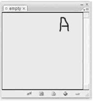
Create a new Book file by choosing File > New > Book. When prompted, specify the location and name of the INDB Book file. Typically, the Book file should be named after the project title, and saved in the same location as the documents that are or will be components of the project. When you click Save, the Book panel will appear (see Figure A).


As with the Layers panel, the major area of a Book panel is a list, in this case a list of documents. Add documents to the book by clicking the Add Documents plus button at the bottom, which will generate an Open-style Add Documents dialog. In Add Documents, browse to the InDesign documents you want to add to the book. Multiple documents may be added concurren tly using standard multiple selection modifier keys such as Cmd/Ctrl to select non-sequen tial files and Shift for sequential selections. Click Open and the selected document(s) will be added to the Book panel . Additional documents, including those in other folders or on other disks, can be added to the book the same way. The Book file, not their respective locations on disk, ties them together.

Although a Book file can only manage a single book, any given document may belong to any number of Book files. If any documents were created by earlier versions of InDesign, or are InDesign Interchange Format INX files, checking Automatic Document Conversion on the panel flyout menu will convert documents to CS3 format while adding them to the Book file. Remove documents from the book by highlighting them and clicking the Remove Document minus sign button. Save changes to the Book file by clicking the disklike icon at the bottom or choose Save Book or Save Book As from the Book panel flyout menu. To open a document that is part of a book, double-click the document in the list.

Page, Chapter, and Section Numbering

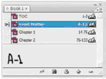
Upon adding documents to a book, the first thing you should notice is the document page numbers, which, unless you’ve specifically changed the section and nu mbering options in the individual documents, will be sequential—the numbers on the right in Figure 9.19. Each InDesign document, unless changed in the document’s Numbering & Sections Options, always begins numbering at page 1. Once booked, however, only the document first in the list begins with page number

1. Each successive document then begins numbering its pages where the previous left off. (Fig A-1)

If page numbers show on the document pages themselves, placed there with the Current Page Number special character marker on the page or master page, the page numbers will update to reflect what is shown in the Book panel. If documents, and thus page numbers, are not in the correct order, simply rearrange the documents in

the list by dragging and dropping. Page numbers will instantly resynchronize to match the new document order. They will also update to reflect any pages added to, or subtracted from, documents in the book. Fine control

over continuous or other page numbering begins with Book

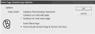
Page Numbering Options, opened from the panel’s flyout menu (see Figure B).

In the Book Page Numbering Options dialog, Page Order offers a direct continuance of page numbering, continuing on the next odd, or next even, pages, and the option to insert blank pages to help with page number jumps to odd or even pages.

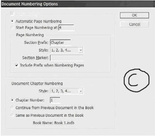
Turn off Automatically Update Page & Section Numbers to stop InDesign from automatically updating page and section numbers when documents page counts change or their order in the list is altered. With this option off, use the commands on the Update Numbering menu on the Book panel’s flyout menu to manually update page and section, chapter and paragraph, or all numbers when needed. The Document Numbering Options command on the panel menu controls page numbering and section options for a highlighted document. The Document Numbering Options dialog is nigh identical to the Numbering & Section Options dialog available on the Layout menu in any single document (see Figure C).

Automatic Page Numbering Continues numbering from the previous document in the book. If the selected document is the first, it will begin numbering from page 1, subject to the other options below.

Start Page Numbering At Choose this option and enter a number in the field to the right to begin numbering pages in the document at a certain point.

Section Prefix The Section Prefix field enables you to propend up to eight characters—letters and/or numbers—to section numbers. For instance, enter Part- here to create page numbering and TOC entries such as Part-X Page Y.

Style Choose the style for section numbers, either Arabic or upper- or lowercase Roman or alphabetic.

Section Marker Documents may be divided into multiple sections—for instance, in this book, there are sections for front matter pages, the TOC, the chapters, the glossary, and the index. Each section of a publication may be numbered or formatted differently, and the page number may also be prefixed with a section-specific bit of information like Section 1: Page 19. To insert a section marker in a text frame—say, in the folio beside the page number—place the Type tool cursor in the appropriate place in the text frame and choose Type > Insert Special Character > Markers > Section Marker. The section marker that appears will be specific to that section. What you enter in the Section Marker field is what appears as the section marker inserted into a text frame. For instance, to identify the glossary of a book, you may enter Glossary. When the section marker appears on the page, it will then display as Glossary in the folio, header, or wherever you’ve placed the marker. If the Include Prefix when Numbering Pages box is checked, it will also insert the section marker as part of automatic page numbers created using Type > Insert Special Character > Markers > Current Page Number.

Document Chapter Numbering Although a single document may contain several sections, it may only contain, or be, a single chapter. In this section, choose the format of chapter numbering, the chapter number for the current document, and whether to continue growing from, or mirror, the chapter number of the previous document in the book. The latter option is used to define two or more documents at being part of the same chapter. Chapter numbers are made visible on the page by inserting the Chapter Number text variable ( some other time I

Tables of Contents

Creating a table of contents for the document (or book) is far less involved than creating an index, as long as you practiced efficient composition by assigning paragraph styles to the elements that should be listed within the TOC. The basis for TOC generation is paragraph styles—in other words, any text assigned to this style or that style will be included or excluded based solely on its paragraph style. InDesign supports an unlimited number of

tables of contents. Thus, you can create the standard document TOC like the one at the front of this book, but you can also create per-chapter tables of contents, lists of figures or tables, alphabetized lists of topics, and just about anything else you can imagine (and manage with paragraph styles). Begin creating the table of contents by choosing Layout > Table of Contents, which opens the Table of Contents dialog (see Figure D). Click the More Options button to reveal the full depth of the dialog.

TOC Style All of the options incorporated into the Table of Contents dialog may be saved as a preset called a TOC style. After setting the options, click the Save Style button on the right and give the style a name. TOC styles can also be created and edited from Layout > Table of Contents Styles. If a style has been pre-created, it will appear in the TOC Style list; choose it, and all the below options will fill in with their style-defined values.

Title When the TOC is generated and placed, it will have a title as the first line of the story. By default, the title will be Contents, but it can be anything you like. Leaving the Title field blank removes the title from the generated TOC entirely, without leaving a blank carriage return where it would have been.

Style The paragraph style for formatting the TOC title.

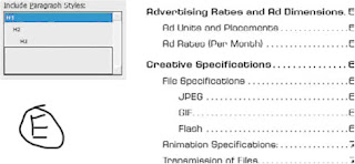
Styles in Table of Contents This is the crux of creating a TOC. On the right, in the Other Styles list, are all the paragraph styles defined in the document. Click a style on the right to highlight it, then use the Add button to move it to the left, the Include Paragraph Styles list. You can also double-click an entry in either column to move it to the other. Each style included on the left will cause all text assigned to that style to be listed in the resulting TOC; styles not in the list will not have their dependent text referenced by the TOC. The order of styles in the Include list establishes the TOC hierarchy. In other words, the first listed style is the most important, highest level of the generated TOC, with the next appearing below it, the next below that, and so on. If you insert styles in the wrong order, drag them up or down in the list just as you reorder styles in the Paragraph or Character styles panels. But you must also change their Level value in the Style section below.(Figure E) shows an example of the Include Paragraph Styles list and the TOC it would generate.

Click to highlight a style in the Include Paragraph Styles to set its options below in the Style section. Each included style may have its own entry style, page number options, and so on.

Entry Style When the TOC is generated, the text for each entry level can have its own paragraph style. Unlike index styles, InDesign will not automatically created level-based paragraph styles. You’ll need to pre-create your TOC styles and then select them from the list for each Include Paragraph Style option. Alternatively, leave the default of [Same Style] to include the same style in the TOC as on the document pages.

Page Number Choose whether to place the page number before or after the entry text or to omit the page number entirely. With the Style field to the right, the page number can be given its own character style for customized formatting.

Between Entry and Number The separator character or characters to appear between the entry text and its number (or number and text, if the page number is placed before the text). The pop-up menu to the right offers many symbols, markers, and special characters. To create a leader dot separator, specify a tab (^t) in the field and then modify the paragraph style (outside of the Table of Contents dialog) to include a leader dot separator at that tab stop. The dropdown menu at the right allows assigning a character style to the separator itself, enabling any unique styling to be applied to just the separator.

Sort Entries in Alphabetical Order By default, and in most cases, TOC entries are sorted in order of appearance in the document. However, especially when creating documents for electronic distribution as PDFs, this option opens numerous other possible uses for the Table of Contents feature beyond creating a standard TOC. When InDesign generates a TOC, it creates hyperlinks connecting the TOC entries to the text they reference. Exporting to PDF preserves these hyperlinks, enabling a reader of such a PDF to click on the TOC entry and jump to the content. Thus, the option to sort entries alphabetically rather than logically opens the possibilities of creating vastly different lists such as lists of product names, personnel referenced in the document, or even a replacement for a standard index—without having to manually create index entries. The only significant limitation to using the Table of Contents functions in place of index and other features is that InDesign’s Table of Contents is dependent upon paragraph styles; it cannot create an entry from a character style or a specific word in the middle of a paragraph.

Level In a hierarchal TOC such as the one at the front of this book, entries from each successive style are considered inferior to their predecessors—Heading 1, for instance is superior to Heading 2, which is superior to Heading 3. The Level field defines that hierarchy. As each style is moved from the Other Styles list to the Include Paragraph Styles list, InDesign automatically assigns a successive level. If you have reordered the include list by dragging and dropping, you will also need to change the level for each affected style. Often successive TOC entries are indented as visual cues to the hierarchy. The Include list mimics the hierarchy by indenting styles in the list, giving you a visual representation of how the generated TOC may look. The Level field is nonexclusive, meaning that you are not required to have only a single level 1 or level 2 entry. If you have two or more equally important styles, they can all be set to the same level.

Create PDF Bookmarks Similar to the way each entry on the page itself will be hyperlinked to its content, InDesign can automatically generate PDF bookmarks, which are hidden until PDF export time. Adding these, and choosing to include bookmarks when exporting to PDF, creates something akin to Figure 9.38—a Bookmarks panel sidebar TOC-style list of topics that, when clicked in Acrobat or Adobe Reader, become hot links and jump the reader to the referenced content.

Replace Existing Table of Contents If you have previously generated and placed a TOC, this option will replace (not update) it. When using the Table of Contents to build separate styles of tables, you want this option unchecked.

Include Book Documents When generating a TOC for documents managed through an InDesign Book file, check this option to generate a single TOC that points to all instances of the included paragraph styles in all documents within the book.

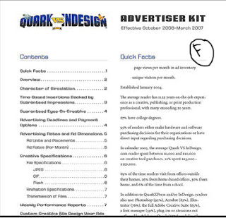
Run-In By default, all TOC entries are given their own line, with a carriage return at the end. An alternate style is to use the run-in method that, like the same option within an index, only separated by top-level styles. All entries lower in the hierarchy than the top will be placed together in a paragraph (see Figure F).


Include Text on Hidden Layers Choose whether to include in the TOC text on hidden layers.

Numbered Paragraphs New to CS3, this option tells InDesign how to handle paragraphs that have been numbered through the List and Numbering functions. Note that InDesign does not recognize numbers that have been converted to standard text and will include them in the TOC regardless of this setting. The options are as follows:

Include Full Paragraph lists the text in the TOC exactly as it appears on the page, with all text automatic numbering intact. For example, the ninth table in a chapter whose number is defined within the paragraph Numbering options to include the prefix Table 9 and whose table caption is KDY Capital-Class Products will list in both the main story and the TOC as Table 9.9 KDY Capital-Class Products.

Include Numbers Only ignores the text in the paragraph and includes only the automatic number and any prefixes. For example, to include a TOC entry for Table 9.9 without the table’s caption, choose Include Numbers Only.

Exclude Numbers includes in the TOC the text of the paragraph but not the automatic number. The TOC output using the above example would therefore be simply KDY Capital- Class Products. Click OK to return to the document with a loaded cursor ready to place the TOC story, which may be placed and flowed like any story. If any stories in the document contain overset text assigned to the included styles, you will be prompted after clicking OK whether to include those instances in the TOC. Unlike an index, tables of contents don’t have their own panel. Also unlike an index, you needn’t go through the entire generate process to update a TOC. Instead, select a text frame holding the TOC style, and choose Layout ➢Update Table of Contents. Shortly, an alert dialog will inform you that the table of contents has been updated successfully. When creating a comprehensive TOC for book documents, it’s often better to place the TOC into its own self-contained document and to add that document to the Book panel.

The Bottom Line

Interact with Documents Visually, Change Zoom Level, View Modes, and Display Performance

InDesign provides numerous means of changing the way you interact with documents, how fast they move, how you see them, and what you see.

Master It Open any InDesign document containing text and images on the same page. Open three different views of the same document, arranged simultaneously onscreen, zooming all to fit the page within the document window, and compare the views according to the following options:

View 1: Preview mode with High-Quality Display display performance.

View 2: Layout mode with Fast Display display performance.

View 3: Bleed mode with Typical Display display performance.

Build and Manage Grids and Guides The foundation of any well-laid-out document is a well thought- out grid.

Master It Create a new document and build a grid on the master page consisting of six equal columns and three equal rows within the page margins. Once that’s done, apportion the top row into three equal sections.

Create and Manage Book Files Often one person finds it easier to work on longer documents by breaking them up into chapters or sections and connecting them via a Book file. For workgroups wherein different people are responsible for different sections of the document, a Book file is essential to productivity.

Master It Working alone or in a group, create at least three InDesign documents of several pages of text each. Save each document, and then create a Book file to connect the documents. Finally, create a single PDF from the entire book.

Index Terms and Create an Index An index helps readers find content. From simple keyword lists to complex, multilevel, topic-driven indices, InDesign handles them all, marrying index entries to referenced text through index markers.

Master It Open or create an InDesign document containing a story of at least three pages in length. Working through the document, create index entries and cross-references for at least 10 words, one of which should be a word that repeats numerous times throughout the story (use a common word such as the if needed). Once the terms are indexed, generate and place the index story on a new page.

Create Tables of Contents Tables of contents direct readers in logical or virtually any order to content, and InDesign’s TOC options are varied and powerful for myriad uses.

Master It Open or quickly create a rudimentary book-style document containing body text and several heading paragraphs utilizing at least two levels of headings. Create and assign paragraph styles for the body text and headings. Using what you’ve learned in this chapter, generate and place a hierarchal TOC.

Blog Widget by LinkWithin