Search This Blog

Step 1
First we'll create the frame. Although our final image will be 1200 pixels wide and 800 pixels high, we'll start by drawing a frame which is bigger than our final image. Thus we'll have more detail on the frame, then we'll scale it down to fit in our final composition. Now create a new document
Step 2
Create a new layer and name it "Wood." Set your Foreground Color to #994400 and Background Color to #ffcc66. Fill the layer with your Foreground Color. Go to Filter > Render > Fibers. Set the Variance to 16 and Strength to 55, then apply.

Step 3
Hit Command + T to enter Free Transform mode, set the Reference Point Location to middle-left, set the Horizontal Scale to 30%, and hit Enter twice to apply. Scaling the layer down horizontally makes the texture more dense.
Step 4
Get the Rectangular Marquee Tool, set the Style to a Fixed Size and set the Width and Height to 125 pixels. Click anywhere on the canvas, then move the selection to the top-left corner of the canvas. Drag two horizontal and two vertical guides from the rulers (Hit Command + R to make them visible if they are not) and snap them to the edges of the selection. Move the selection to the bottom-right corner of the canvas, then drag the guides around the selection.
Step 5
Create a new layer and name it "Dent 1." Get the Rectangular Marquee Tool, make sure Style is set to Fixed Size, then set the Width to 38 pixels and Height to 1200 pixels. Make a selection. The selection I made is 20 pixels away from the left edge, so you can place the selection to the most left of the canvas and move it 20 pixels right by hitting the Right Arrow key two times, do this while holding the Shift key. Fill the selection with the Foreground color and the Deselect.
Step 6
This rectangle is going to be one of the dents in our wooden frame. We'll now apply two layer styles to it. First set the layer's Interior Opacity (Fill) at 0%. Now apply a Bevel and Emboss layer style to the layer using these settings: Style set to Inner Bevel, Depth set at 75%, Direction set to Down, Size set to 40 pixels, and Highlight Mode Opacity set at 100%. Next, apply a Gradient Overlay and use the following settings: Blend Mode of Multiply, Gradient set at Black to White, Opacity set at 70%, Angle set to 0 degrees, and Scale set at 150%.
Step 7
We are going to make two more dents. Create a new layer named "Dent 2." Get the Rectangular Marquee Tool and set the Width to 32 pixels and make a selection. Snap the right edge of the selection to the second vertical guide and move the selection 18 pixels left. Fill the selection with the Foreground Color. Create another new layer and name it "Dent 3." Make another rectangular selection which is 12 pixels wide and place it 2 pixels left from the second guide, as you can see in the below image, then fill with the Foreground Color again and Deselect. Now go back to the "Dent 1" layer in the Layers palette, go to Layer > Layer Style > Copy Layer Style. Select both "Dent 2" and "Dent 3" layers in the Layers Palette, then go to Layer > Layer Style > Paste Layer Style.
Step 8
Now we're almost done with the left piece of our wooden frame. Select all Dent layers and the "Wood" layer in the Layers Palette and go to Layer > New > Group From Layers. Name the group "Left." Duplicate the "Left" layer group and name it "Right." Make the "Right" layer group invisible for now.
Step 9
Go back to the "Left" layer group, open it, then go to the "Wood" layer. Also, make sure Guides are visible. Grab the Rectangular Marquee Tool, set the Style to Normal, and make a selection as shown below, and hit Delete to clear the selected area. Deselect by hitting Command + D. Select the "Left" group in the Layers palette and go to Layer > Merge Group (Command + E).
Step 10
Go to the "Right" layer group in the Layers Palette and open it. Select the "Wood" layer and go to Edit > Transform > Flip Horizontal. This way we won't have the exact same texture in for the left and right pieces. Get the Rectangular Marquee Tool and make a selection, then clear by hitting Delete. Deselect by hitting Command+ D.
Step 11
Select the "Right" Layer Group and go to Edit > Transform > Flip Horizontal. Move the layer group to the right of the canvas as shown. Open the layer group and change the Blend Mode of each Dent layers' Gradient Overlay Layer Style from Multiply to Screen. Select the "Right" Layer Group in the Layers Palette and hit Command + E to merge.
Step 12
Duplicate the "Right" layer and name it "Bottom." Hit Command + T and rotate it 90 degrees, then place it at the bottom of the canvas. Duplicate the "Left" layer and name it "Top." Rotate it 90 degrees, then place it at the top of the canvas. Go to the Layers palette and drag the "Top" layer above the "Right" layer.
Step 13
Grab the Polygonal Lasso Tool and make a selection with the help of the guides, then hit Delete to clear.
Step 14
Go to the "Bottom" layer in the Layers Palette and do the same thing for the bottom part: Make a selection with the Polygonal Lasso Tool and hit clear. Go to the Layers Palette and select all layers except for the "background" layer, then merge them by hitting Command + E. Name the merged layer "Frame."


Step 15
Hit Command + A to select all and then hit Command + C to copy. Go to the Channels Palette and create a new channel. Hit Command + V to paste. Go to Filter > Artistic > Paint Daubs. Set the Brush Size to 1, Sharpness to 10, and set the Brush Type at Simple. Command-click the Alpha Channel to load the white areas as a selection.
Step 16
Go to the Layers Palette and select the "Frame" layer. Go to Layer > New > Layer via Copy and name the new layer "Bumps." Apply a Drop Shadow to the "Bump" layer with these settings: Blend Mode set to Multiply, Opacity at 90%, Angle set to 120 degrees, Distance and Size set to 3 px. Apply an Inner Shadow layer style using these settings: Blend Mode set at Color Burn, Opacity at 100%, Angle set at 120 degrees, and Distance and Size set to 0 px. Next, apply a Bevel and Emboss layer style and use these settings: Style set to Inner Bevel, Depth at 1000%, Direction set at Down, and Size set to 0 px.
Step 17
Now select all the layers other than the "Background" layer and merge them by hitting Command + E. Name the merged layer "Frame." Now we need a photo to put inside the frame. Open it in Photoshop and drag the image into your "Frame" document, place it beneath the "Frame" layer, then scale and position. Name this layer "Photo." Go to the "Frame" layer and apply an Outer Glow Layer Style using these settings: Blend Mode of Multiply, Opacity set at 40%, Color set to black, and Size set to 9 px. Now apply a Drop Shadow with these settings: Blend Mode set to Multiply, Opacity at 35%, Angle set to 120 degrees, Distance set to 3 px, and Size set to 9 px.
Step 18
It is now time to make the glass. Actually, we'll make the reflections. You can get the image that is reflected on the glass anywhere from internet. Open it in Photoshop and drag it into your "Frame" document, then scale and place as shown below image. Go to Filter > Blur > Gaussian Blur and apply with a Radius of 3 pixels. Set the Layer Blending Mode to Screen and Opacity at 15%. Name this layer "Ref 1." We need two reflections on the glass, so duplicate the "Ref1" layer and name it "Ref 2." Move the "Ref2" layer five pixels left.
Step 19
Create a new layer above the "Ref2" layer and name it "Highlight." Grab the Rectangular Marquee Tool and make a selection as shown. Get the Gradient Tool, set the Gradient to Foreground as Transparent and set it to a Radial Gradient. Select white as the Foreground color. Fill the selection and Deselect.
Step 20
Hit Command + T and scale the highlight down horizontally and up vertically, as shown below. Go to Filter > Blur > Gaussian Blur and apply with a Radius of 3 pixels.
Step 21
Now we'll make the dirty edges of the glass. Go to the Channels Palette, create a new channel, and name it "Dirt1." Go to Filter > Render > Clouds. Go to Filter > Artistic > Film Grain, set the Grain to 9, set the Highlight Area and Intensity to 0, and hit OK. Go to Filter > Brush Strokes > Accented Edges, then set the Edge Width to 1, Edge Brightness to 20, Smoothness to 1 and apply.
Step 22
Create another channel and name it "Dirt Area." Make sure the guides are visible. Grab the Rounded Rectangle Tool, set it to Fill Pixels, set the Radius to 25 pixels, and choose white as your Foreground color. Draw a rectangle vertically.
Step 23
Go to Filter > Blur > Gaussian Blur and apply with a Radius of 15 pixels. Go to Image > Adjustments > Levels (Command + L) and set the Shadow Input Level to 200 and Highlight Input Level to 220. Now apply another Gaussian Blur filter, this time with a Radius of 7 pixels. Now go to Image > Adjustments > Invert (Command+I). This channel will define the area that the dirt will be visible in. Now Command-click the channel in the Channels Palette to make a selection out of the white areas. Alt + Command-click the "Dirt" channel to select where the white area of the "Dirt" channel intersects the already selected area.
Step 24
Go to the Layers Palette and create a new layer below the "Frame" layer, then name it "Dirt1." Fill the selection with the color #a79988. Go to the Channels Palette again, then Command-click the "Dirt Area" channel to load the selection. Go back to the Layers palette and create a new layer above the "Dirt1" and name it "Dirt2." Fill the selection again with the color #a79988.
Final Step
The frame is almost finished. Before we merge the layers, lets make some final adjustments. Go to the "Frame" layer and hit Command + U to bring up the Hue/Saturation dialog. Set the Saturation to -15. Go to the "Photo" layer, press Command + U again and set the Lightness to -10 and apply. Now we're ready! Go to Layer > Flatten Image.

How to make a real eye in Photoshop?

Note: follow the image sequence (A,B,........, I)
Sketch
Before laying down a single brushstroke, it’s important for me to create a rough sketch. It doesn’t have to be perfect, but we need to get our point across here. This will only make things easier during the painting process. Create a new layer and sketch in an eye.
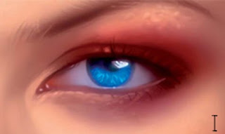
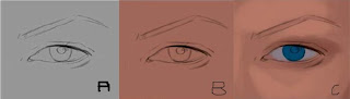
Laying down the Base Color This step is simple enough; here we lay down the base color for the skin. Simply use the Gradient tool here and fill the background layer with your color choice. In general try not to go too light or too saturated here.
Defining Form
Using the HSB Slider, (Windows>Color), pick a darker more saturated color for the darker areas of the skin, and paint it using a simple Hard Edged brush. I also pick a lighter, less saturated tone for the highlights of the skin. I choose a color for the eye, in this case, a bright blue and paint that in as well. 
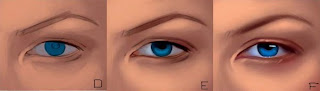
Bringing Life to the Skin
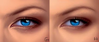
The values of the skin need some work here. I choose an even brighter, lighter color to define the form of the skin. I introduce the lighter tones according to the lighting here, which is a standard front light. I add the lighter tones to the tone, the bridge of the nose, near the eyebrow, and around the eyelid to make things appear more realistic.
Smoothing Out the Skin
At this point, all my work was done using a standard Hard Edged brush, which is great for defining form quickly. To blend the skin and give it a more photo realistic look, I now switch to a soft brush (Hardness at 0%) and Opacity at 50%. I blend all the sharp transitions until things appear much smoother. Additionally, I paint darker tones on the blue iris to give it more depth.
Bringing More Life
At this point I work a bit more on the skin tones, adding some more saturated reddish tones on the area around the eye, as well as the cheek. I also add a more saturated blue to the eye as well. I do this all with a soft airbrush at a fairly low opacity on a new layer, then merge it down when I’m satisfied with how things are looking. I also do some more detail work using a softer Hard Edged brush as well. Details
I’m satisfied with how things are looking at this stage, so I start working on the details. Using a fairly small brush, I begin to add some ‘bumps’ around the eye to give it a more realistic looks. I also create bumps around the eyebrow using a both a fairly light as well as dark color to help it pop for a realistic look. I also add details in the iris using a lighter bluish color to really bring the image to life. I work in at a very large zoom at this stage as well to make things easier and more accurate.
Refinement
I go over everything with a Soft Edged brush at a low opacity for a more realistic look. Additionally I bring out the details more using fairly small, hard edged brushes. I work on the eyebrow, painting each strand in, as well as the eyelashes.
Color and Texture Enhancement
Things are looking a bit too muddy for my taste, so what I do here is create a new layer set to soft light, and enhance the colors quite a bit. I introduce much warmer tones around the eye to give it more life. Finally, I slightly overlay a leather photo texture to give the skin a slightly more realistic effect.

How to build Scripting in Indesign?

To one degree or another, anything you can do manually in InDesign can be automated via a script. Such scripts can be written in Mac-only AppleScript, Windows-only Visual Basic Script, or cross-platform JavaScript. They can do something as simple as preload the Swatches panel with your corporate colors and they can perform highly complex, multistaged operations such as turning a blank page into a press-ready layout. Using scripts, InDesign can also be connected to other applications—for example, data from a spreadsheet or database can be sucked into InDesign and laid out automatically. The possibilities are limited only by your imagination and coding skill. Covering what can be done and how to do it is far beyond the space available in this tome. Entire books have been written on the subject, and Adobe wrote one of the best—the InDesign CS3
Scripting Guide. There are three variations of the InDesign CS3 Scripting Guide: one each for Apple- Script, Visual Basic Script, and JavaScript. You’ll find them as PDFs in the Adobe InDesign Documentation\ cripting folder on the InDesign or Creative Suite DVD. If you don’t have your DVDs on hand, you can also grab copies free of charge from www.adobe.com/go/scripting_id.
You’ll want to begin with the Adobe Intro to Scripting, progress through InDesign CS3 Scripting Tutorial, and use the JavaScript Tools Guide CS3 and the three script-language-specific versions of the InDesign CS3 Scripting Guide for reference. Accompanying the scripting tutorial and reference documents are hundreds of sample scripts that do everything from creating printer presets to unlinking text frames, placing text files to laying out events calendars. In addition to those, there are hundreds of other scripts floating around the Internet, most created by other InDesign users to address specific workflow needs. A great place to look for them is the Adobe Exchange at www.adobe.com/cfusion/exchange/. There you can find many scripts (and more!) for InDesign and every other Adobe product. I would hope you’ll find ones that function on your platform.
When you’ve written or obtained scripts you’d like to use, you have to give them to InDesign. Do that by closing InDesign and copying the scripts to the correct location for your platform: Mac OS X: Users/[username]/Library/Preferences/Adobe InDesign/Version 5.0/Scripts Windows XP: Documents and Settings\[username]\Application Data\Adobe\InDesign\ Version 5.0\Scripts Windows Vista: Users\[username]\AppData\Roaming\Adobe\InDesign\Version 5.0\Scripts When you relaunch InDesign, the scripts will be available in the User group on the Scripts panel, which can be opened by choosing Window >Automation >Scripts. Under Application in the panel, you’ll also see numerous sample scripts that are not in the locations noted above. If you want to delete these, you’ll find them in the InDesign application installation location:
Mac OS X: Applications/InDesign CS3/Scripts/Scripts Panel/Samples Windows: Program Files\Adobe InDesign CS3\Scripts\Scripts Panel\Samples To execute a script on the Scripts panel, double-click it.
Note that many scripts function only when a specific condition has been met—such as pre-selecting certain types of objects or highlighting text. Indeed, many scripts that manipulate or work from objects require that objects be named. This is where the Script Label panel comes into play. The Script Label panel (Window >Automation >Scripts) has no buttons, no flyout menu, and, apparently, nothing else. Actually, the entire panel is a single text field. Select an object on the page or pasteboard, click once inside the Script Label panel, and begin typing a name or label for the object. That’s it. That’s all it does. But, once named with the label a script expects, the object can then be manipulated by the script.
Script writers can attach scripts and scripted functions to InDesign documents and to menu commands; doing so, while incredibly powerful, represents a security risk. Consequently, Adobe shipped InDesign with the ability to run such scripts turned off. In InDesign’s preferences, on the General pane, the Enable Attached Scripts option is that control. To allow the execution of scripts attached to documents, check Enable Attached Scripts.

How to Perform Quick Apply in indesign?

Quick Apply was introduced in InDesign CS2, although most users have no idea it’s there or what it does. Even if you do know Quick Apply, don’t skip over this section—CS3 is the Col. Steve Austin version Quick Apply. Adobe sat down with InDesign, with Quick Apply, and Kevin Van Weil said, “Gentlemen, we can rebuild it. We have the technology. We have the capability to make the world’s first bionic application menu. Quick Apply will be that application menu. Better than it was before. Better… stronger… faster.”
In the last version, Quick Apply was a menu that consolidated all paragraph, character, and object styles into a single list for rapid access to any of them. Now, in InDesign CS3, its bionics enhance Quick Apply to include all those styles, table and cell styles, and menu commands and scripts all together in a single, rapid-action list. In other words, you might be able to hide the Paragraph Styles, Character Styles, Object Styles, Table Styles, Cell Styles, and Scripts panels and reclaim screen real estate they consume. You really have to see Quick Apply to understand it. Press Cmd+Return/Ctrl+Enter and the Quick Apply menu will appear (see Figure A).
The basic operation of Quick Apply is simple: In the search field above the list, begin typing the name of a style in the current document. As you type, the list of available options will shrink, filtered to those styles, commands, scripts, and variables that begin with what you typed. The first option matching your input will be highlighted. To choose it, applying the style or whatever to a selected object or text, simply press Return/Enter. If the highlighted item isn’t what you want, type more of the name or use the up and down arrows on your keyboard to navigate the list. Can I select something with the mouse? Of course; it’s a scrollable list, after all. But the main point of Quick Apply, with its simple Cmd+Return/Ctrl+Enter activation shortcut—the ability to type a part of a name and use Return/Enter to apply it—is to spare you the need to take your hands off the keyboard. Its secondary point, which does just as much for productivity, saves you from searching through various panels and menus hunting for something whose name—but not exact location— you already know. When you press Return/Enter to apply a selected style, Quick Apply will retreat out of your way.
At the top of Quick Apply you have two buttons (see Figure B). The lightning bolt hides the Quick Apply menu itself. You may recognize it as appearing on all the individual styles panels where the same button will hide or show Quick Apply. Next, the down-facing arrow lets you choose what to show in the Quick Apply menu (see Figure B). That’s right, Quick Apply includes not only all the styles, but also text variables, scripts, and every menu command in InDesign: those on the menu bar at the top of the application, those on panel flyout menus, and even many that don’t appear anywhere else in the user interface. You can quite literally run InDesign exclusively from Quick Apply. (Note that scripts are, by default, not included in Quick Apply. To include them, activate that option from the Show/Hide menu.) You can even include in Quick Apply menu commands hidden by customizing menus.
Beside each type of entry in the Show/Hide menu is a parenthetic special code—for instance (p:) beside Include Paragraph Styles. With so much now added to the Six Million Dollar Menu, typing just a few letters into the search field will undoubtedly return numerous commands, styles, and so on. The expanded focus of Quick Apply therefore becomes a hindrance to its own utility. Rather, it would, but for the filter codes. If you want a table style, for example, preface your search with t:, which filters the Quick Apply list to show only table styles. Use m: for menu commands, v: for text variables, p: for paragraph styles, and so on. The Show/Hide menu is a complete key to filter codes.
Quick Apply even makes it easy to edit a style. Pressing Cmd+Return/Ctrl+Enter opens Quick Apply, but pressing the shortcut again while Quick Apply is open will open the editing options for the selected style, command, script, or variable. With an object style selected, for instance, Cmd+Return/Ctrl+Enter will open the Object Style Options dialog editing that particular style. With a text variable selected, Cmd+Return/Ctrl+Enter opens the Text Variables dialog.

What are styles shortcuts in indesign

All styles—paragraph, character, table, cell, and object—may be assigned to keyboard shortcuts on the General pane of their options dialogs. To set a keyboard shortcut, click in the Shortcut field and press the keyboard keys that will serve the particular style—for instance, Cmd+5/Ctrl+5. Assigning keyboard shortcuts to styles is not a new feature; neither is the fact that it’s so limited as to be almost useless.
The primary limitation to style shortcuts, you see, is that they require use of the numeric keypad— the set of number keys out to the right of full-sized keyboards. Every shortcut must be one or more modifier keys—Cmd, Opt, Ctrl, Shift on Mac or Ctrl, Alt, Shift on Windows—plus a numeric keypad number. Thus, the first limitation is that usually alphabetically named styles must be bound to arbitrary numbers. (Did I put the RunIn Head paragraph style on Ctrl+Shift+Num 5, Ctrl+Num 5, or was it something plus the 6?) Next, you have to recognize that, on most keyboards, any of these options are two-handed keyboard shortcuts, which are only—and not always—slightly more convenient than reaching for the mouse and clicking an entry on a panel. The choice of shortcuts is also limited by the fact that many key combinations are reserved for use by the operating system. On Windows, for example, you cannot use Alt and a number without also choosing Shift or Ctrl because Alt plus the numeric keypad numbers is reserved for system-wide insertion of special characters—for example, to insert a copyright symbol, press Alt+0169. Finally, the biggest limitation to keyboard shortcuts for styles is again the numeric keypad. Laptops don’t have them, nor do many slim desktop keyboards. Most laptop keyboards have a pseudo-numeric keypad created by depressing the Function key (often labeled as Fn and unique to laptops) and then pressing other keys (such as U, I, and O for 4, 5, and 6 or another mapping of numeric keypad functions to existing keys). So, in addition to pressing one, two, or three modifier keys and a number key, those using laptops or slim keyboards must press Function. Worse, pressing Function often changes the function of a modifier key. Option on a Mac PowerBook, for instance, becomes Alt when the Function key is depressed. Therefore, it is impossible to press Opt+Shift+Num 6 on a PowerBook’s built-in keyboard.
Until Adobe adds styles to the customize Keyboard Shortcuts dialog and opens up the rest of the keyboard to style shortcuts, the feature is more of a hindrance than a help. The only exception I would proffer is default styles. Leave your custom styles unassigned to shortcuts, but binding the Basic Paragraph paragraph style, the None character style, and similar defaults for table, cell, and object styles to shortcuts can be very useful and universal because every document you create has these defaults (though you may not use them). For instance, some people find it very helpful to put Basic Paragraph on the numeric keypad’s 1 key, the None character style on 2, and so on. For the rest of their styles they use something far more efficient: Quick Apply.

Creating Snippets in Adobe InDesign

Snippets are reusable content similar to libraries but with two key differences. First, whereas libraries collect multiple objects into a single list, snippets are new external assets not gathered together into a panel. Second, library objects do not remember positioning data, but snippets do. A snippet is an encapsulated segment of XML code, but don’t let that put you off—after finishing this sentence, you need never again consider the words snippet and XML together. What is important, and the reason I mention it, is that XML can contain text, path data, imagery, attributes— all the structural data and everything InDesign needs to re-create a container, its content, and their attributes. Snippets even remember their relative location on the page and the layer(s) on which they originated. In the simplest terms, a snippet is a piece of an InDesign page externalized.
Snippets may be passed around and traded like baseball cards.
Create a snippet by selecting one or more objects with the Selection tool, and then drag the object(s) out of InDesign to drop on your desktop. An INDS file will be created, which is like any other file and can be managed through the file system, Bridge, or what have you. If the idea of dragging something out of an application onto the desktop gives you the heebie-jeebies, use File > Export; in the Export dialog, set Save As Type to InDesign Snippet. Placing snippets in documents is just as easy—through File ?Place or by dragging from the desktop into InDesign. Upon dropping (or placing), the object(s) dragged to the desktop will instantly appear with all formatting and appearance intact and on the layer(s) from which they originated.
By default in InDesign CS3, snippets will drop at the cursor location rather than at the position on the page from which they originated. Changing that behavior is a toggle. In Preferences, on the File Handling pane, change the Snippet Import option. Position at Original Location will place the snippet in exactly the same place on the page as the original set of objects from which the snippet was created. Position at Cursor Location will place the snippet content wherever a loaded place cursor is clicked or where a snippet dragged from the desktop is dropped.

Creating Libraries in Adobe InDesign

The utility of proprietary application object libraries has been greatly diminished with modern innovations such as placing native format graphic files (e.g., PSD, AI, PDF) into the layout; the ability to place one InDesign file as an asset inside another; snippets; accessible visual digital asset managers (DAMs); and the ability to drag and drop pictures from a DAM, the file system (e.g., OS X Finder and Windows Explorer), and other applications. Once upon a time, a library palette was the pinnacle of convenience and productivity. Now, libraries are no longer essential, but they’re still very handy for improving efficiency in many solo and group workflows. Besides, they’re kind of fun.
Libraries are floating, mini DAMs inside InDesign (see Figure A). They allow objects created or placed in InDesign to be duplicated and placed elsewhere in the same or other documents without copying and pasting. Objects added to a library may be linked images that are, in reality, scattered about one or more hard drives or network resources. Library assets can be text frames (with or without text), native InDesign paths, objects with effects, groups of objects, even an entire page. These objects can be arranged and sorted in various ways within the library and then added to a document simply by dragging them out of the library and dropping on the page or pasteboard.
If you’re a freelancer with no repeat clients or the print shop’s in-house document fixer, you probably won’t have much use for libraries these days. I recommend everyone else at least try using a library—or two, three, or more—because having at your fingertips all your frequently used objects can save massive amounts of time and effort over other methods of inserting objects. Consider some of the following uses:
- All your company’s or client’s logos can be stored—versions in RGB, CMYK process, CMYK plus spot colors, grayscale, black and white; logos with and without the tagline; full logos; iconic logos.
- Advertising-supported publications can store all their variously sized ad space placeholders and ready-for-content frames in a library ready for drag-and-drop placement (instead of keeping a list of ad sizes taped to the side of the monitor).
- Periodicals, catalogs, and other longer documents that use several layout templates for different types of pages can insert each page layout—inclusive of its text frames, graphic frames, and all other elements—as a single library entry and place all the pieces onto a blank page by dragging just one entry from the library.
- Photos and illustrations slated as potential use in a document can be collected from various sources and locations and organized together into a library for side-by-side evaluation.
- Any object or bit of text used once in a while in documents created for the same client or project can be collected into a library, keeping them always available for the next new document for the client or in the project.
Now that you’re beginning to see the value of libraries, let’s make one:
1. Open or create a document with several objects on a given page. These can be any type of object—text, placed imagery, paths drawn in InDesign, and so on.
2. Choose File >New >Library. InDesign will prompt you to save the library, which creates
an INDL file.
InDesign suggests the default name of Library.INDL. Don’t use the default. Give the library a meaningful name. If this will be a library of logos for your client XYZ Corp., name the file XYZ Logos.INDL and save it in the folder where you save XYZ Corp. assets or documents. If you use libraries well, you’ll probably find yourself creating them for several clients, projects, and other purposes. Naming them all Library.INDL and saving them to a default location like My Documents or your Home folder won’t seem like a very smart decision when you need to archive all documents related to one client or project to DVD-ROM.
3. After you save the library, a new panel will appear bearing as its title the filename you chose (e.g., XYZ Logos). The library itself will be blank. One at a time, select objects on the document page and drag them into your library panel. Notice how each becomes a new library entry with a thumbnail and Untitled as its legend. We’ll set aside the legend for now.
4. Move to another page in the document, and then drag an object out of the library panel onto the page. An exact duplicate of the original object appears on the page.
5. Create a new document (File >New >Document), and then do the same, dragging an object from the library panel onto the page. Now think about doing that for an identity package, quickly adding the client’s logo and textual information—in the correct colors and typefaces—across the business card, letterhead, envelope, and other layouts.
Adding items to a library, as you saw, is as easy as drag and drop. If you need to add several items from the same page, however, there’s an easier way. On the library panel’s flyout menu, choose Add Items on Page or Add Items on Page as Separate Objects. The former adds all items on the page as a single library entry. Thus, if your page contains five objects, all five will be added as a single library entry. Dragging that entry from the panel to the page places all five objects back into the document simultaneously and as five separate objects. The latter menu command, Add Items on Page as Separate Objects, adds all items on the page as separate entries, one per object. A trick to quickly and easily populate a library is to place assets onto a page by dragging and dropping from their various locations in Bridge, Finder/Explorer, or elsewhere and then, once all objects are on the page, use the As Separate Objects command.
To delete items in the library, drag the items to the trashcan icon at the bottom, select them in the palette and click the trashcan icon, or select items and use the Delete Item(s) command on the flyout.
Each item may have a title, a type, and a description. Double-click the item or choose Item Information from the panel menu to open the Item Information dialog (see Figure B). In a library with only a handful of items, names, description, and object type—collectively meta information— aren’t very important because organization will be done visually. However, with larger libraries, or when the thumbnail detail in the panel isn’t sufficient to differentiate items, adding meta information can be very helpful. Give the item a name and, optionally, a description. And then choose the type of object—image, EPS, PDF, Text, InDesign File (INDD), Structure (e.g., XML code chunk), Page (an entire page of objects as a single item), or Geometry (a vector path). None of the meta information is required; its only purpose is to help you or someone else find and identify items.
Large libraries may be sorted by, filtered to, and searched for specific items. All of these features depend on the meta information attached to each item. To search or filter the list, click the binoculars icon at the bottom of the panel (refer back to Figure A), or choose Show Subset from the panel flyout menu. Up will pop the Show Subset dialog (Figure C), which allows you to search across potentially thousands of library items (in the same library) for data that does or does not appear as Item Name, Creation Date, Object Type, or Description meta information. In fact, if you click the More Choices button, additional parameter rows may be added for highly focused searching and filtering. When you click OK, the library panel will filter to show only those results matching the query. To clear the query and see all items in the library, choose Show All from the menu.
If, when adding content from a library to a new document, you choose an entry that includes a linked placed asset, the Links panel in the new document will show a link to the original asset just like the entry that appears on the Links panel in the document from which you dragged the object into the library. It’s important to recognize that linked assets are not stored within the library any more than they are stored within documents; in both documents and libraries, only the link—the actual location on disk—is recorded. Don’t make the common mistake of adding a linked image to a library and then deleting the original from your hard drive. If the object included any custom swatches, strokes, or paragraph, character, table, cell, or object styles, they will be added to their respective panels as well. Items in a library are independent of their original instances, the ones from which they were created. Similarly, items placed on the page from a library are not tied to the library instances.
Changing one does not update the other. Think of a library as a sort of copy and paste operation; when copying and pasting, neither the original nor duplicate will update to reflect changes in the other. The same is true of library items. On the flyout menu, the Update Library Item command lights up when an object is selected on the page. Executing that command will replace the selected library item with the object selected on the page. That will not, however, alter any instances of the original library item added to the document. It only changes the copy stored in the library. Confused? Let’s try an example. Say you’ve created a black square as a library object and then dragged that black square from the library onto a document page. You now have two distinct, unrelated black squares—one on the page, one in the library. On the page, you can recolor the square to green, but the version in the library will remain black. Similarly, if you change the color of the black square in the library to blue, the copy on the page remains black (or green). Deleting one instance also doesn’t affect the other.
You may have more than a single library open at any given time, and libraries are not dependent on a particular document. I, for instance, often work with several libraries at once, and with numerous documents, depending on the client or project. Except for the fact that library panels are tied to specific external files, they behave like any other panel—they can be docked, tabbed, stacked, rolled up, rearranged, and resized. Their inventory can be sorted by name, by newest or oldest addition, or by the type of asset, all from the Sort Items menu on the panel flyout menu. Closing a library is as simple as clicking the close button in its title bar or choosing Close library from the flyout menu; open libraries with InDesign’s File >Open command. InDesign saves libraries automatically every few minutes, so changes you make to the panel’s inventory are saved almost as you make them. Libraries can be shared from one user to the next, which is among the most productive features of libraries for workgroups. If the library contains linked images, they will work as long as everyone using the library has access to the same images in the same path. Otherwise, InDesign will prompt them to locate missing links as it would with any document.

chicklogo.flv

chicklogo2

Working Efficiently with Objects

Working efficiently with objects also entails employing reusable styles but goes beyond to reusable objects as well.
Object Styles
Let’s review: InDesign operates on a container-to-content model where everything in the document is either content—text, images, paths—or a container to hold content. Text, for instance, must be contained in either a text frame or a path text object. In addition to container and content, InDesign also cares about attributes. Thus, InDesign deals with containers and content and with the attributes of each. Paragraph and character styles govern text content formatting attributes but not the attributes of the frame containing the text. Paragraph styles, for instance, have no bearing on the number of columns in the text frame or the transparency of text. That and much more is left to the dominion of object styles, which record and apply the attributes of containers. If you open the Object Styles panel from the Window menu, you’ll find three preloaded entries—None, Basic Graphics Frame, and Basic Text Frame (see Figure A). Each style is listed in brackets denoting that it is undeletable; you can edit these styles and change their definitions, but you can’t get rid of them. The None style you want because it wipes out pretty much every attribute—fill, stroke, effects, everything. Basic Graphics Frame and Basic Text Frame reduce a selected object to default options; for a graphics frame, for example, that means 1 pt black stroke, no fill, nothing else. One extremely useful option is the ability to set a user-created object style as the default for newly created graphics or text frames. Remember, a graphic frame is not only one into which you’ll place imagery; it’s also any unfilled decorative path such as a block of color, an ellipse, and so on. On the Object Styles panel flyout menu, choose any existing object style from the Default Graphic Frame Style submenu to format every new graphic frame as you draw it, which is an even faster and more efficient method of styling multiple objects than drawing and then applying the style. The Default Text Frame Style offers the same choice for text frames. The rest of the panel is remarkably similar to the other four Styles panels, with a re-orderable style list, the ability to group styles in nested folders, and buttons for New, Delete, Clear Overrides, and Clear Attributes Not Defined by Style. What’s the difference between the latter two? Object styles can be defined to include every possible attribute but are rarely so defined. Instead, many attributes are simply not enabled. For instance, you may have an object style that doesn’t include a drop shadow. Now, if you applied the style to an object and then selectively gave the object a drop shadow, that effect is an attribute not defined by the style. Clear Overrides, on the other hand, is relevant if the style does define a drop shadow but you later change the shadow angle on the individual object. Double-clicking a style or choosing Style Options from the panel flyout menu will open the robust Object Style Options dialog (see Figure B). Every attribute that may be given to a container— and many for content—is organized within this dialog. On the General pane, in the Style Settings area, is an expandable tree detailing the attributes defined in the style. The list of attributes on the left matches the summary of Style Settings and offers in one place access to just about every option you can set on the Swatches, Stroke, Effects, Story, Text Wrap, and other frames and in the Corner Options, Text Frame Options, Anchored Object Options, Effects Options, and other dialogs. Beneath the deceptively named Basic Attributes list is a replicated Effects Options section. Using the Effects For drop-down menu to select the element affected, you can apply the various Photoshop-esque transparency effects to containers and contents and individually to fills, strokes, text, and images. Although most creatives prefer to design a live object on the page or pasteboard, applying needed attributes, and then produce an object style from the object, others know precisely what they want and can build the style in Object Style Options from scratch, by setting options without an object ready. Which way you choose depends on your particular work style. The Preview box at the bottom of the dialog will show changes in a selected object as you make them either during initial style creation or later tweaking.

next to come............
Libraries
Snippets
Style Shortcuts
Quick Apply
Scripting

Sharing Reusable Settings in InDesign

Collaboration doesn’t just mean sharing a page or a document. Often designers work together on separate documents within the project, on different projects of a larger campaign, or, especially within in-house creative and production departments, with a variety of different projects and campaigns that share common attributes. Whenever a designer re-creates something that would more easily be obtained another way, time and money are wasted. I don’t know about you, but I hate blowing time or money on anything that doesn’t bring a smile to somebody’s face. Although everything that follows has been covered, in depth, in other chapters, a review is warranted. Besides, here it’s all in one place, in succinct how-tos. The following settings may be saved out of InDesign as reusable settings and then shared to other InDesign or InCopy users.

Dictionaries

User dictionaries, including added, removed, ignored, and excepted spellings and hyphenations.

Export Go to Edit ➢Spelling ➢Dictionary and click the Export button. You’ll be prompted to save a Word List.txt file. Change the filename to something unique and meaningful in case the recipient receives multiple exported dictionaries.

Import Go to Edit ➢Spelling ➢Dictionary and click the Import button. When prompted, locate the TXT file you received from a collaborator. Importing a dictionary adds it to the current document’s document-level dictionary. If you import a dictionary with all documents closed, the word list will become part of the default InDesign dictionary and thus applicable to all new documents you create.

Paragraph, Character, Table, Cell, and Object Styles

The various styles aren’t saved to external files but rather become part of the INDD documents

in which they’re used. Thus, there is no export instruction.

Import On each of the styles panels there is an Import command—for example, Import Character Styles on the Character Styles panel. Execute that command, and then, in the resulting Open dialog, navigate to and choose the INDD InDesign document or INCX InCopy document containing the styles you’d like to load into the current document. Loading styles with all documents closed make those permanent parts of InDesign, and the styles will therefore be available in every new document you create.

Both the Character Styles and Paragraph Styles panels offer the Load All Text Styles command, which will load both character and paragraph styles in one step. Similarly, the Table Styles and Cell Styles panels have a command to load both of those in a single step as well.

Swatches

As are styles, color swatches are saved as part of the documents in which they’re used. Unlike styles,

however, they can also be saved to external files that can then be shared among other InDesign documents

as well as saved to Photoshop and Illustrator.

Export On the Swatches panel flyout menu, choose Save Swatches. This command is disabled until you select a nondefault swatch in the panel itself. When prompted, save the Adobe Swatch Exchange ASE file to disk.

Import Choose the Load Swatches command from the Swatches panel flyout menu in InDesign, Illustrator, or Photoshop and load the ASE file.

Stroke Styles

Custom-designed striped, dotted, or dashed stroke styles.

Export On the Strokes panel flyout menu, choose Custom Stroke Styles. If you have created any custom stroke styles, the Save button will be available. Click it and choose a destination for your stroke styles.

Import To import, return to the Custom Stroke Styles dialog and choose the Load button.

InDesign: tips and tricks session

Apply Colors Quickly
To apply a color quickly, drag a swatch onto a frame, stroke, or table cell. This is also the easiest way to colorize a gray-scale TIFF or PSD image.

Keep Tabs on Preflight Errors

Look in the lower-left corner of InDesign's document window to see whether you have any preflight errors. If the error number starts creeping up, go to the Preflight panel for more information.

Dynamic Rotation Cursor

In InDesign CS5, you can forever eliminate trips to the Tools panel to choose the Rotate tool. Hover just beyond any object's corner with the Selection tool, and the cursor switches to a rotate icon. If you've selected multiple objects, they all rotate together -- no need to group them.

Bring Hidden Characters to Light

Hidden characters (also called invisibles) indicate the presence of non-printing characters, such as spaces, tabs, and paragraph returns. Most of the time, you don't need to see these, but when you do, Choose Type > Show Hidden Characters. The characters will be in the same color as layer they're on. When that's light yellow, for example, the hidden characters may be hard to see even after you choose Show Hidden Characters. In that case, just change the color of layer in the Layers panel.

No More All-Caps in Panel Names

When text is in all-caps, it can be difficult to read. Why then are the names of InDesign's panels in all caps? To change that, create a new, empty folder and name it "noallcaps". Place that folder in the InDesign application folder. The next time you restart InDesign, all panel names will be the more-pleasing upper/lowercase!

Add Tabs to Table Cells

To jump from cell to cell in an InDesign table, just press the Tab key. Handy, right? But to insert an actual tab character in a cell, you'll have to go to Type > Insert Special Character > Other > Tab.

InDesign Six Small Things, Six Big Results

The big, flashy features of InDesign seem to get all the attention. But for long work sessions, it's the little things that make InDesign a pleasure to use. Here are six favorites.
You can use these six techniques in InDesign.
1. Single-click on field labels
Many InDesign users know that you can double-click on a value in a palette field to highlight the value. But you can do the same thing with half the effort by simply clicking once on the icon or text to the left of any numeric or text field in any palette or dialog box (Figure 1). The entire field value will highlight, so you can easily type the new replacement value.
Figure 1. InDesign, click once on the "W" to highlight the entire field value to the right. Same goes for any numeric or text field in any palette or dialog box. To see a larger version of this screenshot, click on the image.
2. Do the nudge…the power nudge!
No, this isn't a new dance step. The little up and down arrow buttons to the left of all numeric fields are called "nudge buttons" (Figure 2). Clicking these buttons lets you quickly move the numeric value up or down in small increments. Add the Shift key when you click and you do the "power nudge," increasing or decreasing the value in larger increments. Figure 2. My cursor is pointing at the down arrow, which I can turn into a power nudge by Shift-clicking on it.
You can also nudge with the cursor (arrow) keys on the keyboard. Just highlight the field value (see the above tip), then use the up and down arrow keys to nudge, or Shift+up and down arrow keys to power nudge the field value.
3. Sneaky access to options
Many of the icons in the Control Palette have a hidden back door that will display preferences or options related to that icon. To open the door, just Option- or Alt-click an icon. For example, Option/Alt-click on the superscript button to display the Preferences panel for superscript and subscript size. Option/Alt-click on the number of columns icon to display the Text Frame Options dialog box, where you can designate column width, gutter, and text inset for the frame. Option/Alt-click on the rotate field to display the rotation options dialog box, where you can rotate the content of a box independent of the frame. Spend some time Option/Alt-clicking in the Control palette,and you'll discover many ways to speed up your work (Figure 3).
Figure 3. Option/Alt-click any of the icons highlighted above to display options related to that icon. To see a larger version of this screenshot, click on the image.

4. "i" is for inches
Do you prefer to work in inches, but the default measurement system is in picas or millimeters? Sure, you can change the measurement system in Edit> Preferences> Units & Increments, but the nudge buttons function with more precision when you leave the measurement system in picas or millimeters. Here's how to maintain that precision while still entering a measurement in inches: Just enter an "i" after the value. As soon as you hit the Tab key to move out of the value field, InDesign automatically converts the measurement from inches to the default measurement system.
5. Let InDesign do your math
Did you know that InDesign can "do math" in any numeric field in palettes and dialog boxes? To see for yourself, type one of the following symbols and the appropriate numbers, just like your elementary school math homework:
+ (addition)
- (subtraction)
* (multiplication)
/ (division)
This ability is particularly useful when you're mixing measurement systems. Need an image to be one-third the existing size? Enter 100%/3 in the scale field of the measurements palette. Need to subtract two and a half picas from a 5.125" margin? Enter 5.125" - 2p6. Need to make a 39p6 frame three times larger? Enter 39p6*3 in the width field of the measurements palette.
6. Keyboard shortcuts for palettes
In InDesign, "focus" refers to where text will appear when you begin to type. To move the focus to the first field of the Control palette, press Command-6 (Mac) or Ctrl-6 (Windows). If the first field is the typeface field, you can then type the first few characters of the typeface you want to quickly select it. Once the focus is on the Control palette, you can also tab from field to field.
To move the focus from the current page to the last-used palette field, press Command-Option-` (Mac) or Ctrl-Alt-` (Windows). To toggle between the paragraph and character modes in the Control palette, press Command-Option-7 (Mac) or Ctrl-Alt-7 (Windows).

Create a support structure for InDesign users

Before you start training QuarkXPress users how to use InDesign, you should develop a support structure for your InDesign users. A good first step is to put together a group of in-house InDesign experts. Make them the first group to receive training). After they’ve been trained, ask them to evangelize the benefits of switching to InDesign and the relative ease of learning the pro¬gram, as well as to provide on-demand training and support. Designate your top InDesign users as the resident experts and task them with collecting and distributing information about product and plug-in updates, common problems, tips and tricks, frequently asked questions, and so on.
In-house support can also include:
• A library of InDesign reference books. Several titles are available, including:
Adobe InDesign Classroom in a Book from Adobe Press (available for purchase at www.adobepress.com/bookstore.
Real World Adobe InDesign CS by Olav Martin Kvern and David Blatner (Peachpit Press).
InDesign CS for Macintosh and Windows: Visual QuickStart Guide by Sandee Cohen (Peachpit Press).
Moving to InDesign: Use What You Know About QuarkXPress and PageMaker to Get Up to Speed in InDesign Fast! by David Blatner, Christopher Smith, and Steve Werner (Peachpit Press).
InDesign for QuarkXPress Users by David Blatner (Peachpit Press).
Adobe InDesign CS One-on-One by Deke McLelland (Deke Press).
How to Do Everything with Adobe InDesign CS by David Bergsland (McGraw-Hill Osborne Media). Adobe InDesign for Dummies by Deke McLelland and Amy Thomas Buscaglia (Hungry Minds).
• Subscriptions to the InDesign Talk mailing list. This free e-mail discussion list, hosted by OmniPilot Software, Inc., lets you post and reply to messages about InDesign. If you have a question or encounter a problem, you can post a message to the list, and you can search the list archives to see if your question has already been discussed. To subscribe, unsubscribe, and search the list’s archives, go to the list’s home page at www.listsearch.com/indesigntalk.lasso?tab1=about&tab2=lists.

Other support resources
In addition to the in-house support resources you provide, you can also point InDesign users to support options available on the Adobe website:
• Adobe CustomerFirst Technical Support offers two pay-as-you-go support options: (1) Per minute. Pay $2/minute. The cost is charged to your phone bill. For the Windows version of InDesign, call 900-555-2200; for the Macintosh version of InDesign, call 900-555-3300. This option is available only in the U.S. (2) Flat fee. Pay $25 per incident. For the Windows and Macintosh versions of InDesign, call 206-675-6126. Adobe CustomerFirst Alliance support plans let you purchase one year of toll-free support. Several options are available. For informa¬tion, call 800-685-3652.
• The Adobe InDesign Support page on the Adobe website (www.adobe.com/support/products/indesign.html)
includes links to top support issues, tutorials, support-related announcements, and user forums. You can also subscribe to an InDesign RSS (Really Simple Syndication/Rich Site Summary) feed to receive current support information.
• The Adobe Support –User to User Forums home page at www.adobe.com/support/forums/main.html
includes links to user forums for all Adobe products. These forums let you share questions, suggestions, and information with other Adobe software users around the world.
• InDesign User Group chapters have formed in major cities throughout the United States. The InDesign User Group home page at www.indesignusergroup.com/
has links to each of the InDesign user group chapters, as well as a link for meeting topic archives. The archives include meeting notes, presentations, and documents. The home page also includes links to other InDesign-related resources, including news and events, tips and techniques, and services and support.
Leveraging your legacy documents
Although InDesign can open some QuarkXPress documents, the recommended best practice for ad agencies with legacy documents is to rebuild them using InDesign. Attempting to convert a potentially corrupted QuarkXPress document and then making it the foundation for years of future work can lead to unexpected results and other problems. After years of use, QuarkXPress documents can become bloated with unused and unnecessary fonts, colors, and style sheets, as well as other unneeded objects and information. Building new documents and templates with InDesign is a good way for new users to learn the program and ensures that you’re starting out with clean, correctly constructed files.
Opening a QuarkXPress document with InDesign isn’t the only way to move content between the two programs. Here are some other options:
• Save Page as EPS. If you need to use a single page of a QuarkXPress document in an InDesign document and you don’t need to modify any of the page’s content within InDesign, you can use the Save Page as EPS command (File menu) in QuarkXPress to save the page as an EPS file, and then use the Place command (File menu) to import the file into an InDesign document.
• Export Document as PDF. If you would rather work with PDF files than EPS files, you can use the PDF export feature in QuarkXPress to create a PDF file of the pages you want to place into an InDesign document.
• Copy and paste. If you need to move text from a QuarkXPress document into an InDesign document and you don’t need to retain the formatting, you can use the Copy and Paste com¬mands. You can also copy and paste pictures, but in most cases you shouldn’t use this method because the link to the original graphic file is not maintained. Use copy and paste only for pictures that have no disk file (for example, screen captures).
• XML. You can export XML from QuarkXPress and import the XML file into InDesign.
Converting versus recreating QuarkXPress documents
If you’re thinking about converting QuarkXPress documents into InDesign documents, you should begin by doing some experimenting. In general, the longer and more complicated a QuarkXPress document, the more likely you are to discover differences when you open the document in InDesign. If possible, it’s best to recreate your QuarkXPress documents using InDesign. In addition to being an effective way to learn to use InDesign, recreating documents eliminates the possibility of conversion-related problems.
If you choose the conversion option, keep in mind that the process of converting everything in a QuarkXPress document—text formatting, graphics, character and paragraph styles, master pages—is not an exact science. While the programs are similar in many ways, there are also many differences. At best, a QuarkXPress document that’s opened with InDesign is a starting point. You may discover that you need to modify the InDesign document to make it match the original QuarkXPress document. In some cases, you may find it easier to recreate a document than to find and change all of the differences.

Determine hardware and software requirements

Before you install InDesign and begin to use it at your site, you should evaluate your current hardware and operating system software and determine if upgrades to either or both are neces¬sary. (For example, InDesign CS2, as well as the entire Adobe Creative Suite, is not compatible with Mac® OS9. All Adobe Creative Suite components run only under Mac OS X.) You may find that upgrades aren’t necessary but are nonetheless desirable. That is, InDesign may run perfectly well on your current computers with your current operating system, but the program will run even better on a newer, faster computer with the latest operating system. (For a complete list of InDesign system requirements for Mac OS and Windows®, go to the Adobe InDesign System Requirements page at www.adobe.com/products/indesign/systemreqs.html.)
Regarding hardware, the faster the computer, the faster any software, including InDesign, will run. And the more RAM you have, the better all of your programs will run and the more programs you can run simultaneously. It’s worth noting that the performance of InDesign has improved significantly since the first version was released in 1999.

Illustrator: Creating an art brush

You use artwork from an illustration to

define the art brush. You can change the direction and size of objects painted along a path with art brushes and also flip the objects along the path or across the path.

To create an art brush:

1 Select the artwork to be used as an art brush.

2 Click the New Brush button in the Brushes palette, or choose New Brush from the palette menu. Select New Art Brush and click OK.

3 In the Name text box, enter a name for the brush (up to 30 characters).

4 For Direction, click a button for the direction in which you want the art to be drawn as you drag the paintbrush. In each button, the arrowhead represents the end of the brush stroke.

When you drag the paintbrush in the artwork window, the art is drawn as follows:

For , the left side of the art is the end of the stroke.

For , the right side of the art is the end of the stroke.

For , the top of the art is the end of the stroke.

For , the bottom of the art is the end of the stroke.

5 For Size, enter a percentage by which to scale the art in the Width text box. To preserve the proportion, select Proportional.

6 To change the orientation of the art on the path, choose Flip Along or Flip Across.

7 Choose a method of colorization from the Method pop-up menu.

8 Click OK.

you are done...........!

see how to create scatter brushes in illustrator?

see how to create calligraphic brush in illustrator?

Illustrator: Creating a scatter brush

You use artwork from an illustration to define the scatter brush. You can change the size, spacing, scatter pattern, and rotation of objects painted on a path with scatter brushes.

To create a scatter brush:

1 Select the artwork to be used as a scatter brush.

2 Click the New Brush button in the Brushes palette, or choose New Brush from the palette menu. Select New Scatter Brush and click OK.

3 In the Name text box, enter a name for the brush (up to 30 characters).

4 Drag each Minimum slider or enter a value in each leftmost text box for the brush’s size, spacing, scattering, and angle of rotation:

Size controls the size of the objects.

Spacing controls the amount of space between objects.

Scatter controls how closely objects follow the path independently on each side of the path. The higher the value, the farther the objects are from the path.

Rotation controls the angle of rotation of the objects.

5 From each pop-up menu, choose the way in which you want to control variations in the size, spacing, scattering, and rotation:

Choose Fixed to use the value in the associated text box. For example, when the Scatter value is 50%, Fixed always uses 50% to scatter objects along the path.

Choose Random to use a random value. When you choose Random, you also need to enter a value in the rightmost text box, or use the Maximum slider, to specify the range by which the brush characteristic can vary. For each stroke, Random uses any value between the Minimum and the Maximum value. For example, when the Minimum value is 50% and the Maximum value is 100% for Size, the objects’ sizes can be 50%, or 100%, or any size in between.

Choose Pressure (if you will use the brush with a graphics tablet) to use a value determined by the pressure of your stylus. When you choose Pressure, you also need to enter a value in the rightmost text box, or use the Maximum slider. Pressure uses the Minimum value for the lightest tablet pressure and the Maximum value for the heaviest pressure. The heavier the stroke, the larger the objects.

Note: To keep the same range of values between the two sliders, Shift-drag the sliders. To move the sliders an equal value apart or together, Alt-drag (Windows) or Option-drag (Mac OS) them.

6 Choose a relative orientation from the Rotation Relative To pop-up menu:

For Page, the angle of rotation of scattered objects is relative to the page (0 degrees points to the top).

For Path, the angle of rotation of scattered objects is relative to the path (0 degrees is tangent to the path).

7 Choose a method of colorization from the Method pop-up menu.

8 Click OK.

See How to create Calligraphic Brush in Illustrator?

See How to create art Brush in Illustrator?

Note: see the images at the end of this tutorial.....

Blog Widget by LinkWithin