Search This Blog

Showing posts with label Bridge Color Management Sets. Show all posts

v2 versus v1?

A number of broad ICC profiles ship with Creative Suite and its constituent applications. Many of these, for instance U.S. Web Coated (SWOP), carry the v2 version number suffix. If you’ve continuously upgraded from earlier Adobe applications, you may also have v1 profiles hanging around. Use the v2. The v1 ones were created with older software (Color Savvy for Adobe PressReady), whereas the v2 profiles were built using a special version of Photoshop and perform better in multistaged color conversions wherein an image is converted from one profile to another and then either back to the first or into a third profile.
A Color Management Off set is also there, but it’s a misnomer—there is no off switch to color management in Creative Suite. Instead, this set will define defaults just like the rest, which, come press time and depending on your work, can cause either barely noticeable color shifts or disastrously wide spectral swings. It assumes that all your RGB images were created directly on your monitor, in its color space, and that everything will be printed in the U.S. Web Coated (SWOP) v2 CMYK space.
Here is what Color Management Off really gives you:
RGB Working Space (Your monitor’s ICC/ICM profile)
CMYK Working Space U.S. Web Coated (SWOP) v2
RGB Policy Off (Leave it as is, without considering the source profile and without converting it to the current working space, and upon print, just convert the RGB numeric values to CMYK numeric values.)
CMYK Policy Off (Print it as is, without considering the source or output profile and without converting it to the current working space.)
Profile Mismatches Ask When Opening
Missing Profiles N/A
Rendering Intent Relative Colorimetric
Black Point Compensation Yes
I vigorously advise against using Color Management Off if color matters in the least to your work. Even one of the out-of-the-box presets would be a (marginally) better option.

InDesign: How to Use Print Dialog?

Ans. Print Dialog
We’ve talked about most of the Print dialog already, in context. Let’s quickly run through what we haven’t already covered.
General
In addition to printing all pages and sequential selections from the current document, InDesign allows printing of non-sequential pages. In the Range box (see Figure A),
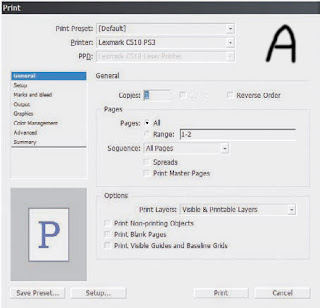
enter a sequential range as X-Y. If you want to print non-sequentially, use commas, like this: 2, 4, 6, 8, 10. Maybe, with a multiple-template magazine, for instance, you want to print about 10 pages, but they’re spread out in 2- and 3-page chunks across the document’s 36 pages. Simple: Combine range and non-sequential like so: 2-3,8-10,20-22. If all you need is even or odd pages, for instance when doing manual duplexing, select the appropriate option from the Sequence drop-down.
Printing master pages is useful for quite a few things, particularly when proofing or redesigning templates. Under options, you can choose to print layers that are visible (on) and not tagged as non-printing, but you can also override layer visibility and non-printing status. I like this feature for variations and particularly document review markups. I can feel free to mark up a document with change notes right in InDesign as long as my collaborators or I do it on a layer set to non-printing. When I want to print those markups or other non-printing data, the Print Layers drop-down lets me print them. Thus, through deliberate action I can get a hardcopy of my document and markups, comments, and other non-printing data, but I don’t have to worry that comments like "Were you high when you wrote this!?" will unintentionally go to press. Setup If you need to scale pages to fit in a smaller space, make thumbnails, or tile large pages to span multiple sheets of smaller paper, do it here instead of in your printer’s setup dialog (Setup button on the bottom left). Why? Because InDesign will scale or divide the pre-processed data; leaving it to your printer scales the post-RIP imagery. You’ll get better quality letting InDesign take care of it. (See Figure C) The preview on the left will update with any changes here (or elsewhere in the Print dialog), which makes it easy to adjust thumbnails, scaling, page position, and tile overlap.
Marks and Bleed
This is cool (see Figure D). Want color bars? You got ’em. Want crop marks with a custom offset? There they are. Need to print a proof with custom bleed widths without messing up the document? Well then, just uncheck Use Document Bleed Settings and set the new widths. You can even print information in the document slug area.

Output
We’ve already covered most of this pane (see Figure E). The rest is as follows:
Text as Black Prints all text in black ink.
Flip This one tends to get some people who are used to other layout applications. Flip is how you set emulsion up or down (Flip Horizontal), but it also lets you rotate the image simultaneously.
Screening. All the screen frequencies (in lines per inch and gots per inch) available for the selected PPD. Inks Notice the little printer icon next to each ink? If you’d like to selectively print or omit from printing any inks, just click those icons just as you’d hide layers by clicking the eyeball. InDesign makes it really easy to create your own custom comps or seps or to print without including the colors taking the place of varnishes or dies.
Graphics
(See Figure F). This should be called something else since there’s really only one option for images, but…

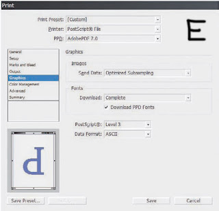
Send Data If high-quality images aren’t important to a particular proof, you can speed printing by sending sub-sampled, low-resolution proxy, or no images at all to the printer.
Fonts Should an entire font be sent to the printer, a subset comprising only the glyphs used in the document, or no fonts at all? The last option includes only a reference to the font in the PostScript file and is useful only when the printer has the needed fonts onboard. When you’ve used TrueType fonts or TrueType-flavored OpenTypes, it’s generally best to download them.
Download PPD Fonts Even if the fonts in use are printer resident, InDesign will download the fonts anyway. Typically, you want this on to guard against disparate versions of fonts causing glyph substitution or text reflows.
PostScript The version of PostScript encoding for the printed data. This option automatically sets itself according to the highest supported level of PostScript in the output device as reported by the PPD. Some desktop printers support emulated PostScript (a PS interpreter from someone other than Adobe), which often doesn’t support the full set of features for a particular PostScript level. If you experience problems printing at PostScript 3 with a device that should support it, try changing PostScript to Level 2. Similarly, when printing to a Post- Script file with a generic PPD, you may need to knock the level down to PostScript Level 2 for compatibility.
Data Format Binary has better compression and is a little faster, but it can cause problems with EPS and DCS files and may not be compatible with many output devices. I’ve used Binary a couple of times, but only on direct request from a service provider. I’ve never had trouble sending ASCII-encoded PostScript code to a wide variety of devices.
Color Management
At the top (see Figure G), choose whether to print using the document working space profile or the proof profile defined in the Customize Proof Conditions dialog. Next, depending on the printer, PPD, and output options selected, Color Handling will offer options to let InDesign handle color management or to handle it in-RIP. Choose the latter only if you have a PostScript 3—compatible RIP with onboard color management. Finally, choose the output device’s specific ICC profile. The rest of the options you already know. Advanced
(See Figure H). In the OPI section, you can omit different types of proxy images from the print stream to leave just the OPI link comments in the PostScript code. Use this when OPI image insertion is to be handled further downstream.
Above the omit options, OPI Image Replacement tells InDesign to handle OPI image replacement in the print stream. Leave it unchecked for an OPI server to do the replacement. In order for InDesign to take care of image replacement, the following conditions must be met:
- EPS images in the document must have OPI comments linking to high-resolution versions.
- When the EPS proxies were imported, the Read Embedded OPI Image Links check box must have been checked in Import Options.
- InDesign must be able to access the high-resolution images. If conditions one and two are met but not three, InDesign will leave in place OPI comment links for images it can’t access.
Last is Transparency Flattener presets and the ability to ignore or override spread overrides. Print Presets
Once you’ve configured all your print settings the way you need them, do yourself a favor and save a preset with the button at the bottom. Next time you need the same configuration, you’ll find all your arduously configured settings only two clicks away on the Presets menu. Even better, from File -Print Presets
-Define (see Figure I), you can manage all your presets and even save them to external, shareable PRST files. Clicking New or Edit opens the Print dialog to create or modify a complete set of printing options in the familiar interface.
I frequently recommend to my print and pre-press shop clients that they generate PRST files for their common devices and workflows and then distribute those files to their customers as part of job preparation instructions. Save yourself—and your designer customers—some agony and delays. Just make sure to also include the appropriate PPD and ICC files.

InDesign: What is Configuring Color Management?

Configure Color Management
In the past, configuring color management seemed to require a PhD in spectrophotometry. It’s much easier now in general, but especially if you use InDesign as part of the Creative Suite.

Bridge Color Management Sets
We’ve talked about Adobe Bridge a couple of times now primarily in the context of asset manager. It does much more, as I intimated, and Adobe’s intent is that Bridge becomes the central hub of your Creative Suite experience—indeed, of your entire workflow. Toward that end, color management across all individual CS3 version applications is managed inside Bridge rather than within InDesign, Photoshop, and Illustrator, which keeps color display results almost identical between the individual applications. On the Edit menu in Bridge, you’ll find Creative Suite Color Settings, which opens an extremely simplified interface to apply full sets of ICC profiles and color management options to all CS3 applications simultaneously

In the Suite Color Settings dialog, click on one of the four friendly, plain language sets, and then click Apply. Behind the scenes, all applications will then be synchronized to use the following color management settings:

Monitor Color Used for onscreen and video projects without CMYK colors.
· RGB Working Space (Your monitor’s ICC/ICM profile)
· CMYK Working Space U.S. Web Coated (SWOP) v2
· RGB Policy Off
· CMYK Policy Off
· Profile Mismatches Ask When Opening
· Missing Profiles N/A
· Rendering Intent Relative Colorimetric
· Black Point Compensation Yes

North America General Purpose 2 Large RGB and CMYK gamut profiles compatible with (but not optimized for) typical print output devices in North America. Will not warn when profiles do not match.
· RGB Working Space sRGB IEC61966-2.1
· CMYK Working Space U.S. Web Coated (SWOP) v2
· RGB Policy Preserve Embedded Profiles
· CMYK Policy Preserve Numbers (Ignore Linked Profiles)
· Profile Mismatches N/A
· Missing Profiles N/A
· Rendering Intent Relative Colorimetric
. Black Point Compensation Yes

North America Prepress 2 Similar to North America General Purpose 2 except that profile mismatches will generate warnings, it uses a very large RGB gamut profile, and CMYK colors in linked assets will be preserved to the exclusion of separate profiles assigned to the assets.
· RGB Working Space Adobe RGB (1998)
· CMYK Working Space U.S. Web Coated (SWOP) v2
· RGB Policy Preserve Embedded Profiles
· CMYK Policy Preserve Numbers (Ignore Linked Profiles)
· Profile Mismatches Ask When Opening & When Pasting
· Missing Profiles Ask When Opening
· Rendering Intent Relative Colorimetric
· Black Point Compensation Yes

North America Web/Internet Uses a large gamut RGB profile purportedly representative of the color values available to the upper average of all monitors in use to access the Web. Any RGB colors will be converted from other profiles to the one defined as this set’s RGB Working Space.
· RGB Working Space sRGB IEC61966-2.1
· CMYK Working Space U.S. Web Coated (SWOP) v2
· RGB Policy Convert to Working Space
· CMYK Policy Preserve Numbers (Ignore Linked Profiles)
· Profile Mismatches Ask When Opening & When Pasting
· Missing Profiles N/A
· Rendering Intent Relative Colorimetric
· Black Point Compensation Yes

The four sets shown in the Suite Color Settings dialog are the most common for those who can’t (or won’t) profile their devices to obtain specific ICC profiles.

I’m asked often—I mean, very often, What are the default color management options should I use for
_________ design work?

My answer: Profile your particular monitor, scanner, camera, and printers; use those as defaults.
Them: No, what generic profiles should I use?
There are no “generics” in color management. There’s no generic language to unite the delegates of the UN Security Council. The only way their discussions or color management works is if interpreters listen to input in native languages and then convert verbatim into the next delegate’s or device’s native language. If, before you can leave this page, you absolutely must have something akin to “generic” settings in a process that has no definition for the word, then use one of the four sets above—whichever comes closest to describing what you’re doing in InDesign and its brethren. And then hope really hard that the output comes close to the colors you envisioned.

The Show Expanded List of Color Settings Files toggles 19 additional pre-configured sets. A few are the sets that were available in previous incarnations of Creative Suite (for instance, North America General Purpose [1]) as well as several European or Japanese defaults similar to the first four for North America.
Blog Widget by LinkWithin