Search This Blog

use of plugin shag hair part 2

Due to some bussiness I couldn't upload the part 2, please accept my apology.
here starts the "use of plugin shag hair"......
In the following tutorial, you will take the file from the previous tutorial and create both dark brown hair using sub-material ID’s, then create a clown-like hair style by applying a material directly to the ShagView object.
First up, let’s use a SubMaterial ID. To begin, we need a new material for the head, so open up the Material Editor.
1. There, you will find a beige skin colored material. Select that material preview window if it isn’t already selected.
2. Click on the Material Type button. This launches the Material/Map browser.
3. Select a Multi/Sub-object material and choose to keep the material as a sub-material. Then click OK.
4. This places the beige material in the Material ID slot #1. Copy that material to slot #2 as well. When you do, if you have a shaded camera view, you will see the area where the hair is emitting has turned gray.
5. Click on the Material located in slot #4. This takes you to the Standard Material rollout for that sub-material.
6. Click on the blank button next to diffuse to apply a map. This launches the Material/Map browser. Select Bitmap and choose OK.
7. When the Bitmap rollout appears, click on the blank button. This launches a file selection dialog box. Select the file Dryleave.JPG from your MAPS/Ground folder.
8. Once you have selected the Map, turn on Show Map in Viewport.
9. Choose Go to Parent twice, and then assign the material to the Head object. Now, the map doesn’t appear yet because we need to have mapping coordinates.
10.Select the head and go to the Modify command panel. Apply a UVW Mapping modifier. Set the mapping type to Box with a size of 70 in the X,Y, and Z directions. You should now see the map on the head.
11.Now, let’s setup the hair. Go to the Environment dialog box. You should see the Shag:Hair and Shag:Render entries from the last exercise. Click on Shag:Hair.
12.Scroll down to the Shading, Geometry, Quality rollout. For the Tip color, enable the Sub-Mat ID spinner and set the spinner to 4. Repeat for the Base color as well.
13.Close the Environment dialog box and render the scene. At this point, the Shag: Hair strands will take their coloration from the underlying material on the scalp of the head. This is great when working with animals such as zebras or leopards, where you want a specific pattern applied to the strands.

Another method for applying materials is to simply select the ShagView object and add a material directly to it.
14.Now, let’s create a clown hairstyle this way. Open the Material Editor and select an empty material slot.
15.In the Diffuse Map slot add a Gradient Ramp material. The default colors of Red, Green and Blue work fine here. Under the Coordinates rollout, change the W Angle value from 0 to 90. This will rotate the map 90 degrees so that the gradient will run along the length of the individual strands, and will start out blue, and change through green to red.
16.In the scene, select the ShagView object. Assign the material you just created to this object.
17.Re-render the scene.

v2 versus v1?

A number of broad ICC profiles ship with Creative Suite and its constituent applications. Many of these, for instance U.S. Web Coated (SWOP), carry the v2 version number suffix. If you’ve continuously upgraded from earlier Adobe applications, you may also have v1 profiles hanging around. Use the v2. The v1 ones were created with older software (Color Savvy for Adobe PressReady), whereas the v2 profiles were built using a special version of Photoshop and perform better in multistaged color conversions wherein an image is converted from one profile to another and then either back to the first or into a third profile.
A Color Management Off set is also there, but it’s a misnomer—there is no off switch to color management in Creative Suite. Instead, this set will define defaults just like the rest, which, come press time and depending on your work, can cause either barely noticeable color shifts or disastrously wide spectral swings. It assumes that all your RGB images were created directly on your monitor, in its color space, and that everything will be printed in the U.S. Web Coated (SWOP) v2 CMYK space.
Here is what Color Management Off really gives you:
RGB Working Space (Your monitor’s ICC/ICM profile)
CMYK Working Space U.S. Web Coated (SWOP) v2
RGB Policy Off (Leave it as is, without considering the source profile and without converting it to the current working space, and upon print, just convert the RGB numeric values to CMYK numeric values.)
CMYK Policy Off (Print it as is, without considering the source or output profile and without converting it to the current working space.)
Profile Mismatches Ask When Opening
Missing Profiles N/A
Rendering Intent Relative Colorimetric
Black Point Compensation Yes
I vigorously advise against using Color Management Off if color matters in the least to your work. Even one of the out-of-the-box presets would be a (marginally) better option.

Find/Change Styles to the Rescue

Mr. X worked as the final stop in a publication workflow that involved nine layout artists, each working on different portions of a 320-page quarterly. His job was to collect and proof everyone’s work, stitch it all together into a single publication managed by an InDesign book, and fix any mistakes before imposing the issue and sending it to press. Ofcourse, the publication had a style guide, templates, and preconfigured paragraph and character styles; invariably, however, the articles and sections Mr. X received from the other creatives contained numerous style overrides in the form of local formatting—all of which Mr. X had to fix before the publication went to press. Making matters worse, the publication also ran per issue anywhere between 1 and 10 articles and pieces of articles from outside agencies and filler libraries. The outside contributions were formatted in ways that rarely bore any resemblance to Mr. X’s templates.
Wrangling these wild styles should have been as easy as selecting paragraphs and applying or reapplying paragraph styles. Unfortunately, doing so cleared out desired overrides, most notably italic. Consequently, Mr. X found himself spending days staring at side-by-side comparisons of original pages and pages with correct paragraph styles, locating italicized words in the former, and manually italicizing the same words in the latter. The process took so long that Mr. X had to push up the issue closing date—which, of course, some members of the team understood to mean more time between submission and press for making last-minute rewrites, leading to more formatting cleanup and often on the same story more than once.
The real solution to Mr. X’s problem lay with stricter enforcement of the publication’s style guide, which was in the offing but still left Mr. X with a lot of extra work in the interim. Although style enforcement might improve the consistency of work from Mr. X’s coworkers, policy changes for content from external agencies wasn’t likely to improve as quickly as internal policy changes. By way of retaining Mr. X’s direct control over fixing the publication, there is a two-step solution.
First, Mr. X should identify all the formatting options that fell under the heading of “desired override”— in other words, any appropriately used character-level formatting such as italic, a couple of different underline and coloring styles used for assorted kinds of URLs listed in stories, and small caps for acronyms and occasional other uses. Mr. X should create character styles to hold each of the settings—one for small caps, one each for the types of URLs, one each for italic, bold-italic. Mr. X also should create a Regular character style that specifically disallowed all the formatting options of all the other character styles; using the Regular style would instantly strip off the effects of, say, the bold-italic style, reverting the selected text to non-bold, non-italic. Mr. X should add these styles to the main template.
Step two is building and enacting a procedure to replace wanted style overrides with character styles and then remove all unwanted overrides. No sweat. Using Find/Change (Edit > Find/Change), Mr. X should search for any italic glyph and assigned it to the Italic character style. You see those settings in the screenshot of the Find/Change dialog. Similar searches were run for each of the other format overrides that had matching character styles. Each replacement criteria set was saved as a reusable query.

To revert undesirable overrides back to their correct paragraph styles, additional searches were performed, one for each paragraph style. In that case, it was even simpler: both Find Format and Change Format were set to the same paragraph style and no other options.

When InDesign performs a Find/Change with such criteria, it automatically strips off any overrides—but not those properly assigned to character styles. So, to remove any unwanted overrides on the Body Copy style, Mr. X set the Find Format to search for Paragraph Style: Body Copy; the Change Format was also set to only Paragraph Style:
Body Copy. InDesign rolled through all the stories in the document, finding every instance of text in the Body Copy style, and force reapplying the paragraph style. Mr. X’s problem was solved.

To make things even faster, and with the help of a JavaScript programmer in Mr. X’s IT department, even all the Find/Change queries were automated. Now Mr. X just executes the Style Cleanup script from the Scripts panel. Formatting cleanup that used to take his days is finished within a couple of minutes.

Difference between InDesign and InCopy

InCopy is Adobe’s best kept secret, the least marketed of all of Adobe’s products, and a tool whose success is due almost entirely to the passionate handful of InCopy experts running around praising it to anyone who will listen. The difference between Story Editor in InDesign and the entire InCopy application is like the difference between the farm teams and major league baseball— steroids…um, I mean, greater talent and vastly expanded training.
InDesign and InCopy share a code base, meaning that they are, for all intents and purposes, the same application at heart. Their differences are the result of different sets of plug-ins stacked atop that code base. Many features are identical. For example, InCopy has InDesign’s full text styling and formatting capabilities, including lists, bullets and numbering, and tables and even identical Character, Paragraph, Character Styles, Paragraph Styles, Tabs, Swatches, Table, Story, Glyphs, Links, and Layers panels. Anything you can do with text in InDesign you can do in InCopy, its editorial counterpart. It also introduces features far beyond InDesign’s, features like an advanced thesaurus (and accompanying panel); Word-esque change tracking; text macros; constantly updating line, word, and character counts; and the ability to edit one, some, or all stories and text frames in an InDesign document concurrently, in several windows or just one. Whereas InDesign has two editing modes, InCopy has three: Story, Layout, and Galley. Story view (see Figure A) is identical to InDesign’s Story Editor, a pure word processor without accurate line breaks or composition. It also has the same pros, cons, and customization options.
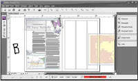
Of course, InCopy can open its own INCD and INCX file formats, as well as Microsoft Word DOC files, ASCII text, Rich Text format, and other common textual document formats, but it can also open InDesign documents. Lacking layout tools, frames cannot be moved or modified in InCopy, but their contents—text and imagery—can, which is what enables offloading editorial work from design and production to the editorial department. Editors who want to proof or even edit copy within the final layout can do so through InCopy’s layout view (see Figure B). The document in layout view is 100% accurately copy fit.
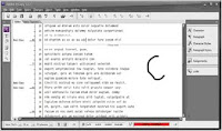
Finally, galley view is a combination of both (see Figure C). It’s a story editor but with accurate line breaks, hyphenation, composition, and copy-fitting. Working together, InDesign and InCopy fill both sides of the design-editorial dynamic, allowing one department to concentrate on its specialty and allowing the other group to do the same. Native editing of both applications’ files in the other, live copy and layout update links between them, and for more robust needs, the ability to assign frames, pages, and spreads to specific InCopy users are the reasons InCopy is rapidly supplanting Microsoft Word in collaborative publishing workflows. If you’re part of such a workflow, whether design and editorial are at the same or different sites, migrating writers, editors, and proof readers to InCopy could be the most valuable idea you gain from this book. I say that with all sincerity, and I have the experience migrating publishing clients to back up the claim.

Footnotes
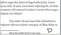
Footnotes are citations or resources placed at the end of a story and referenced from within the main text of the story. Figure D shows a typical footnote.
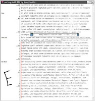
Inserting a footnote is easy. Position the cursor in the text immediately after the word or phrase to reference the footnote, and then select Type > Insert Footnote. Using the current footnote options, a new footnote reference will be added to the text at that point and the footnote itself at the bottom of the column; your cursor will stand ready to type the footnote. The easiest way to edit footnotes and their reference numbers is in Story Editor where they magically appear together. In Figure E, you can see both collapsed and expanded footnotes in their colored boxes. To collapse or expand, just double-click the colored box. To collapse or expand all footnotes at once, choose Collapse All Footnotes or Expand All Footnotes from the context sensitive menu or from the View > Story Editor menu.
Footnotes are anchored to their reference numbers. If text reflows, moving the reference to another column or page, the footnote follows to the bottom of that column or page. Similarly, pasting or dragging text containing a reference to a different place in the same document takes the footnote with it. The same occurs when pasting or dragging into a different document with the added benefit that both the reference and footnote itself will pick up the footnote formatting options in effect in the new document. Deleting a footnote is even easier than inserting it—delete just the reference number and the entire footnote goes along with it. You can delete the footnote number or other identifier at the beginning of the footnote itself, but you really shouldn’t—readers match the reference to the footnote by that mark. If you’ve deleted the number and want to reinsert it, choose Type > Insert Special Character > Markers > Footnote Number with the cursor ahead of the footnote.
Formatting Footnotes
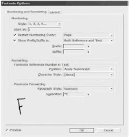
Extensive footnote formatting controls are available from Type > Document Footnote Options. The first tab of Footnote Options, Numbering and Formatting, is largely concerned with the appearance and sequence of footnotes (see Figure F).

What does it all mean?

Style Footnotes may take on numerous styles, including the most common Arabic numerals; the second most common, a system of symbols including the dagger (†), double-dagger (‡), and so on; incrementing asterisks; Roman numerals in both cases; and alphabetic enumerators in both lower- and uppercase.
Start At. InDesign automatically increments footnote numbers in the same story, and renumbers them to reflect additions, deletions, and rearrangement of footnote references. By default, each first footnote in the story will begin with 1 and ascend from there. In cases where a single chapter or document comprises more than a single story, you’ll want to either manually choose the starting number in the Start At field, or set an appropriate Restart Numbering Every option.
Depending on the type of document being written or laid out, you may want footnotes to continuously increment throughout the whole document or just per-section, spread, or page. For the former, leave Restart Numbering Every unchecked. However, to start the footnote reference numbering over at the Start At value for every section, spread, or page, check this box and choose the appropriate divider in the drop-down menu to the right.
Show Prefix/Suffix Between the check box, drop-down list, and specific Prefix and Suffix fields, you can add brackets [],parentheses (), hair spaces, thin spaces, or custom glyphs to either or both the footnote reference number and footnote text. The spaces in particular are handy when footnote references are rendered in a typeface too close to preceding or succeeding glyphs.
Footnote Reference Number in Text In the Position drop-down, determine if you’d like to format footnote reference numbers in the usual fashion of superscripted numbers or if you’d like them subscripted or even rendered as normal position, full-size numbers. By creating beforehand and assigning here a character style, every aspect of reference numbers’ appearance is open to customization distinct from surrounding copy.
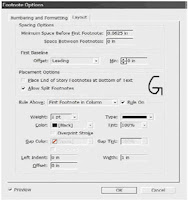
Footnote Formatting Footnotes themselves are paragraphs and can be styled while editing. Here, though, you have the ability to specify a particular paragraph style to set the majority of global appearance options. In the Separator field, enter the glyph(s) or marks to divide the identifying reference number from the footnote text it keys. The default, ^t, is code for a tab. On the Layout tab, more advanced formatting as well as footnote placement is stipulated (see Figure G).
Spacing Options. Enter in these fields the amount of vertical spacing between the end of the story column and the first footnote as well as the amount of vertical paragraph space separating multiple footnotes from each other. The latter option has no effect with single footnotes.
First Baseline. Baseline offset sets the vertical distance between the baseline of the first line of footnote text and the (by default ruled) top of the text frame holding footnotes. Control text baseline offset using the same options as in normal text frames—by ascent, cap height, leading value, x-height, or a fixed amount. The Min field refines Baseline Offset values of Leading or Fixed by specifying the minimum amount of space between the top of the line and the baseline of its text.
Place End of Story Footnotes at Bottom of Text. This option specifies where footnotes appearing in the last frame of a threaded story appear. In all other frames but the last, footnotes are placed at the bottom of the column in which their reference numbers appear. In some publications and according to some style guides, however, it’s preferable to place all footnotes from the last frame of a story not at the bottom of each column but beneath the last column. Checking this option sets the latter condition.
Allow Split Footnotes. When footnote text outgrows the amount of space allotted to hold footnotes, how should it be handled? Checking this option splits long footnotes across columns (and perhaps even pages), creating effectively threaded footnote frames at the bottoms of successive columns. Unchecking Allow Split Footnotes can force InDesign to move the body copy line of text containing the footnote reference number to its next column, which could result in large, multiline gaps at the bottom of main story columns. If the resulting gap is too large, InDesign will instead overset the footnote text. One way to help control footnote cohesion is to ensure that you’ve assigned to it a paragraph style with appropriate keeps options defined (e.g., keep X number of lines together or keep all lines together).
Rules. Mirroring the options of a paragraph rule above the paragraph, this section lets you create visually interesting separators above the first footnote section and/or above all footnote sections (for split footnotes). To disable the rule entirely, uncheck the Rule On box. In addition to all the formatting options in Footnote Options, you can still manually and individually style footnotes. For instance, you could select the footnote text (press Cmd+A/Ctrl+A with the cursor inside a footnote to select the entire text of just that footnote) and apply character styles, font or color changes, or anything else you can normally do with text. You can also manually style the footnote reference numbers, but it’s a much better idea to do it in Footnote Options with character styles. Even doing it that way, though, styles will be lost if you clear overrides and character styles in the paragraph containing the footnote reference.
Endnotes
Endnotes are similar to footnotes except that, instead of appearing at the end of columns, endnotes appear at the end of the story. InDesign does not have any actual endnote creation features beyond pressing Cmd+Shift+End/Ctrl+Shift+End (the shortcut to go to the end of the story) and typing the endnote. Microsoft Word does have endnote features, which means you could potentially import Word documents including them. Checking Show Import Options in the Place dialog presents the option of whether to import endnotes in Word files. If they’re imported, InDesign will convert Word endnotes to normal,

Table Of Contents in InDesign

Creating a table of contents for the document (or book) is far less involved than creating an index, as long as you practiced efficient composition by assigning paragraph styles to the elements that should be listed within the TOC. The basis for TOC generation is paragraph styles—in other words, any text assigned to this style or that style will be included or excluded based solely on its paragraph style.
InDesign supports an unlimited number of tables of contents. Thus, you can create the standard document TOC like the one at the front of this book, but you can also create per-chapter tables of contents, lists of figures or tables, alphabetized lists of topics, and just about anything else you can imagine (and manage with paragraph styles).
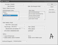
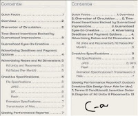
Begin creating the table of contents by choosing Layout > Table of Contents, which opens the Table of Contents dialog (see Figure A). Click the More Options button to reveal the full depth of the dialog.

TOC Style. All of the options incorporated into the Table of Contents dialog may be saved as a preset called a TOC style. After setting the options, click the Save Style button on the right and give the style a name. TOC styles can also be created and edited from Layout > Table of Contents Styles. If a style has been pre-created, it will appear in the TOC Style list; choose it, and all the below options will fill in with their style-defined values.
Title. When the TOC is generated and placed, it will have a title as the first line of the story. By default, the title will be Contents, but it can be anything you like. Leaving the Title field blank removes the title from the generated TOC entirely, without leaving a blank carriage return where it would have been.
Style. The paragraph style for formatting the TOC title.
Styles in Table of Contents. This is the root of creating a TOC. On the right, in the Other Styles list, are all the paragraph styles defined in the document. Click a style on the right to highlight it, and then use the Add button to move it to the left, the Include Paragraph Styles list. You can also double-click an entry in either column to move it to the other. Each style included on the left will cause all text assigned to that style to be listed in the resulting

TOC; styles not in the list will not have their dependent text referenced by the TOC. The order of styles in the Include list establishes the TOC hierarchy. In other words, the first listed style is the most important, highest level of the generated TOC, with the next appearing below it, the next below that, and so on. If you insert styles in the wrong order, drag them up or down in the list just as you reorder styles in the Paragraph or Character styles panels. But you must also change their Level value in the Style section below. Figure B shows an example of the Include Paragraph Styles list and the TOC it would generate.

Click to highlight a style in the Include Paragraph Styles to set its options below in the Style section. Each included style may have its own entry style, page number options, and so on.
Entry Style. When the TOC is generated, the text for each entry level can have its own paragraph style. Unlike index styles, InDesign will not automatically created level-based paragraph styles. You’ll need to pre-create your TOC styles and then select them from the list for each Include Paragraph Style option. Alternatively, leave the default of [Same Style] to include the same style in the TOC as on the document pages.
Page Number. Choose whether to place the page number before or after the entry text or to omit the page number entirely. With the Style field to the right, the page number can be given its own character style for customized formatting.
Between Entry and Number. The separator character or characters to appear between the entry text and its number (or number and text, if the page number is placed before the text). The pop-up menu to the right offers many symbols, markers, and special characters. To create a leader dot separator, specify a tab (^t) in the field and then modify the paragraph style (outside of the Table of Contents dialog) to include a leader dot separator at that tab stop. The dropdown menu at the right allows assigning a character style to the separator itself, enabling any unique styling to be applied to just the separator.
Sort Entries in Alphabetical Order. By default, and in most cases, TOC entries are sorted in order of appearance in the document. However, especially when creating documents for electronic distribution as PDFs, this option opens numerous other possible uses for the Table of Contents feature beyond creating a standard TOC. When InDesign generates a TOC, it creates hyperlinks connecting the TOC entries to the text they reference. Exporting to PDF preserves these hyperlinks, enabling a reader of such a PDF to click on the TOC entry and jump to the content. Thus, the option to sort entries alphabetically rather than logically opens the possibilities of creating vastly different lists such as lists of product names, personnel referenced in the document, or even a replacement for a standard index—without having to manually create index entries. The only significant limitation to using the Table of Contents functions in place of index and other features is that InDesign’s Table of Contents is dependent upon paragraph styles; it cannot create an entry from a character style or a specific word in the middle of a paragraph.
Level. In a hierarchal TOC such as the one at the front of this book, entries from each successive style are considered inferior to their predecessors—Heading
1, for instance is superior to Heading.
2, which is superior to Heading.
3. The Level field defines that hierarchy. As each style is moved from the Other Styles list to the Include Paragraph Styles list, InDesign automatically assigns a successive level. If you have reordered the include list by dragging and dropping, you will also need to change the level for each affected style.
Often successive TOC entries are indented as visual cues to the hierarchy. The Include list mimics the hierarchy by indenting styles in the list, giving you a visual representation of how the generated TOC may look. The Level field is nonexclusive, meaning that you are not required to have only a single level 1 or level 2 entry. If you have two or more equally important styles, they can all be set to the same level.
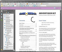
Create PDF Bookmarks. Similar to the way each entry on the page itself will be hyperlinked to its content, InDesign can automatically generate PDF bookmarks, which are hidden until PDF export time. Adding these, and choosing to include bookmarks when exporting to PDF, creates something —a Bookmarks panel sidebar TOC-style list of topics that, when clicked in Acrobat or Adobe Reader, become hot links and jump the reader to the referenced content.
Replace Existing Table of Contents. If you have previously generated and placed a TOC, this option will replace (not update) it. When using the Table of Contents to build separate styles of tables, you want this option unchecked.
Include Book Documents. When generating a TOC for documents managed through an InDesign Book file, check this option to generate a single TOC that points to all instances of the included paragraph styles in all documents within the book.
Run-In By default, all TOC entries are given their own line, with a carriage return at the end. An alternate style is to use the run-in method that, like the same option within an index, only separated by top-level styles. All entries lower in the hierarchy than the top will be placed together in a paragraph (see Figure C).

Include Text on Hidden Layers Choose whether to include in the TOC text on hidden layers.
Numbered Paragraphs New to CS3, this option tells InDesign how to handle paragraphs that have been numbered through the List and Numbering functions. Note that InDesign does not recognize numbers that have been converted to standard text and will include them in the TOC regardless of this setting. The options are as follows:
Include Full Paragraph lists the text in the TOC exactly as it appears on the page, with all text automatic numbering intact. For example, you choose table 9 (if you have in the document) in a chapter whose number is defined within the paragraph Numbering options to include the prefix Table 9 and whose table caption is XYZ or ABC Products will list in both the main story and the TOC as Table 9. XYZ or ABC Products.
Include Numbers Only. ignores the text in the paragraph and includes only the automatic number and any prefixes. For example, to include a TOC entry for Table 9.9 without the table’s caption, choose Include Numbers Only.
Exclude Numbers. includes in the TOC the text of the paragraph but not the automatic number. The TOC output using the above example would therefore be simply KDY Capital- Class Products.
Click OK to return to the document with a loaded cursor ready to place the TOC story, which may be placed and flowed like any story. If any stories in the document contain overset text assigned to the included styles, you will be prompted after clicking OK whether to include those instances in the TOC.
Unlike an index, tables of contents don’t have their own panel. Also unlike an index, you needn’t go through the entire generate process to update a TOC. Instead, select a text frame holding the TOC style, and choose Layout > Update Table of Contents. Shortly, an alert dialog will inform you that the table of contents has been updated successfully. When creating a comprehensive TOC for book documents, it’s often better to place the TOC into its own self-contained document and to add that document to the Book panel.

How to rotate text?

Ans. There are times when, for creative reasons, you’d like to rotate text without rotating the frame in which it resides. Maybe the frame is a bezier path, or maybe it’s just a rectangle. For whatever reason, however, rotating the frame and its content and then using the direct selection tool to manually restore the rotated frame to its original shape and location are too time- consuming. There is a way to accomplish this task quickly using InDesign’s Pathfinder feature.
Rotating text in frames
We start with our text un-rotated and in a bezier frame.Draw a new frame on top and completely within the bounding box of the text frame, as shown in the screenshot at right. It doesn’t matter how big this new frame is, as long as it fits completely inside the original text frame. Text frame that contains text you want to rotate.
The new frame that you draw on top of the first text frame.
Next, Cut the text from the text frame, and paste it into your new frame. Then rotate the new frame to your desired angle, and select both frames.
Rotating text in frames
Using the Pathfinder palette, click on the Add button to combine the two shapes. When the Pathfinder combines multiple shapes with Add function, the stroke, fill, content, angle of rotation and other properties for the resulting shape are taken from the topmost object.
Blog Widget by LinkWithin