Search This Blog

Illustrator: What is Trapping? How to do trapping? II

To create a trap using the Trap command:
1 Select two or more objects, choose Window > Show Pathfinder, and select Trap from the palette’s pop-out menu.
2 In the Thickness text box, enter a stroke width of between 0.01 and 5000 points. Check with your print shop to determine what value to use.
3 Enter a value in the Height/Width% text box to specify the trap on horizontal lines as a percentage of the trap on vertical lines. Specifying different horizontal and vertical trap values lets you compensate for on-press irregularities, such as paper stretch. Contact your print shop for help in determining this value. The default value of 100% results in the same trap width on horizontal lines and on vertical lines.
To increase the trap thickness on horizontal lines without changing the vertical trap, set the Height/Width value to greater than 100%. To decrease the trap thickness on horizontal lines without changing the vertical trap, set the Height/Width value to less than 100%.

4 Enter a Tint Reduction value to change the tint of the trap. The default value is 40%. The Tint Reduction value reduces the values of the lighter color being trapped; the darker color values remain at 100%. The Tint Reduction value also affects the values of custom colors.

5 Select additional trapping options as required:
• Traps with Process Color if you want to convert spot color traps to equivalent process colors. This option creates an object of the lighter of the spot colors and overprints it.
• Reverse Traps to trap darker colors into lighter colors. This option does not work with rich black—that is, black that contains additional CMY inks.
6 Click OK to create a trap on the selected objects. Click Defaults to return to the default trapping values.

Trapping by overprinting
For more precise control of trapping and for trapping complex objects, you can create the effect of a trap by stroking an object and setting the stroke to overprint.

To create a spread or choke by overprinting:
1 Select the topmost object of the two objects that must trap into each other.
2 In the Stroke box in the toolbox or the Color palette, do one of the following:
• Create a spread by entering the same color values for the Stroke as appear in the Fill option. You can change the stroke’s color values by selecting the stroke and then adjusting its color values in the Color palette. This method enlarges the object by stroking its boundaries with the same color as the object’s fill.

• Create a choke by entering the same color values for the Stroke as appear in the lighter background (again, using the Color palette); the Stroke and Fill values will differ. This method reduces the darker object by stroking its boundaries with the lighter background color.
3 Choose Window > Show Stroke.
4 In the Stroke palette, in the Weight text box enter a stroke width of between 0.6 and 2.0 points. A stroke weight of 0.6 point creates a trap of 0.3 point. A stroke weight of 2.0 points creates a trap of 1.0 point. Check with your print shop to determine what value to use.
5 Choose Window > Show Attributes.
6 Select Overprint Stroke.
In a spread, the lighter object traps into (overprints) the darker background. In a choke, overprinting the stroke causes the lighter background to trap into the darker object.

To trap a line:
1 Select the line to be trapped.
2 In the Stroke box in the toolbox or the Color palette, assign the stroke a color of white.
3 In the Stroke palette, select the desired line weight.
4 Copy the line, and choose Edit > Paste in Front. The copy is used to create a trap.
5 In the Stroke box in the toolbox or the Color palette, stroke the copy with the desired color.
6 In the Stroke palette, choose a line weight that is wider than the bottom line.
7 Choose Window > Show Attributes.
8 Select Overprint Stroke for the top line.

To trap a portion of an object:
1 Draw a line along the edge or edges that you want to trap. If the object is complex, use the direct-selection tool to select the edges, copy it, and choose Edit > Paste in Front to paste the copy directly on top of the original.

2 In the Stroke box in the toolbox or the Color palette, select a color value for the Stroke to create either a spread or a choke. If you are uncertain about what type of trap is appropriate,
3 Choose Window > Show Attributes.
4 Select Overprint Stroke.


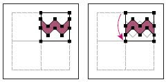
(Special Note: these images are named as trap, trap2, trap3 etc. consider them by this sequence, do not bother yourself with the placement of the images here.)


Illustrator: What is Trapping? How to do trapping? I

About traps
When overlapping painted objects share a common color, trapping may be unnecessary if the color that is common to both objects creates an automatic trap. For example, if two overlapping objects contain cyan as part of their CMYK values, any gap between them is covered by the cyan content of the object underneath.

Note: When artwork does contain common ink colors, overprinting does not occur on the shared plate.

There are two types of trap:
A spread, in which a lighter object overlaps a darker background and seems to expand into the background.
and
A choke, in which a lighter background overlaps a darker object that falls within the background and seems to squeeze or reduce the object.

You can create both spreads and chokes in the Adobe Illustrator program. It is generally best to scale your graphic to its final size before adding a trap. Once you create a trap for an object, the amount of trapping increases or decreases if you scale the object. For example, if you create a graphic that has a 0.5-point trap and scale it to five times its original size, the result is a 2.5-point trap for the enlarged graphic.

Trapping with tints
When trapping two light-colored objects, the trap line may show through the darker of the two colors, resulting in an unsightly dark border. For example, if you trap a light yellow object into a light blue object, a bright green border is visible where the trap is created.
To prevent the trap line from showing through, you can specify a tint of the trapping color (here, the yellow color) to create a more pleasing effect. Check with your print shop to find out what percentage of tint is most appropriate given the type of press, inks, paper stock, and so on being used.

Trapping type
Trapping type can present special problems. Avoid applying mixed process colors or tints of process colors to type at small point sizes, because any misregistration can make the text difficult to read. Likewise, trapping type at small point sizes can result in hard-to-read type. As with tint reduction, check with your print shop before trapping such type. For example, if you are printing black type on a colored background, simply overprinting the type onto the background may be enough. To trap type, you can add the stroke below the fill in the Appearance palette, and set the stroke to overprint (or set it to Multiply blending mode).

Using the Trap command
The Trap command creates traps for simple objects by identifying the lighter artwork— whether it’s the object or the background—and overprinting (trapping) it into the darker artwork.

Note: The Trap command is only available when you are working on CMYK documents.

You can apply the Trap command as a Pathfinder command or as an effect.

In some cases, the top and bottom objects may have similar color densities so that one color is not obviously darker than the other. In this case, the Trap command determines the trap based on slight differences in color; if the trap specified by the Trap dialog box is not satisfactory, you can use the Reverse Trap option to switch the way in which the Trap command traps the two objects.

See next guidance trip

(Special Note: all the figures regarding this topic "trapping" are at the end of this guidance trip.)

Creating corner tiles for brush patterns

Corner tiles lend special border effects when applying brush patterns. You can create corner tiles from scratch, or you can use a brush pattern’s side tile as the basis for designing complementary outer and inner (reflected –135 degrees) corner tiles.
To create symmetrical corner tiles from a side tile:
1
Choose File > Open, locate a brush pattern file, supplied with Adobe Illustrator, that you want to use, and click Open.
2 Choose Window > Brushes. Select the tile you want to use, and drag it to the center of your artwork.
3 If the tile does not have a square bounding box, create a box that completely encompasses the artwork, the same height as the side tile. (Side tiles can be rectangular.) Fill and stroke the box with None, and choose Object > Arrange > Send to Back to make the box backmost in your artwork. (The bounding box helps you align the new tile.)
4 Select the tile and the bounding box.
5 Use the rotate tool to rotate the tile and its bounding box 180 degrees.
Pasted tile (left) and tile rotated 180º (right)
6 Using the rotate tool, Alt+Shift (Windows) or Option+Shift (Mac OS) the lower left corner of the bounding box. Enter a value of 90 degrees, and click Copy to create a copy flush left of the first tile. This tile becomes the corner tile.
7 Using the selection tool, drag the left tile down by the top right anchor point, pressing Alt+Shift (Windows) or Option+Shift (Mac OS) to make a copy and constrain the move so that you create a third tile beneath the second. When the copy’s upper right anchor point snaps to the corner tile’s lower right anchor point, release the mouse button and Alt+Shift (Windows) or Option+Shift (Mac OS).
You use the third copy for alignment.
Rotate 90º and copy left tile (left). Then Alt-drag/Option-drag corner tile to make copy
beneath it (right).
8 Select the artwork in the right tile. Drag it to the left, pressing Alt+Shift (Windows) or Option+Shift (Mac OS) so that the artwork overlaps that in the corner tile.
Copy (left) and move upper right tile over corner tile (right).
9 Edit the corner tile so that its artwork lines up vertically and horizontally with the tiles next to it. Select and delete any portions of the tile that you do not want in the corner and edit the remaining art to create the final outer corner tile.
Unneeded elements selected (left) and deleted; Final outer corner tile (right).
10 Select all of the tile including the bounding box.
11 Save the new pattern
12 Double-click the new pattern swatch to bring up the Swatch Options dialog box, name the tile as a variation of the original (for example, use the suffix .outer), and click OK.

To create an inner corner tile:
Do one of the following:
• If the side tile for the brush pattern is horizontally symmetric (that is, if it looks the same when flipped top to bottom), you can use the same tile for the inner corner tile as for the outer corner tile.
• If the side tile for the brush pattern is not horizontally symmetric, follow the same steps as to create symmetrical corner tiles from a side tile, but skip step 5 (rotating the tile by 180 degrees).

Adobe Illustrator: Adding, duplicating, and deleting swatches

You can add color swatches to the Swatches palette by dragging and dropping colors on the palette or by using commands in the Swatches palette. To duplicate swatches, use the commands in the Swatches palette or drag the swatch onto the New Swatch button.
To add a color to the Swatches palette:
1 In the Color palette, Gradient palette, or the Fill box and Stroke box in the toolbox, select the color or gradient you want to add to the Swatches palette.
2 Do one of the following:
• Click the New Swatch button at the bottom of the Swatches palette.
• Choose New Swatch from the pop-up menu in the Swatches palette.
Enter a name in the Swatch Name text box, choose Process Color or Spot Color from the Color Type pop-up menu, and click OK.
• Drag the color or gradient to the Swatches palette, positioning the pointer where you want the new swatch to appear.
• Ctrl-drag (Windows) or Command-drag (Mac OS) a color to the Swatches palette to create a spot color. You can also press Ctrl (Windows) or Command (Mac OS) while clicking the New Swatch button to create a spot color.
To duplicate a swatch in the Swatches palette:
1 Select the swatch you want to duplicate. To select multiple swatches, hold down Ctrl (Windows) or Command (Mac OS) and click each swatch. To select a range of swatches, hold down Shift and click to define the range.
2 Do one of the following:
• Choose Duplicate Swatch from the pop-up menu.
• Drag the swatches to the New Swatch button on the bottom of the palette.
To replace a swatch in the Swatches palette:
Hold down Alt (Windows) or Option (Mac OS) and drag the color or gradient from the Color palette, Gradient palette, or the Fill box and Stroke box in the toolbox to the Swatches palette, highlighting the swatch you want to replace.
Important: Replacing an existing color, gradient, or pattern in the Swatches palette Globally changes artwork in the file containing that swatch color with the new color, gradient, or pattern. The only exception is for a process color that does not have the Global option selected in the Swatch Options dialog box.
To delete a swatch from the Swatches palette:
1 Select the swatch you want to delete. To select multiple swatches, hold down Ctrl (Windows) or Command (Mac OS) and click each swatch. To select adjacent swatches, hold down Shift and click to define the range.

2 Delete the selected swatches in one of the following ways:
• Choose Delete Swatch from the pop-up menu.
• Click the Delete Swatch button at the bottom of the palette.
• Drag the selected swatches to the Delete Swatch button.

Note: When you delete a spot color or global process color swatch (or a pattern or gradient containing a spot or global process color), all objects painted with those colors will be converted to the non-global process color equivalent.

Editing swatches
You can change individual attributes of a swatch—such as its name, color mode, color definition, whether it is process or spot, or whether a process color can be changed globally—using the Swatch Options dialog box.
Any swatch can be named in Adobe Illustrator; for example, you can change the name of a CMYK process color, and it still prints and separates with each of its CMYK values intact.
To edit a swatch:
1 Choose Window > Swatches.
2 Select a swatch, and do one of the following:
• Double-click the swatch.
• Choose Swatch Options from the pop-up menu in the Swatches palette.
3 Enter the relevant information in the Swatch Options dialog box:
• Enter a name in the Swatch Name text box.
• Choose Spot Color or Process Color from the Color Type pop-up menu. Both spot colors and process colors can be changed globally.
• Click Global if you want changes to the selected process color to be applied globally throughout the document.
• Choose CMYK, RGB, Web Safe RGB, HSB, or Grayscale from the Color Mode pop-up menu and change the color definition (if desired) using the color sliders or text boxes at the bottom of the palette.
4 Click OK.

Note: When separated, each spot color is converted to a process color by default, unless you deselect the Convert to Process option in the Separation Setup dialog box.

A Real-Time Reversed Text InDesign Part II

2nd Way
A Text Interacts With A Black Shape

1. Let’s start again from the beginning. Very important, via the View menu, Overprint Preview must be enabled.
2. Draw a shape and colorize it with a Black color, not the default [Black] between brackets, just select the [Black] and by clicking on the New Swatch button at the bottom of the Swatches palette create a new “Black 2”. You can change its name to “Black 100K” for instance.
3. Deselect everything with Cmd- Shift-A / Ctrl-Shift-A and in the Swatches palette’s fly-out menu > New Color Swatch... - Color Type : Spot - Name : Spot Black for Texts and click OK.
4. Now select the text with the Text Tool and colorize its Fill with the “Spot Black for Texts” spot color.

5. Select the Black Arrow so the text frame is selected. Right-click > Arrange > Send to Back so the text frame is behind the black circle.
6. Select the black circle alone and in the Transparency palette, choose the Lighten blending mode. Turn this page to see the final result...
Warning : if you have reproduced the steps to create this effect on a white background, it works perfectly. But if you place the logo on a colored background, the black text will disappear. The workaround is simple and is explained on the previous page (step 6).
7. Move the text frame to see a real-time reversed text effect. The problem now is that a spot color is involved but the goal is usually to print in CMYK mode without a Black spot color. InDesign’s Ink Manager and “Ink Aliases” features can’t
convert all spot inks to process inks without discarding the reversed text effect. Fortunately, Acrobat Professional will do it perfectly. Thus...
8. Export the document in PDF format using the [PDF/X-1a:2001] preset for instance and add other options like bleed and cropmarks.
9. Open the PDF in Acrobat Professional and display Tools > Print Production > Ink Manager...
10. Select the “Spot Black for Texts” spot ink and at the bottom of the window > Ink alias > Process Black then click OK.
11. Tools > Print Production > Output Preview... The PDF is indeed in CMYK mode and both Blacks are on the Process Black plate ; no more spot ink.
12. Check the color separation : File > Print > Advanced... (button) then Output > Color > Separations then close the dialog box with OK and then OK to print. The black objects will only appear on the Black plate. File > Save as... the PDF.

A Real-Time Reversed Text InDesign Part I

Due to the way blending modes work, and depending the colors you will use to create this effect,
there are two ways to achieve this effect.
Ist Way

A Text Interacts With A Colored Shape
1. Very important, via the View menu, Overprint Preview must be enabled.
2. Draw a shape and colorize it in any color but do not use the Black (K) in the swatche’s composition, otherwise the trick will not work.
3. On top of the shape, draw a text frame and fi ll it with some text. Colorize the text with a Black color, not the default [Black] between brackets, just select the [Black] and by clicking on the New Swatch button at the bottom of the Swatches palette create a new “Black 2”. You can change its name to “Black 100K” for instance.
4. Now select the text frame with the Black Arrow. In the Transparency palette, choose the Lighten blending mode.
5. Move the text frame to see a real- time effect.
6. Warning : if you have reproduced the steps to create this
effect on a white background, it works perfectly. But if you place the logo on a colored background like in this document, the black text will disappear.
The workaround is simple :
- select the text frame and the red circle, not the background object, - group them : Cmd-G / Ctrl-G,
- tick the Isolate Blending option in the ransparency palette.

Blending, Trasnparency in InDesign

Designers tell me that they do not really see the purpose of the options in the Transparency palette. OK, let’s start from the beginning.
Isolate Blending
1. A yellow shape is set to overprint the cyan square (select the yellow object and via Window > Attributes tick the Overprint Fill option). Both objects are placed on top of a picture. You know that if you want to see on screen the final result when printed after color separation, you have to enable Overprint Preview via the View menu. The intersection (Cyan + Yellow) is green.
2. Select both shapes and group them Cmd-G / Ctrl-G.
3. In the Transparency palette tick the Isolate Blending option (If you cannot see the Isolate Blending checkbox, choose More Options from the palette menu): the yellow shape will only overprint the cyan square.
Knockout Group
1. Deactivate the Isolate Blending mode and tick the Knockout Group option: the yellow shape creates a hole in the cyan square and thus overprints the image. Still dubious about this feature?
2. OK, here is a series of duplicated logos, and each logo has a different level of opacity. The problem is that we see through each logo, revealing the object behind, but you don’t want that, you just want to create objects that get lighter and lighter.
3. Select all objects and group them.
4. Check the Knockout Group option and there you go.

A Transparent Object with an Opaque Shadow
In InDesign, it is impossible to apply a low-level opacity to an object while at the same time keep the shadow 100 % opaque because the effect is applied to the whole frame, effect included. How can we do it ? Very simple ! We will use the previous trick (Knockout Group). This is the effect that we want to achieve.
1. On top of the background picture, draw the shape and apply the desired shadow.
2. As you can see, if I change the opacity of the object, the opacity of the shadow changes with it. Return the object to 100% opacity.
3. Copy the object and paste the copy on top of the very same object via Edit > Paste in Place.
4. Keep the overlapping object selected and remove its shadow. Change the object’s color and set a different opacity, for instance 50 %.
5. Now select both shapes (don’t select the background image) and group them via Cmd-G / Ctrl-G.
6. In the Transparency palette, select the Knockout Group option. Yes ! The overlapping shape knocks out
the bottom shape, and because they To avoid to mistakenly select the background have the
same shape, the one behind image, use layers. And the #1 rule in InDesign is : is knocked out, but not completely : “Whatever the job, always use layers, whether is it a very thin line revealing the THE catalogue of a lifetime or a business card.” underneath object is still visible.
7. To change the opacity of the overlapping object, click outside everything (or Cmd-Shit- A / Ctrl-Shift-A), select it with the White Arrow (Direct Selection Tool) to select it alone even if it is part of a group and set its opacity, for instance, at 0 %. The shadow is still there !
8. To completely cover the very thin line, be sure that the Center Reference Point is selected and set the Scale X and Y Percentage of the selected object (the top one) to 101 %.
9. At this point you can use again the White Arrow to select two overlapping anchor points and modify the shape of the objects ; visually it looks like you’re working on a single transparent object with an opaque shadow.

Changing Vector Graphics Into Bitmap Images

The process of changing a vector graphic to a bitmap image is called rasterization. During rasterization, Illustrator converts the graphic’s paths into pixels. The rasterization options you set determine the size and other characteristics of the resulting pixels.
There are two ways to rasterize vector graphics:
• The Object > Rasterize command permanently converts the graphic to a bitmap image
using the specified rasterization settings. Once you apply the Object > Rasterize
command, you cannot modify the image’s rasterization settings.
• The Effect > Rasterize command changes only the appearance of the graphic without
changing the graphic’s underlying structure. You can modify the rasterization settings of the bitmap image or revert the bitmap image to a vector graphic at any time.

Once graphics are converted by either method, you can apply plug-in filters, such as those designed for Adobe Photoshop, to the image as you would with any placed image. However, you cannot apply vector tools and commands (such as the type tools and the Pathfinder commands) to modify the bitmap image.
To rasterize a vector graphic:
1 Do one of the following:
• Select one or more objects you want to rasterize, and choose Object > Rasterize.
• Select one or more objects you want to rasterize, or target an item in the Layers palette. Then choose Effect > Rasterize.
2 Set the following rasterization options, and click OK:
Color Model Determines the color model that is used during rasterization. You can generate an RGB or CMYK color image (depending on the color mode of your document), a grayscale image, or a 1-bit image (which may be black-and-white or black-and-transparent, depending on the background option selected).
Resolution Determines the number of pixels per inch (ppi) in the rasterized image.
Select Use Document Raster Effects Resolution to use global resolution settings.
Background Determines how transparent areas of the vector graphic are converted to pixels. Select White to fill transparent areas with white pixels, or select Transparent to make the background transparent. If you select Transparent, you create an alpha channel (for all images except 1-bit images). The alpha channel is retained if the artwork is exported into Photoshop.
Type Quality Determines the method used to rasterize type. Select Streamline if you want the rasterized type to be slender and attenuated. Select Outline if you want the rasterized type to be slightly heavier.
Anti-aliasing Determines the type of anti-aliasing that is applied during rasterization. Anti-aliasing reduces the appearance of jagged edges in the rasterized image. Select None to apply no anti-aliasing and maintain the hard edges of line art when it is rasterized. Select Art Optimized to apply anti-aliasing that is best suited to artwork without type. Select Type Optimized to apply anti-aliasing that is best suited to type.
Create Clipping Mask Creates a mask that makes the background of the rasterized image appear transparent
Note: You do not need to create a clipping mask if you selected Transparent for Background.
Add Around Object Adds the specified number of pixels around the rasterized image.

Text on a Path: Adobe Illustrator CS3


Entering horizontal or vertical type along a path
You can enter type that flows along the edge of an open or a closed path. The path can be regularly or irregularly shaped. When you enter type along a path, the path is no longer stroked or filled. You can paint it later if you want, without affecting the paint attributes of the type.
Entering horizontal type on a path results in letters that are perpendicular to the baseline.
Entering vertical type on a path results in text orientation parallel to the baseline. To toggle between the type tool and the vertical type tool when another type tool is currently selected, Shift-click.
To enter horizontal type along a path:
1 Select the type tool or the path-type tool .
2 Position the pointer on the path, and click. An insertion point appears on the path.
3 Enter the type you want. Type appears along the path, perpendicular to the baseline.
To enter vertical type along a path:
1 Select the vertical type tool or the vertical-path-type tool .
2 If the multilingual options are not visible in the Character palette, choose Show Multilingual
from the palette menu.
3 Choose Standard from the Direction pop-up menu.
4 Position the pointer on the path, and click. An insertion point appears on the path.
5 Enter the type you want. Type appears along the path, parallel to the baseline.
To move type along a path:
1 Use the selection tool or the direct-selection tool to select the type path if it is not
already selected.
2 Position the pointer on the I-beam in the type.
3 Use the selection tool to move the selected type along the path. Be careful not to drag
across the path.
To align horizontal type evenly along a path, enter a negative baseline shift value in
the Character palette so that the type runs along the center of the path. This method
creates an even flow of type along the curve.
To flip the direction of the type along a path:
1 Select the selection tool .
2 Position the pointer precisely on the I-beam.
3 Do one of the following:
• Drag the I-beam across the path.
• Double-click the I-beam.
The initial direction of type flows in the order that points were added to the path.
If you want your text to flow from left-to-right without having to flip the I-beam, construct your paths in that order. To move type across a path without changing the direction of the type, use the Baseline Shift option in the Character palette. For example, if you created type that runs from left to right across the top of a circle, you can enter a negative number in the Baseline Shift text box to drop the type so that it flows inside the top of the circle.
Deleting empty type paths from artwork :
The Delete Empty Text Paths option in the Cleanup dialog box lets you delete unused type paths and containers from your artwork. Doing so makes your artwork more efficient and easier to print. You can create empty type paths, for example, by inadvertently clicking the type tool in the artwork area and then choosing another tool.
To delete an empty type path from your artwork:
1 Choose Object > Path > Clean Up.
2 Select Delete Empty Text Paths, and click OK.

Drawing The Eye: Side View

Step1: the eye is actually a small sphere that rests in the circular cup of the eye socket. It’s a good idea to begin by drawing the complete sphere. Around the sphere, wraps the eyelids, like two curving bands, and places the iris on the front of the sphere. The eyebrow curves around the edge of the sphere. If you visualize the eye in this way, it looks rounder and more three dimensional. Later on, you can erase the lines of the sphere, of course.

Step 2: working with the pencil point, carefully sharpens the lines of the lids, draw the iris more precisely, and add the pupil. A second line is added to indicate the top of the lower lid. Now you have an even stronger feeling that the eyelids are bands of skin that wrap around the sphere of the eye—although you can erase most of the lines of the sphere that appear in Step 1. Begin strengthens the lines of the eyebrow, which has a distinct S-Curve. Compare the upper and lower lids: the upper lid has steeper slant that the lower lid, and just farther forward.

Step 3: Moving the side of the pencil lightly over the paper with parallel strokes, begins to block in the tones. Darken the eyebrow and indicate the shadow beneath the brow, just above the bridge of the nose. Add shadows to the edges of the curving eyelids and place a deep shadow in the eye socket, just above the upper lid. The upper lid casts a distinct strip of shadow over the iris and the white of the eye. You should darken the iris and the pupil.

Step 4: Still working with the side of the pencil, darken the shadows with clusters of broad, parallel strokes. Try accentuate(highlight) the shadows around the eye, making the eye sockets seem deeper. Also darken the shadowy edges of the eyelids and add a few dark touches to suggest eyelashes. The iris becomes a darker tone and the pupil becomes darker still—highlighted with a white dot made by the tip of the kneaded rubber eraser. Just above the lower lid, a hint of tone kames the white of the eye look rounder. Rhythmic, curving strokes complete the eyebrow.

Color Management

Because color-matching problems result from various devices and software using different color spaces, one solution is to have a system that interprets and translates color accurately between devices. A color management system (CMS) compares the color space in which a color was created to the color space in which the same color will be output, and makes the necessary adjustments to represent the color as consistently as possible among different devices.

The following components are integral to a color-managed workflow:
Device-independent color space. To successfully compare different device gamuts and make adjustments, a color management system must use a reference color space—an objective way of defining color. Most CMSs use the internal CIE (Commission International ed’ Eclairage) LAB color model, which exists independently of any device and is large enough to reproduce any color visible to the human eye. For this reason, CIE LAB is considered device-independent.
Color management engine. Different companies have developed various ways to manage color. To provide you with a choice, a color management system lets you choose a color management engine that represents the approach you want to use. Sometimes called the color management module (CMM), the color management engine is the part of the CMS that does the work of reading and translating colors between different color spaces.
Color profiles. The CMS translates colors with the help of color profiles. A profile is a mathematical description of a device’s color space, that is, how the reference CIE values of each color in the color space map to the visual appearance produced by the device. For example, a scanner profile tells a CMS how your scanner “sees” colors so that an image from your scanner can be translated into the CIE color space accurately. From the CIE space, the colors can then be translated accurately again, via another profile, to the color space of an output device. Illustrator uses ICC profiles, a format defined by the International Color Consortium (ICC) as a cross-platform standard.
Rendering intents. No single color translation method can manage color correctly for all types of graphics. For example, a color translation method that preserves correct relationships among colors in a wildlife photograph may alter the colors in a logo containing flat tints of color. Color management engines provide a choice of rendering intents, or translation methods, so that you can apply a method appropriate to a particular graphical element.

About paths, Illustrator

A path is made up of one or more straight or curved segments. The beginning and end of each segment is marked by anchor points, which work like pins holding wire in place. You change the shape of a path by editing its anchor points. You can control curves by dragging the direction points at the end of direction lines that appear at anchor points. A path is either open, like an arc, or closed, like a circle. For an open path, the starting and ending anchor points for the path are called endpoints.
Components of a path

A. Selected (solid) endpoint B. Selected anchor point C. Curved path segment D. Direction
line E. Direction point


Paths can have two kinds of anchor points—corner points and smooth points. At a corner point, a path abruptly changes direction. At a smooth point, path segments are connected as a continuous curve. You can draw a path using any combination of corner and smooth points. If you draw the wrong kind of point, you can always change it.

Points on a path
A. Four corner points B. Four smooth points C. Combination of corner and smooth points

A corner point can connect any two straight or curved segments, while a smooth point always connects two curved segments.
A corner point can connect both straight segments and curved segments.

Changing a tool pointer
You can change the appearance of the pointer from the tool pointer to a cross hair for more precise control. When the pointer is a cross hair, more of your artwork is visible. This is convenient when you’re doing detailed drawing and editing.
To make a drawing tool pointer appear as a cross hair:
Do one of the following:
• Choose Edit > Preferences > General (Windows and Mac OS 9) or Illustrator > Preferences > General (Mac OS X). Select Use Precise Cursors, and click OK.
• Press Caps Lock before you begin drawing with the tool.

Opening Photoshop files in Illustrator

When opening a Photoshop file in Illustrator, you can preserve masks, blending modes, and transparency, and convert layers to separate Illustrator objects. When exporting an Illustrator file to Photoshop format, you can preserve layers, opacity masks, transparency (including blending modes), slices, image maps, compound shapes, and editable type.
Illustrator does not support some Photoshop features such as adjustment layers and layer effects. To maintain the effects in Illustrator, select Convert Photoshop Layers to Objects in the Photoshop Import dialog box, or flatten individual layers in Photoshop to embed the effects before importing the file into Illustrator.

Layer mask in Photoshop (top) converts to opacity mask in Illustrator (bottom), with preserved
blending mode and transparency.

To open a file created by Photoshop:
1 Choose File > Open.
2 Locate and select a Photoshop file, and click Open.
3 In the Photoshop Import dialog box, choose a method to import Photoshop layers to Illustrator:
• Select the Convert Photoshop Layers to Objects option to create a single layer in Illustrator containing objects that correspond to each Photoshop layer or clipping path (Illustrator only imports one clipping path per Photoshop file). If the Photoshop document contains layer sets, you can create corresponding sublayers. Any opacity masks that were applied to the Photoshop layers appear in the Transparency palette when you select the corresponding objects or sub layers. When you use the Convert Photoshop Layers to Objects option, Illustrator uses an automatic selective merging (of layers) feature to maintain appearance. If you don’t require access to layers and objects, you can choose the Flatten Photoshop Layers to a Single Image option instead.
• Select the Flatten Photoshop Layers to a Single Image option to flatten all Photoshop layers into a single image, and place the image on Layer 1 in the Illustrator file. The converted file retains clipping paths but no individual objects. Transparency is retained as part of the main image, but is not editable.
4 If you want to import image maps or slices that are included in the Photoshop file, select Import Image Maps or Import Slices.
5 Click OK.

Note: Do not place EPS files containing mesh objects or transparency objects if it was created in an application other than Illustrator. Instead, open the EPS file, copy all objects and then paste in Illustrator.

To place and link files created by other applications:
1 Open the Illustrator file into which you want to place the artwork.
2 Choose File > Place.
3 Locate and select the file you want to place. If you don’t see the name of the file you want, the file has been saved in a format that Illustrator cannot read.
4 Do one of the following:
• To create a link between the artwork file and the Illustrator file, make sure the Link option is selected in the Place dialog box.
• To embed the artwork in the file deselect the Link option in the Place dialog box.
• To create a template layer using the file, select Template.
• To replace an existing placed file, select Replace. (This option is only available if you select the file to be replaced before choosing File > Place.)
5 Click Place. The artwork is placed into the Illustrator file as either a linked or an embedded image, depending on the option you selected in the Place dialog box.

Importing EPS and PDF files into Illustrator
You can use Adobe Illustrator to edit artwork that was imported as Encapsulated PostScript (EPS) and Adobe Portable Document Format (PDF) file types. You can import PDF and EPS files using these commands:
• The Open command to open a PDF or EPS file as a new Illustrator file.
• The Place command to place a PDF or EPS file in the current layer in an existing Illustrator file.

Important: To place an EPS image containing a mesh object as an embedded file (that is, the Link option is deselected in the Place dialog box), the file should be saved as an EPS Level 1 PostScript file.

Why colors sometimes don’t match?

No device in a publishing system is capable of reproducing the full range of colors viewable to the human eye. Each device operates within a specific color space which can produce a certain range, or gamut, of colors.
The RGB (red, green, blue) and CMYK (cyan, magenta, yellow, and black) color models represent two main categories of color spaces. The gamuts of the RGB and CMYK spaces are very different; while the RGB gamut is generally larger (that is, capable of representing more colors) than CMYK, some CMYK colors still fall outside the RGB gamut. In addition, different devices produce slightly different gamuts within the same color model. For example, a variety of RGB spaces can exist among scanners and monitors, and a variety of CMYK spaces can exist among printing presses.

Because of these varying color spaces, colors can shift in appearance as you transfer documents between different devices. Color variations can result from different image sources (scanners and software produce art using different color spaces), differences in brands of computer monitors, differences in the way software applications define color, differences in print media (newsprint paper reproduces a smaller gamut than magazine quality paper), and other natural variations, such as manufacturing differences in monitors or monitor age.

Who are Ethical Hackers?

Successful ethical hackers possess a variety of skills. First and foremost, they must be completely trust worthy. While testing the security of a client’s systems, the ethical hacker may discover information about the client that should remain secret. In many cases, this information, if publicized, could lead to real intruders breaking into the systems, possibly leading to financial losses. During an evaluation, the ethical hacker often holds the “keys to the company,” and therefore must be trusted to exercise tight control over any information about a target that could be misused. The sensitivity of the information gathered during an evaluation requires that strong measures be taken to ensure the security of the systems being employed by the ethical hackers themselves: limited-access labs with physical security protection and full ceiling-to-floor walls, multiple secure Inter net connections, a safe to hold paper documentation from clients, strong cryptography to protect electronic results, and isolated networks for testing. Ethical hackers typically have very strong programming and computer networking skills and have been in the computer and networking business for several years. They are also adept at installing and maintaining systems that use the more popular operating systems (e.g., Linux or Windows 2000) used on target systems. These base skills are augmented with detailed knowledge of the hardware and soft- ware provided by the more popular computer and networking hardware vendors. It should be noted that an additional specialization in security is not always necessary, as strong skills in the other areas imply a very good understanding of how the security on various systems is maintained. These systems management skills are necessary for the actual vulnerability testing, but are equally important when preparing the report for the client after the test. Given these qualifications, how does one go about finding such individuals? The best ethical hacker candidates will have success fully mastered hacking tools and their exploits.

What do Ethical Hackers do?
An ethical hacker’s evaluation of a system’s security seeks answers to these basic questions:
• What can an intruder see on the target systems?
• What can an intruder do with that information?
• Does anyone at the target notice the intruder’s at tempts or successes?
• What are you trying to protect?
• What are you trying to protect against?
• How much time, effort, and money are you willing to expend to obtain adequate protection determined, a security evaluation plan is drawn up that identifies the systems to be tested, how they should be tested, and any limitations on that testing.

What is Ethical Hacking?

With the growth of the Internet, computer security has become a major concern for businesses and governments. They want to be able to take advantage of the Internet for electronic commerce, advertising, information distribution and access, and other pursuits, but they are worried about the possibility of being “hacked.” At the same time, the potential customers of these services are worried about maintaining control of personal information that varies from credit card numbers to social security numbers and home addresses. In their search for a way to approach the problem, organizations came to realize that one of the best ways to evaluate the intruder threat to their interests would be to have independent computer security professionals attempt to break into their computer systems. This scheme is similar to having independent auditors come into an organization to verify its bookkeeping records. In the case of computer security, these “tiger teams” or “ethical hackers” would employ the same tools and techniques as the intruders, but they would neither damage the target systems nor steal information. Instead, they would evaluate the target systems’ security and re port back to the owners with the vulnerabilities they found and instructions for how to remedy them.
further read
"Who are Ethical Hackers?"
"What do Ethical Hackers do?"

Drawing The Eye: Three Quarter View

Step1: When the head turns from a front view to a three quarter view, the eye turns too, of course, and its shape changes. If the sitter is looking straight at you, the iris moves to the side, as you see here. Once again, the artist begins with quick, casual lines. He draws the main contours of the eyelids. Iris, and eyebrow, with a slight suggestion of the eye socket along the side of the nose. Have you noticed the straight, horizontal line that crosses the eye? That’s the guideline that the artist has drawn across the egg-shaped head to locate the eyes.


Step 2: The artist goes over the lines of step1 with darker, more precise lines. The curves of the eyelids are define more carefully, the disc shape of the iris is drawn more precisely, and the pupil is added. In the three-quarter view, the eye doesn’t seem quite as wide as it does in the front view. But the curving shapes of the lids are essentially the same. From the outer corner, the top lid begins as a long, flattened curve and then turns steeply downward at the inside corner. Conversely, the lover lid starts from the inside corner as a long, flattened curve and then turns sharply upward at the outside corner.

Step 3: The artist begins to suggest the distribution of tones with clusters of parallel strokes. These broad strokes are made with the side of the pencil lead, rather that with the sharp tip. Notice how the strokes tend to curve around the contours of the eye sockets. The shadowy edges of the lids are drawn carefully. Once again, the artist indicates the shadow that’s cast across the eye by the upper lid. The pupil is darkened. The eyebrow is darkened slightly, but the strongest darks are saved for the final step.


Step 4: The artist blackens the pupil, darkens the iris, and strengthens the shadowy edges of the eyelids. More groups of parallel strokes made by the side of the lead—curve around the eye socket to darken the tones and make its shape look rounder. On the white of the eye, a touch of shadow is added at the corner. Long, graceful lines suggest the hairs of the eyebrow, while short, curving lines suggest eyelashes. And eraser picks out highlights on the pupil. Compare the soft, rounded character of this female eye with the more angular male eye on the preceding page.

Drawing Of Human Eye: Front View

Step1. Begin to draw the eye by indicating its basic contuouirs with a few casual but carefully palced lines. The complete upper and lower lids, as well as the eyebrow and the corner of the eye socket at the side of the nose. At this stage the iris is just a circle. Study the contours of the inner edges of the lids. Starting from the outer corner, the top lid follows a long, flattened curve and turns down a bit at hte inside corner. The lower lid does just the opposite, starting from the inside corner as a long, flattened curve and then turning upward at the outside corner.

Step 2.Pressing harder on the point of your pencil, now move back over the casual guidelines of Step 1 to refine the contours. The rather angular lines of Step 1 become rounder and more rhythmic. They eye begins to look more lifelike. The shapes of the lids are more clearly defined. It's particularly important to remember that the upper lid always overlaps the iris, cutting off part of the circle. The lower lid touches the iris but doesn't overlap it quite so much.


Step 3.Having drawn the contours more accurately, the artist now begins to block in the tones with broad, spontaneous strokes. The tones are actually clusters of parallel strokes, which you can see most clearly in the tone of the iris and the shadow inside the eye socket. The suggestion is the dark spot of the pupil, and one should carefully draw the shadow that the upper lid casts across the iris and over the white of the eye. Drawing indicates the shadows at the corners of the lids and on hte underside of the lower lid.

Step 4.In the final stage, the artist should strengthen his/her tones and adds the final details he/she darkens the shadowy lines around the eyelids and deepens the shadow cast over the eyes by the upper lid. He/She can darken the iris and the pupil, picking out the highlight on the iris with a quick touch of an eraser. More clusters of parallel lines darken the corner of hte eye socket alongside the nose. Scribbly, erratic lines suggest the eyebrow. And using the sharp point of pencil, he/she should carefully retrace the contours of theupper lid and the tear ducts at the coner of the eye.

Blog Widget by LinkWithin